by abduzeedo
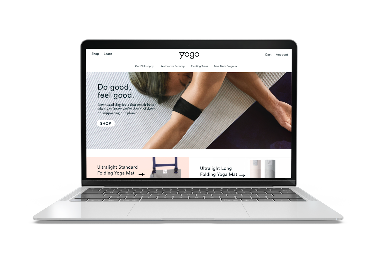
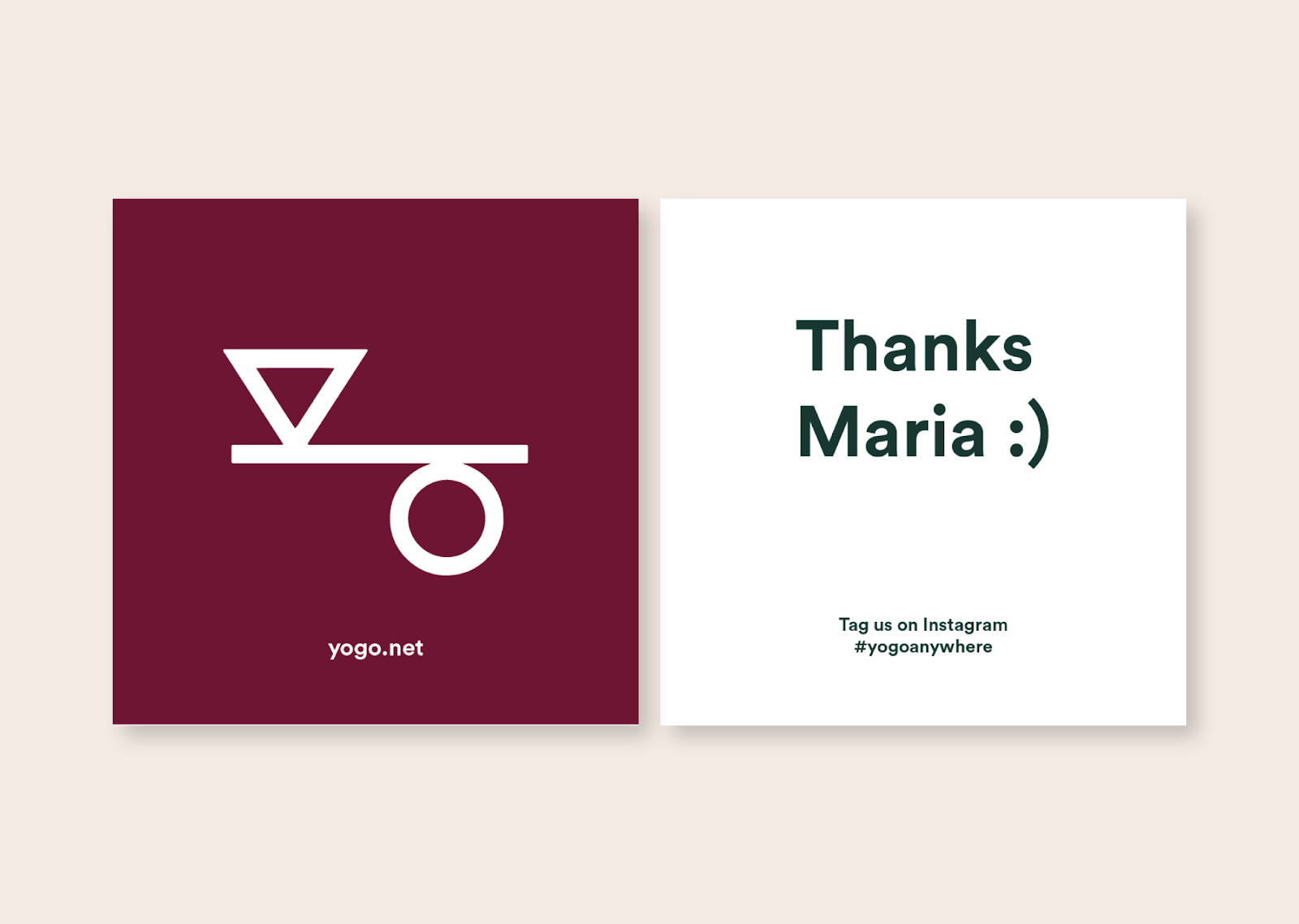
Anastasia Salazar shared a branding and visual identity project for YOGO — a company that makes yoga mats and accessories out of eco-friendly materials in an ethical, transparent process — truly walks the walk when it comes to sustainability. They came to us with a goal of establishing a visual brand identity, defining key messaging, and revamping the look and feel of their website and packaging.
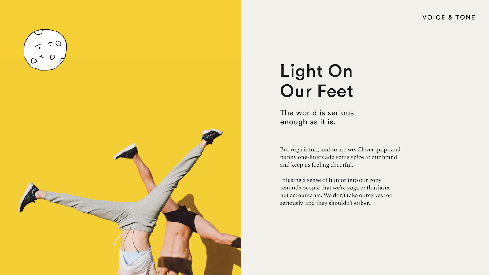
Their signature product was a light, foldable yoga mat that was perfect for travel — but in light of the COVID-19 pandemic, when staying at home was critical for public health, they wanted to move away from that association. “We pivoted to an idea of “yoga anywhere,” whether that meant your living room, porch, or neighborhood park” — which later evolved into the tagline “YOGO anywhere.”
“We pivoted to an idea of “yoga anywhere,”
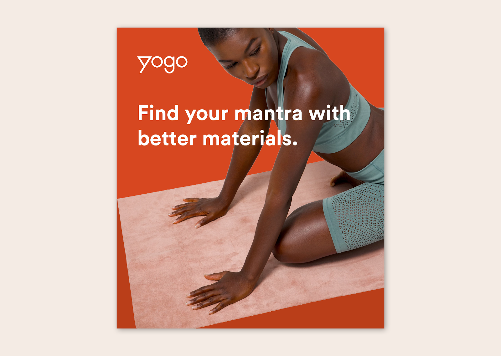
YOGO’s target audience was composed of a predominantly female group of urban dwellers, weekenders, and hardcore outdoor/environmental enthusiasts who weren’t just motivated by fitness, but by overall self-improvement. They wanted their brand to have a natural, laidback, and grounded feel that would resonate with this group. And while they wanted to highlight some of the technical and supply chain innovation that differentiates them from their competitors, they still wanted to maintain a little bit of playfulness.
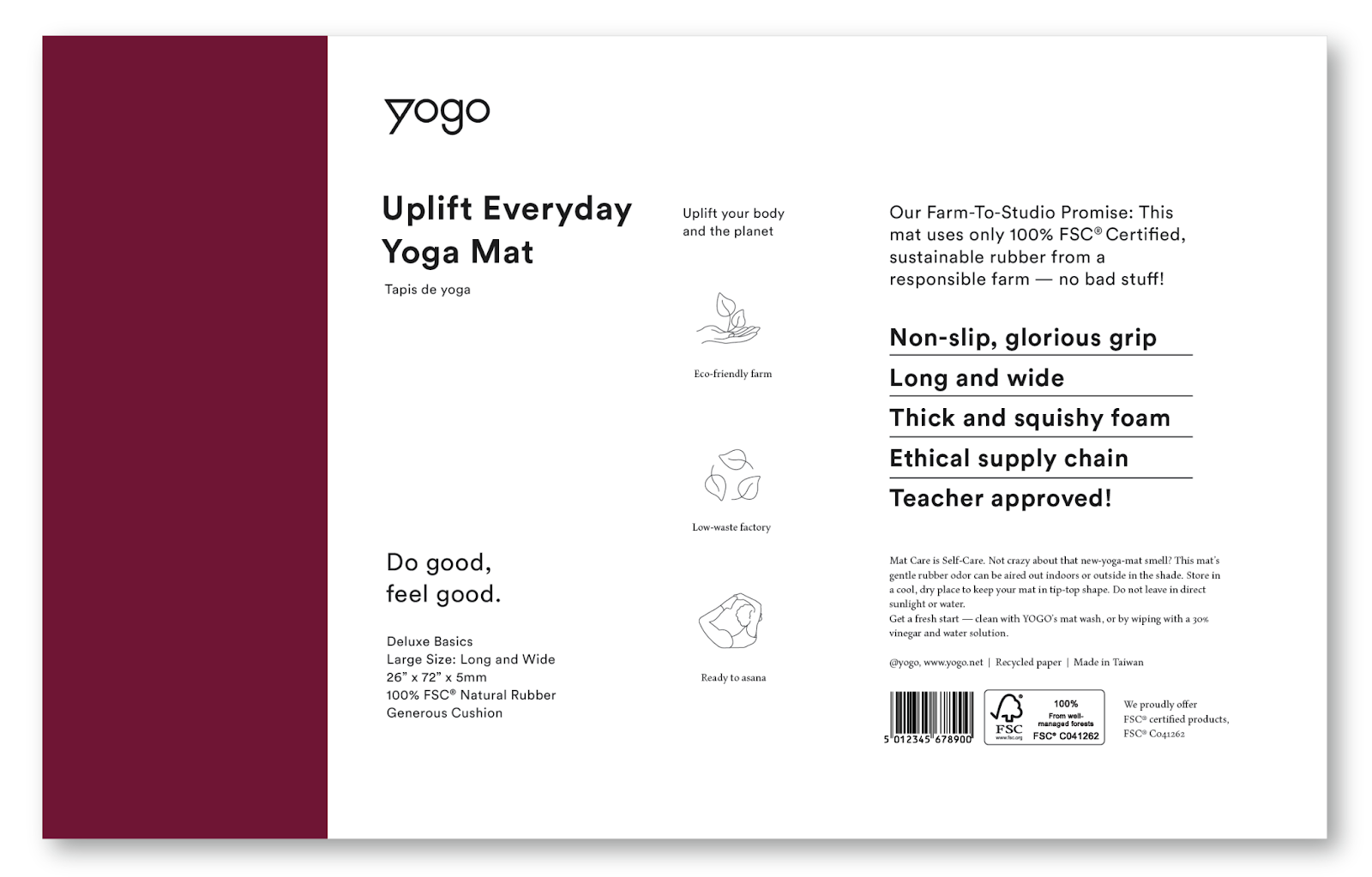
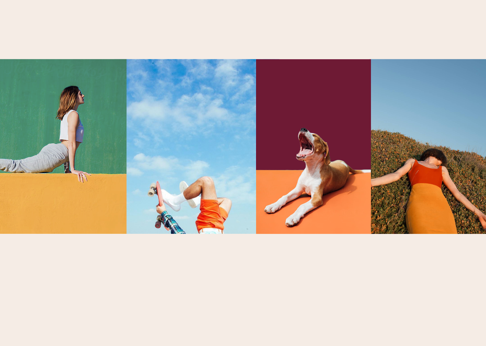
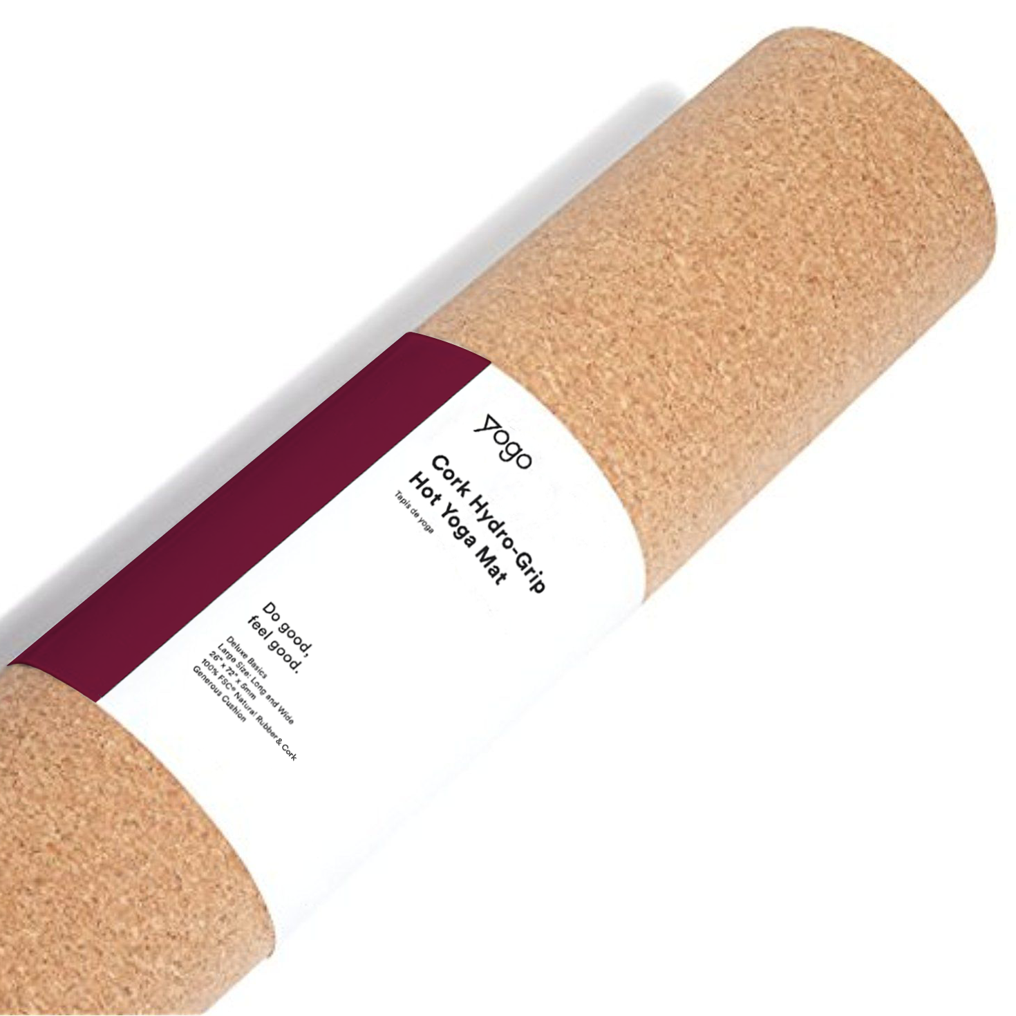
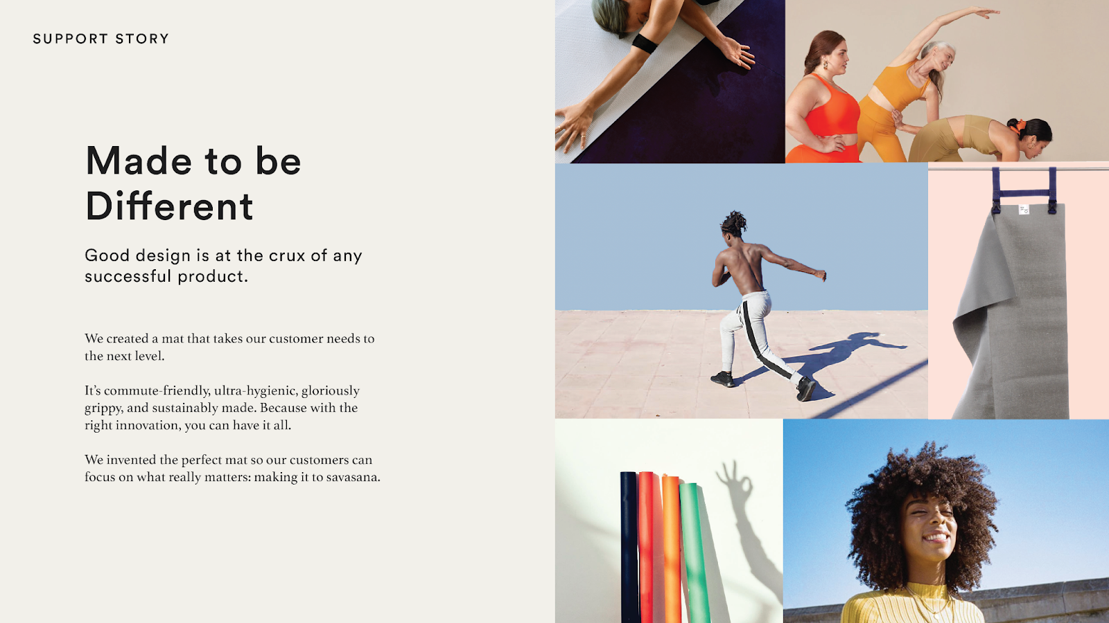
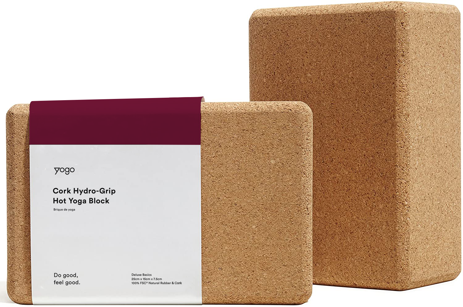
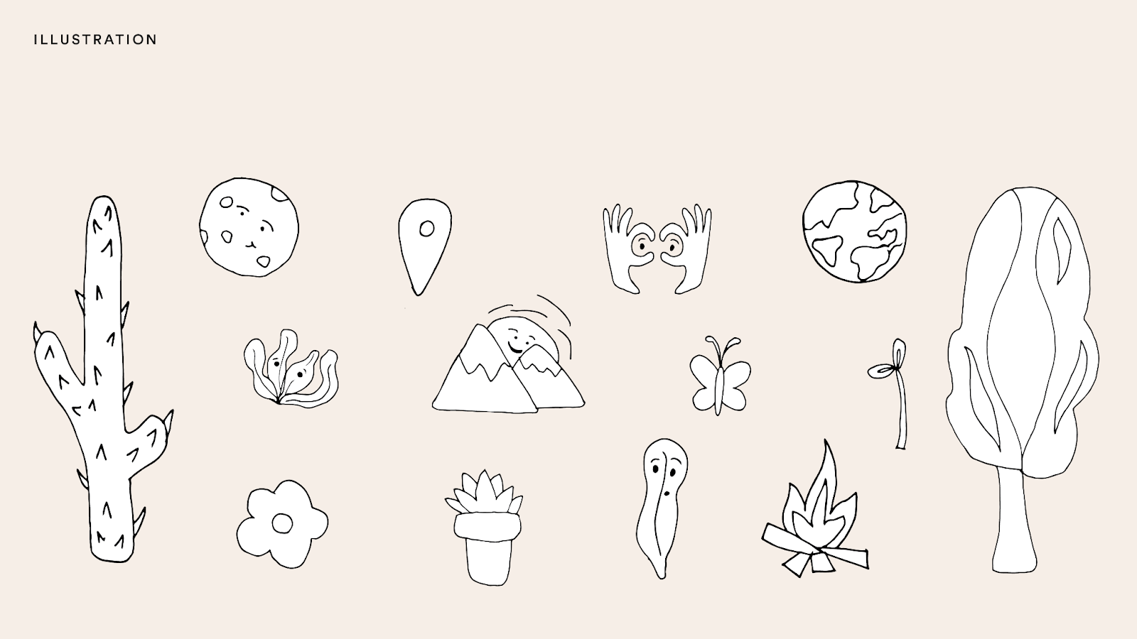
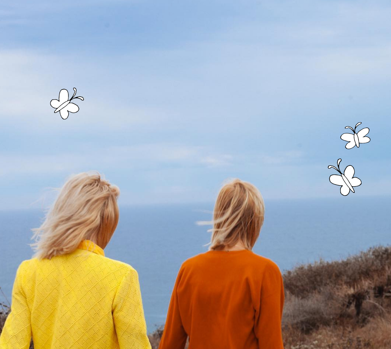
With these goals in mind, Anastasia designers developed a brand identity characterized by earthy, saturated colors; hand-drawn illustrations to pair with technical info on their supply chain and materials; and a round, friendly sans serif typeface that worked just as well for headers as explainer copy. They chose a bold photographic style that leveraged mixed geometric compositions, vibrant color blocks, and pops of natural elements to stand out from the crowd. Because YOGO frequently collaborated with influencers, they also created guidelines for an alternate style that could be more easily replicated at home. And from a messaging perspective, they adopted a witty, punny tone to help bring levity to their information-rich copy filled with ownable, descriptive terms like “hydro-grip” for all of their cork products.
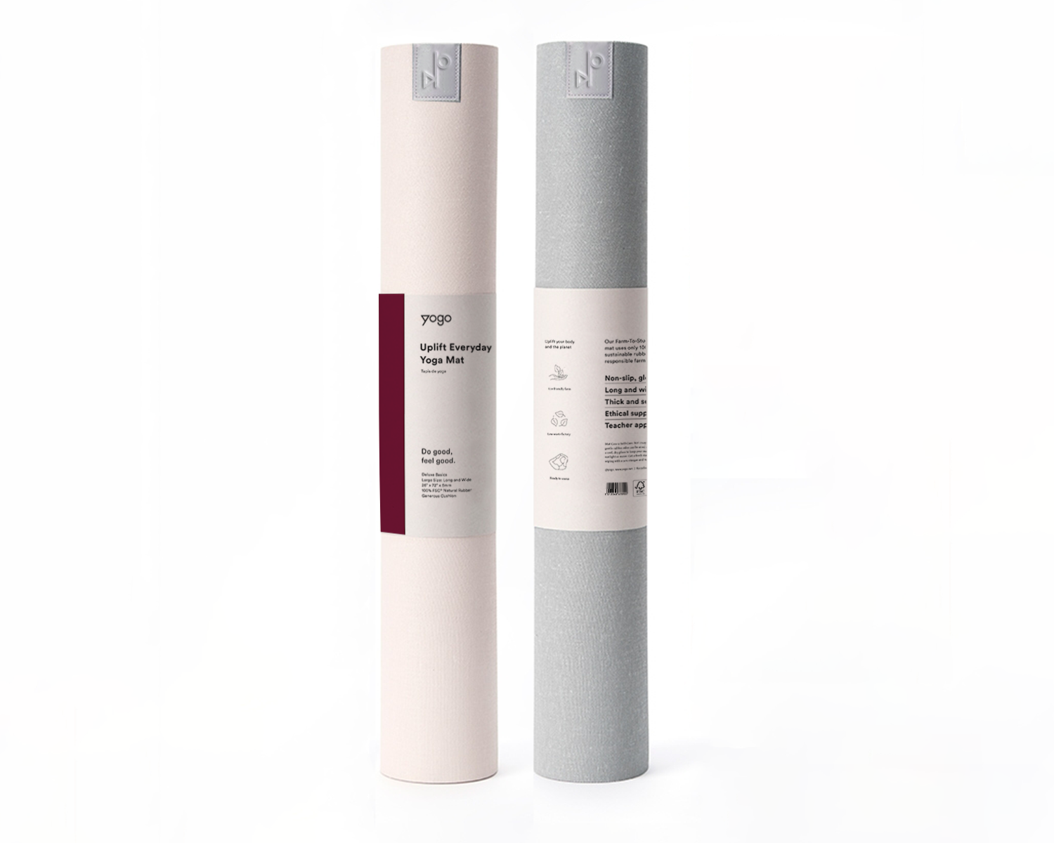
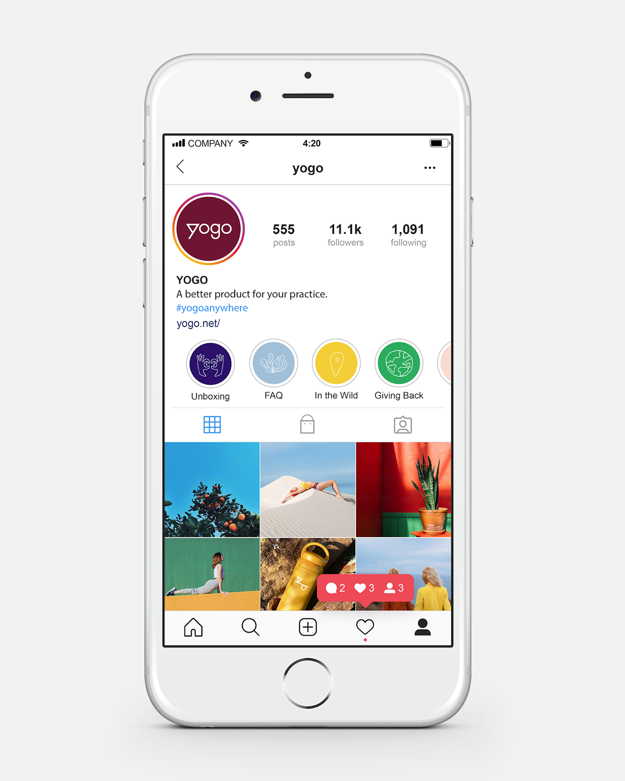
We brought all of these elements together in the website design, where we balanced a seamless shopping experience and detailed explainers on their materials, manufacturing process, and environmentally-friendly practices with a light, breezy feel. In keeping with their company values, we put sustainability at the forefront of their packaging design, opting for simple belly bands with minimal colors printed on FSC-certified paper. And to allow for future product line growth, we designed flexible templates that could work in both vertical and horizontal formats.
After a couple of rounds of revision to incorporate feedback like additional natural elements, Anastasia designers arrived at a brand identity and a set of design assets that were everything YOGO had hoped for.

For more information make sure to check out Anastasia Salazar website.


