by abduzeedo
Explore the striking branding and visual identity of A19 Startup House. Discover how Tradition, Science, and Energy shaped this unique project.
Hey, creative folks! We've all seen projects that just click. You know, those designs that blend concept, execution, and purpose seamlessly. Today, we're diving into one such example: the A19 Startup House brand identity, designed by Mda Sanek. This project offers a masterclass in how strong branding and visual identity can truly embody an organization's mission.
The Heart of A19: Tradition, Science, Energy
A19 Startup House isn't just a building; it's a hub in central Yerevan dedicated to fostering a robust ecosystem for entrepreneurs. It links Armenia's rich legacy of innovators with global companies and emerging founders. The design brief for A19 called for a brand identity that resonated with its core pillars: Tradition, Science, and Energy.
This is where the magic happens. A designer's true skill shines when they translate abstract concepts into tangible visual elements. Mda Sanek's approach here is particularly insightful. They didn't just pick colors and fonts; they built a system around these foundational ideas.
Visual Language in Action
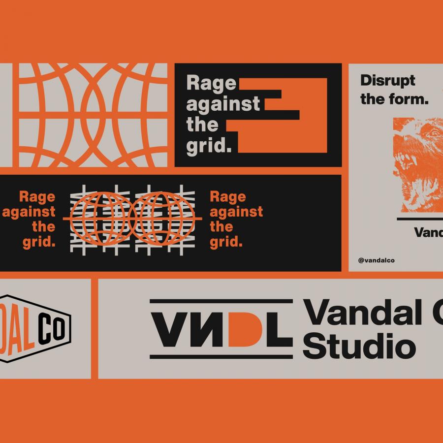
The visual identity artifacts showcased in the project truly bring A19 to life. Take a look at the web layout. The bold red, reminiscent of the physical building itself, creates an immediate impact. It's a color often associated with energy and passion, fitting for a startup accelerator.
Then there's the pictogram set and navigation system. These elements are crucial for wayfinding within a multi-functional space like A19, which includes coworking spaces, a restaurant, and offices. The clean, minimalist icons for "Meeting Room," "Coffee & Food," and "WC" demonstrate clarity and efficiency. This focus on intuitive UI/UX design ensures visitors can easily navigate the space. It’s a subtle yet powerful reinforcement of the brand’s scientific and precise ethos.
The choice of typography, including "BB Manual" and "Suisse Int'l," contributes significantly to the brand's voice. These sans-serif fonts often convey modernity, efficiency, and a touch of technical sophistication, aligning perfectly with the "Science" and "Energy" pillars. The consistent use of these fonts across various materials reinforces the brand's coherent visual identity.
Beyond the Static: Dynamic Elements
What's really captivating is how the branding extends beyond static assets. Consider the event schedules and timelines presented. The graphic representation of time slots and events, using distinct shapes and a clear visual hierarchy, makes information digestible. This thoughtful approach to data visualization speaks to the "Science" aspect, presenting complex information in a clear, organized manner.
Even the subtle animation studies for how the logo might evolve, transitioning from scattered points to a unified form, hint at the "Energy" of connection and growth that A19 aims to facilitate. It’s about building a strong ecosystem, visually represented.
Key Takeaway
Mda Sanek's work on the A19 Startup House branding and visual identity is a fantastic reminder that effective design is built on a deep understanding of core principles. By grounding the visual language in Tradition, Science, and Energy, the designer created a brand that is not only visually striking but also deeply meaningful and functional. It’s a holistic approach that ensures every touchpoint, from pictograms to web layouts, tells the same compelling story.
Ready to see more of Mda Sanek's insightful work? Explore their portfolio here: https://www.behance.net/gallery/227764787/A19-Brand-Identity