by abduzeedo
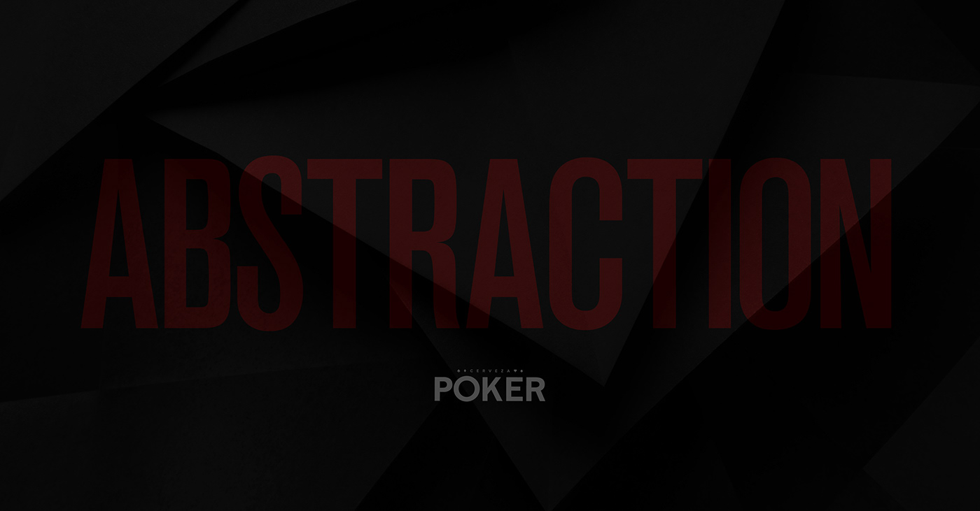
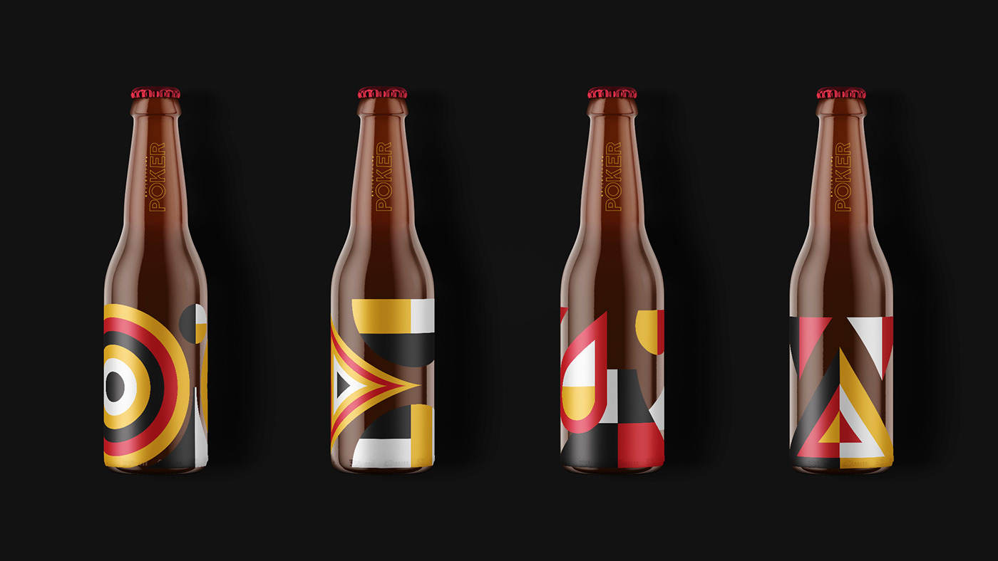
The Poker Beer Branding ID stands as a beacon in the vast landscape of design, exemplifying how multiple elements can be woven together to create a cohesive and compelling narrative. This project created by _ k n d l l _ and Jhon igua, which encompasses branding, visual identity, graphic design, and illustration, serves as a masterclass in harmonizing diverse design facets.
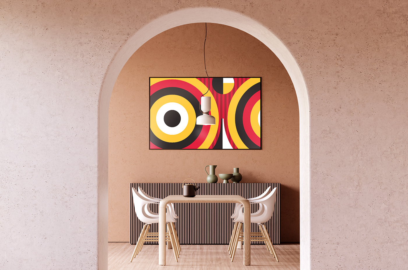
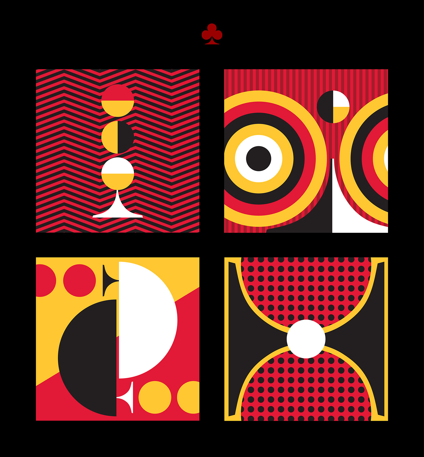
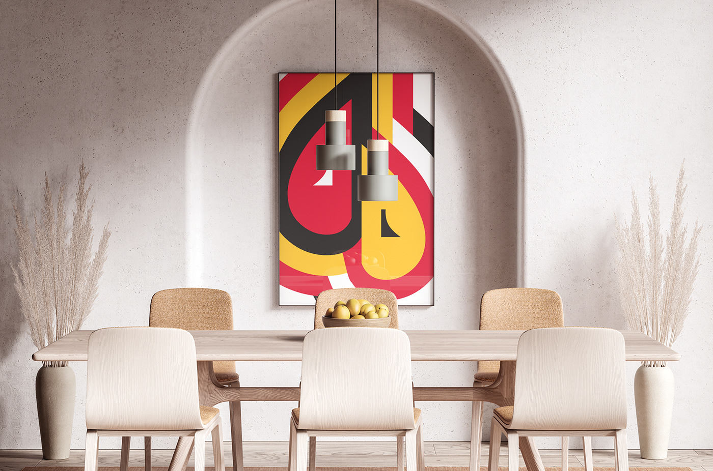
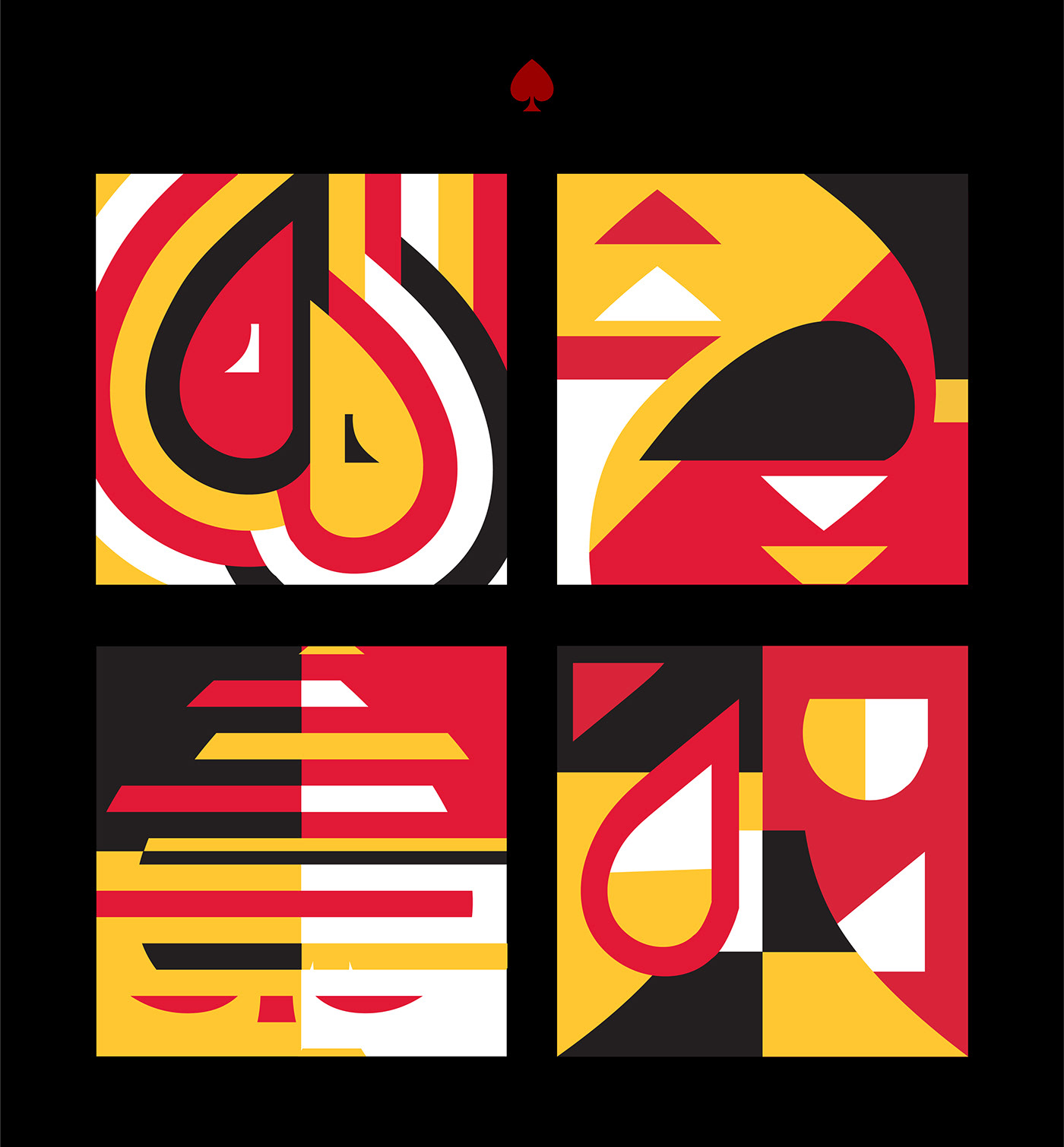
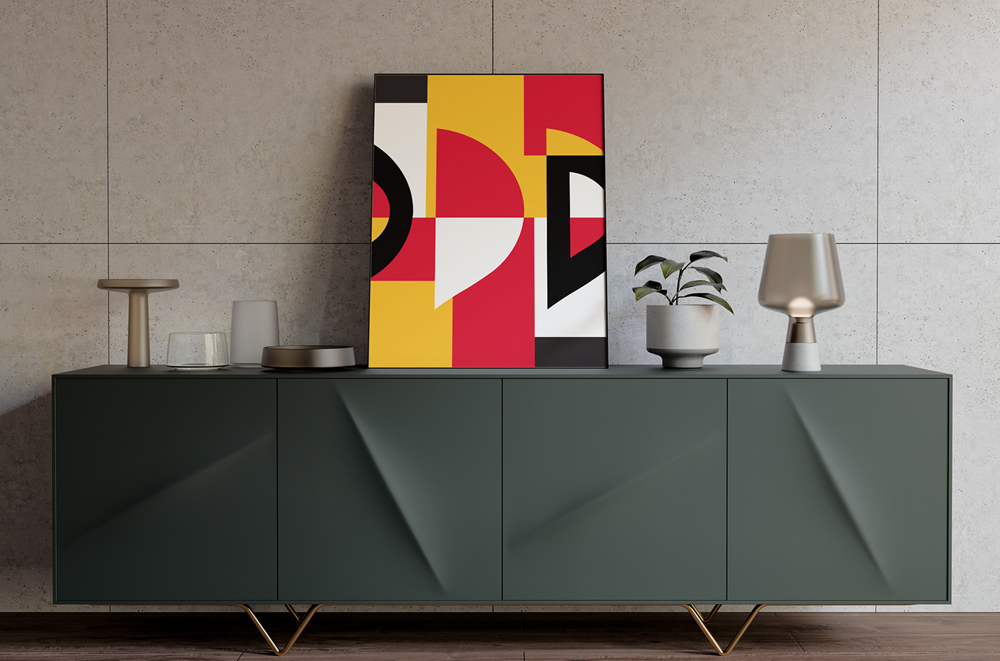
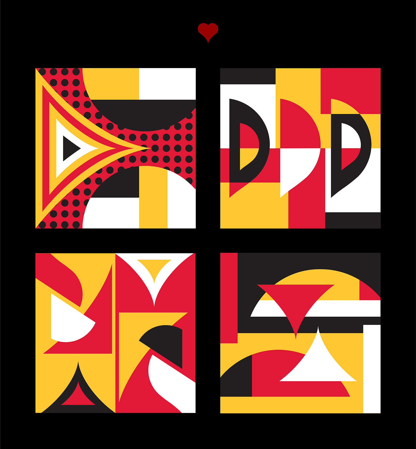
At the heart of this branding initiative is a carefully curated color palette. The foundational black and white scheme provides a canvas upon which the vibrant red and yellow accents come alive. These colors not only infuse energy into the design but also ensure adaptability across a spectrum of platforms, from digital displays to tangible prints.
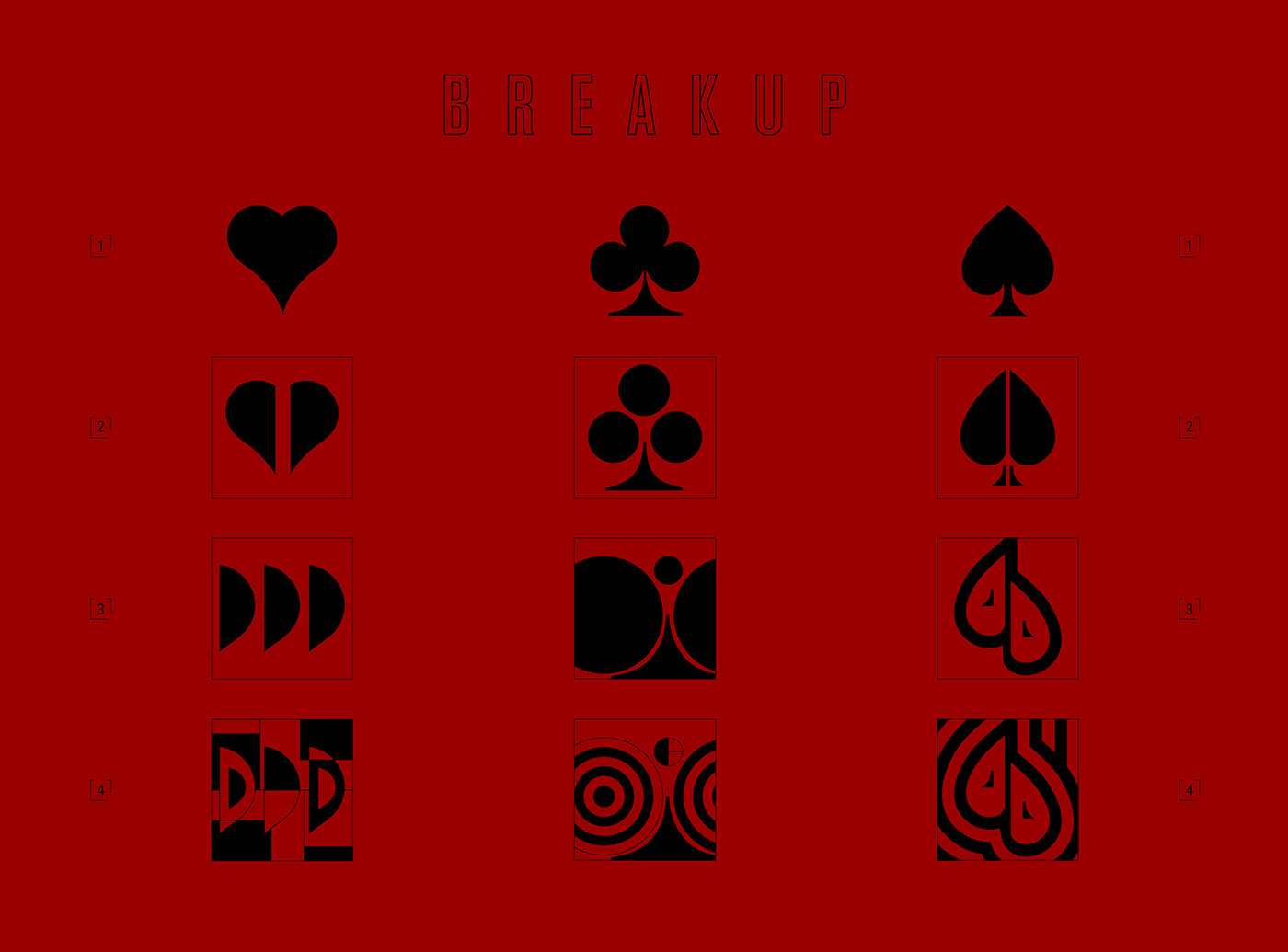
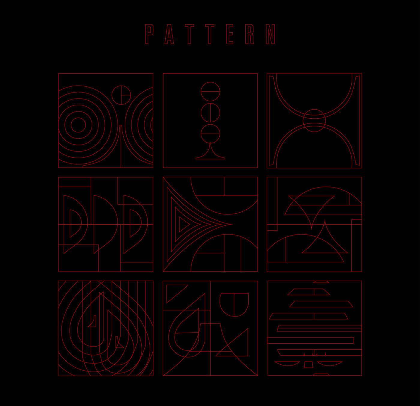
Geometry, with its precise lines and shapes, is a dominant theme. The use of vector clean lines imparts a contemporary touch, while patterns, especially those incorporating circles and lines, add layers of depth. The meticulous use of negative space is particularly commendable, allowing each design element to breathe and stand out without overwhelming the viewer.
The integration of card motifs - clubs, diamonds, hearts, and spades - is both subtle and strategic. These symbols, while resonating with the poker theme, are embedded within the design in a manner that they enhance rather than overshadow. This balance is evident in the range of visualizations, from posters to beer labels, where the motifs meld seamlessly with other design elements.
Furthermore, the project's emphasis on simple, geometric forms combined with intricate patterns showcases the versatility of minimalist design principles. It's a testament to how simplicity can be layered with complexity to produce branding that is both memorable and impactful.
In conclusion, the Poker Beer Branding ID is more than just a design project; it's a study in precision, balance, and harmony. It offers invaluable insights for designers, illustrating that with thoughtful consideration, one can craft branding that resonates and leaves a lasting impression.
Branding, visual identity and illustration artifacts
For more information make sure to check out _ k n d l l _ and Jhon igua on Behance.


