by abduzeedo
The second week of my little project of trying to create an image per week. This time I got inspired by simple vector illustrations I saw that had lines creating the logo. I've done something like this in the past but never with the style that I played with this week, completely out of my comfort zone. Below you can see the little step by step of this image done in Illustrator and Photoshop.
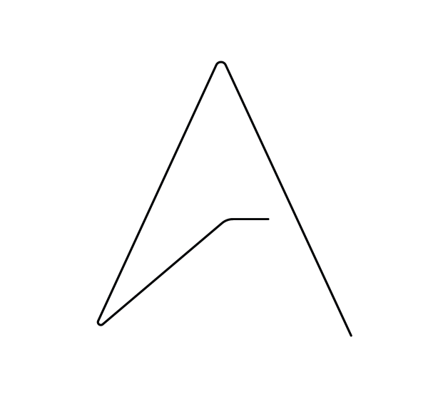
Step 1
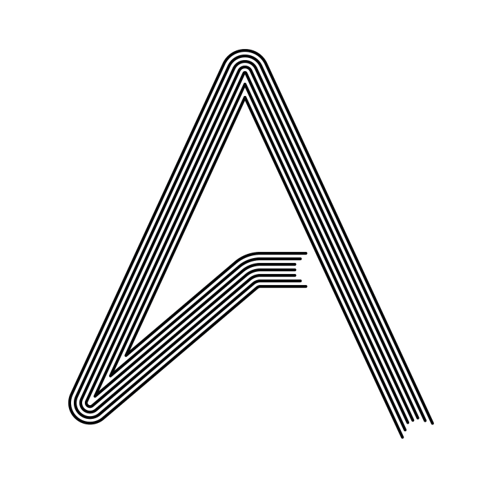
I started with the Abduzeedo logo in a simple line.
Step 2
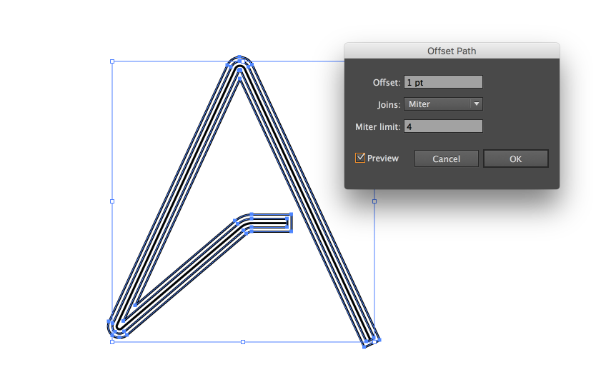
Then I used the Offset Path to create more lines.
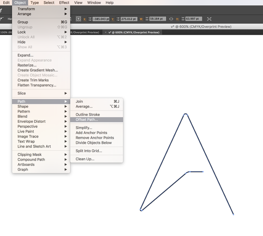
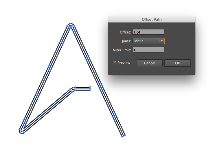
Step 3
The offset path is quite simple to use, just offset by 1pt and keep repeating that with the offset path result.
Step 4
The end result of the offset path is always a closed shape. So with the Direct Selection Tool (A), I deleted the line that closed the shape to have open lines.
Step 5
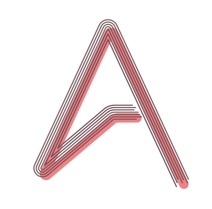
Now with the lines with a nice brownish color, I added a solid and thick version of the logo with a reddish/pink color under the lines.
Step 6
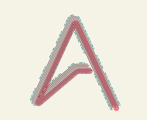
To add more details I offset the outer path once again but for this one, I used the dashed stroke with green for the color.

Step 7
Here's in Photoshop already, I edited a bit the green path to make it less uniform. The background also was changed to a beige tone.
Step 8
I added the logotype "Abduzeedo" trying to replicate the same effect. I just used copies of the text with different strokes.

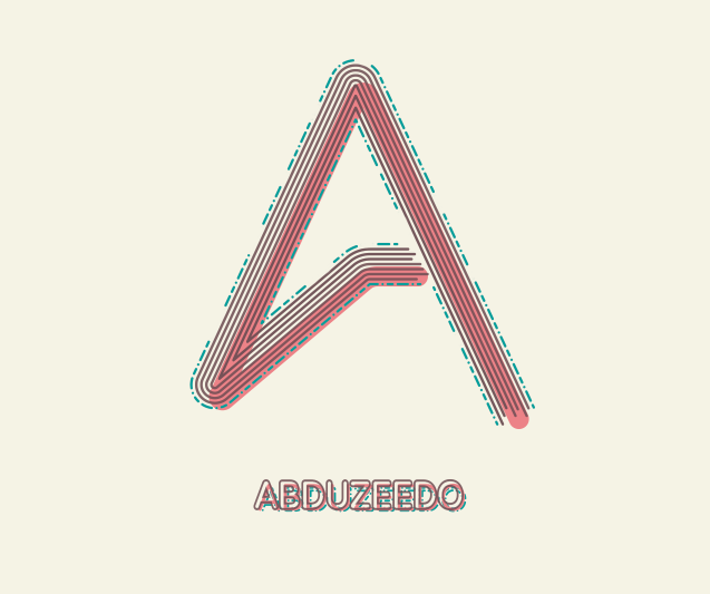
Conclusion
Here's the final result of my second image. I had never played with this style and it was a good exercise for me, especially in terms of going out of my comfort zone.