by abduzeedo
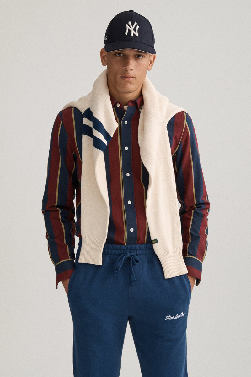
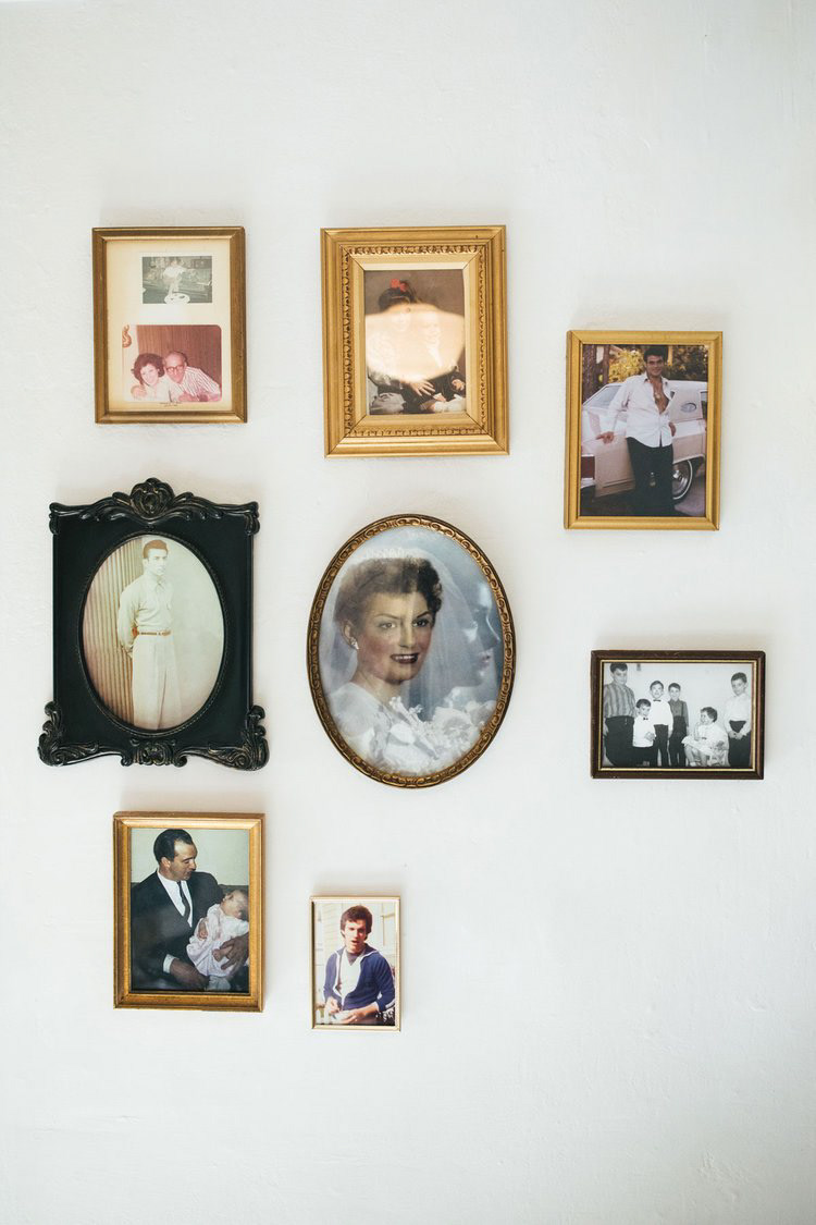
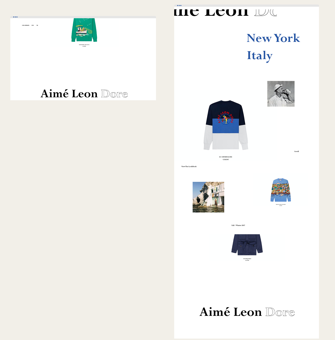
John Breen shared an awesome art direction project for Aimé Leon Dore, a fashion label based out of Queens, New York that takes particular inspiration from the personal roots of Italy and Greece.
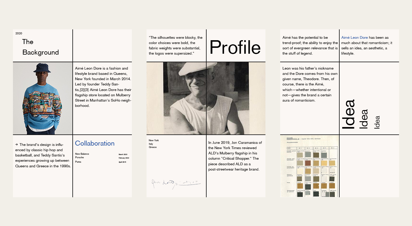
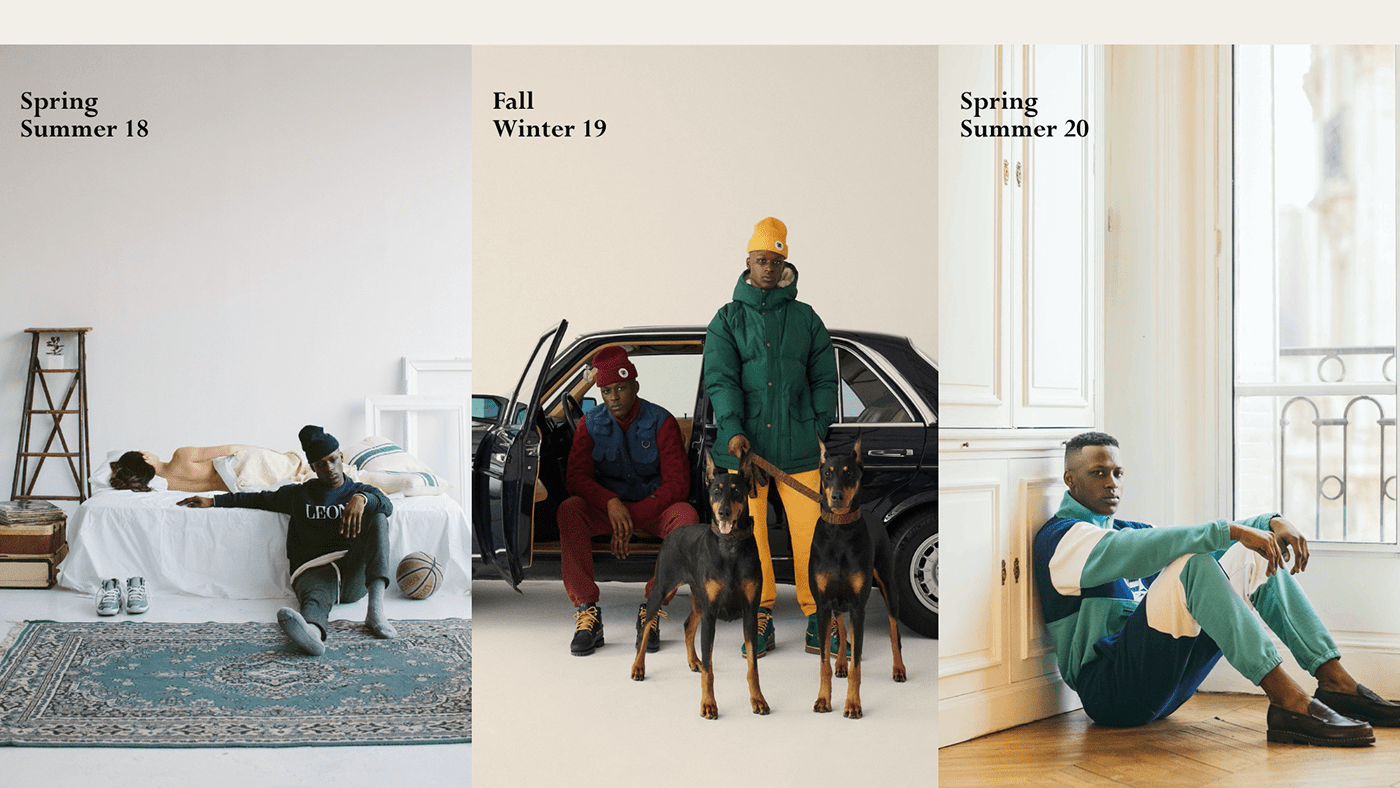
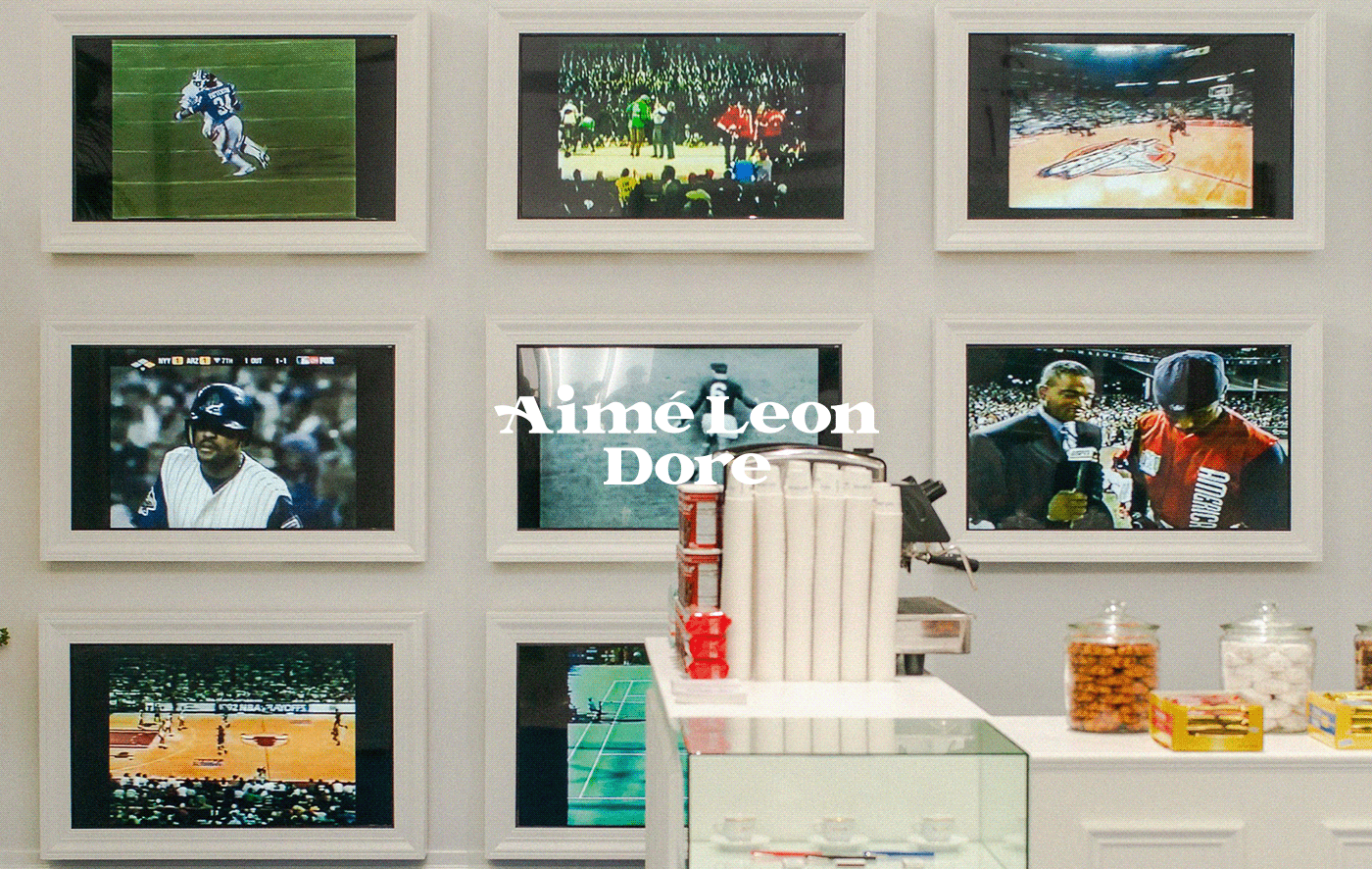
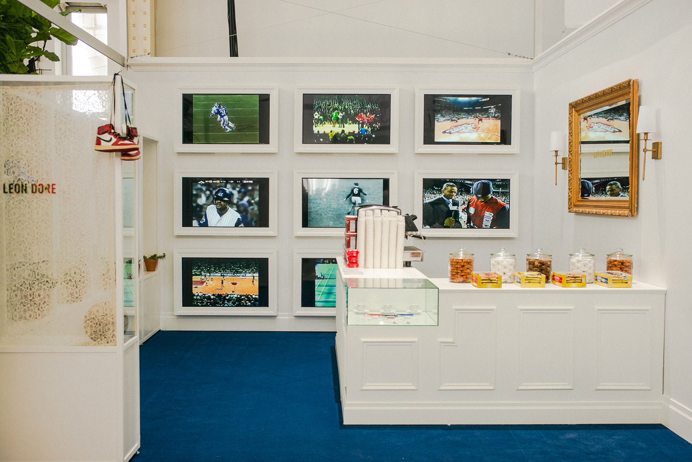
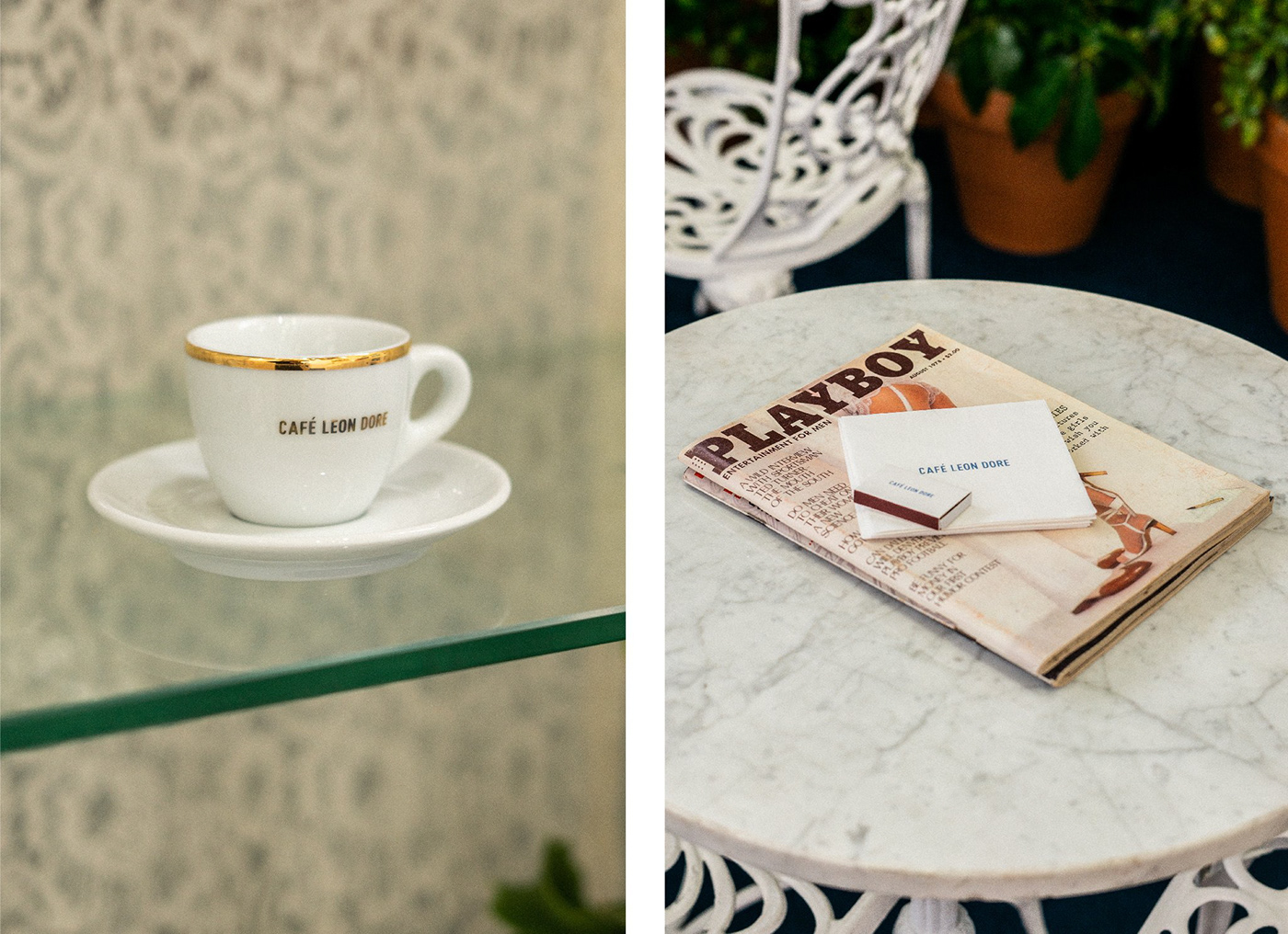
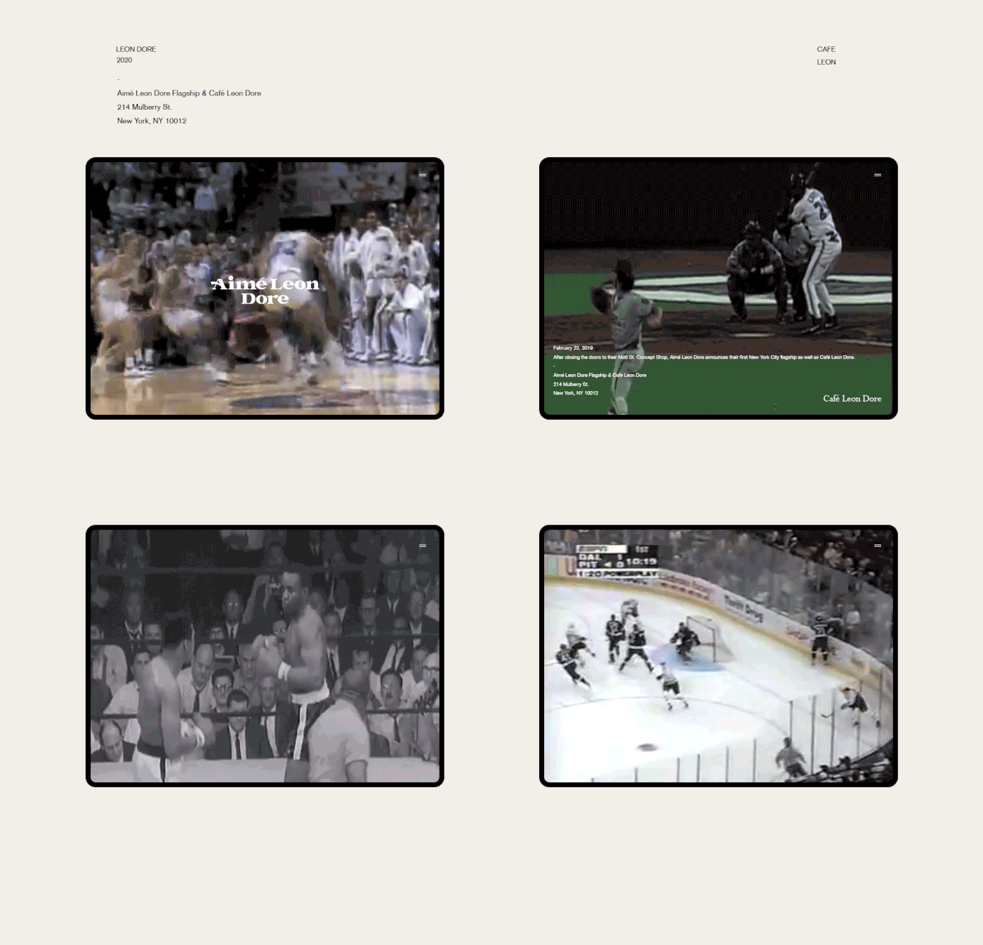
Led by founder Teddy Santis, Aimé Leon Dore has its flagship store located on Mulberry Street in Manhattan's SoHo neighborhood. The brand's design is influenced by classic hip hop and basketball, and Teddy Santis's experiences growing up between Queens and Greece in the 1990s. In June 2019, Jon Caramanica of the New York Times reviewed ALD's Mulberry flagship in his column "Critical Shopper." The piece described ALD as a post-streetwear heritage brand: "In its smart, accessible, post-street-wear clothes, you see the shadow of the first era in which big-tent men’s wear — Polo, Tommy Hilfiger, Timberland, L.L. Bean — was forced to reckon with hip-hop, since hip-hop was already reckoning with it.
Design
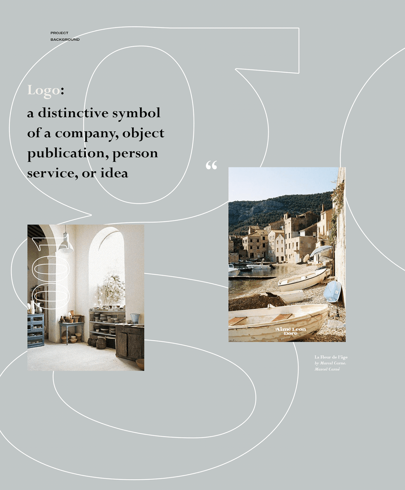
DISCOVERY
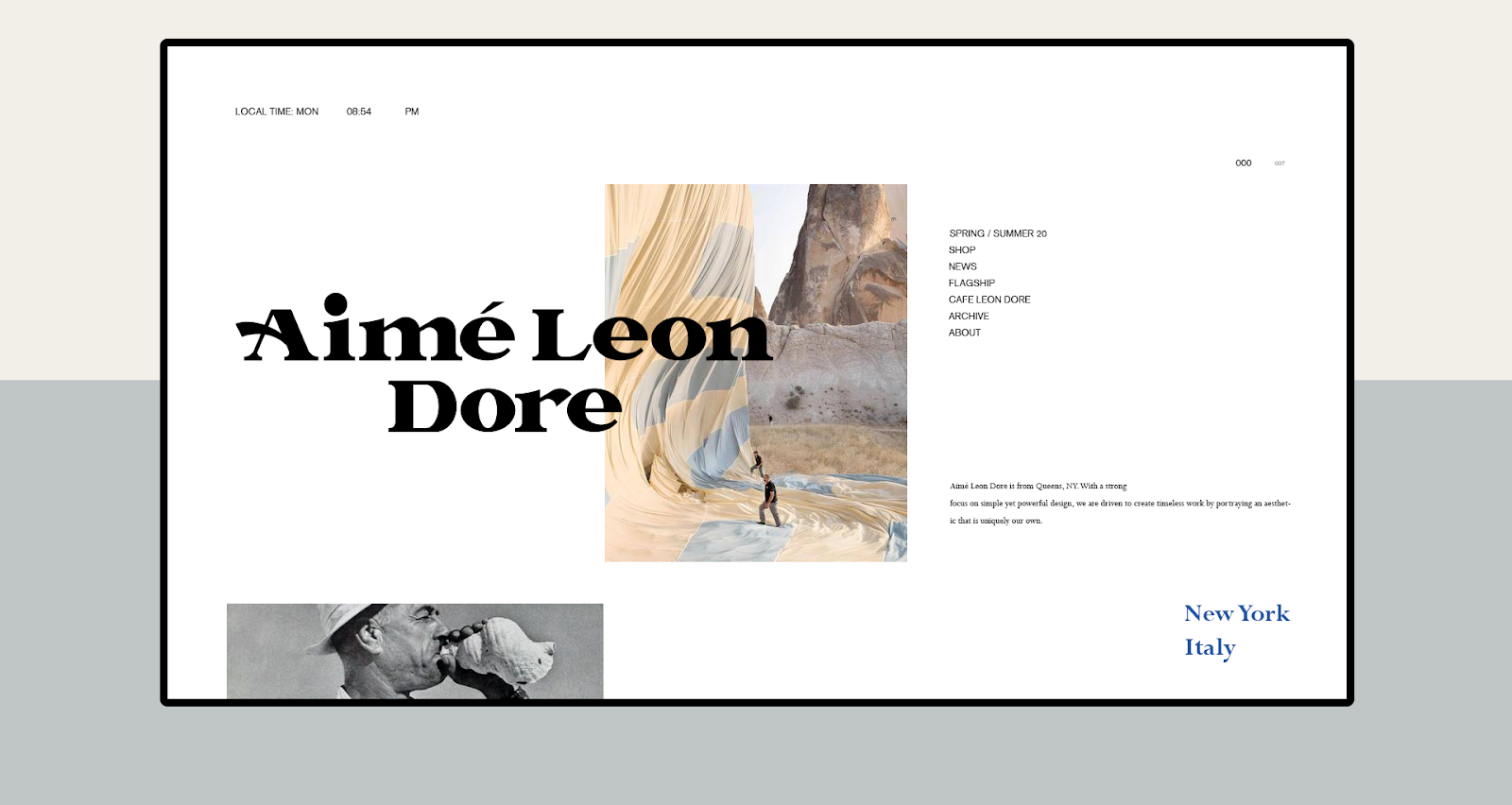
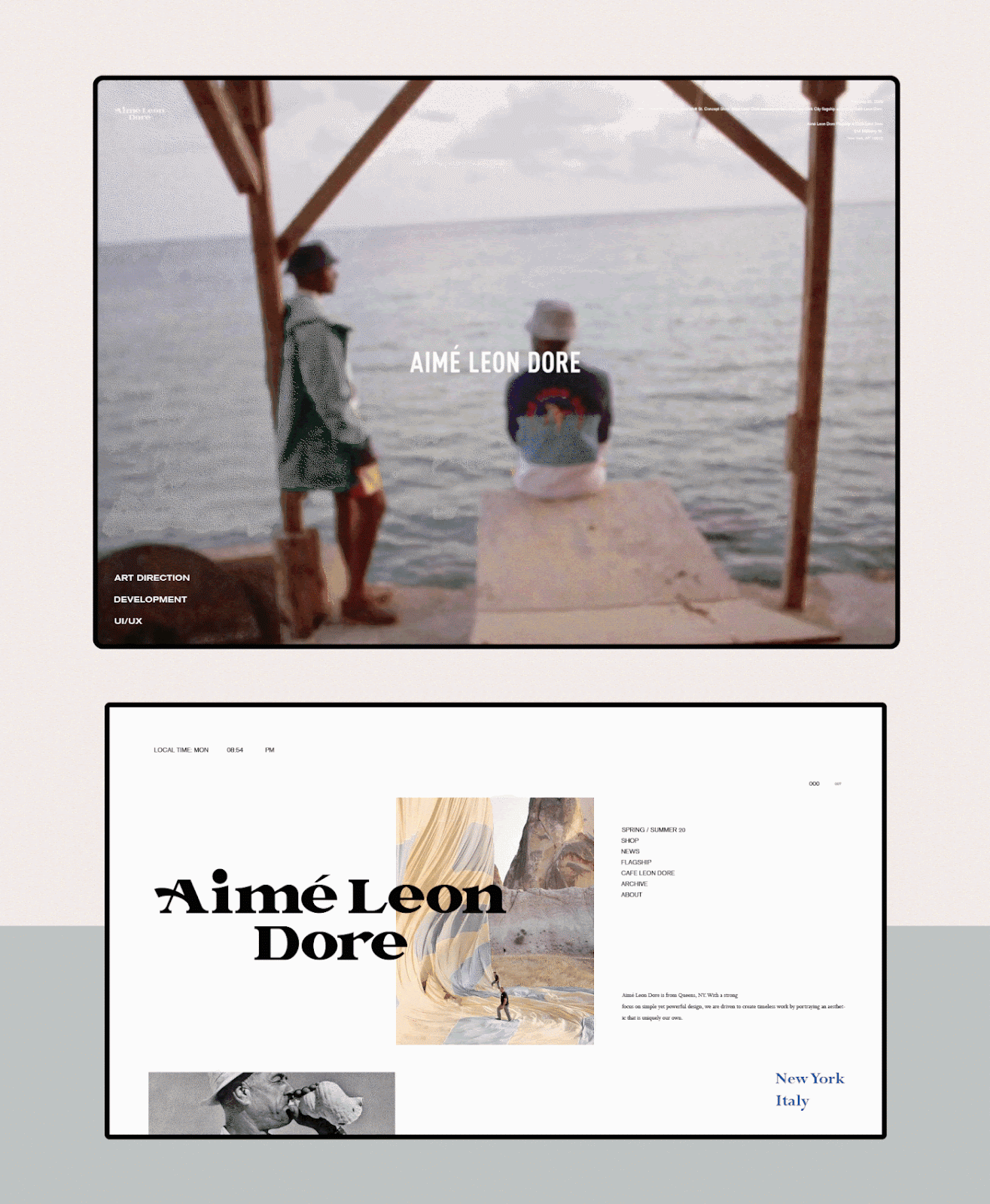
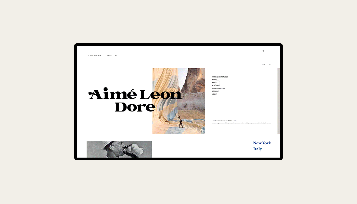
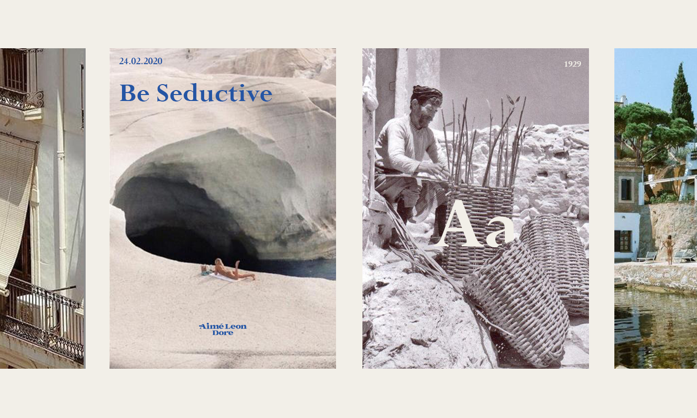
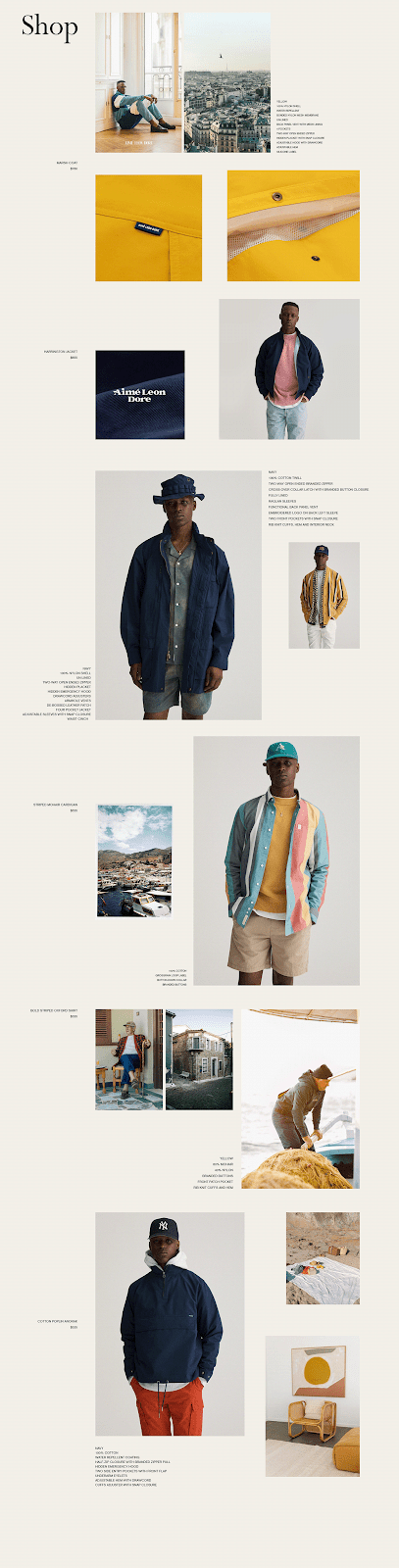
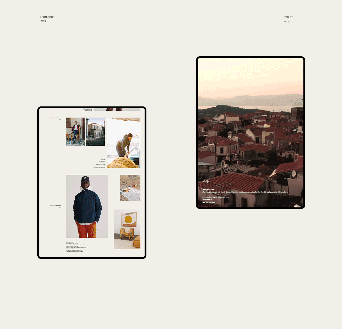
From my observation of Aimé Leon Dore, it offered many possibilities to venture into different areas of creative work. The challenge was to represent this visually in a brand identity that reflected Teddy Santis's personality, values, and aesthetic, but stood as an entity of its own. The goal was to reflect the brand in a modernist New-York style that also carried cultural values from Italy and Greece. An essential aspect of the brand's personality was a sense of relaxation, with colorful and muted tones; it was necessary to suggest tasteful design.
You can have anything you want in life if you dress for it. —Edith Head
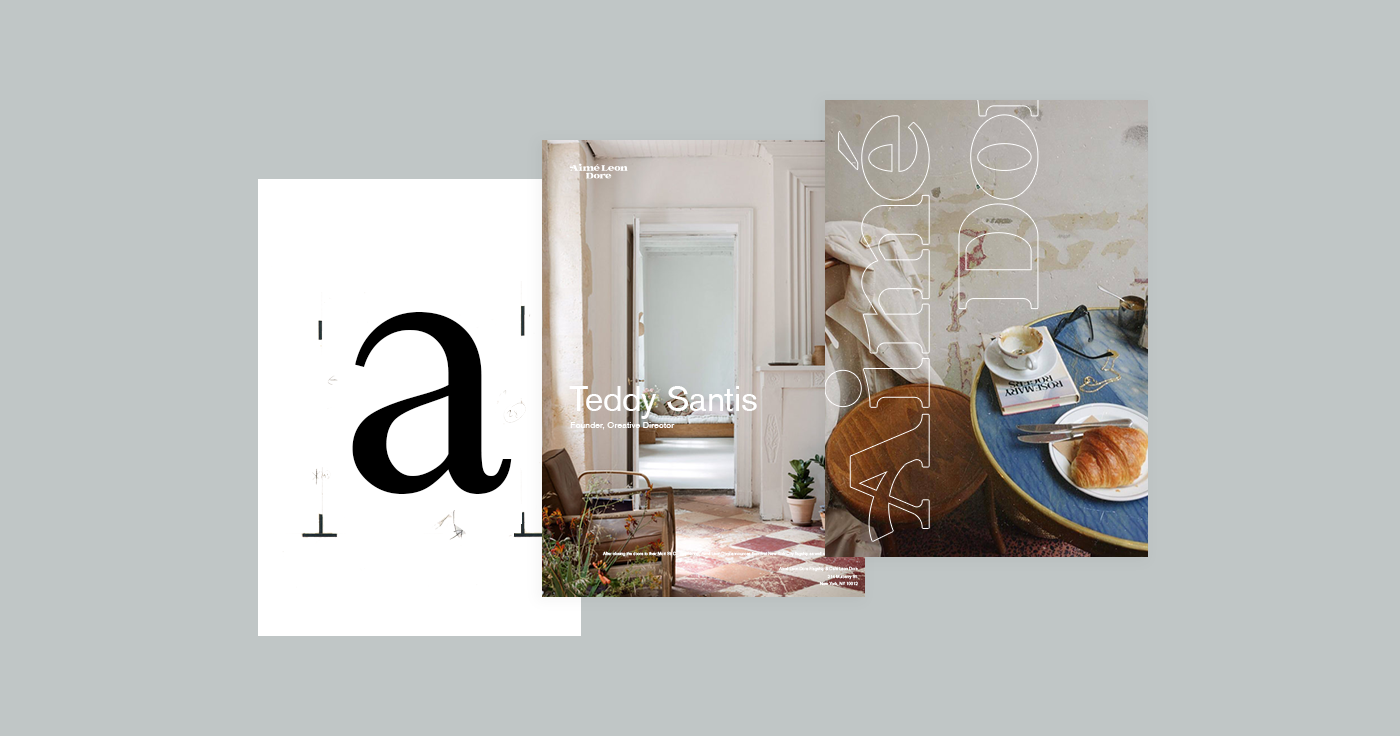
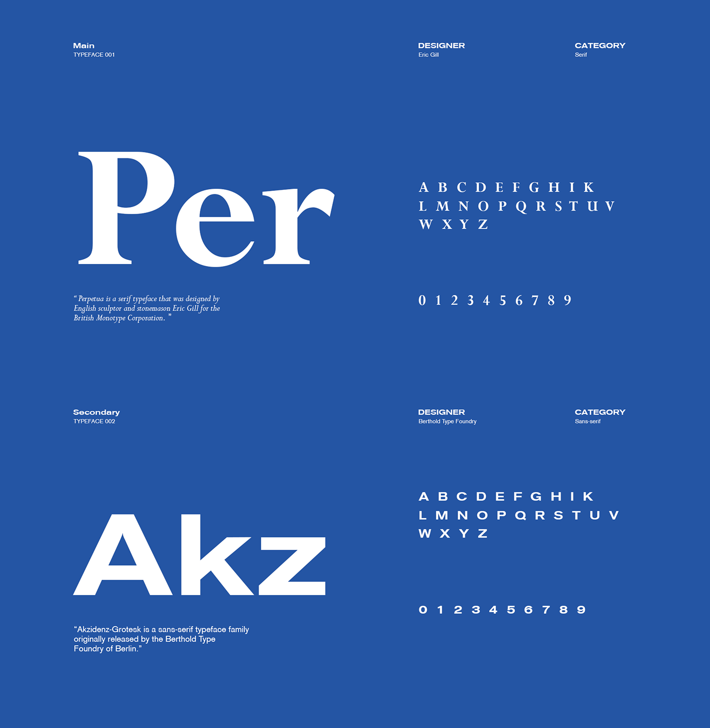
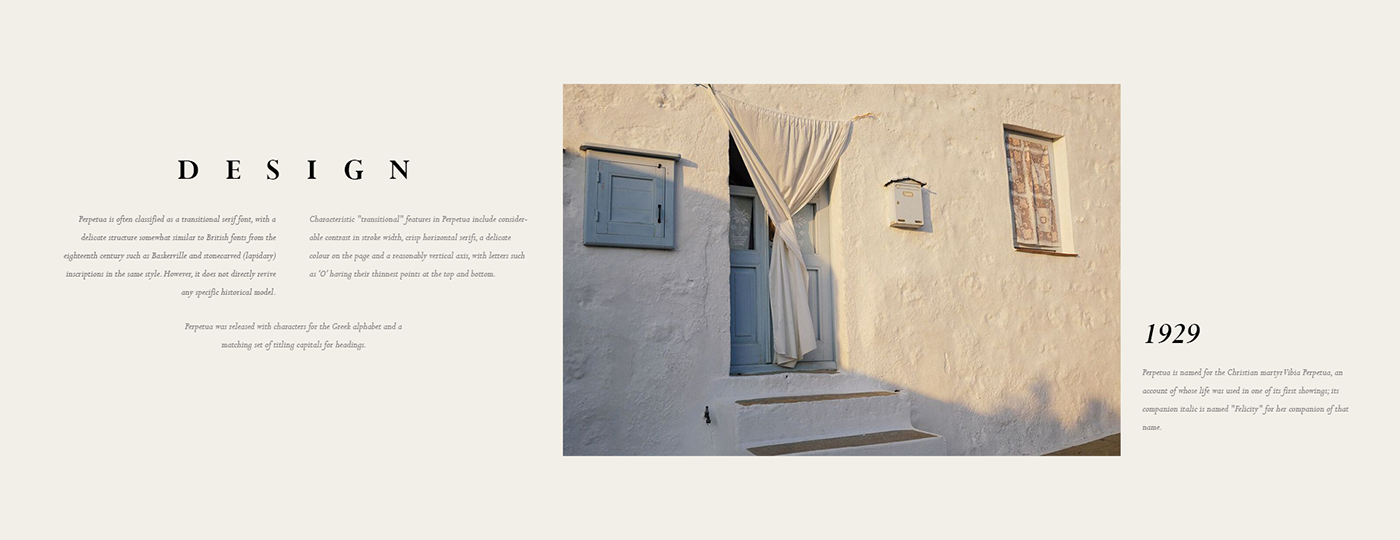
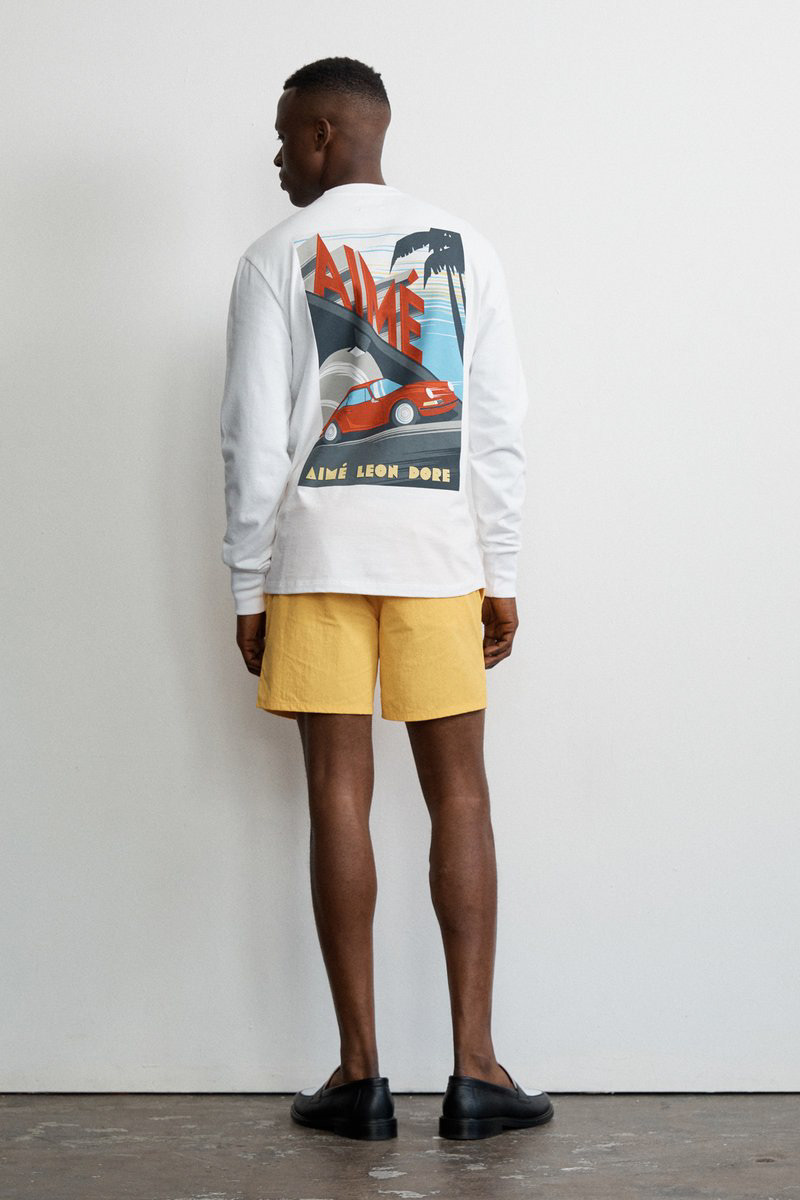
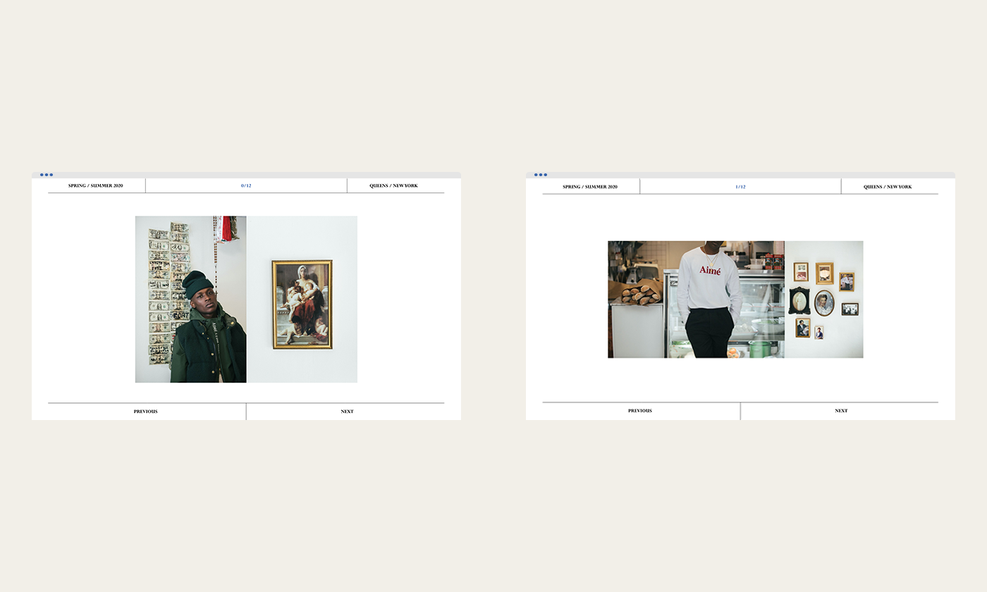
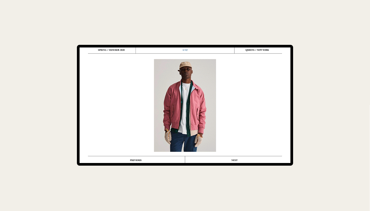
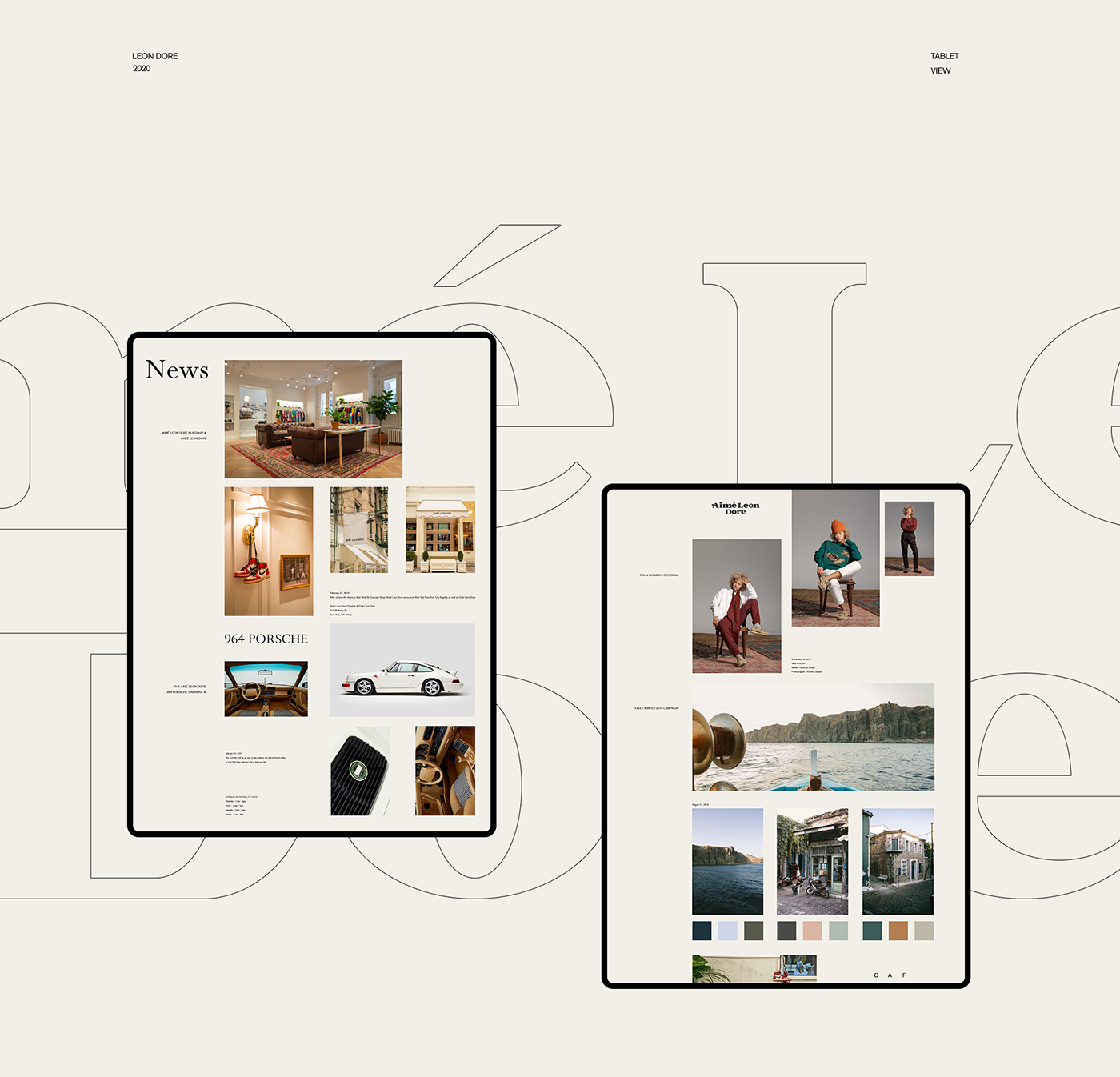
In regards to visuals, I thought it would be more useful to capture the brand through typography and movement. The look and feel of the brand needed to feel tasteful and dominant, carrying a particular message across to the ordinary bystander. I decided to work with (Main) Perpetua, designed by Eric Gill (Serif); Perpetua is a serif typeface designed by English sculptor and stonemason Eric Gill for the British Monotype Corporation. Perpetua achieved the prevailing requirements of being a font with a very mature, class typeface. With such a simple treatment of wordmarks, the details became important.
For the branding process, John wanted to keep it minimal, but also something that you would not forget. Consisting of the color scheme with black and white to keep the brand aged, it also incorporates splashes of the color blue to implement dominance and visually contrast the black and white schematics. He showcased these designs through a variety of branding outlets.


Credits
- Client: Aimé Leon Dore
- Year: 2020
- Art Direction / Development: John Breen
- Special thanks
- Logo-mark: Kyle Reese
Aimé Leon Dore is a registered trademark. 2019-2020 - All Rights Reserved ®


