by abduzeedo
Explore the innovative branding and visual identity project for Fuller Brand Communication. Discover how strategic design redefines brand engagement.
In the dynamic landscape of brand communication, Fuller Brand Communication has embarked on a transformative journey to redefine its brand identity. Spearheaded by the talented Sean Kane, this rebranding initiative marks a pivotal moment in Fuller’s narrative. Known for their strategic and creative prowess, Fuller, an independent brand communication agency, decided to revitalize their brand image eight years after their previous rebrand. The decision stemmed from a desire to reflect a more restrained and timeless quality, aligning with the evolving needs of their diverse client base.
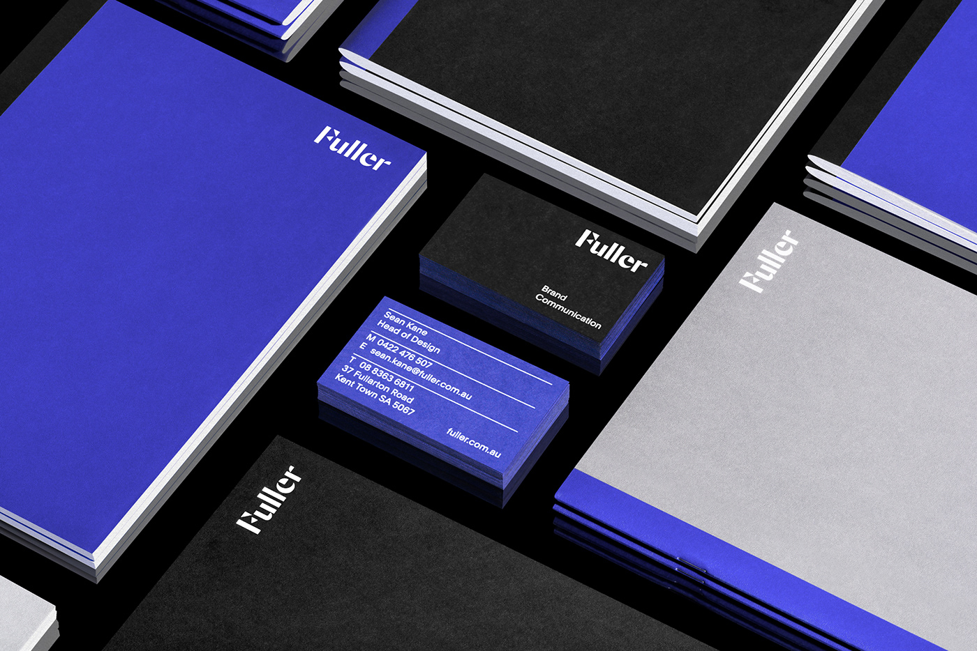
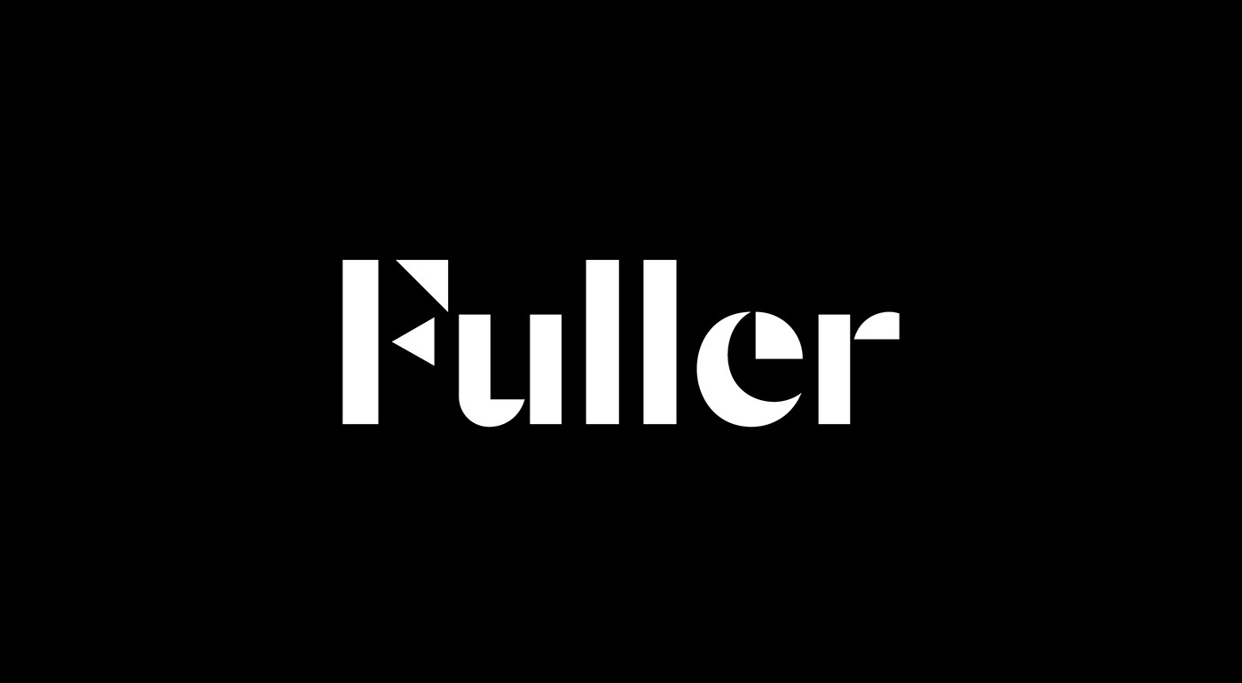
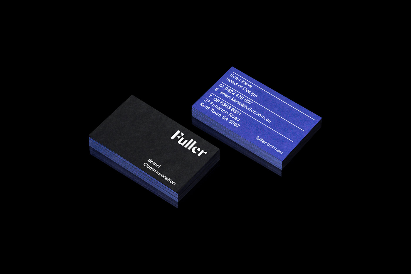
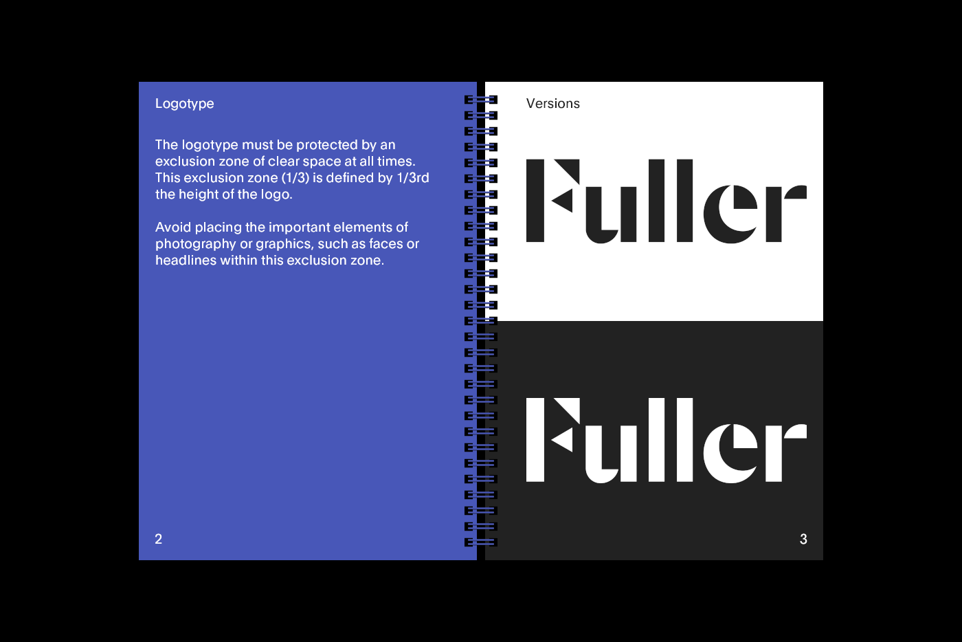
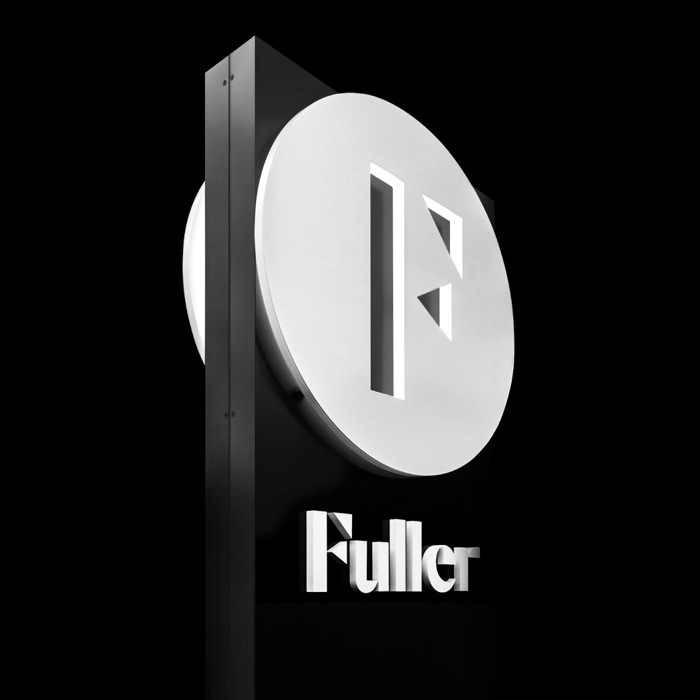
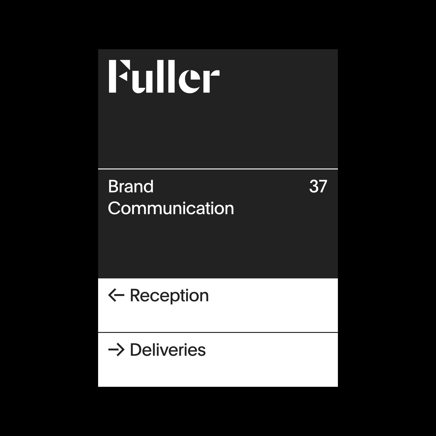
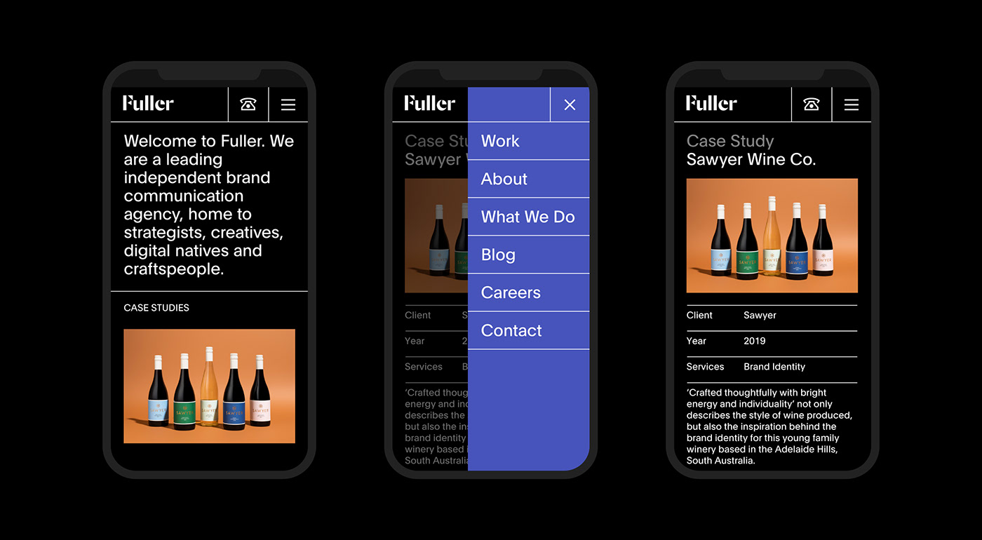
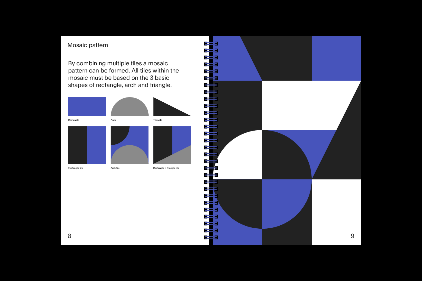
The core of Fuller’s new brand identity lies in the profound exploration of what makes the agency unique. This introspective journey unveiled the essence of Fuller: its rich history, the familial spirit, dedicated staff, and the breadth of its client relationships. These elements are ingeniously woven into the visual language of the brand, through the use of arches, triangles, and geometric shapes that coalesce to form an evocative logotype.
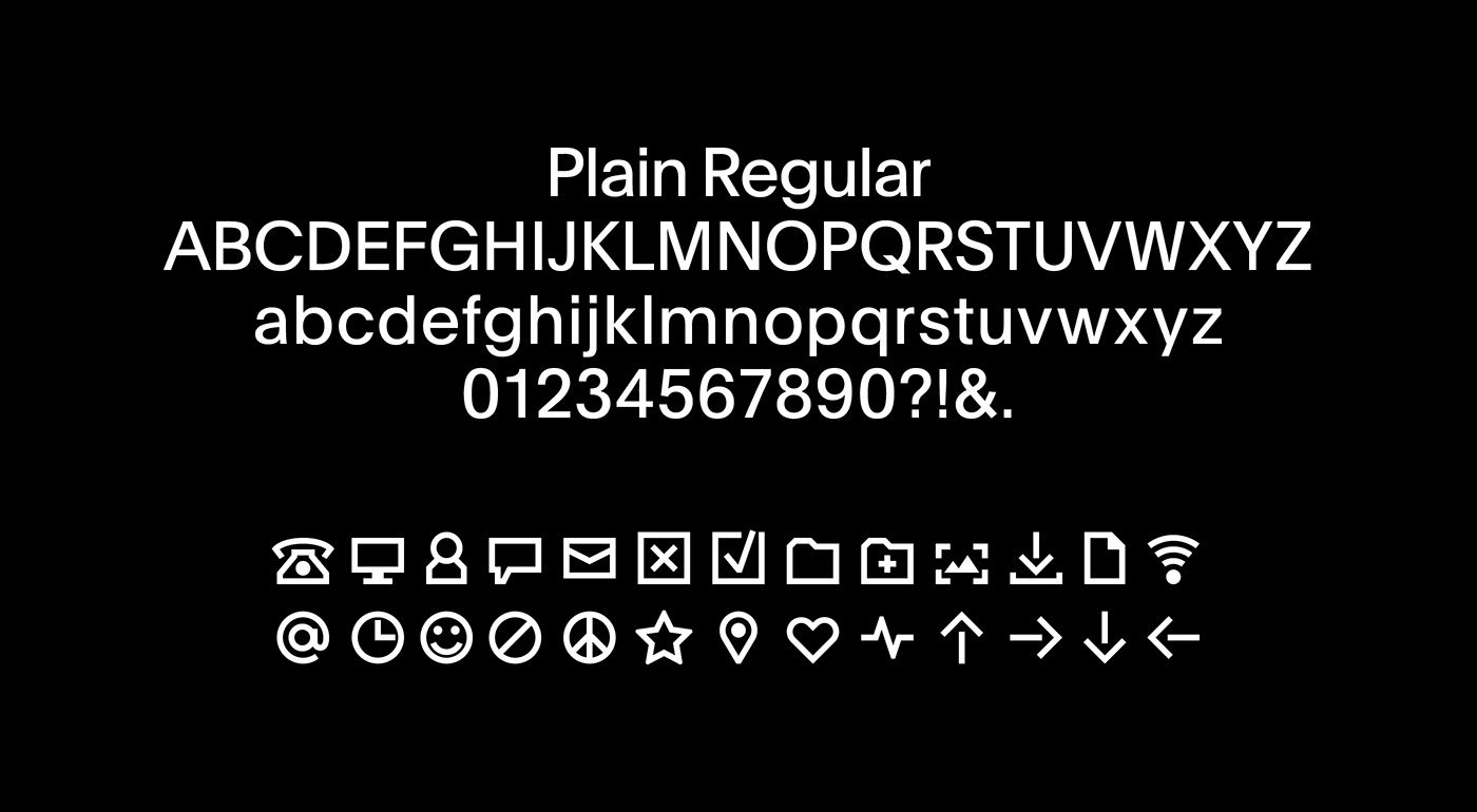
Color plays a critical role in this new visual identity. The selected palette pays homage to Fuller’s roots in writing and newsprint, with a striking indigo accent that echoes the familiar hue of a blue biro. This choice not only breaks up the classic black and white scheme but also injects a modern vibrancy into the design. Furthermore, the selection of ‘Plain’ by Optimo as the primary typeface underscores Fuller’s commitment to clarity and longevity, steering clear of transient design trends.
This rebranding project by Sean Kane for Fuller Brand Communication stands as a testament to the power of thoughtful design in articulating brand values and heritage. It reflects a harmonious balance between tradition and innovation, ensuring that Fuller’s brand communicates with authenticity and relevance. For businesses and creatives alike, Fuller’s journey offers valuable insights into leveraging design as a strategic tool for brand evolution.
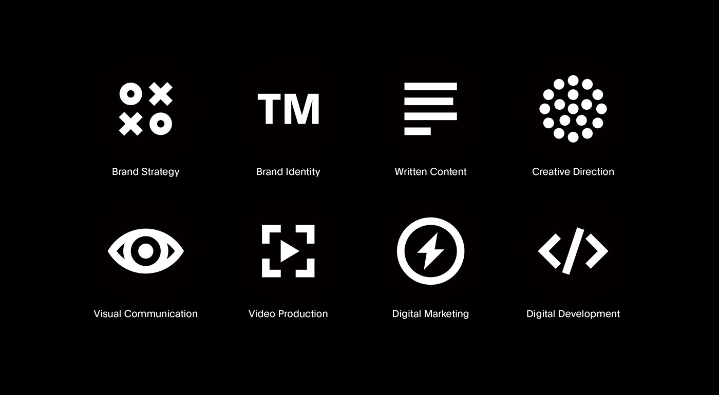
Branding and visual identity artifacts
Details
- Business Cards: 270gsm Colorplan Ebony, 270gsm Colorplan Royal Blue, Duplexed
- Notebooks: 352gsm Neenah Solar White Stipple
- Cards: 350gsm Colorplan Pristine White
- Graphic Design: Sean Kane
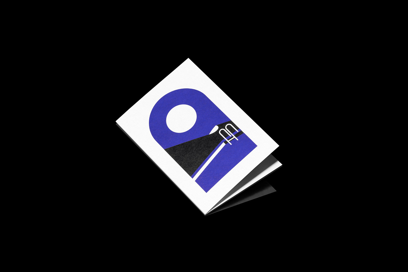
- Card illustration: Millie Sander
- Photography: Lightly Salted
For more information make sure to check out Sean Kane Behance profile.


