by abduzeedo
Discover the colorful branding and packaging design for BUCHU, a kombucha brand that offers a refreshing and balanced beverage.
In the ever-expanding world of beverages, it's always refreshing to see a brand that not only delivers a quality product but also presents it in an aesthetically pleasing way. BUCHU, a kombucha brand, has done just that with its recent branding and packaging design.
Branding and Packaging Design
The design team behind BUCHU's new look has created a visual identity that is both modern and playful. The logo is simple yet effective, featuring the brand name in a bold, black font. The packaging is equally eye-catching, with bright colors and bold graphics that are sure to stand out on store shelves.
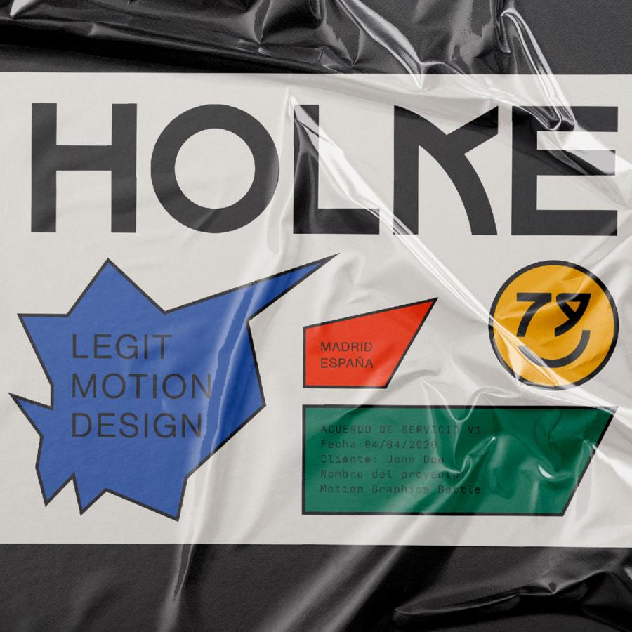
One of the most striking elements of the branding is the use of a smiley face motif. This simple symbol conveys the brand's message of good health and happiness in a fun and approachable way.
Photography
The photography used in BUCHU's branding and packaging is also noteworthy. The images are bright and airy, with a focus on natural ingredients and healthy living. The photos also feature people enjoying BUCHU kombucha, which helps to convey the brand's message of social connection and well-being.
BUCHU's branding and packaging design is a refreshing departure from the more serious and clinical look of many other kombucha brands. The design is fun, approachable, and visually appealing, which is sure to appeal to a wide range of consumers.
BUCHU's branding and packaging design is a great example of how to create a visual identity that is both effective and engaging. The design team has done a great job of capturing the brand's message of good health and happiness in a way that is both fun and approachable. If you're looking for a kombucha brand that is both delicious and aesthetically pleasing, BUCHU is definitely worth checking out.
For more information make sure to check out Olivier Duclos at behance.net/duclos769110e


