by abduzeedo
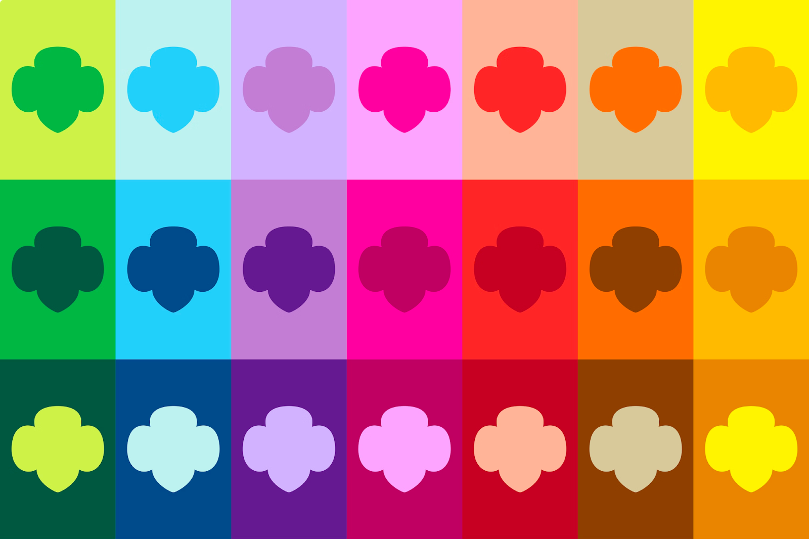
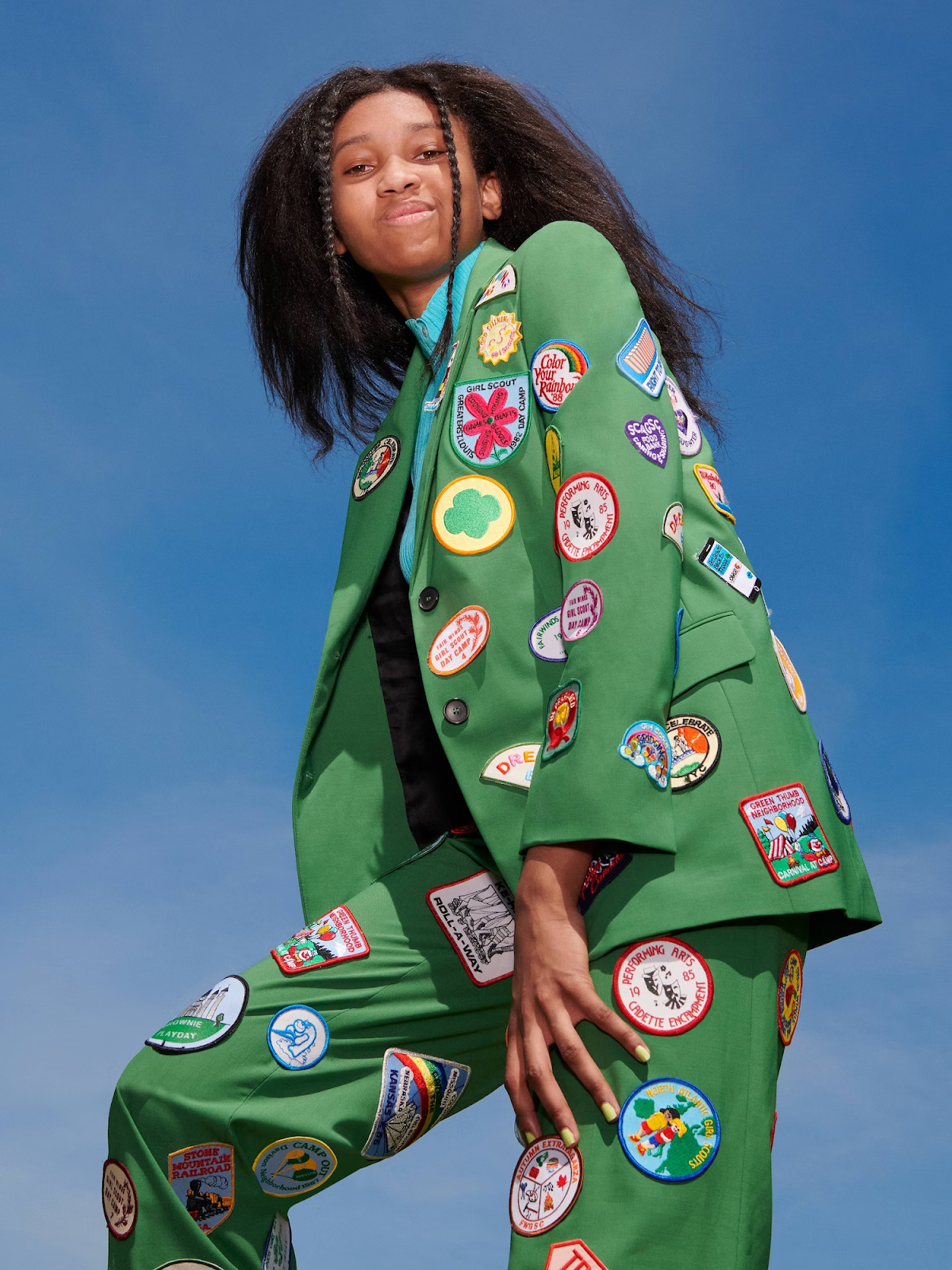
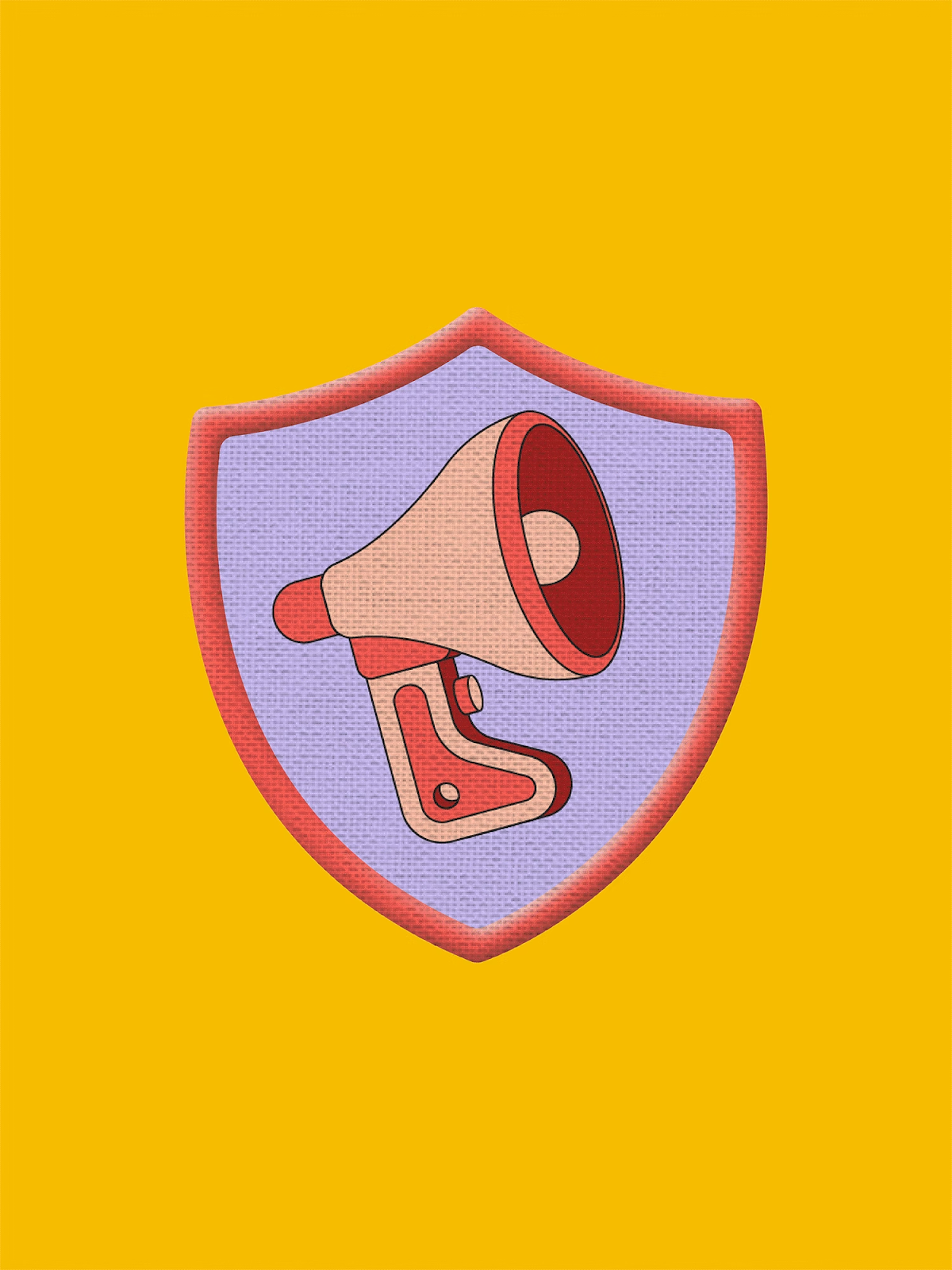
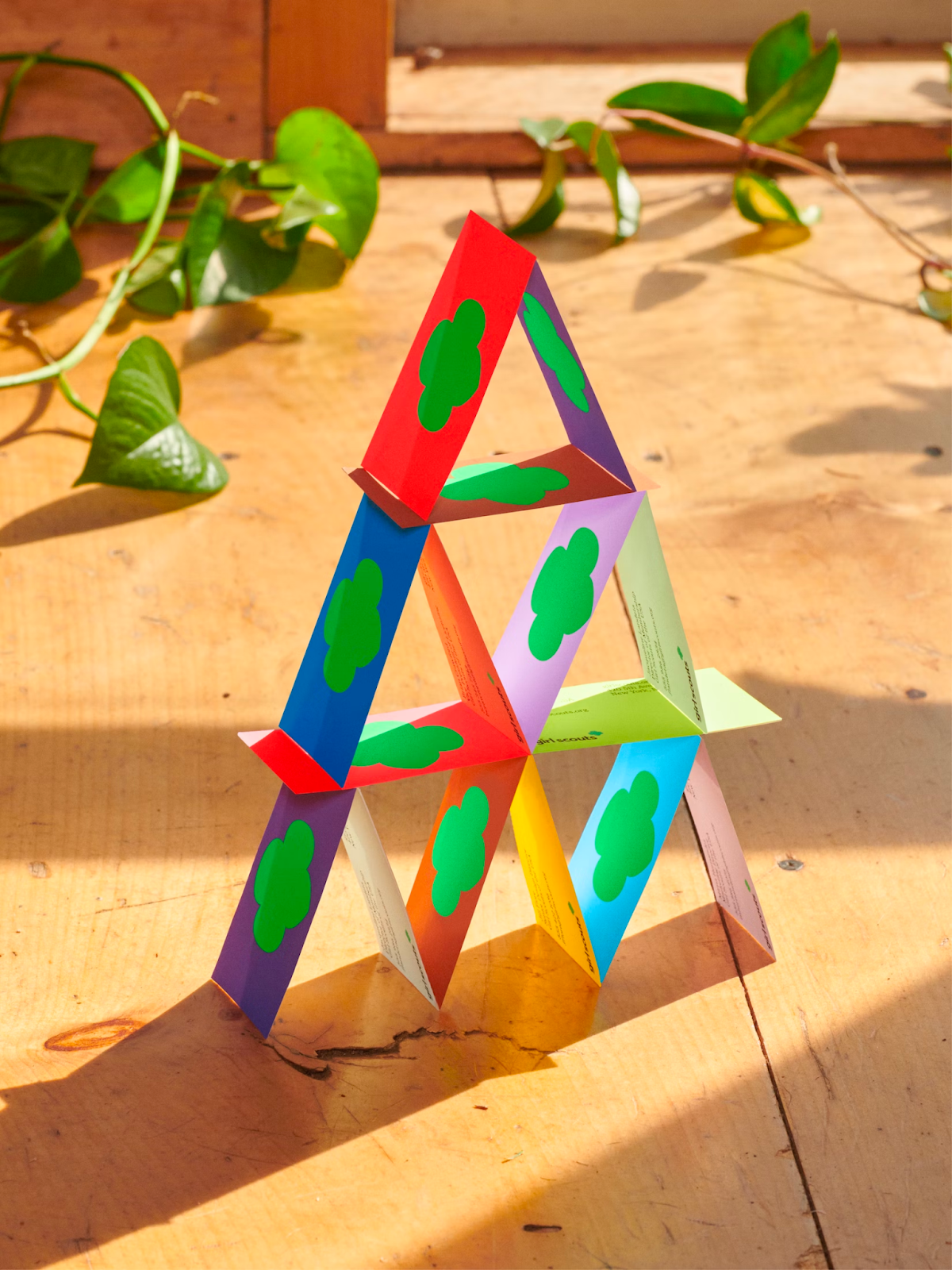
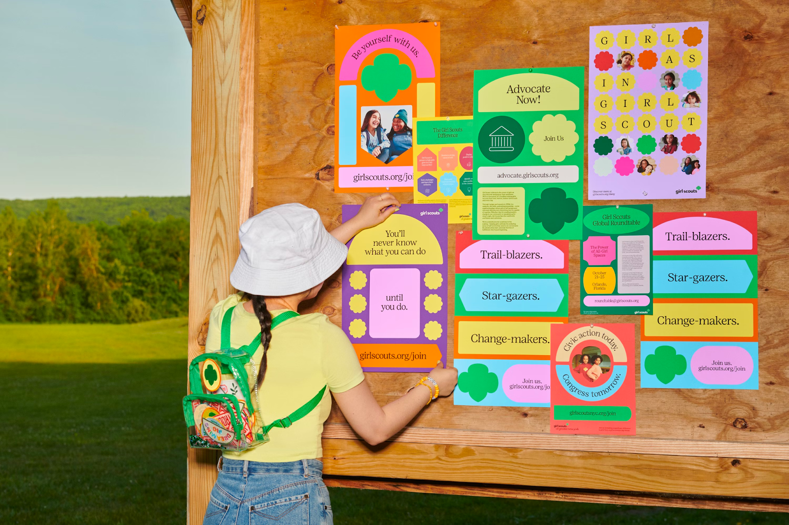
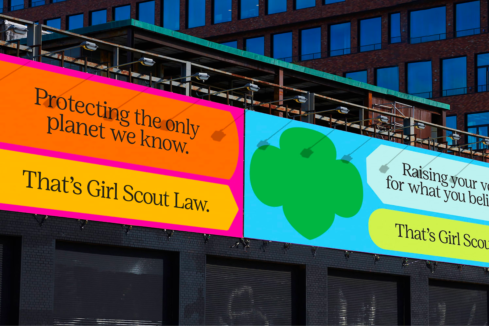
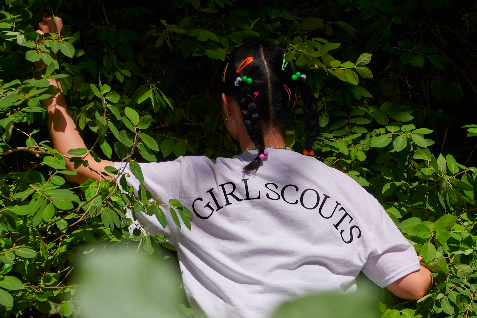
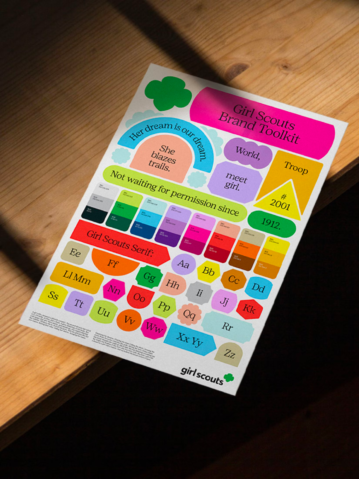
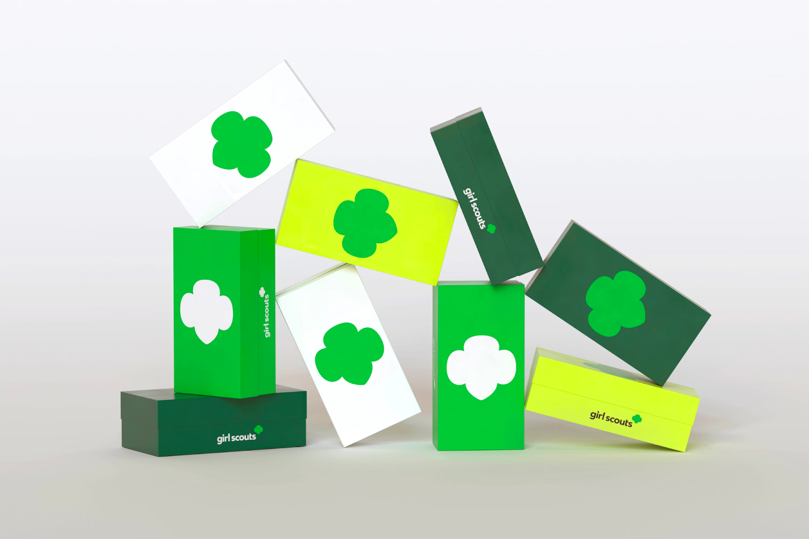
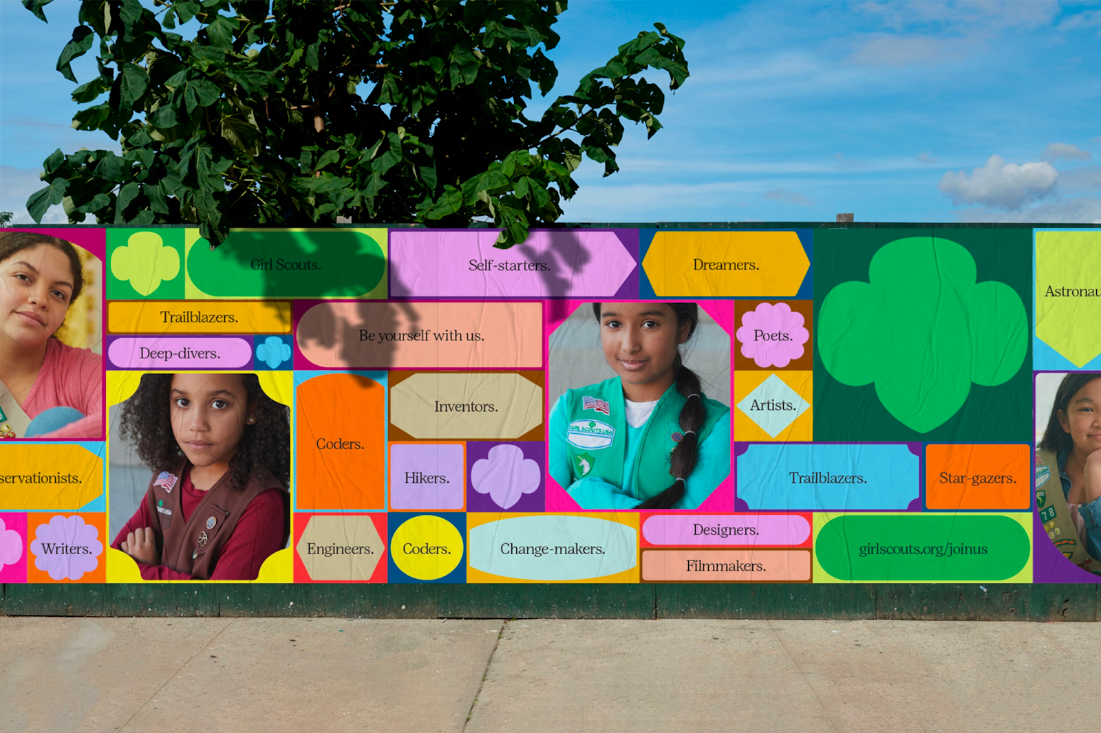
Inspired by the visuality and history of Girl Scout patches and badges, COLLINS translated these objects into bold, geometric forms to be used as building blocks for design and interactivity. The brand system not only grants a common language to all communications but is flexible enough to support any application, whether it be a presentation template or a vibrant campaign. COLLINS also worked with the Girl Scouts creative team and Positype to commission a distinct custom typeface. Overall, the new brand platform centers on being a champion of girls’ ambition and seeks to bring that idea to life through every expression of the brand.
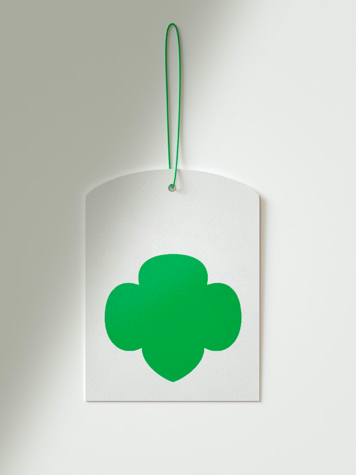
Beyond the logo, a new brand system needed to address the reality of having dozens of energetic councils designing communications for the same brand. The councils needed tools that would provide coherence across the country and offer flexibility to support their different communities. We were inspired by the visuality and history of Girl Scout patches and badges. These are artifacts of achievement that girls proudly wear to tell their own story; their goals, their accomplishments, their interests, their identities. We translated these objects into bold, geometric forms that could be used as building blocks for design and interactivity. The system grants a common language to all communications and is flexible enough to support any application, whether it be a presentation template or a vibrant campaign.
We developed a voice that looks girls in the eye, recognizes everything they are and can do, and seeks to empower them to blaze the trails only they can. To support that voice, we also worked with the Girl Scouts creative team and Positype to commission a distinct custom typeface.


For more information make sure to check out COLLINS website.


