by abduzeedo
Explore Neurosync's calm and cohesive branding and visual identity by Everything Else Practice, designed for accessible mental health.
Design work focused on mental health needs to feel right. It needs to be approachable, safe, and clear. That's exactly what the team at Everything Else Practice aimed for with the Neurosync branding and visual identity. This project, featured on Behance, shows a thoughtful approach to a sensitive subject.
Neurosync is a mental health company. Their goal is simple: create accessible, stigma-free ways to find psychological well-being. Everything Else Practice, a young Italian design collective, took this mission to heart when developing the visual system.
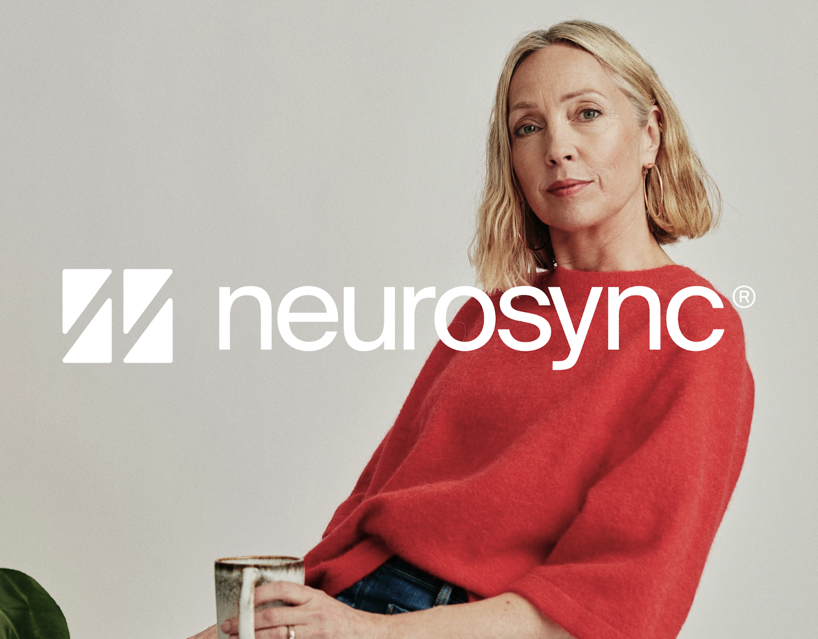
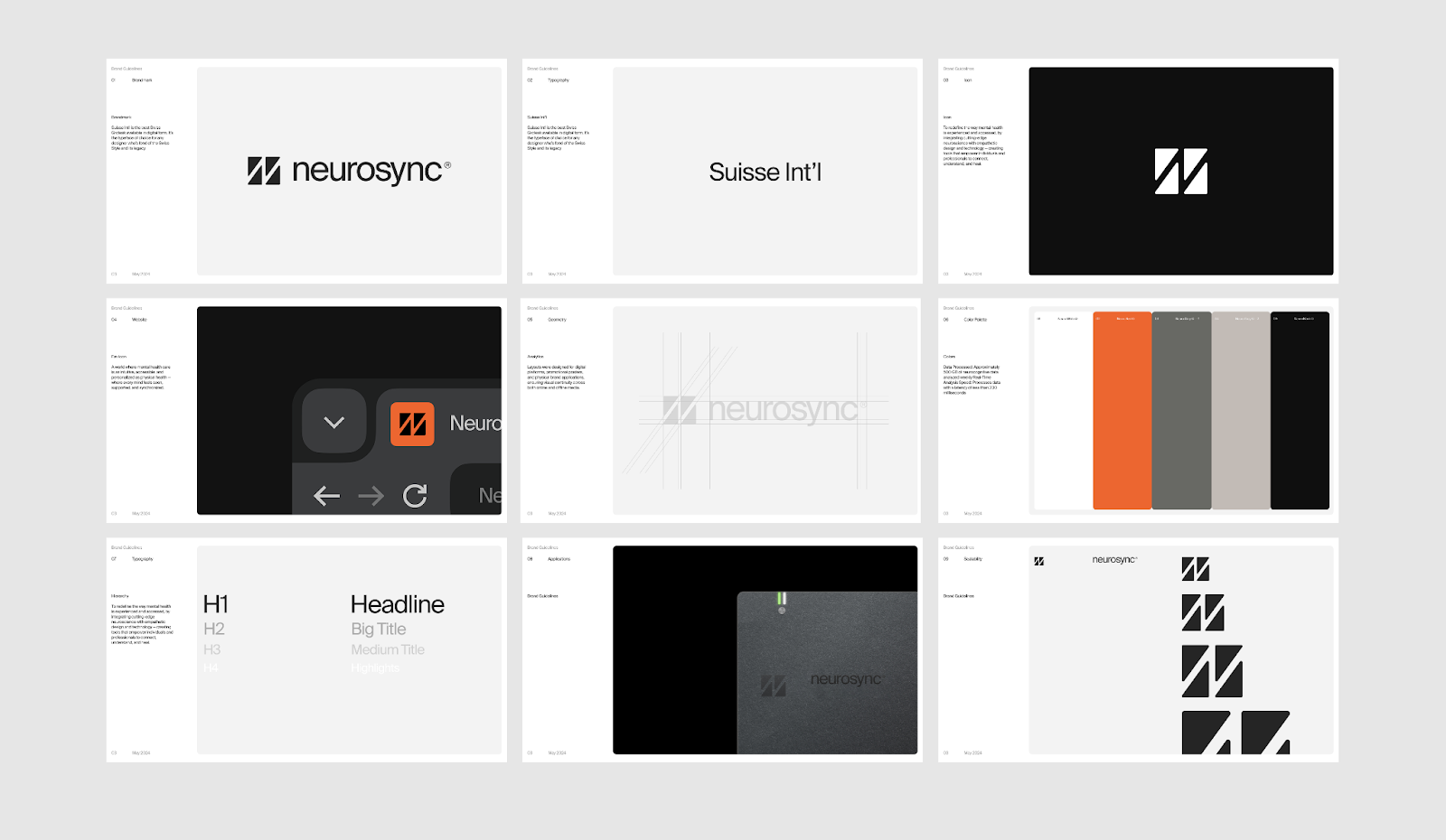
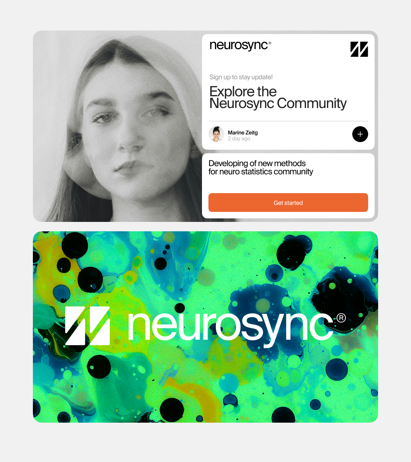
The core idea behind the Neurosync branding is built on clarity, calm, and cohesion. Looking at the design elements, you see this immediately. The identity uses soft typography, a soothing color palette, and minimal graphic shapes. These choices aren't just aesthetic; they reflect the balance and emotional safety Neurosync wants to offer its users.
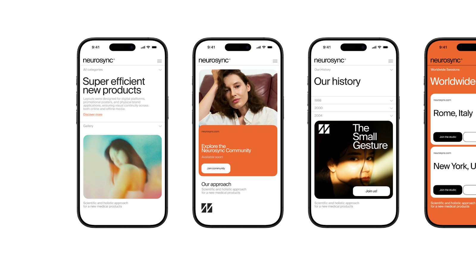
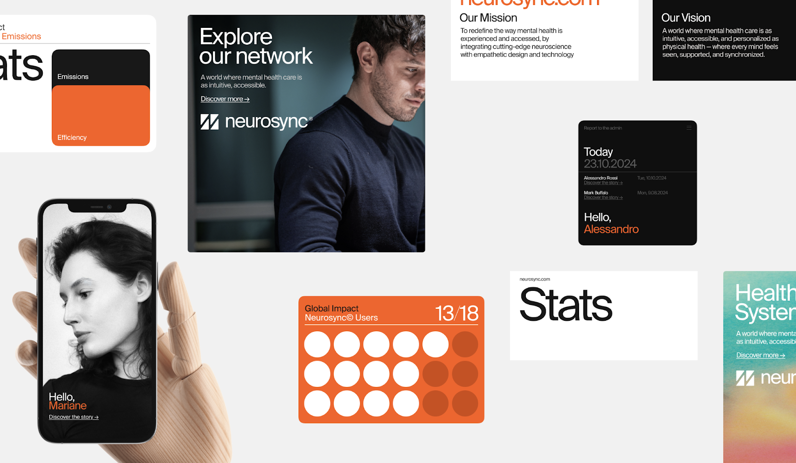
The inspiration for the design came from the rhythm of the human mind. It also drew from the power of gentle communication. This guided the design to work smoothly across different platforms. Whether it's on a website, a mobile app, or printed materials, the branding stays consistent. This consistency helps build trust and approachability at every touchpoint.
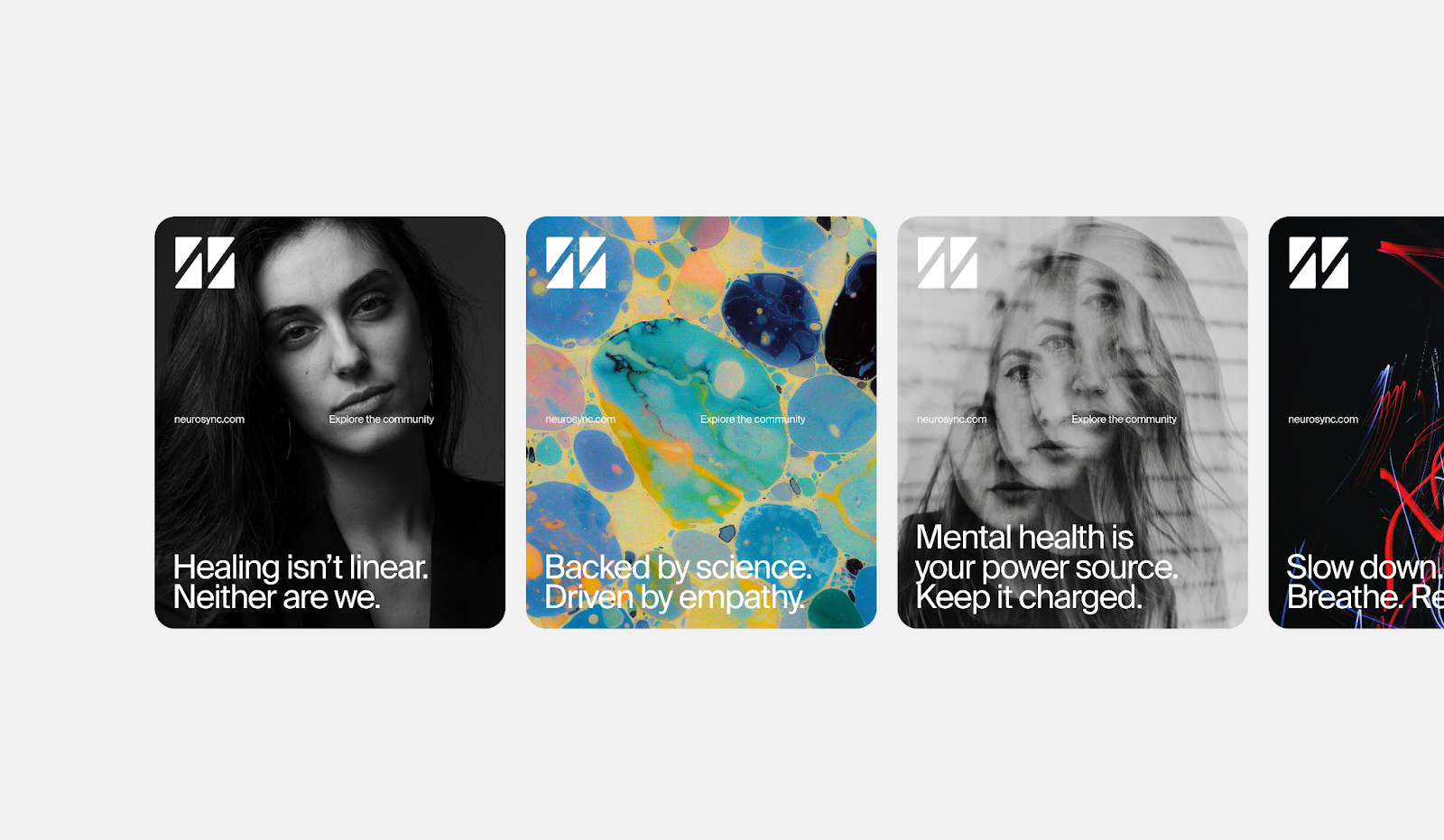
The visual system includes subtle motion and modular layouts. These elements echo the adaptive nature of mental health care itself. The design language feels restrained but still expressive. It helps create an empathetic space for dialogue and connection, which is crucial for a mental health brand.
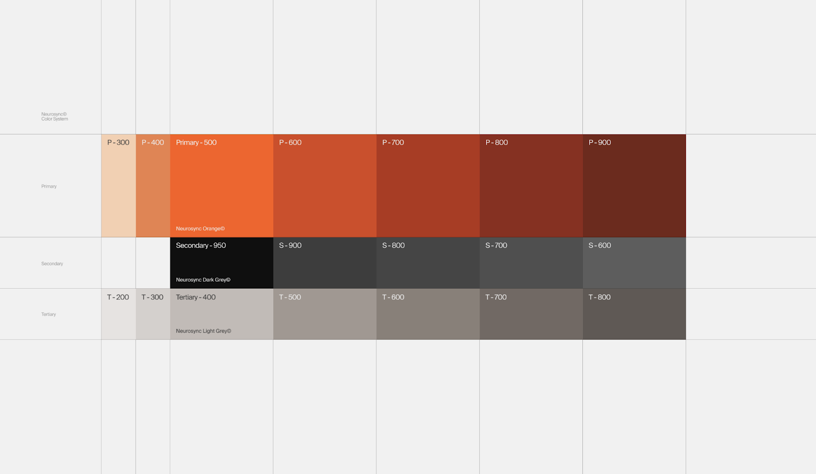
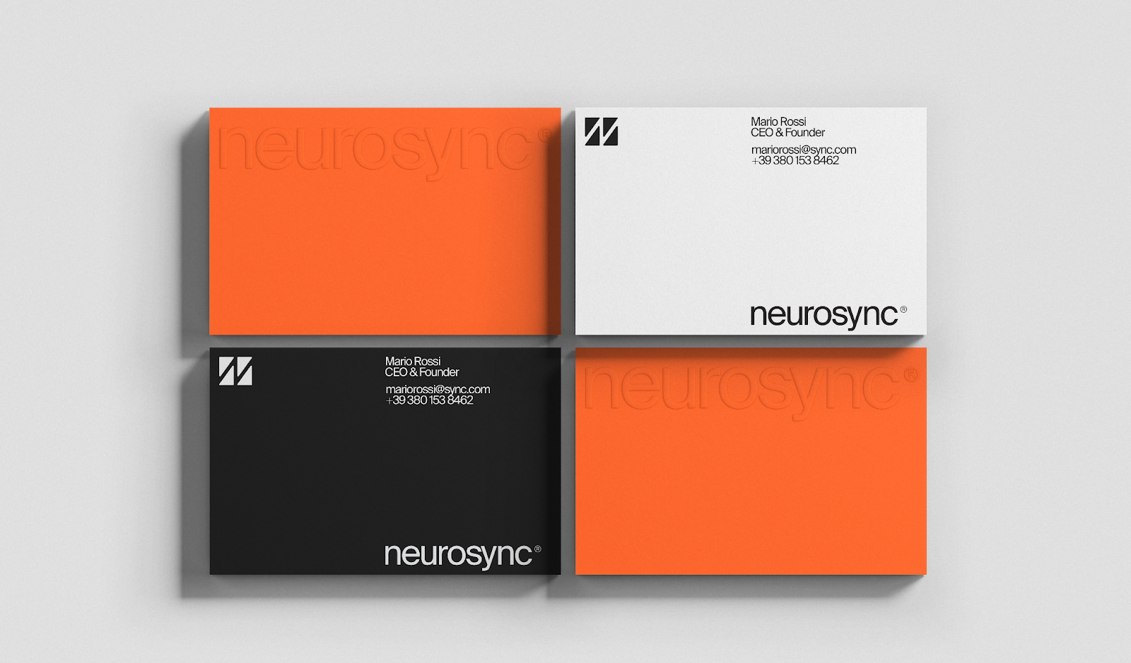
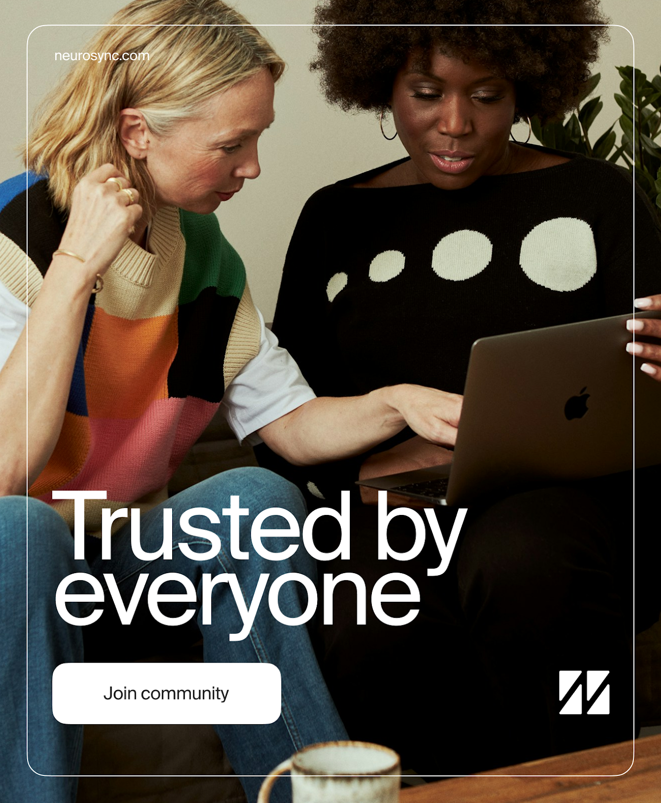
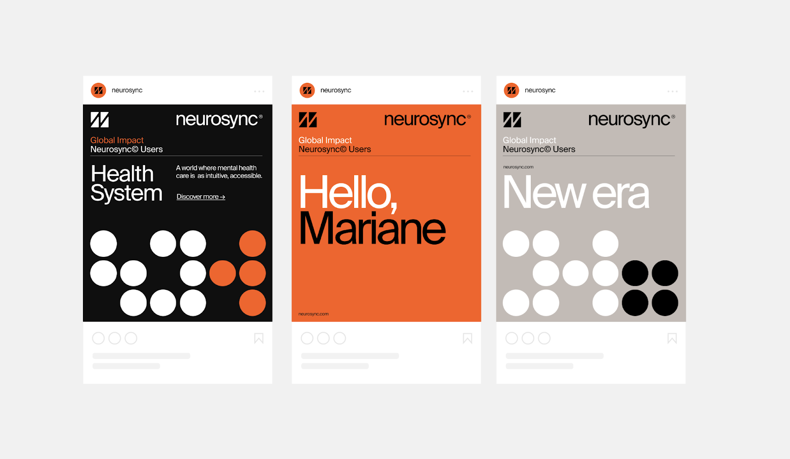
The visual artifacts shared by Everything Else Practice showcase the system's flexibility. You see the logo used simply on a white background, alongside photography that feels warm and human . The color palette, including a prominent orange and softer tones, feels warm yet calming. The typography, Suisse Int'l , is clean and highly readable, supporting the brand's commitment to clarity.
Examples of the branding applied to business cards, social media graphics, and even a t-shirt demonstrate how the system maintains its cohesive feel across various applications. The minimal graphic gestures, like the simple lines forming the logo, are memorable without being distracting.
The project effectively shows how a strong branding and visual identity can support a company's mission. For Neurosync, it's about making mental health support feel less intimidating and more welcoming. The design choices by Everything Else Practice directly contribute to this goal. They've created a visual language that speaks of support, understanding, and calm.
This work is a great example of how design can make a real difference in how a service is perceived. It shows that even for complex or sensitive topics, a clear, calm, and cohesive visual identity can open doors and build connections.
Exploring projects like Neurosync reminds us of the power of thoughtful design. It's not just about looking good; it's about communicating purpose and building trust.
You can see the full project and more details from Everything Else Practice on Behance.