by abduzeedo
Explore how Belmonte Raw's branding, packaging design, and visual identity transformation captivated audiences and set new standards in the organic market.
Belmonte Raw’s ascent in the organic food market is a tale of innovative branding and design. Years ago, Carol Belmonte identified a gap in the organic sector and launched Belmonte Raw, initially offering salads to office workers. The brand's ability to resonate with its audience is evident in the loyalty of its customers, many of whom have been with Belmonte since its inception.
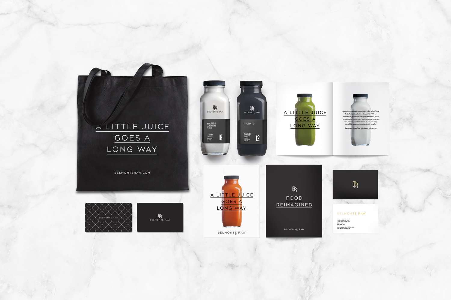
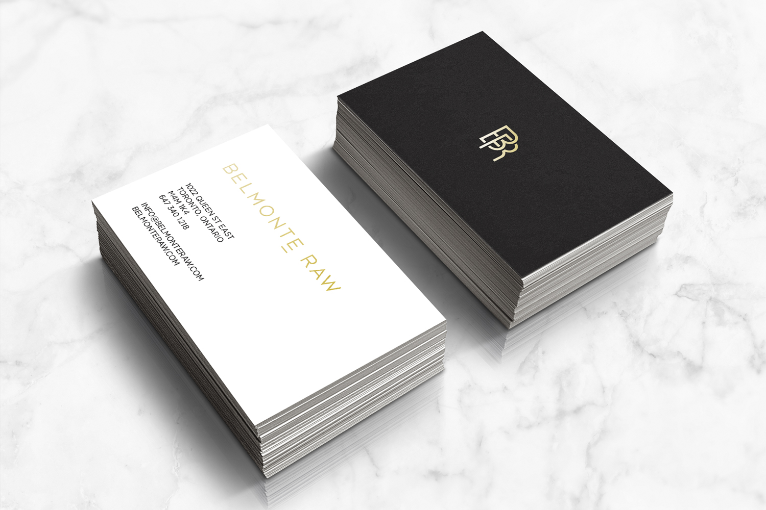
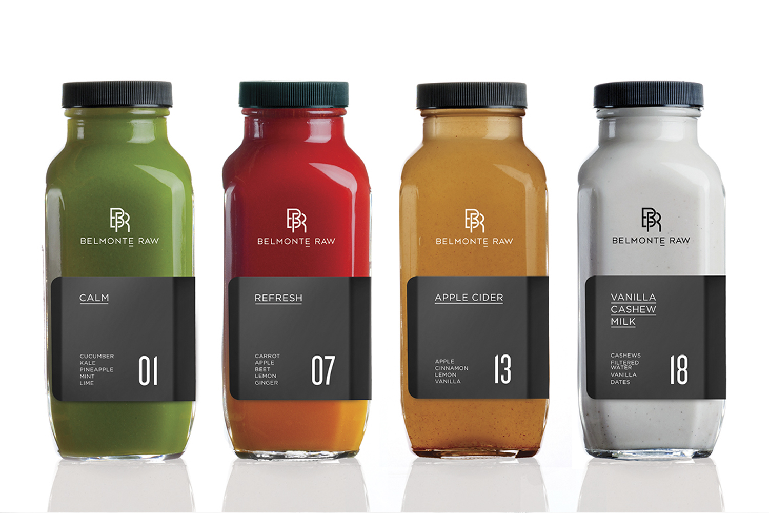
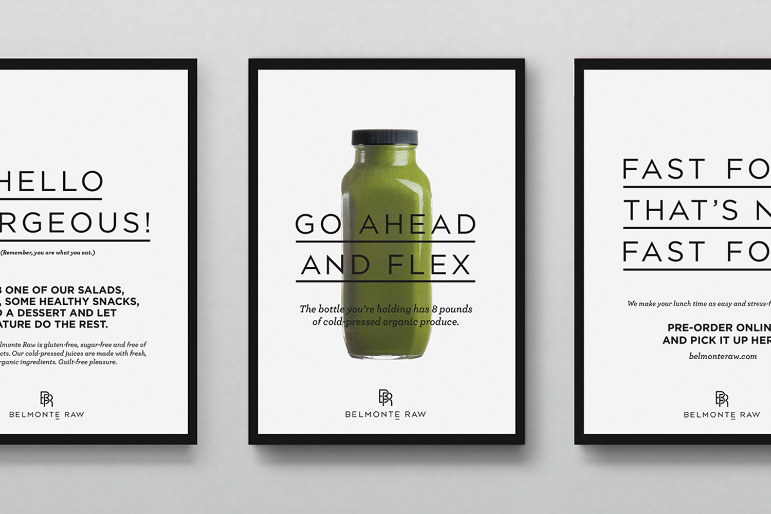
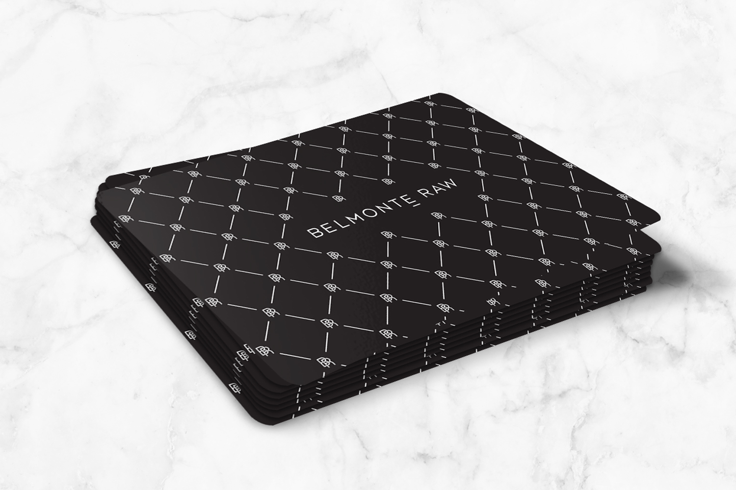
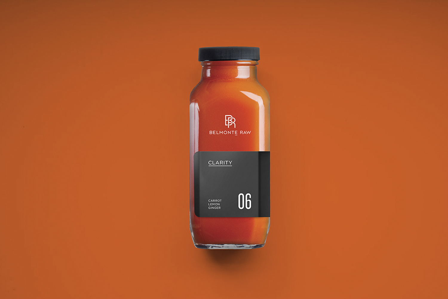
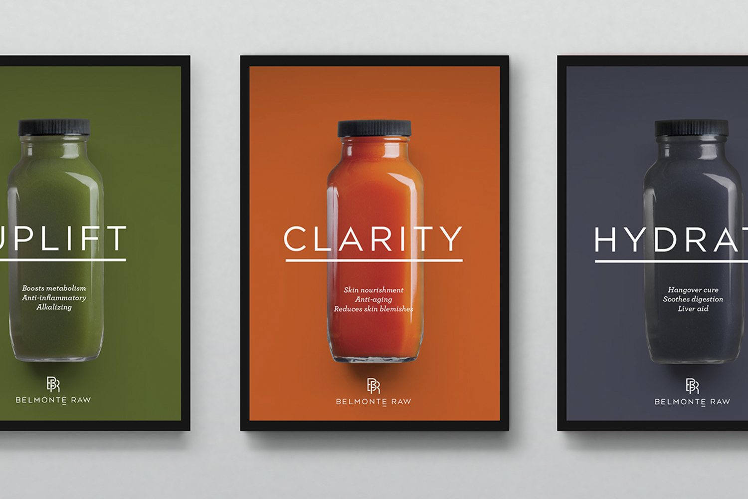
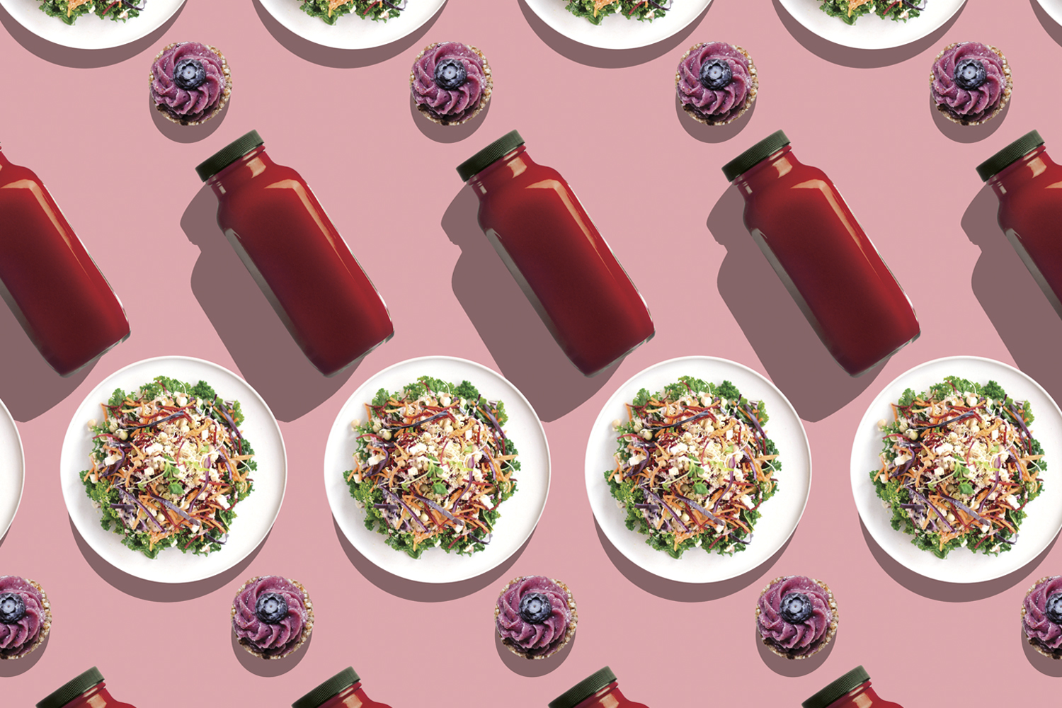
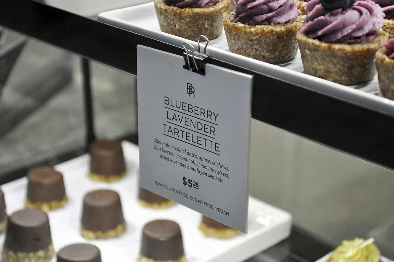
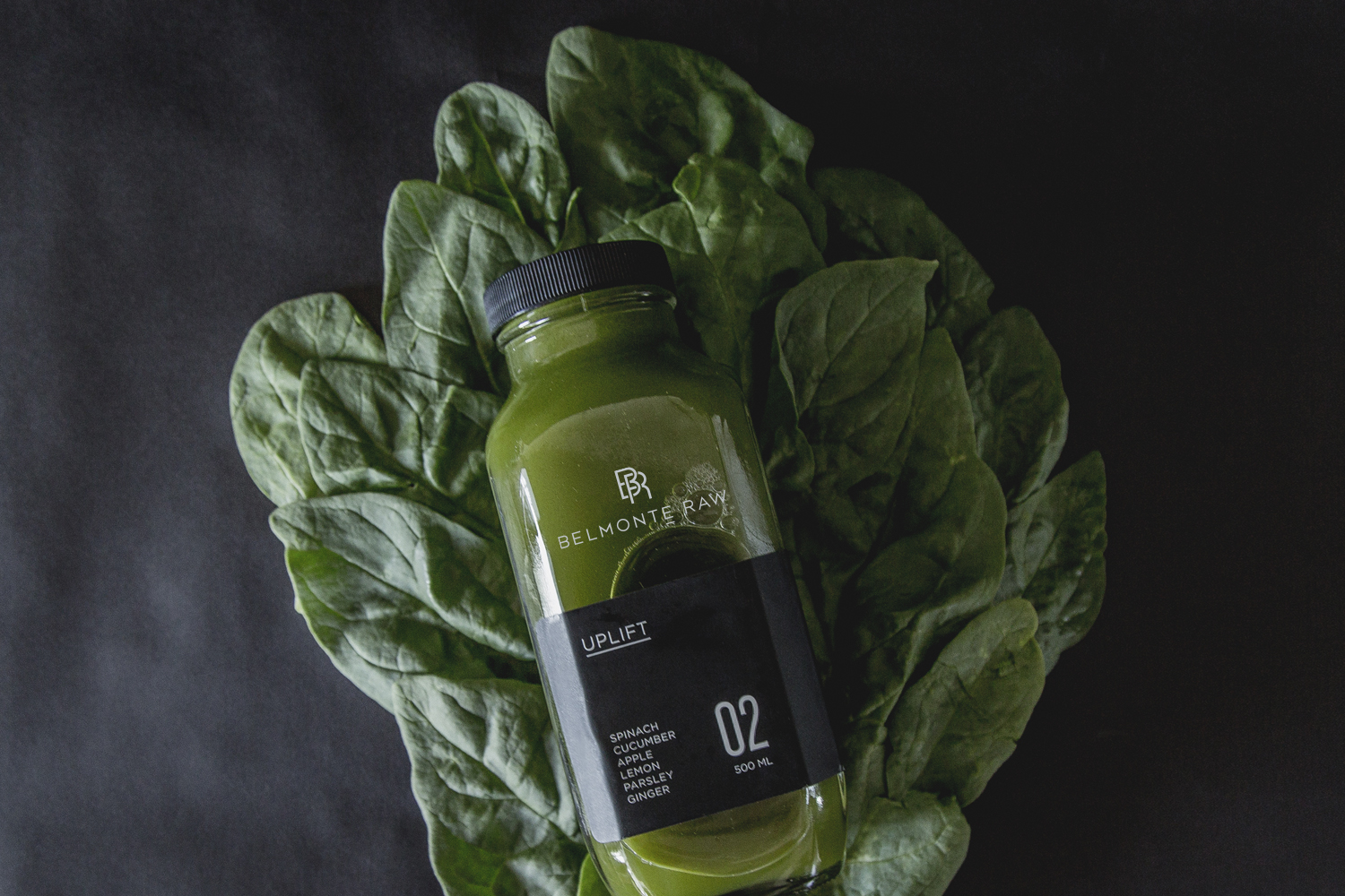
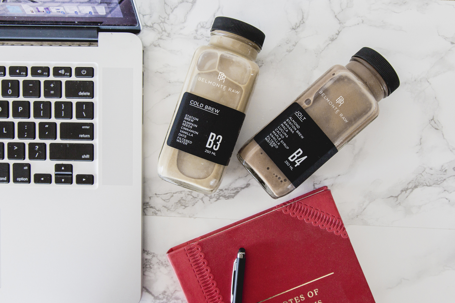
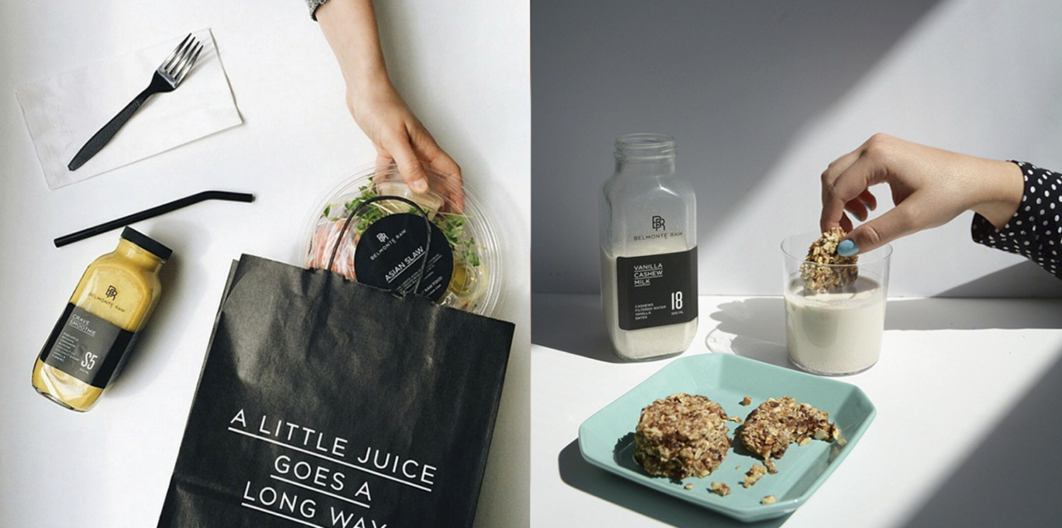
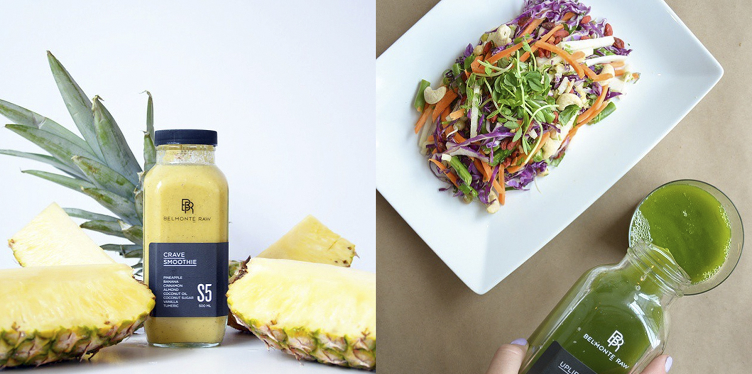
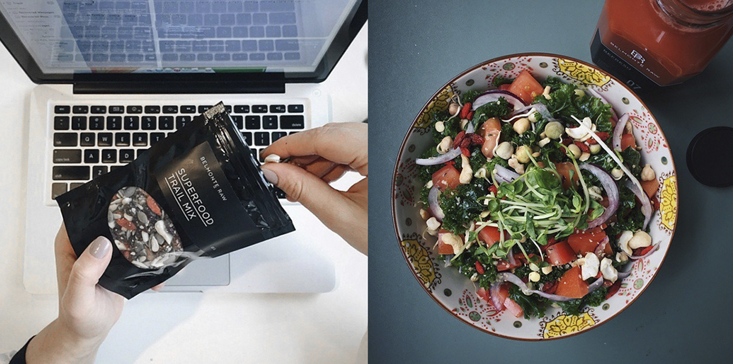
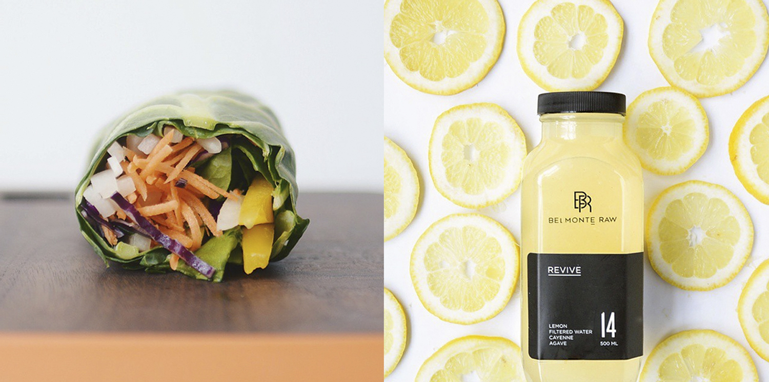
However, as Belmonte Raw grew, a need for a revamped brand identity became apparent. To stand out in a sea of playful juice branding, Belmonte Raw opted for a more premium identity. The design strategy was simple yet effective: use a pared-down palette that allows the natural colors of the food to shine. This approach not only highlighted the organic nature of their products but also distinguished Belmonte Raw in a crowded market.
Communication played a crucial role in this transformation. Brand statements were crafted to breathe life into the products, making them more than just consumables but a part of a lifestyle choice. These statements, combined with the visually appealing design, created a narrative that resonated with health-conscious consumers.
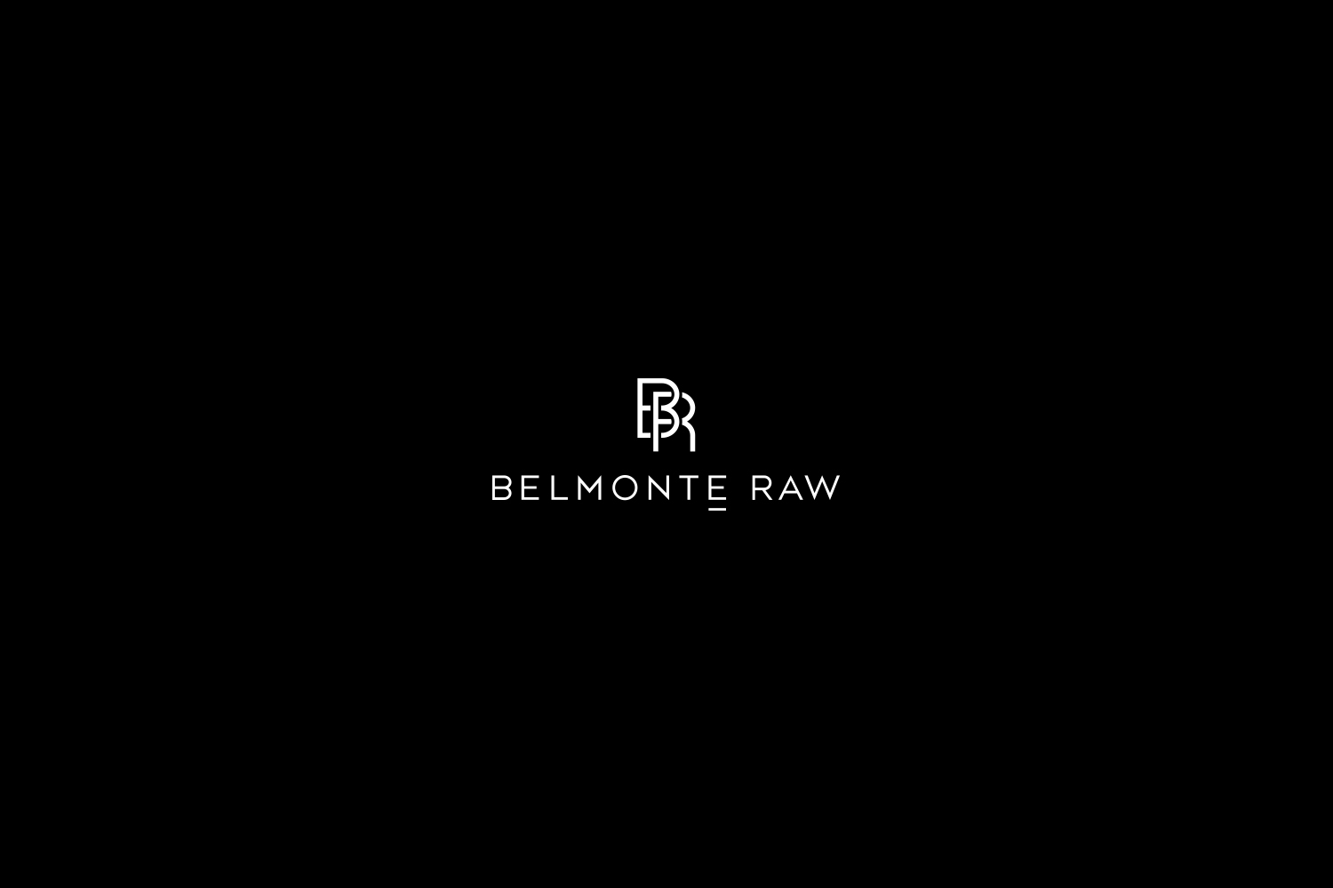
A unique element of Belmonte Raw’s branding is the underline below the "E" in Belmonte. This was a strategic move to address the common mispronunciation of the name. The underline serves as a subtle yet powerful tool for brand enlightenment, educating consumers while maintaining the brand’s sophisticated image.
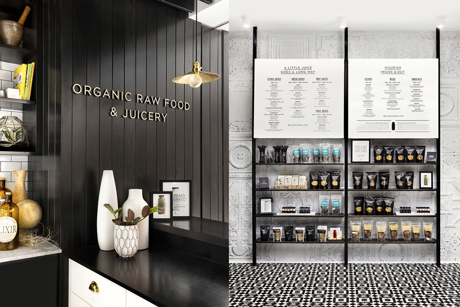
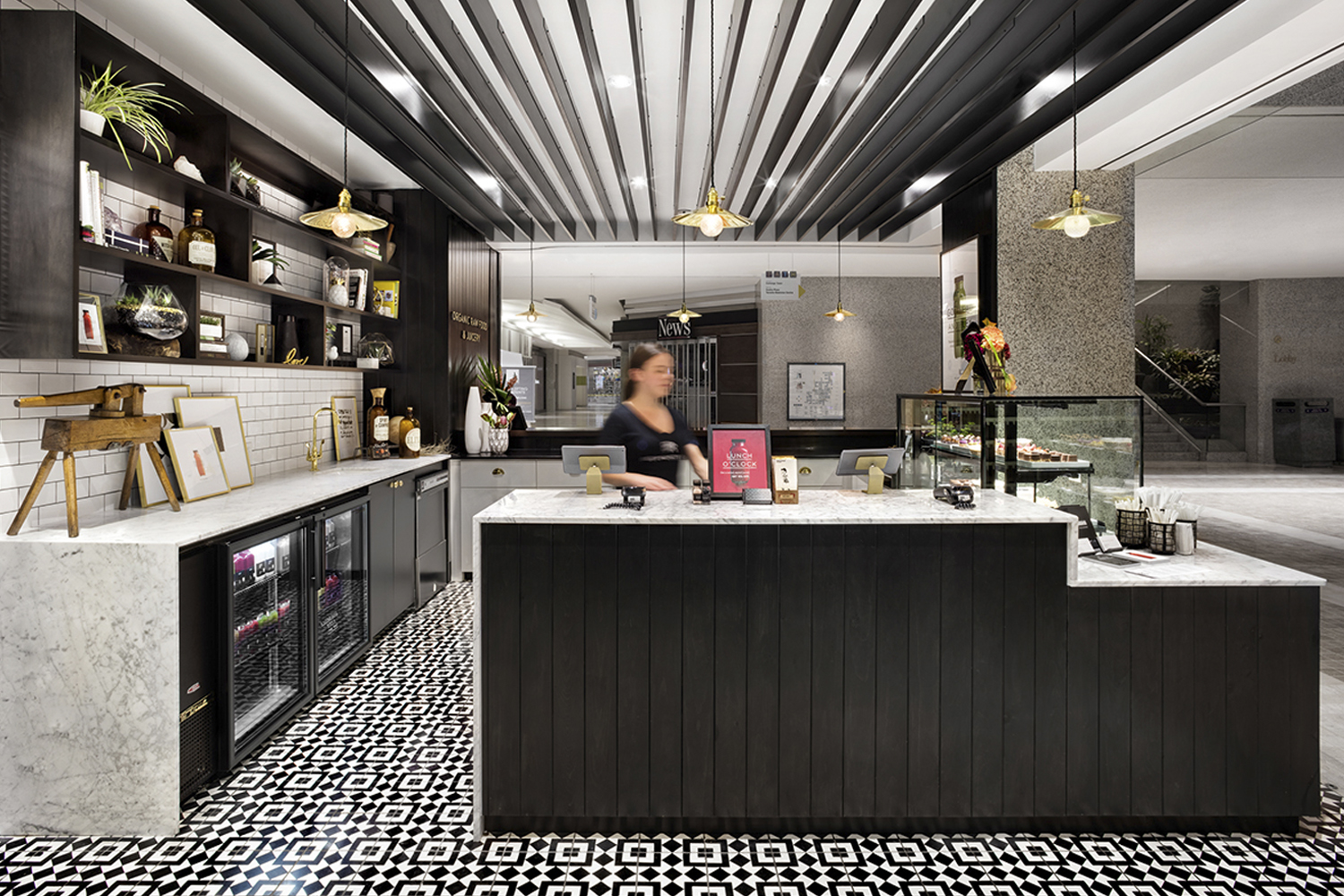
Photography by The Bennett Studio, Acquired Taste, and Lisa Perole, along with store design by Green Tangerine, played a significant role in bringing the new brand identity to life. The collaboration of these creative forces resulted in a cohesive and visually captivating presentation of Belmonte Raw’s ethos.
Belmonte Raw's branding journey demonstrates the power of thoughtful design in elevating a brand. It’s a case study in how effective branding and design can align with a company's growth and evolution, ensuring that its visual identity resonates with its evolving customer base and market position.
Branding, packaging design and visual identity artifacts


For more information make sure to check out Awake Studio website.


