by abduzeedo
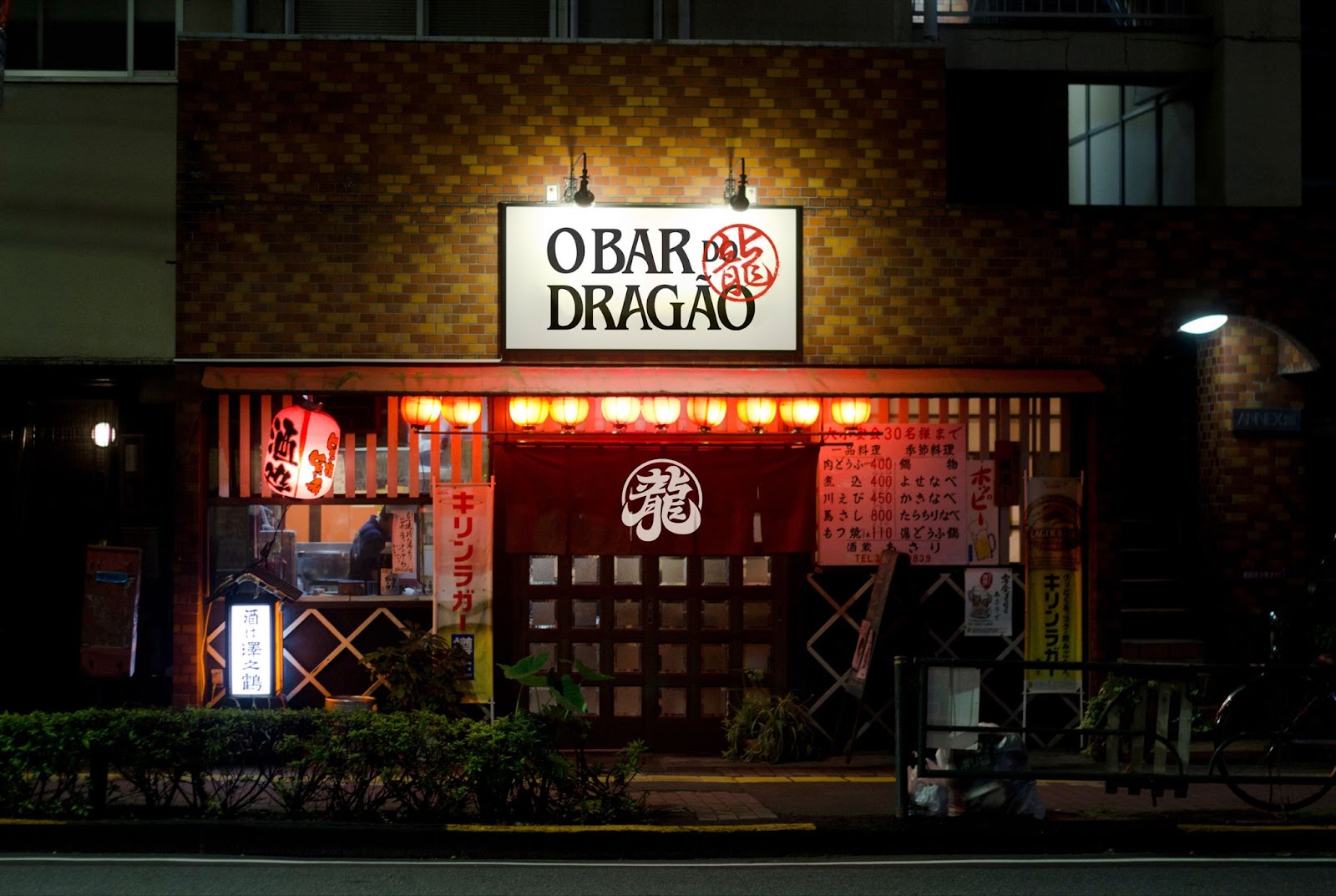
O Bar do Dragão is a place created in an intuitive way, respecting traditions and time, but breaking rules so that innovation is not lost and barriers are not created. With an intimate and reserved atmosphere, the space offers a dip in oriental culture with contemporary food and drinks. In 2022, the bar underwent a repositioning, focusing entirely on gastronomy and mixology and leaving aside the parties that used to take place there. For this, they needed to seek a more mature audience and a new visual identity that represented this new moment.
Scope
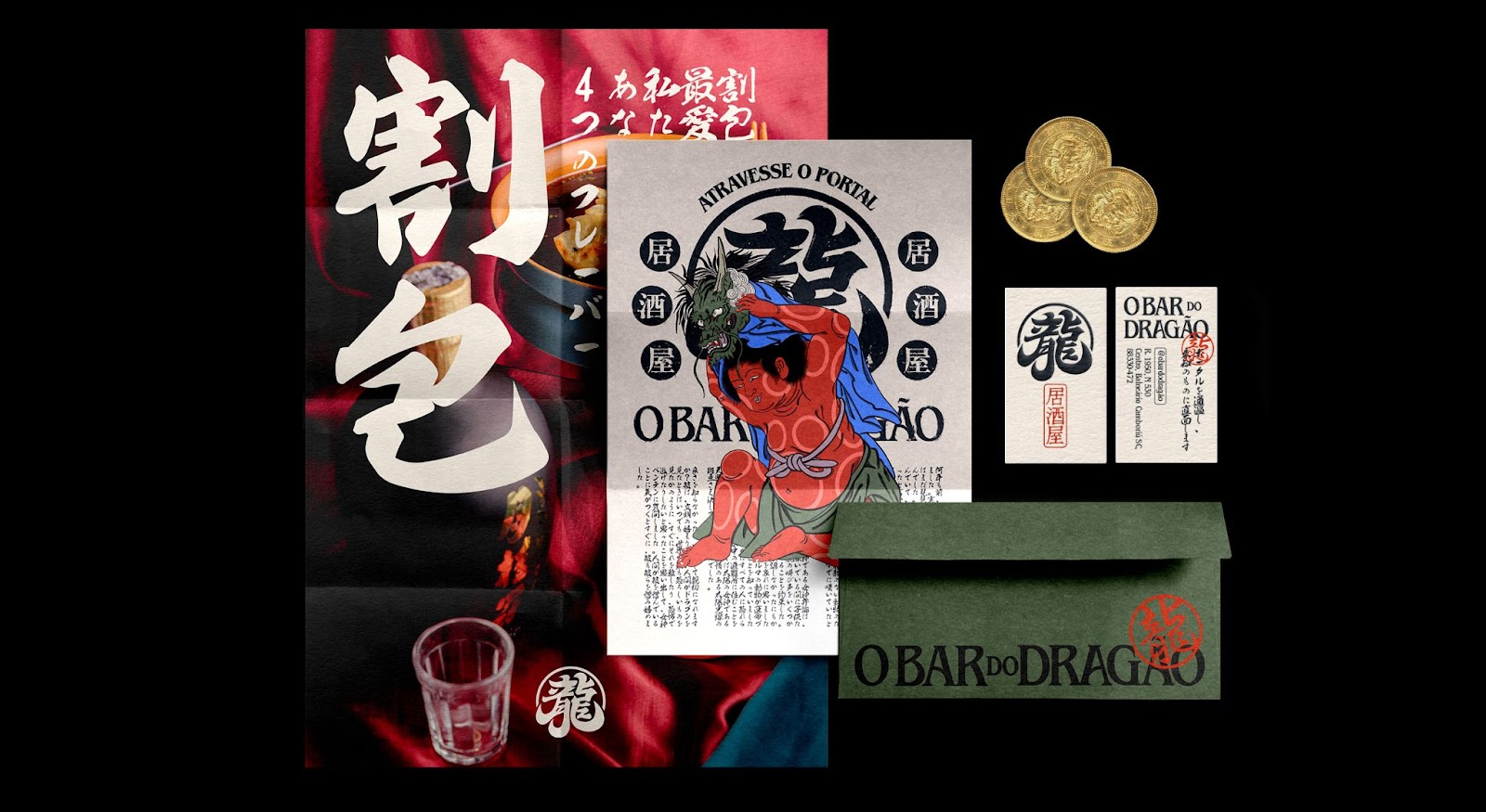
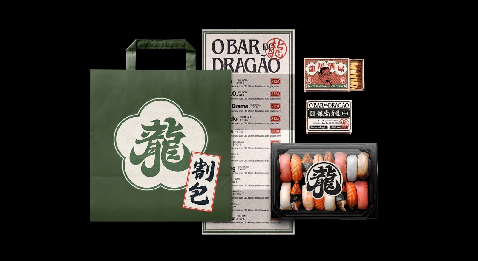
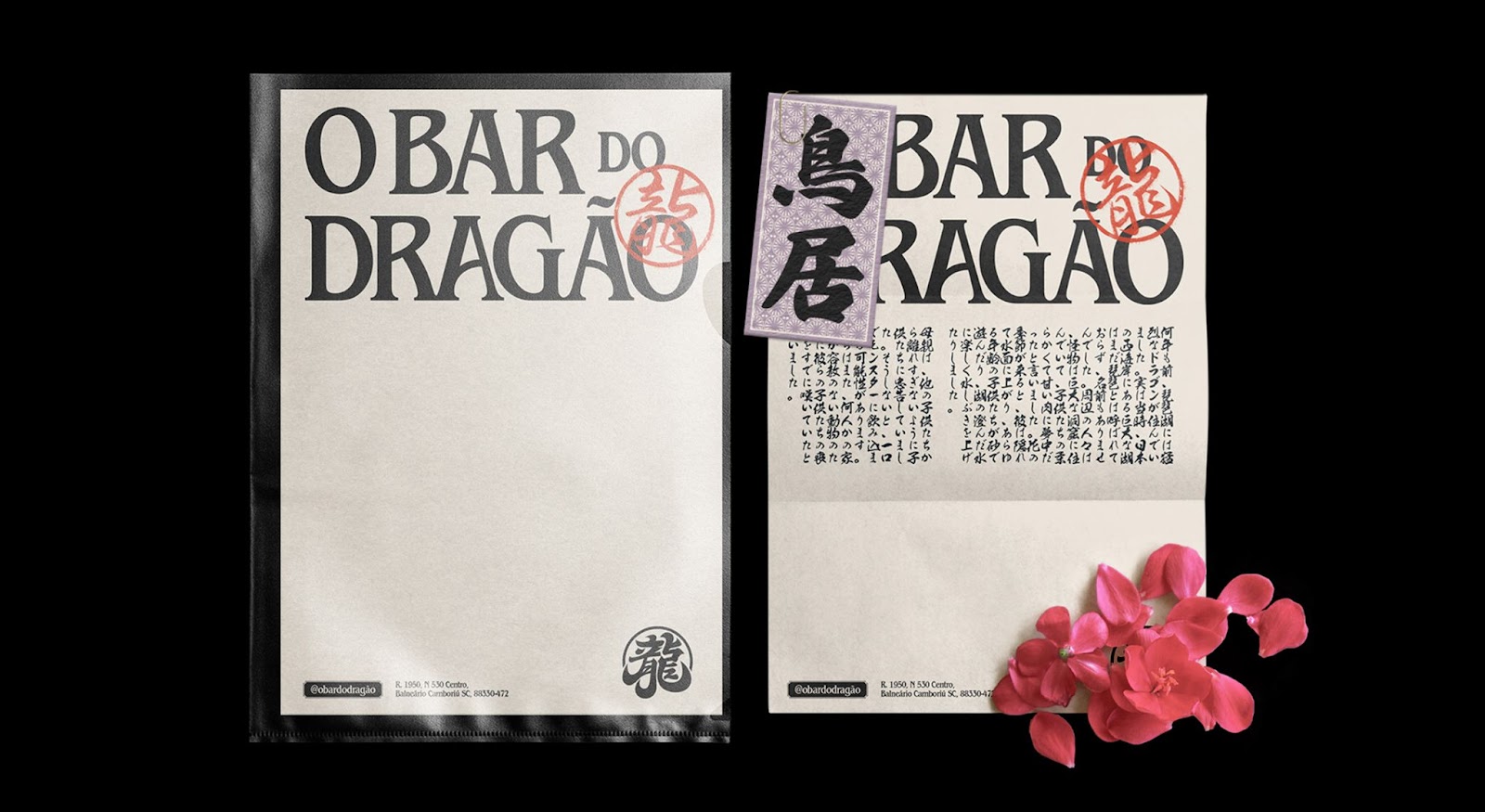
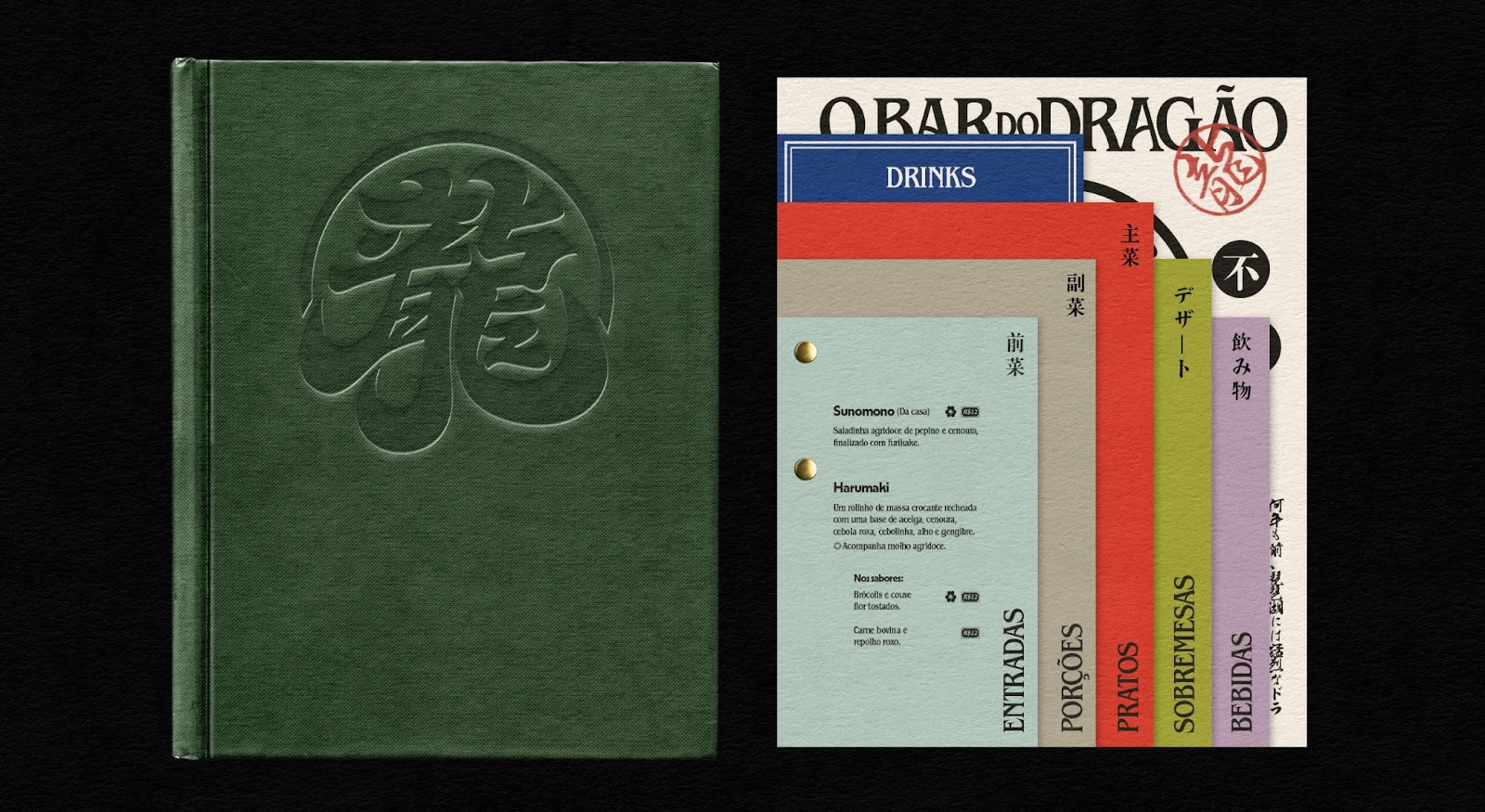
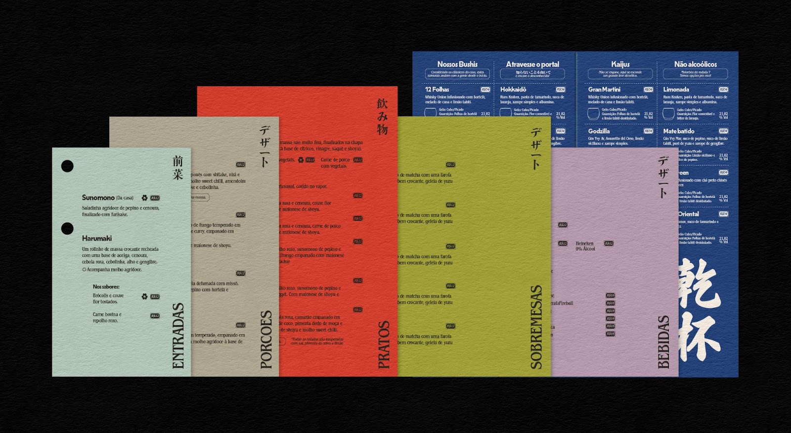
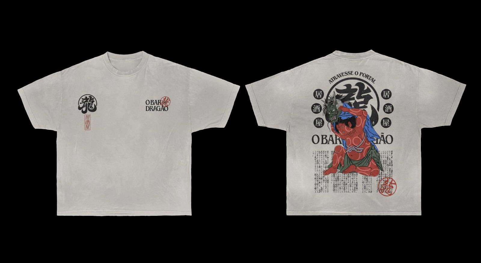
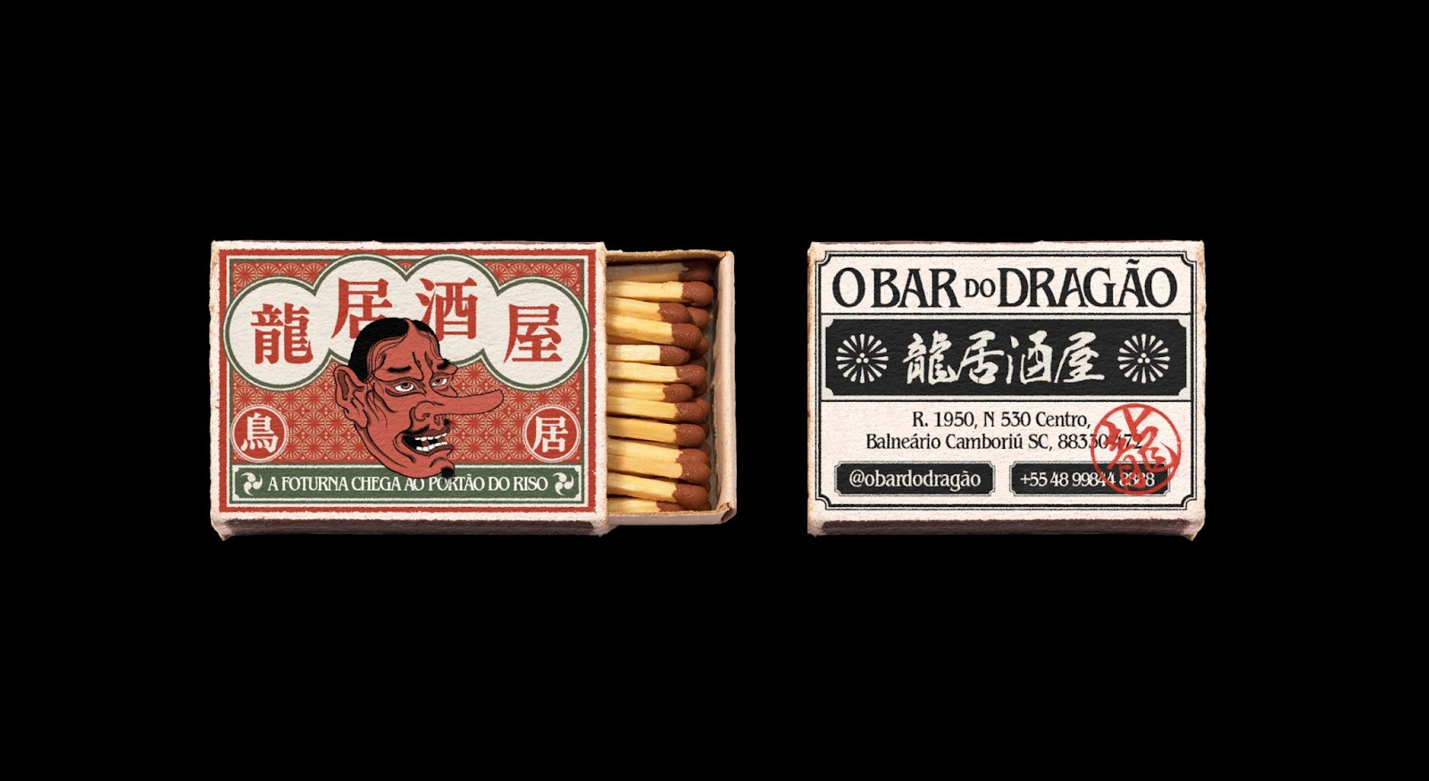
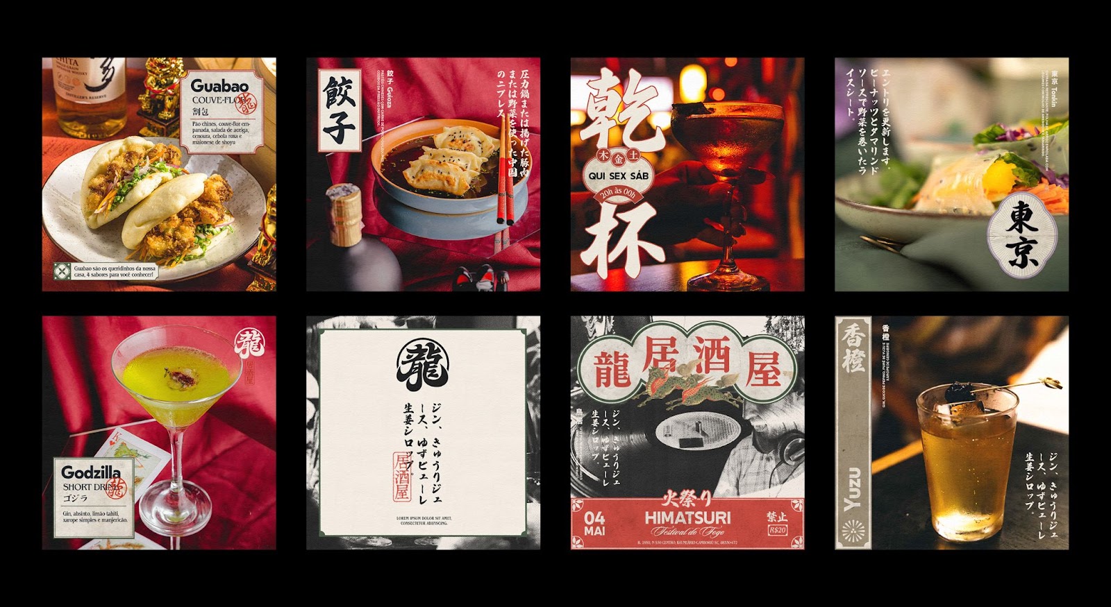
Visual identity, social media design, menu and promotional materials created by Monga Design for O Bar do Dragão, an izakaya* located in Balneário Camboriú, Brazil.
*Style of pub focused on oriental cuisine and mixology.
Goals
Located next to a tattoo studio, O Bar do Dragão is a reserved and mysterious place. Monga's objective was to create a visual identity that invites people to discover these mysteries and cross the gates to an oriental gastronomic experience in a refuge in the middle of the city, very different from the other options for those looking for this type of gastronomy in Balneário Camboriú.
Direction
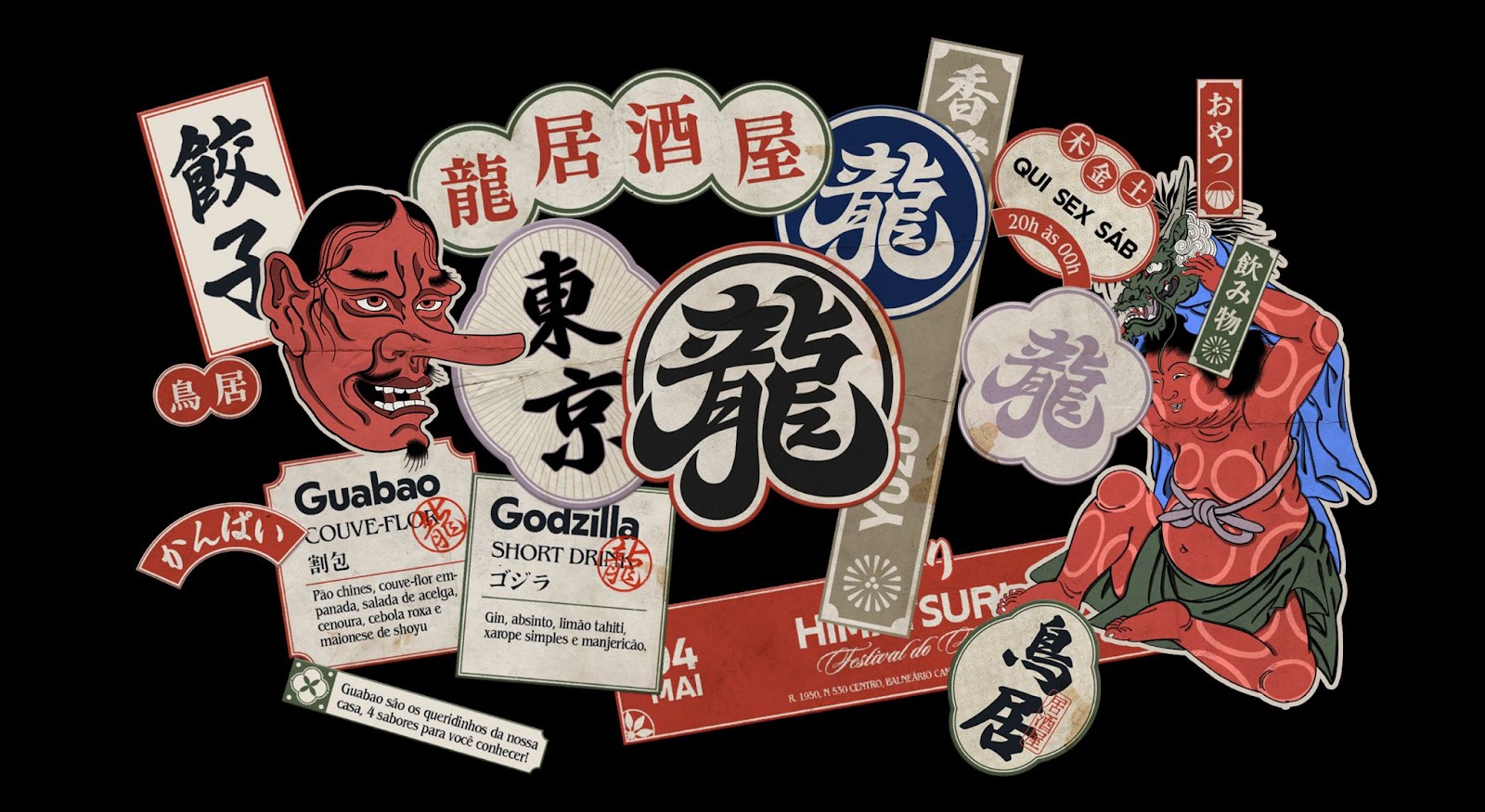
The textures, symbols and illustrations used in the visual identity are a reference and an invitation to a culture different from ours, while the chromatic palette is diverse and deviates from the obvious pattern that is usually used by other Japanese-themed restaurants. For titles and patterns, Nikkei Maru typography was used, created by Brazilian Caio Kondo as a tribute to Japanese immigration to the American continent, with lines and strokes inspired by shapes present in Japanese ships that arrived here in the last century, and the illustrations were created by Gabriel Foltz, a local artist whose work focuses on oriental themes.
Credits
- Studio: Monga Design
- Project management: Michel Refatti
- Design: Mateus Yuzo
Illustration: Gabriel Foltz - Client: O Bar do Dragão


