by abduzeedo
Explore the innovative branding and visual identity of BONELESS. Dive into a design narrative where elegance meets functionality in our latest feature.
In a landscape teeming with brands vying for attention, the creation of a distinctive brand identity is both an art and a strategy. BONELESS, a contemporary clothing brand, has embraced this challenge, showcasing its prowess in a recent branding endeavor that blends functionality with elegance.
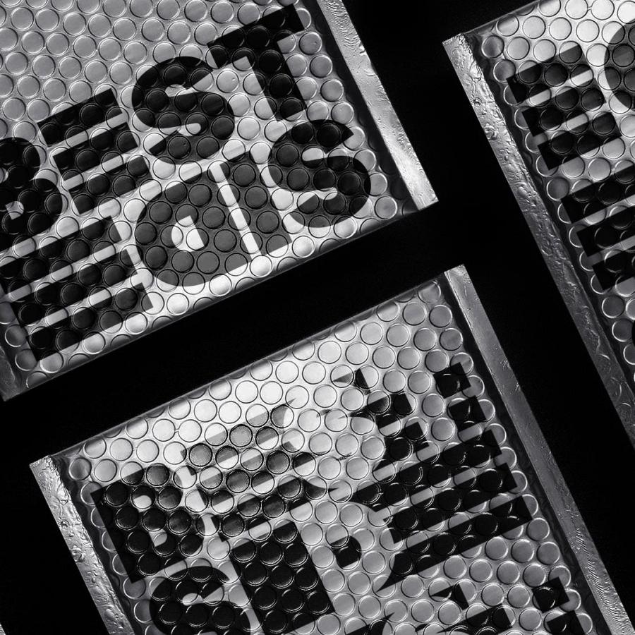
The brand's visual system breaks the convention. By infusing the logo directly within a grid framework, BONELESS achieves a versatile and unified aesthetic. This technique allows for a seamless adaptation across various mediums, a nod to the brand's forward-thinking ethos.
Designer Han Gao, the maestro behind BONELESS’s branding, leveraged simplicity and structure to communicate the brand’s core values. The utilization of a monochromatic palette accentuates the clothing line's minimalist design philosophy. Such an approach is not merely about creating an attractive logo; it's about cultivating an immersive brand experience.
The sharp lines and bold typeface of the BONELESS logo serve as a testament to the brand's commitment to modernity and sophistication. It transcends being a mere visual stamp; it is a symbolic beacon for the company's identity. Through this strategic design, the brand narrates its story without the crutch of ornamental distractions.
Gao's work exemplifies how strategic design can elevate a brand’s visual narrative. It's a testament to the power of branding when it is deftly aligned with a company's vision. BONELESS stands as a case study in achieving visual harmony between logo and brand identity, a design feat that resonates with the essence of contemporary fashion.
For those in the design sector, BONELESS's approach to branding and visual identity offers rich insights. It is an exemplar of design’s potential when it transcends visual appeal and becomes a strategic asset.
In every aspect, BONELESS’s brand identity underscores the notion that in the economy of attention, clarity, coherence, and consistency are king.
Branding and visual identity artifacts
For more information make sure to check out Han Gao on Behance and Instagram.
