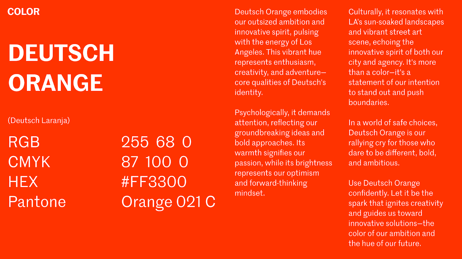
Deutsch Rebrands: LA Spirit Fuels New Visual Identity
Deutsch LA drops the 'LA,' embraces its independent spirit with a bold rebrand that captures the essence of Los Angeles. Discover their vibrant new visual identity!
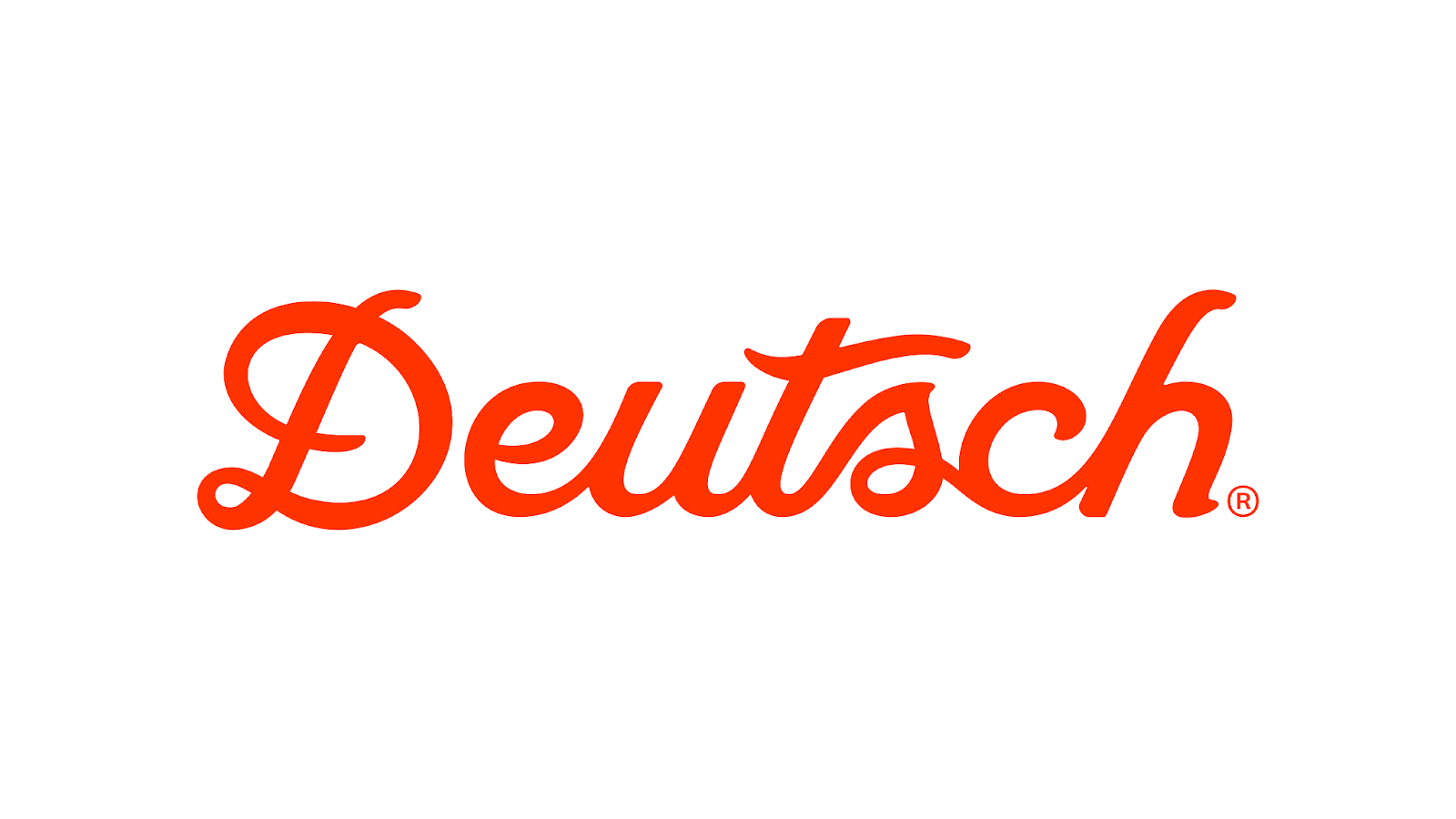
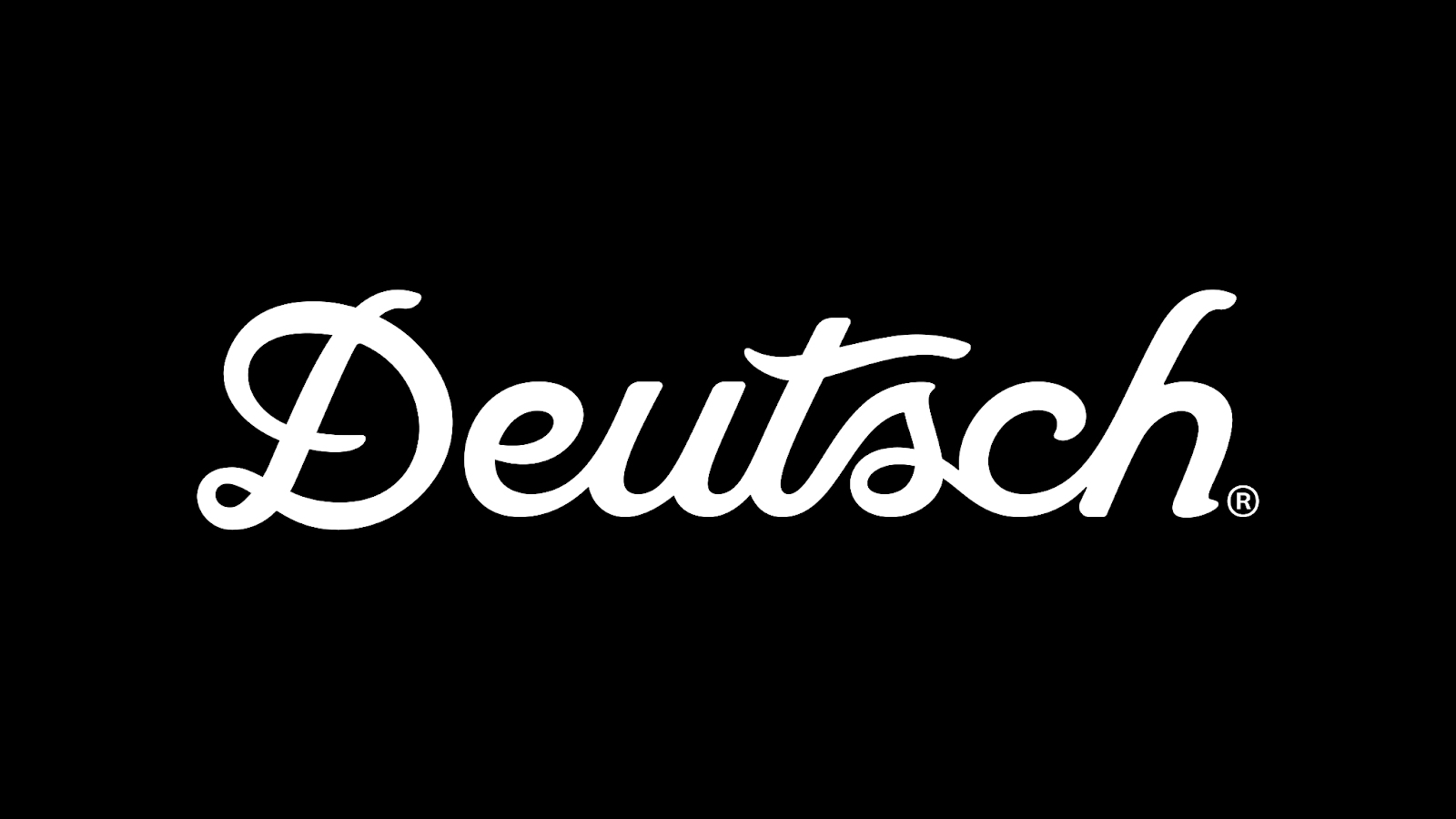
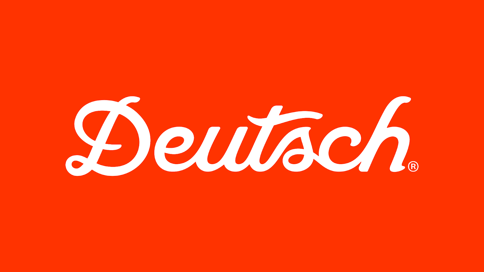
Deutsch LA, the renowned creative agency, has undergone a significant transformation, rebranding itself simply as "Deutsch." This change marks a new era for the agency, solidifying its independent identity and celebrating its deep connection to Los Angeles. The rebranding goes far beyond a simple name change; it includes a vibrant new visual identity that encapsulates the spirit of the city and the agency's unique culture.
A Visual Tapestry Inspired by LA
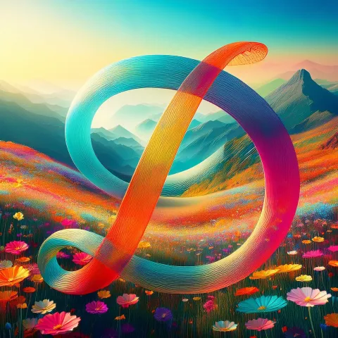
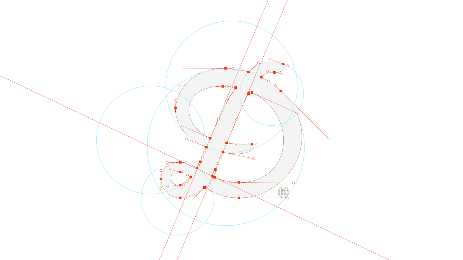
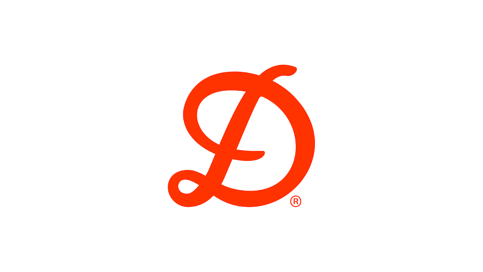
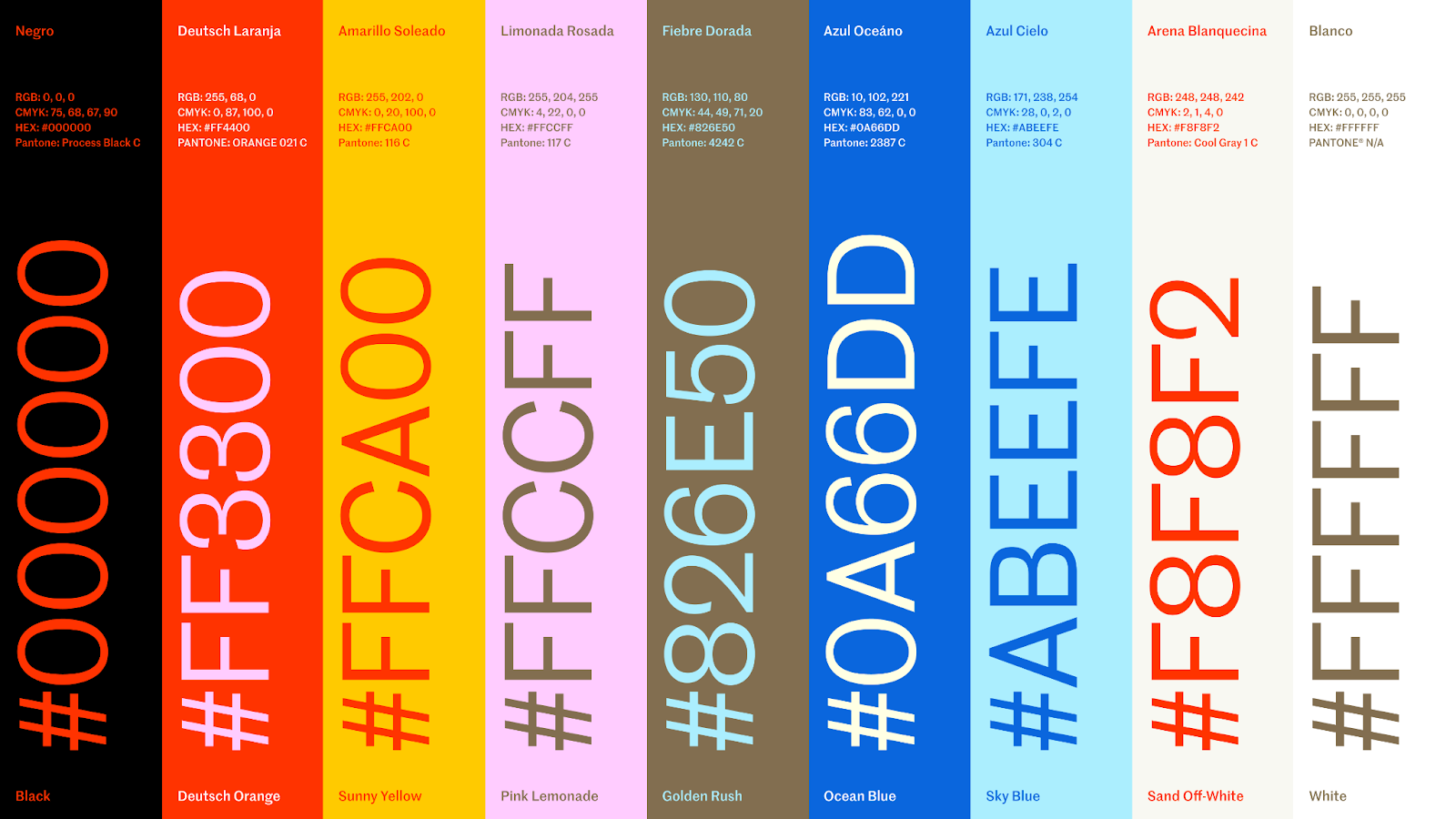
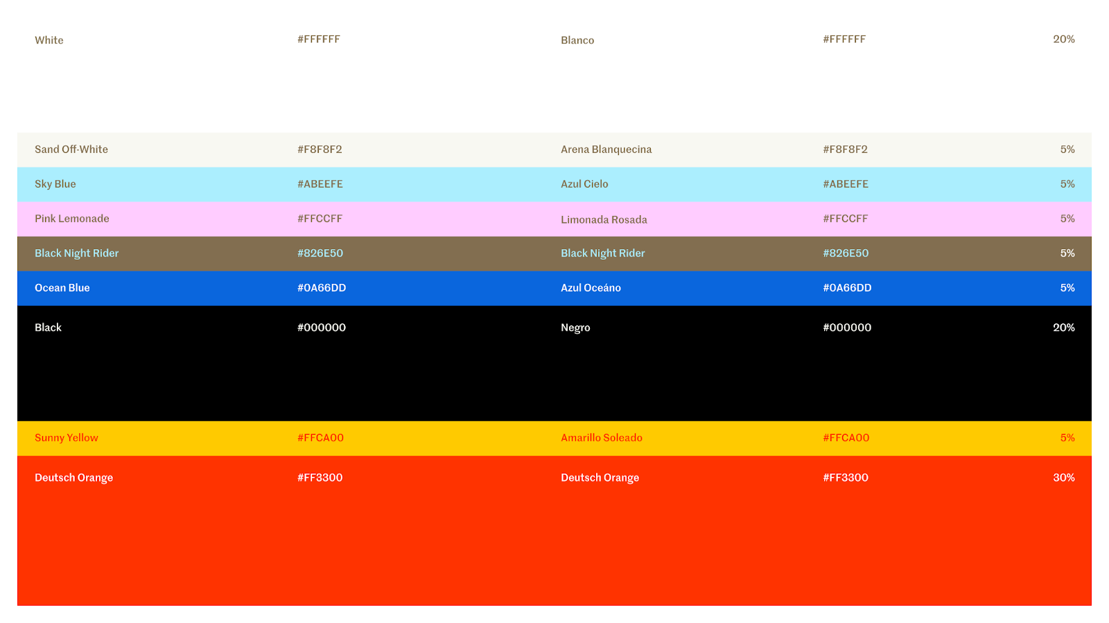
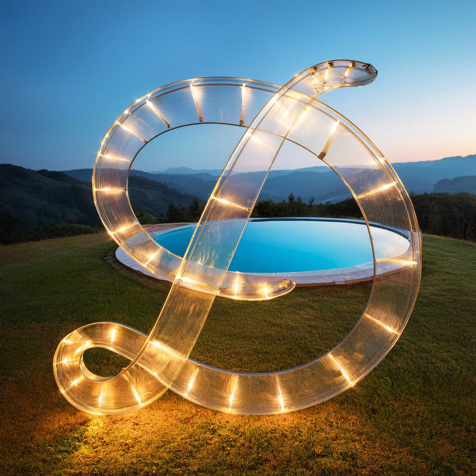
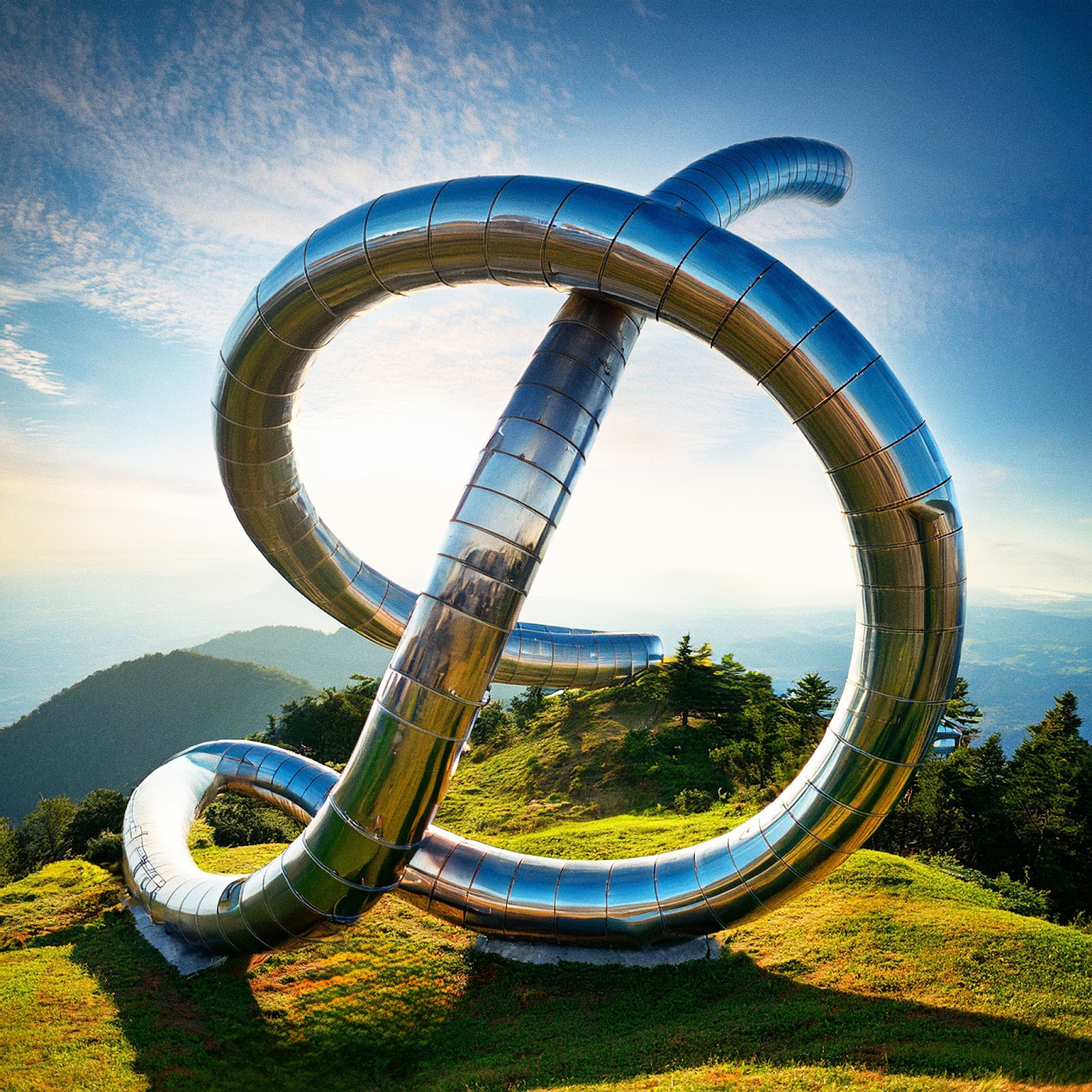
Deutsch's new look and feel is a testament to the diversity and individuality that define both the agency and Los Angeles. It is a rich tapestry woven from mixed media, texture, color, language, code, and art. Key elements of the rebrand include a dynamic "LA" logo that seamlessly transitions into the new "Deutsch" wordmark, and AI-generated personal monikers for each employee, cleverly integrating the agency's logo with the letter "D."
These personalized logos are a visual celebration of LA's multifaceted culture, capturing the essence of everything from its sun-soaked beaches to its vibrant nightlife. Each "D" is a unique creation by Deutsch's Chief Design Officer, Adhemas Batista, reflecting the individual interests and passions of the agency's employees, their love for the city, and their diverse backgrounds.
Fluidity and Flexibility
The new logo and font embody a sense of fluidity and movement, mirroring the dynamic energy of Los Angeles and the ever-evolving nature of the creative industry. As Batista notes, "The new logo and font boast fluidity from letter to letter, akin to the script and graffiti that fill the streets of Los Angeles." This visual language speaks to the agency's adaptability and its commitment to staying ahead of the curve.
A Celebration of Individuality
The rebranding also reinforces Deutsch's dedication to championing diversity and individuality, both within its own walls and in the broader community. This commitment is evident in the personalized logos, the Blackness in Full Bloom program, and the agency's overall ethos.
Looking to the Future
Deutsch's rebrand is a bold statement of intent, signaling its readiness to embrace new challenges and opportunities. It is a visual representation of the agency's evolution, its independent spirit, and its unwavering optimism for the future. As Kim Getty, CEO of Deutsch, puts it, "This rebrand positions us for future big swings."
With its roots firmly planted in Los Angeles and its sights set on the horizon, Deutsch is poised to continue its legacy of innovation and creativity, pushing boundaries and inspiring others along the way. The agency's rebranding is a testament to its resilience, its adaptability, and its unwavering belief in the power of creativity to shape the future.
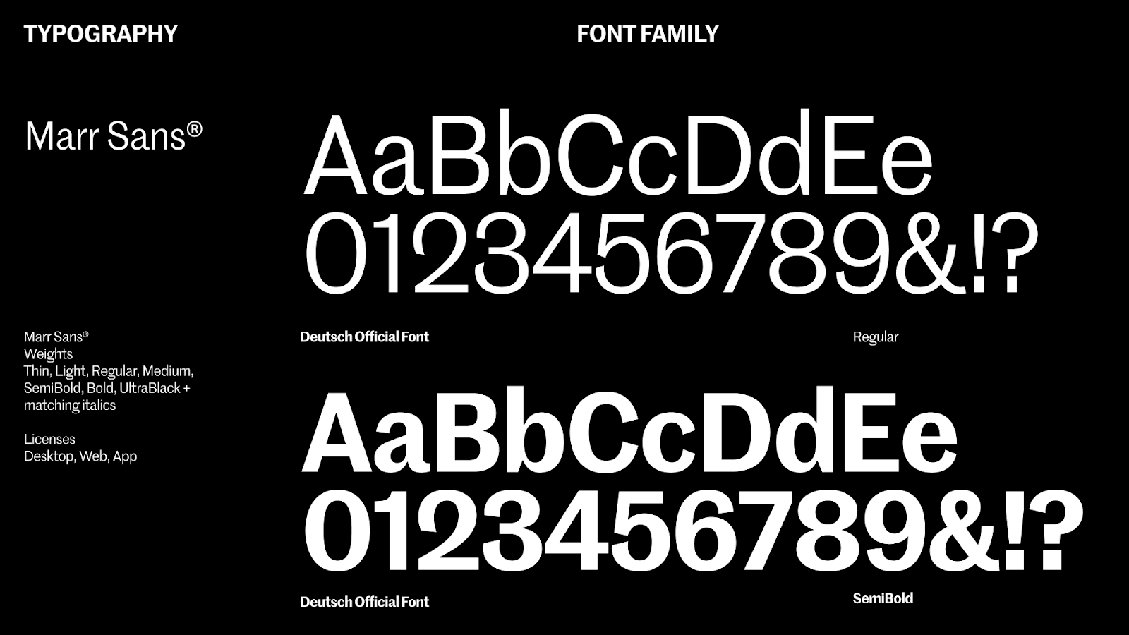
Branding and visual identity artifacts


About Deutsch
Deutsch is a data-inspired, culturally shaped, creative studio based in Los Angeles, California. With Hollywood’s creative legacy as a backdrop and the ingenuity of Silicon Beach serving as daily inspiration, we take an integrated approach that leverages our expertise in advertising, brand strategy, business intelligence, design, media, production, music, and technology. Steelhead, our in-house production company, is the largest agency-owned production facility in the country. Deutsch is proud to work with some of the world’s most renowned global brands, including Taco Bell, Walmart, Dr Pepper, Nintendo, Adobe, Verizon Value, Snapple, PetSmart, Behr, Opendoor, NerdWallet, and more. Deutsch was named one of Fast Company’s Most Innovative Companies of 2024 and one of Adweek’s 2023 Top Five U.S. Agencies of the Year.
For more information, please visit www.deutsch.com