by abduzeedo
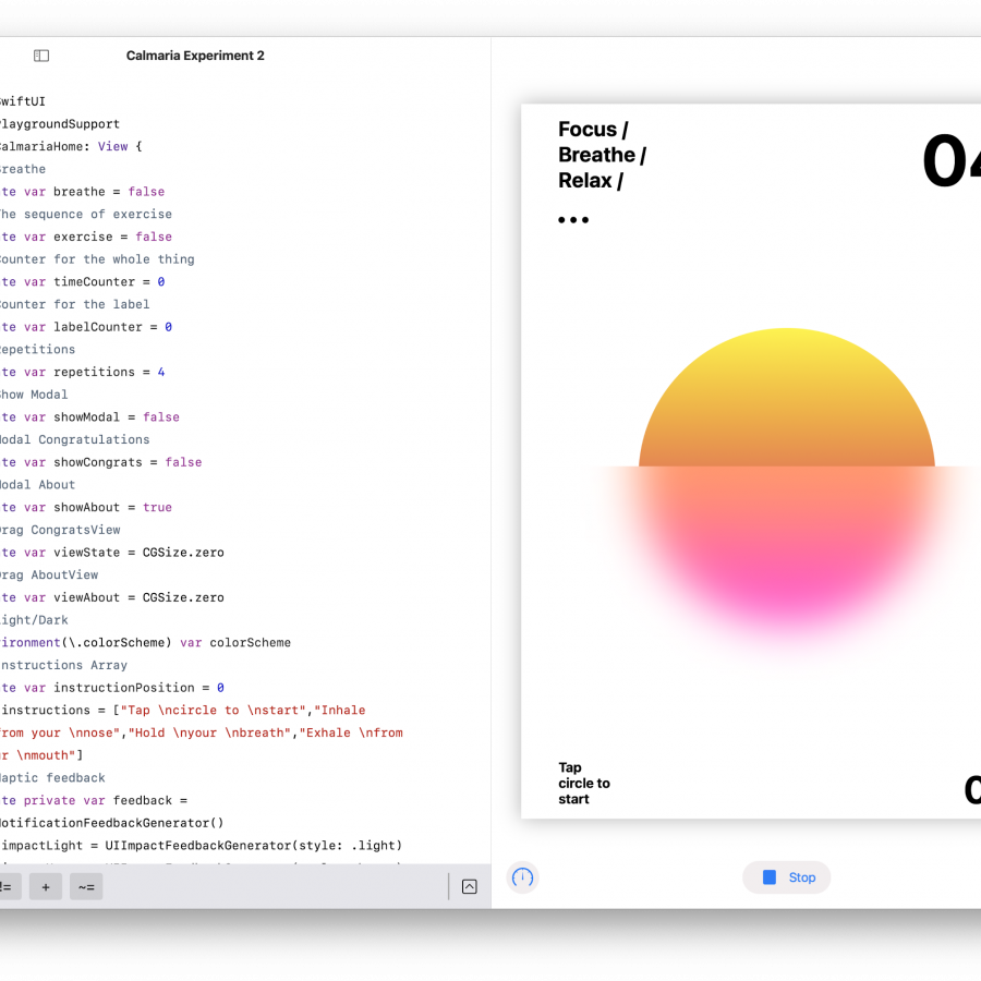
Learning SwiftUI has been a lot of fun. I talked a bit about it before. It started just as a simple curiosity because I had launched Calmaria.app for Android, a platform I have been working on for the past 5-6 years. I know a bit of Java and Kotlin and do most of my prototyping in Android Studio. However, I was always interested in learning something new. First was React. I remember how much hype and love it got. Then lately was Flutter (which I am still interested in) and then SwiftUI.
After seeing some incredible work shared by Jordan Singer on Twitter, I jumped on the train. I got Meng To course to get familiar with and after a few lessons I started to build Calmaria. First for the iPhone, then for the Apple Watch.
I still don’t know much about SwiftUI, but one thing I know for sure. It’s really fun to play with. In addition to that, you can use Playgrounds, yeah, you heard right. You can pretty much build things on the iPad or computer with that learning tool. I built most of my app in it. Including some hacks like this one I’m sharing here.
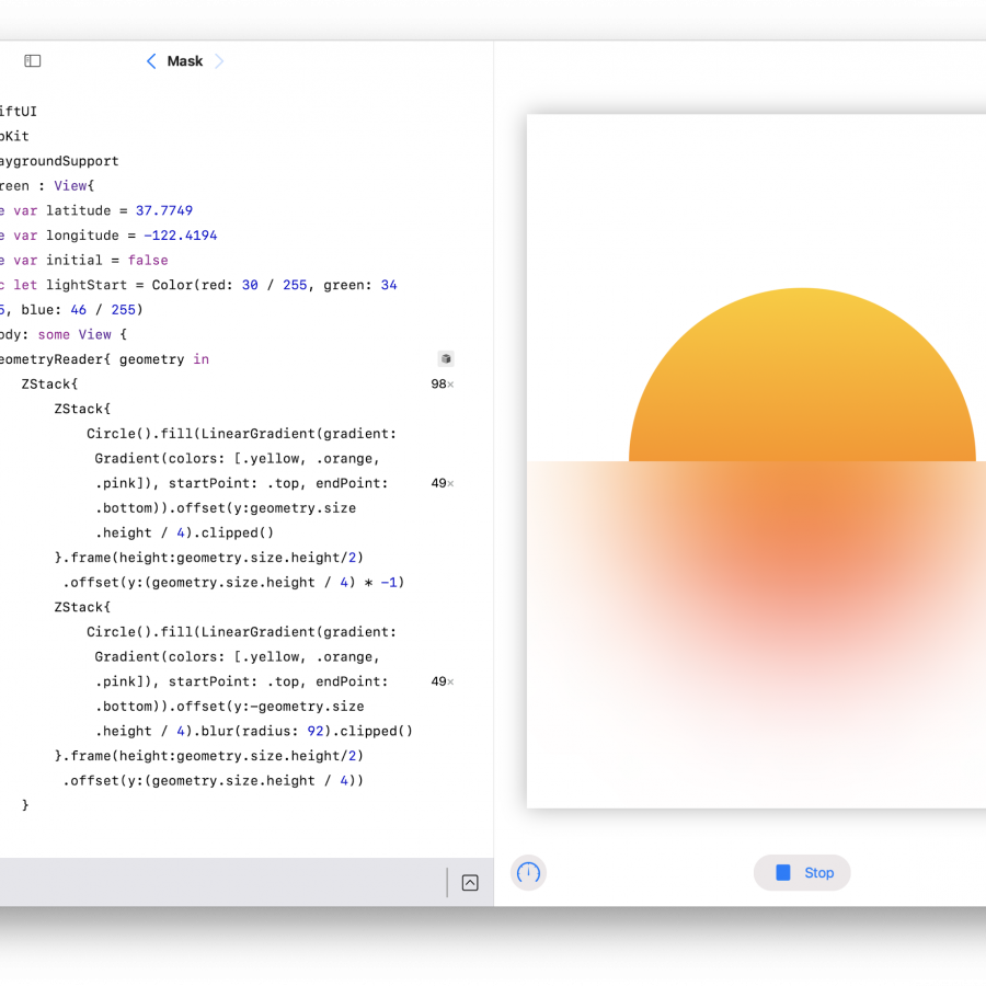
So, from my shallow understanding, watchOS doesn’t support the automatic background blur effect that I used in Calmaria for the iPhone. Initially I decided to just use the original 80s look. But then I realized that I could fake it that pretty easily because you still could blur a view. And that is what I did. I just created 2 circle views masked in half by squares. The bottom one is blurred, the top is not. Simple as that.
Here is how it looks on the Apple Watch.
Download the code from GitHub
