by abduzeedo
In the past year, I stopped writing tutorials and the main reason was that I thought they weren't relevant anymore given the copious amount of great websites out there. Also, I believe the audience of the blog has already matured and focused more on other areas of the design process such as ideations and the process itself. The tools, as I always tried to emphasize, is the least important part of the process, but it's important to have command of them. As a good craftsman, knowing the best tool for each trade will save you a lot of time. The thing is, I miss creating new things and that helped me a lot in terms of productivity. With that in mind, I will try to create an image per week for at least one year. Let's see if I can stick to my word.
Step 1
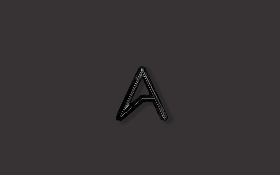
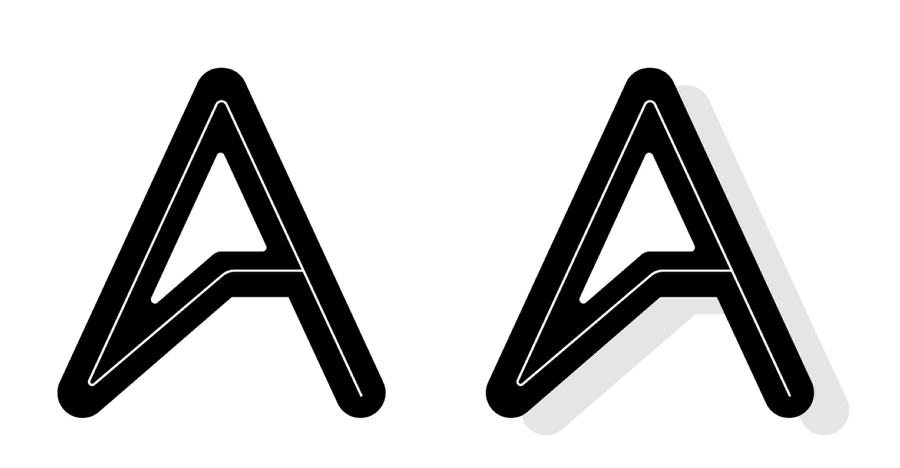
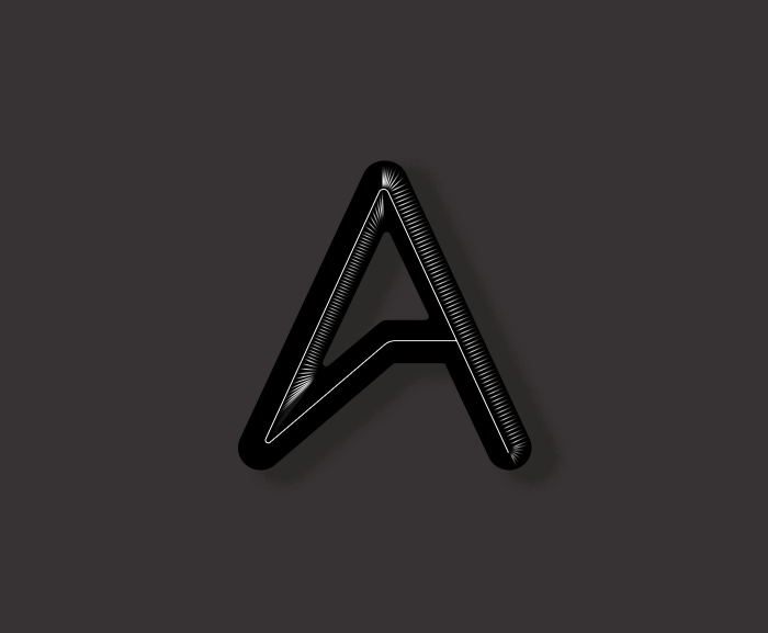
In Illustrator I created a version of the Abduzeedo logo with an inner stroke. After that, I just created a copy of the logo and moved it down and right to create a hard shadow.
Step 2
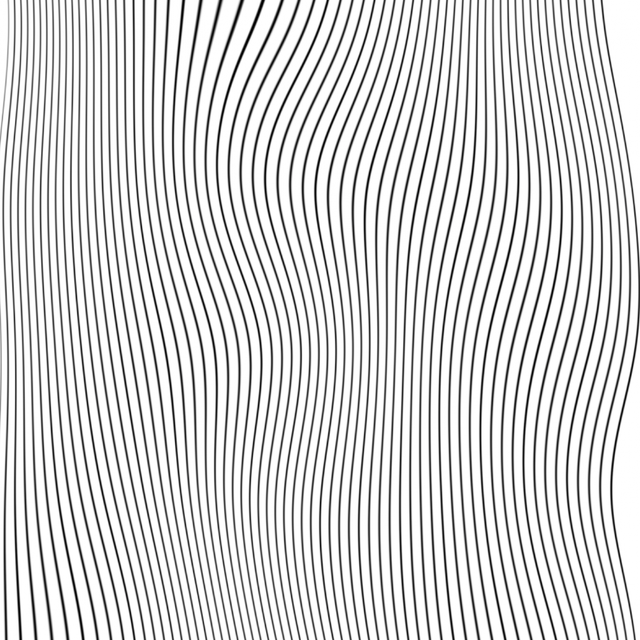
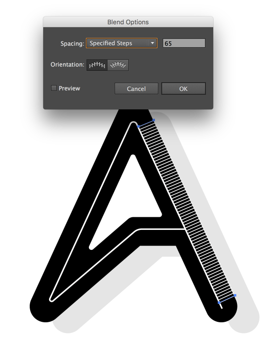
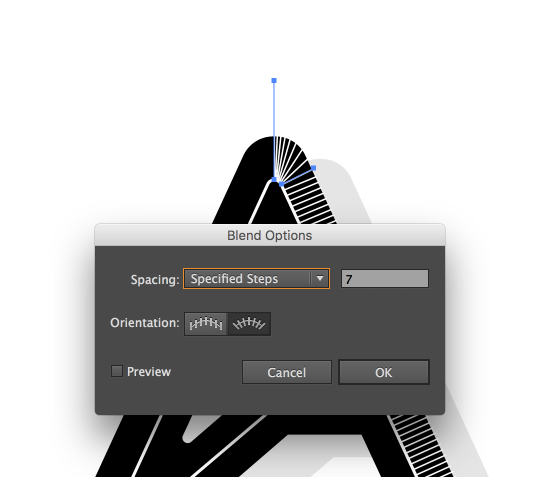
I used the Blend Tool to create the lines for the highlighted area. The first part was kind of easy, just linear Blend.
Step 3
For the edges that are curved, it was a bit trickier. The biggest problem was the spacing between lines, so if you try to do it I recommend a lot of tweaking until you get a cool result.
Step 4
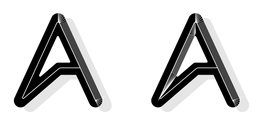
Here's with both sides done with the Blend Tool.
Step 5
Now in Photoshop I copied and pasted the composition in different layers. The idea is to manipulate each one individually.

Step 6
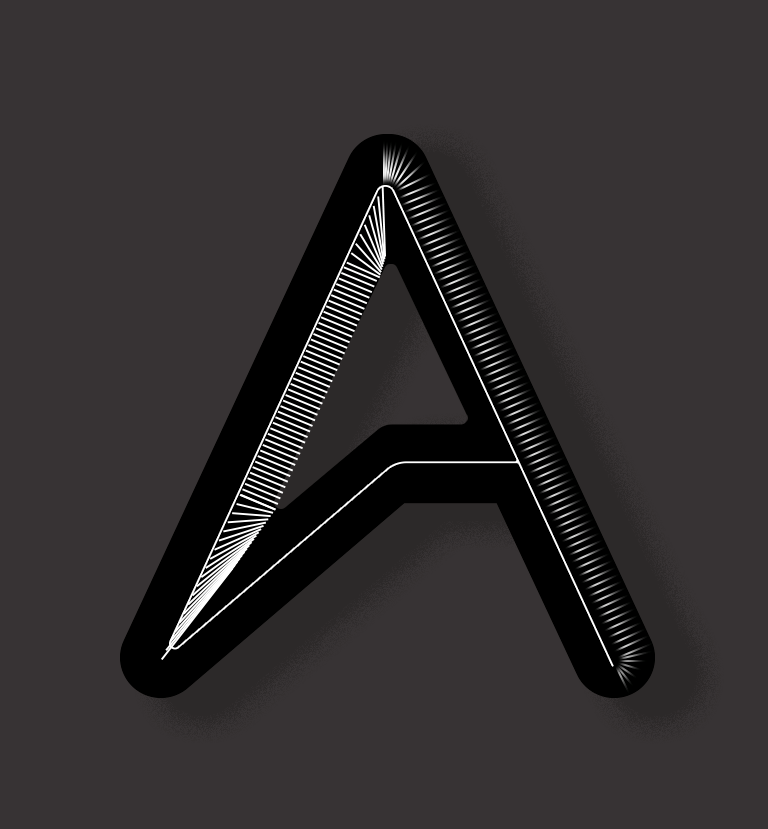
For the lines created with the Blend Tool in Illustrator, I just added a mask and with the soft brush I made them fade away on the edges.
Step 7
Here are both sides once again. The bottom left is a bit too strong in my opinion.
Step 8
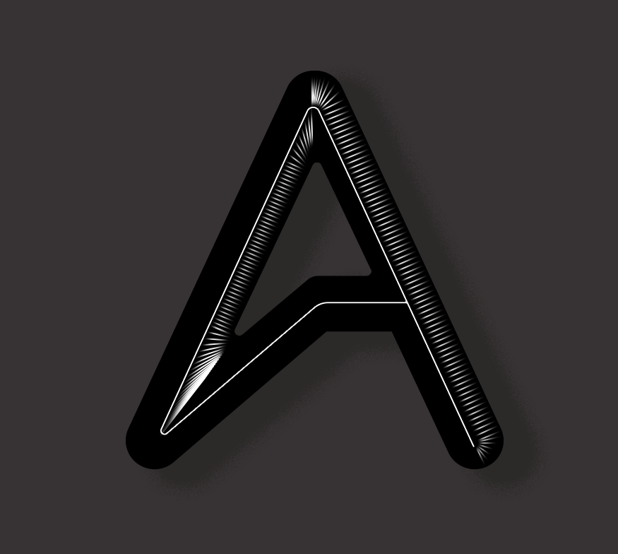
With the brush tool, I softed a bit more the bottom edged.
Conclusion
The last thing to do was to add a little noise and dust texture on top of everything. This image took me a few hours but most of the time was tweaking the details. At the end of the day that is what gives the level of refinement that I was trying to accomplish.
