by abduzeedo
It's been a long time since the last time I wrote Photoshop tutorials. A lot of things have happened as I probably mentioned in the past. Right now there are tons of sites with Photoshop tutorials and they all share tons of content so I started to feel it wasn't necessary for me to keep doing. However, I have been trying to get back to a routine of trying new things back in Photoshop moving away a bit from product design, UI and flat design. Essentially, taking a step back to the good old days of having fun with light effects, textures and that 80s look I miss so much.
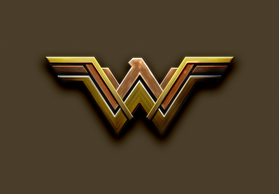
So for this tutorial I will show you how to create the Wonder Woman logo with that crazy metal effect using Photoshop. There are several ways to do it, a 3D tool might be the best way, but I decided to try it in Photoshop. I hope you have as much fun doing it as I did :)
Photoshop Tutorials
Step 1
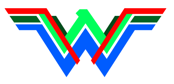
The first thing to do is get the basic shape of the Wonder Woman symbol. I recreated this one in Illustrator. You can do everything in Photoshop if you want, I just feel more comfortable using Illustrator as it's faster for me.
Step 2
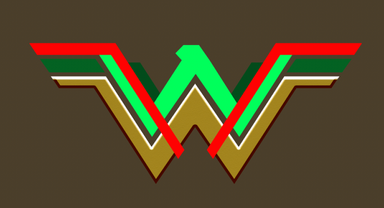
Now in Photoshop the secret here is to have all shapes in different layers. You can achieve that by copying and pasting or importing, or even selecting and creating layers from the selection. It doesn't really matter how you do it as long as you have one layer for each part. We will apply some Layer Styles on the following steps.

Step 3
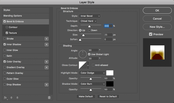
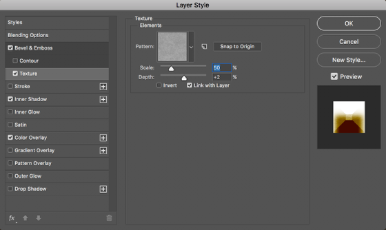
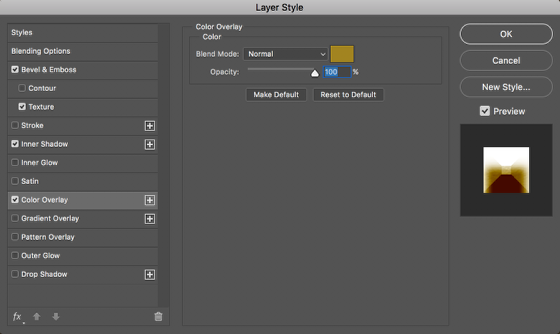
Select the bottom and biggest shape of the logo, the blue in my image. Then go to Layer>Layer Styles>Bevel & Emboss. Use the values below. We will also add a Texture, Inner Shadow and Color Overlay. You can tweak things here as much as you want. For the Texture, use a metal texture. An easy way to do it is to do a Google search for metal texture images, get the one you like. Open it in Photoshop and select it all, then go to Edit>Define Pattern. You will be able to use that in the Layer Styles then.

Step 4
Here you can see the first layer with the bevel look. It's important for it to have strong highlights and shadows. Repeat the same process for the other parts and use different colors.
Step 5
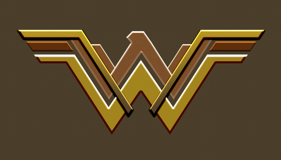
Now that you have all layers with effect, make sure to tweak them a little. Notice that I have not only different colors but also different strengths for the parts. The 2 parts that go on top of everything else I added a drop shadow as well to create more depth. Experiment with it.
Step 6
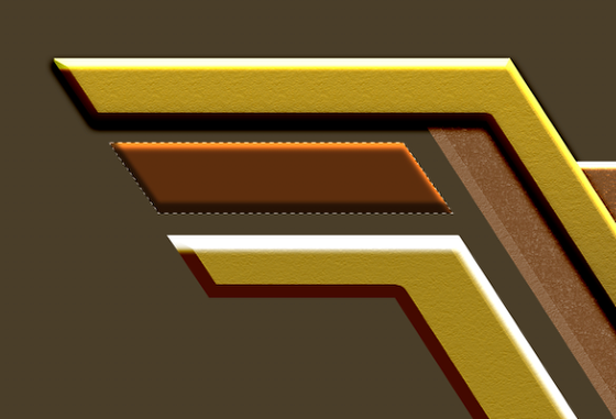
Now the tricky part, add the metal texture. I believe there might be a multitude of ways of doing this, I went with my way, or the way I thought it was the easiest one. So select one of the shapes.
Step 7
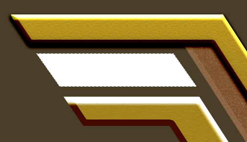
Add a new layer and fill it with white.
Step 8
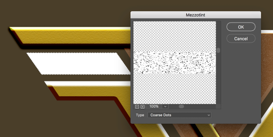
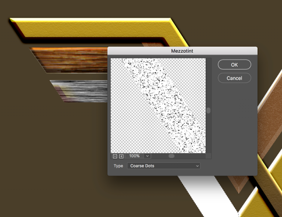
Then go to Filter>Pixelate>Mezzotint. Use Coarse Dots. Make sure that you have white and black for the background color.
Step 9
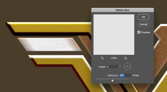
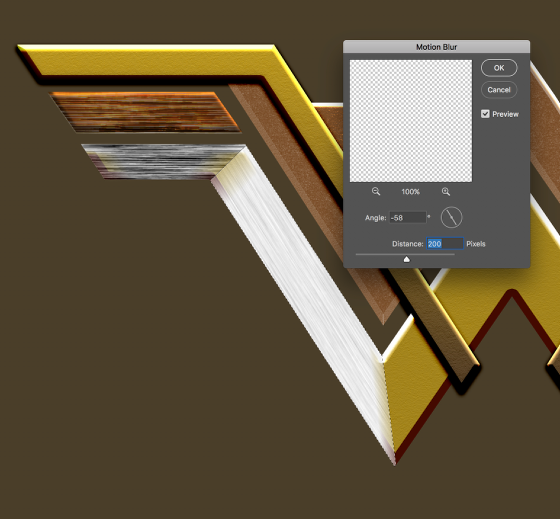
After that still with the marquee selection active go to Filter>Blur>Motion Blur. Use a high value for the Distance. My image is huge so I used 200 pixels.
Step 10
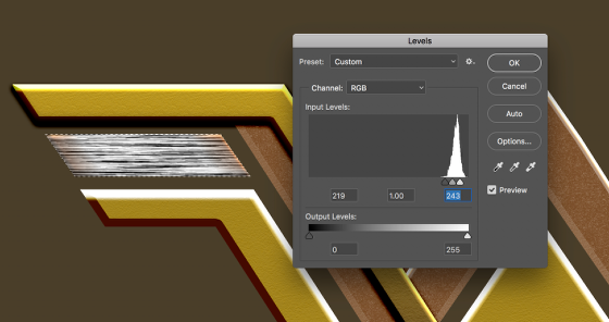
Because the original logo looks like a very rough metal, we need to make the texture a bit stronger. So go to Image>Adjustments>Levels. Move the black level all the way to the right and the white level a bit to the left. The idea is to increase the contrast. Use the image below for reference.
Step 11
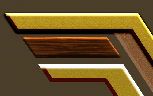
Change the Blend Mode to Linear Burn and play with the opacity. I used around 10-30%.
Step 12
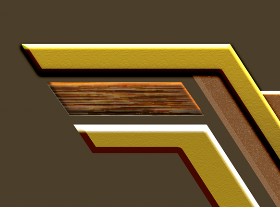
Duplicate the layer and move it down a couple of pixels then change the Blend Mode to Color Dodge at around 80-100% depending on the color of your shape.
Step 13
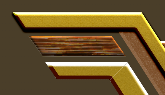
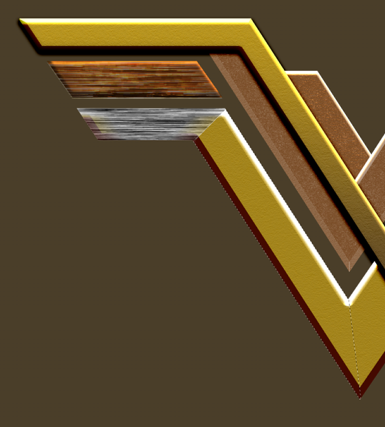
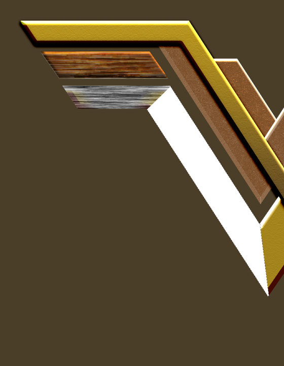
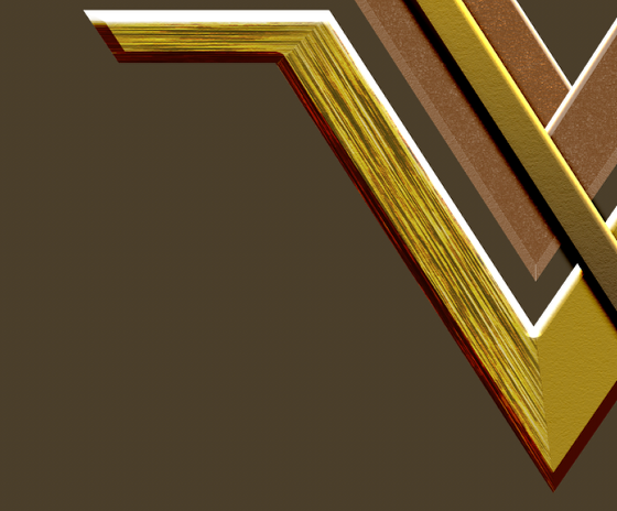
For the shapes that have different angles I just did the same thing but with one difference. I did different angles of motion blur depending on the angle of the shape. The tip here is to use the Polygonal Lasso Tool to select the right angle for the junctions. Below you can see how I did the first 2 parts of the bottom shape.
Step 14
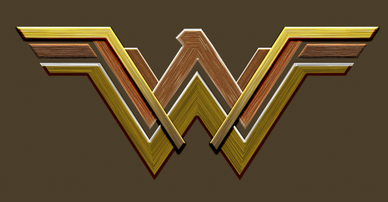
Repeat that pretty much for every other shape. For the head, this is where you will have to do that 3 more times because of the different angles you get there. It's the same process, it will require a bit more attention though.
Step 15
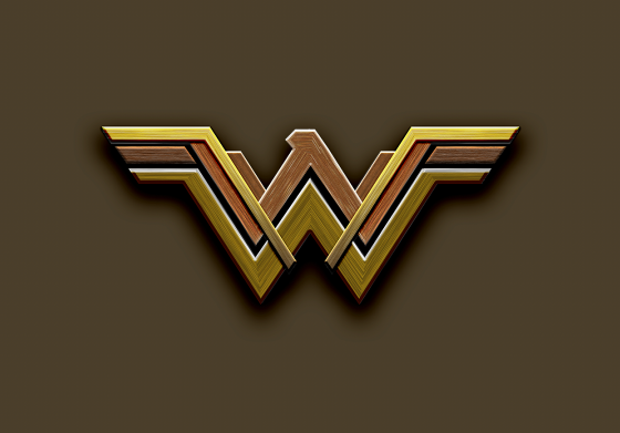
Group all shapes into a folder then apply a shadow to that folder. You can also merge the folder if you want. I always forget that I can add layer styles to folders now.
Step 16
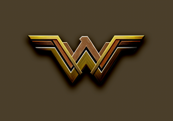
Add a new layer and mask it with the shape of the symbol. Then with the Brush Tool paint the sides and bottom with a very soft brush and black for the color. I painted with my brush at 50% so I could have more control. The goal is to create a sort of vignette effect.
Step 17
Add another layer and fill with black. Change the Blend Mode to Color Dodge, then with the brush tool, paint some white spots on your design. Because of the Blend Mode the brush strokes will create a really nice light effect. That's my favorite trick in Photoshop for light effects. It works all the time.
Conclusion
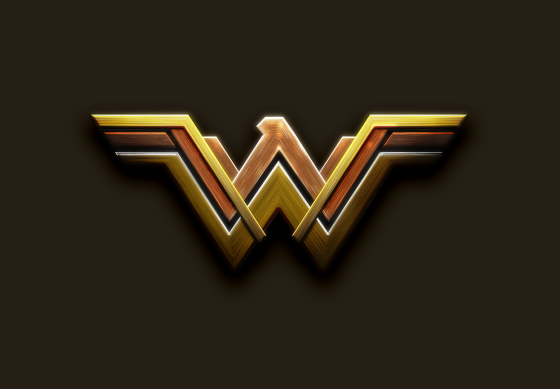
Add another layer and fill with with black, use it as background. Then, select all layers and duplicate them. After that, merge them onto one layer and go to Filter>Blur>Gaussian Blur. I used 20 for the radius but you can try different values depending on the size of your image. Right after, change the Blend Mode to Overlay at 50%. Duplicate this layer and change the Blend Mode to Screen at 40%. Those 2 layers will give the image more depth, contrast and an interesting glow effect. And that's it. That's how to create a design with the effect similar to the Wonder Woman logo you see in the posters out there. As usual, try your way, have fun and check out more of our Photoshop tutorials.

![Neon light effect in Photoshop [revisited] Neon light effect in Photoshop [revisited]](/sites/default/files/styles/square_1x1/public/originals/hero_neon.png?itok=lP4mbIak)
