by abduzeedo
Explore how Maite's branding and visual identity merge Brazilian essence with innovation in skin care, featuring unique lettering and vivid iconography.
In the world of branding and visual identity, standing out is not just an option—it's a necessity. Guilherme Sperb's project for Maite, a brand synonymous with natural Brazilian skin care products, exemplifies this principle beautifully. The Maite Identity project showcases a remarkable journey in crafting a distinctive brand identity that resonates with authenticity and innovation.
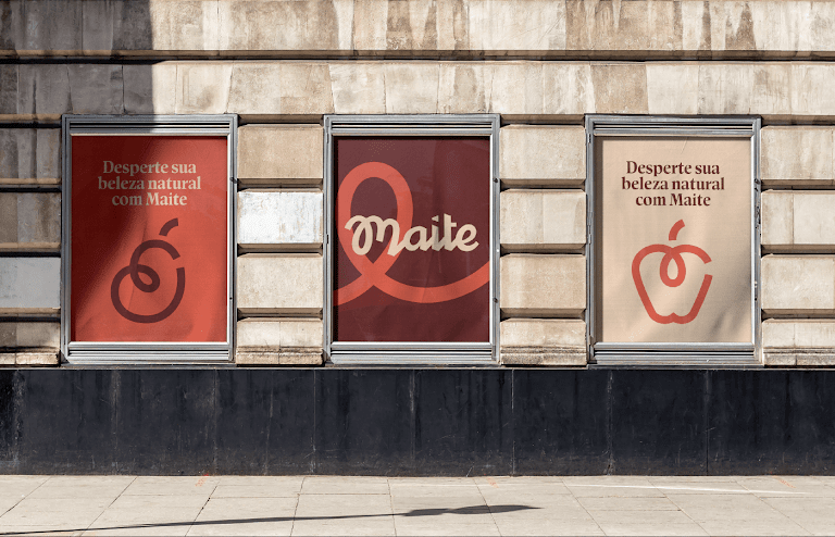
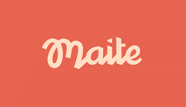
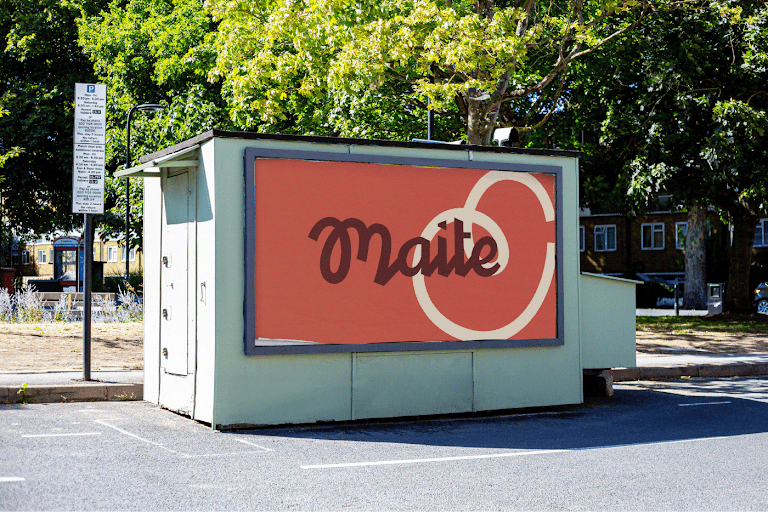
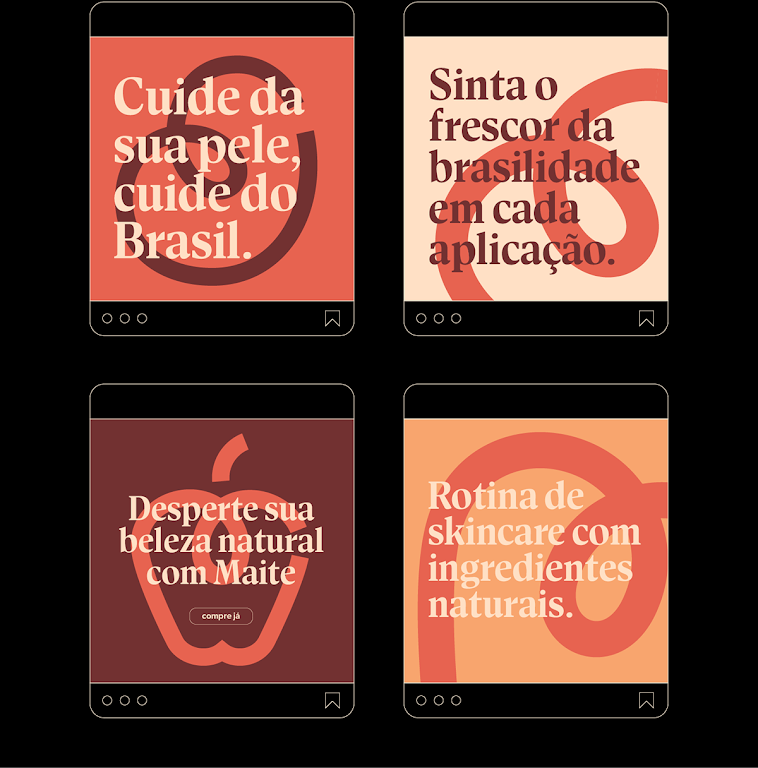
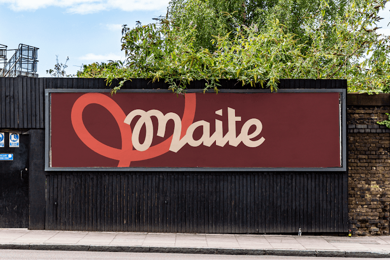
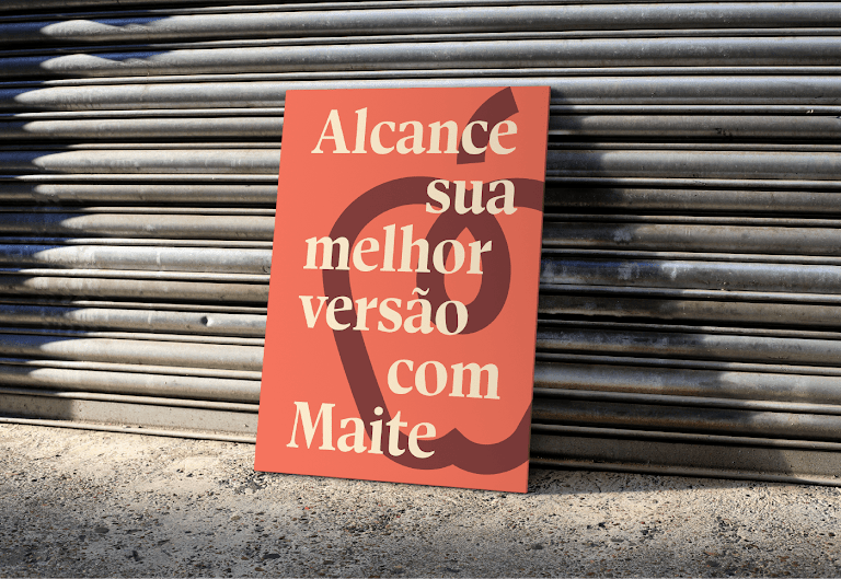
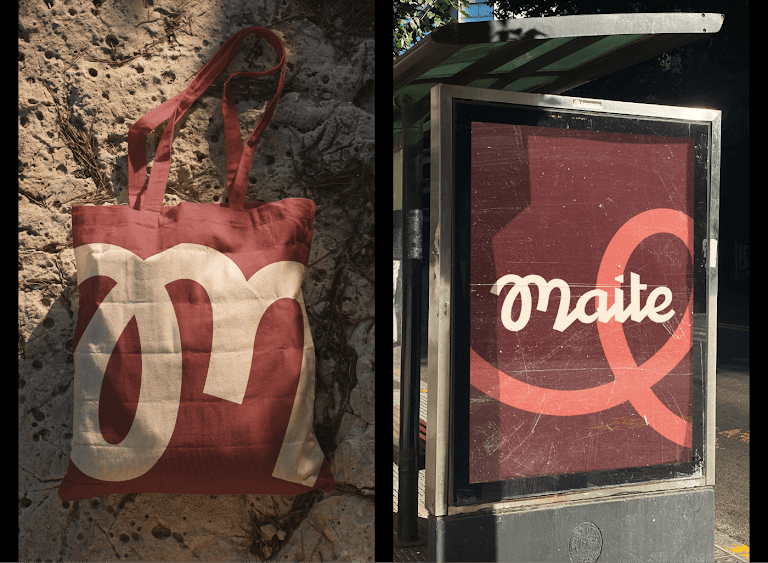
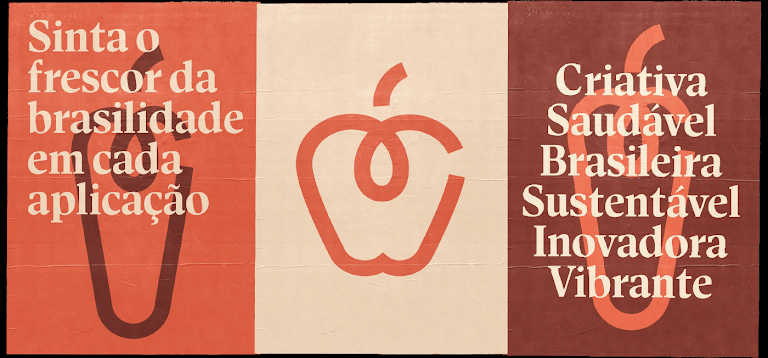
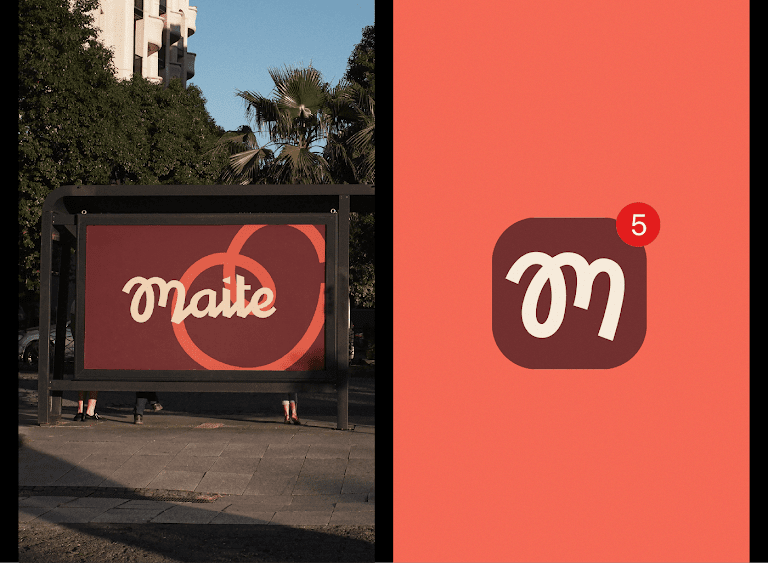
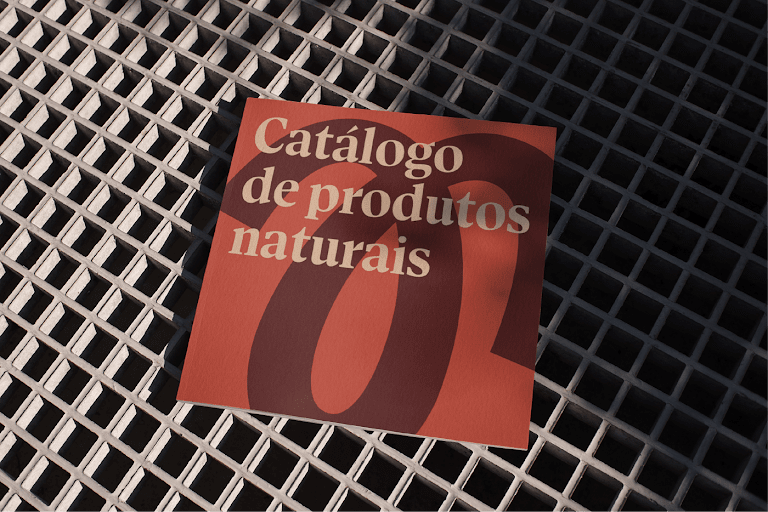
At the heart of Maite's visual identity is a bespoke lettering style, meticulously developed by hand, signifying the brand's commitment to originality. This personalized touch not only elevates the brand's aesthetic but also imbues it with a sense of individuality and craftsmanship that sets it apart in the competitive skin care market.
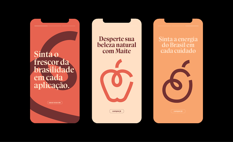
Sperb didn't stop at lettering; he also introduced an elegant series of icons representing Brazilian fruits. These icons, defined by their clean contours, complement the overall design by adding a vibrant and organic feel. They not only pay homage to the brand's natural roots but also serve as a visual feast, making the brand's identity memorable and engaging.
Color and graphics play a pivotal role in Maite's visual narrative. Sperb's choice of striking colors and dynamic graphic elements draws inspiration from Brazil's rich design vernacular, infusing the brand with energy and warmth. This strategic use of color and graphics ensures that Maite's branding is not only visually captivating but also reflective of its heritage and values.
By seamlessly integrating traditional Brazilian design cues with modern aesthetics, Maite's visual identity represents a forward-thinking approach to branding. It's a testament to the power of thoughtful design in conveying a brand's story and ethos.
For businesses and designers alike, the Maite Identity project serves as an inspiring benchmark in branding and visual identity. Guilherme Sperb's work illustrates how creativity, when aligned with a brand's essence and aspirations, can forge a visual identity that not only stands out but also stands the test of time in the digital age.
Focusing on design details, this project reaffirms the importance of uniqueness and authenticity in establishing a strong brand identity. It's a vivid reminder that in the vast landscape of branding, being true to one's roots while embracing innovation is key to making a lasting impact.
Branding and visual identity artifacts


Credits
- Visual Identity: Guilherme Sperb
- Lettering/Logotype: Guilherme Sperb


