by abduzeedo
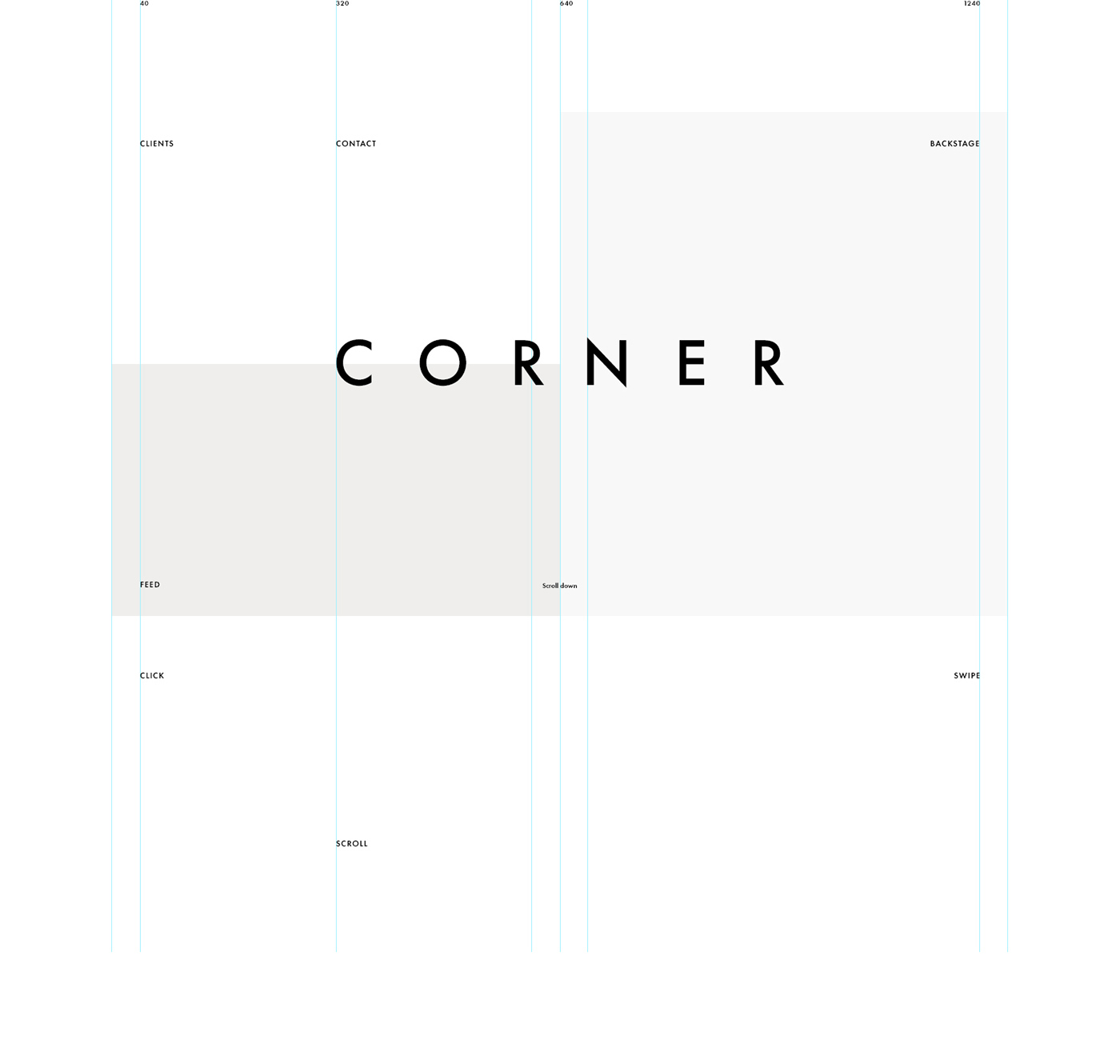
Web design is getting more stylish every day. The editorial look with nice grid system has become a reality. Still we run into some issues of having to design a fluid system to be fully responsive. That ends up with 2, 3 or more different designs for the same project. However it's nice to see desktop taking full advantage of the technology to create stunning looking design. Alexander Laguta and Kate Laguta shared a great example of the state of modern web design. It's simple, elegant, modular and beautiful. Check it out.
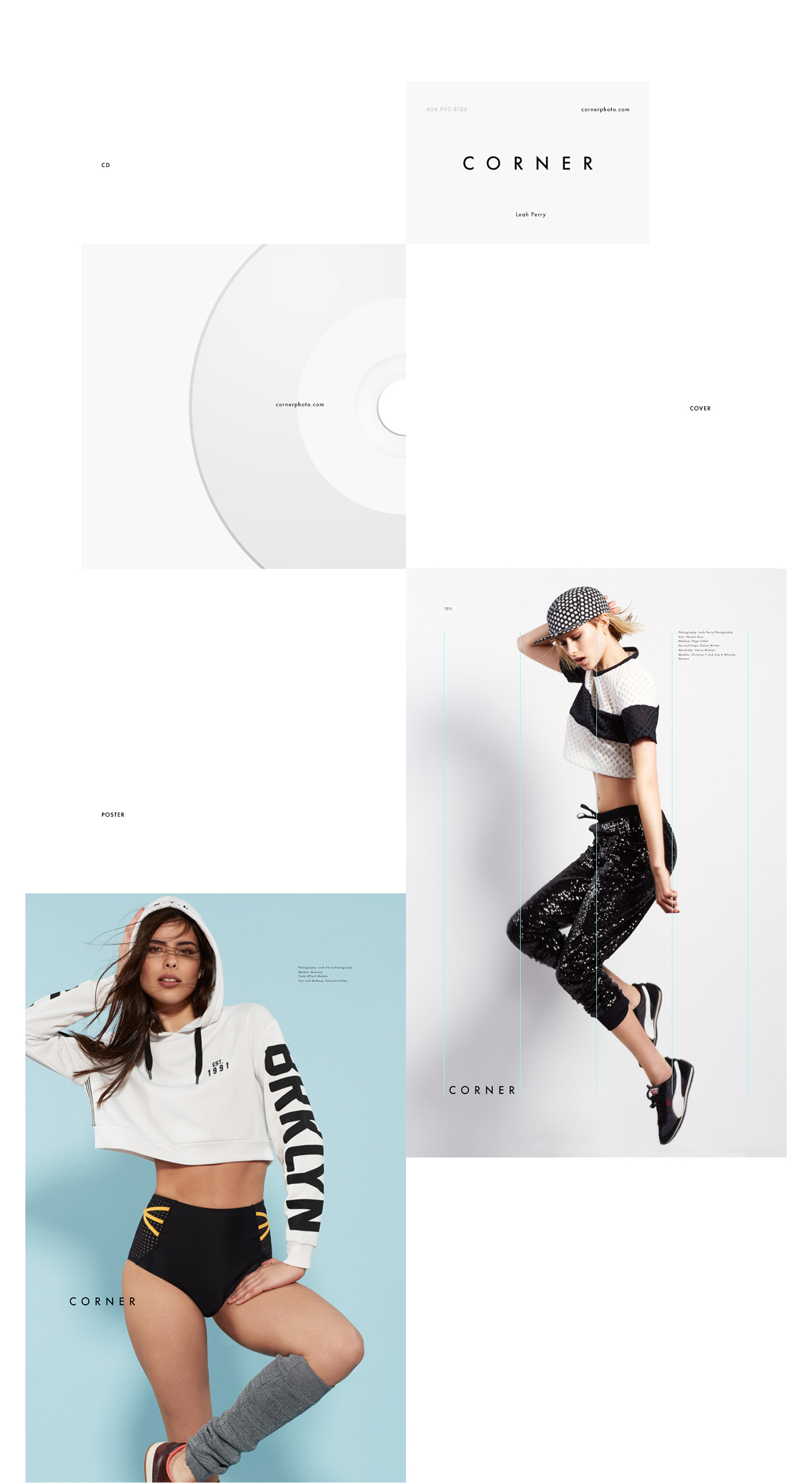
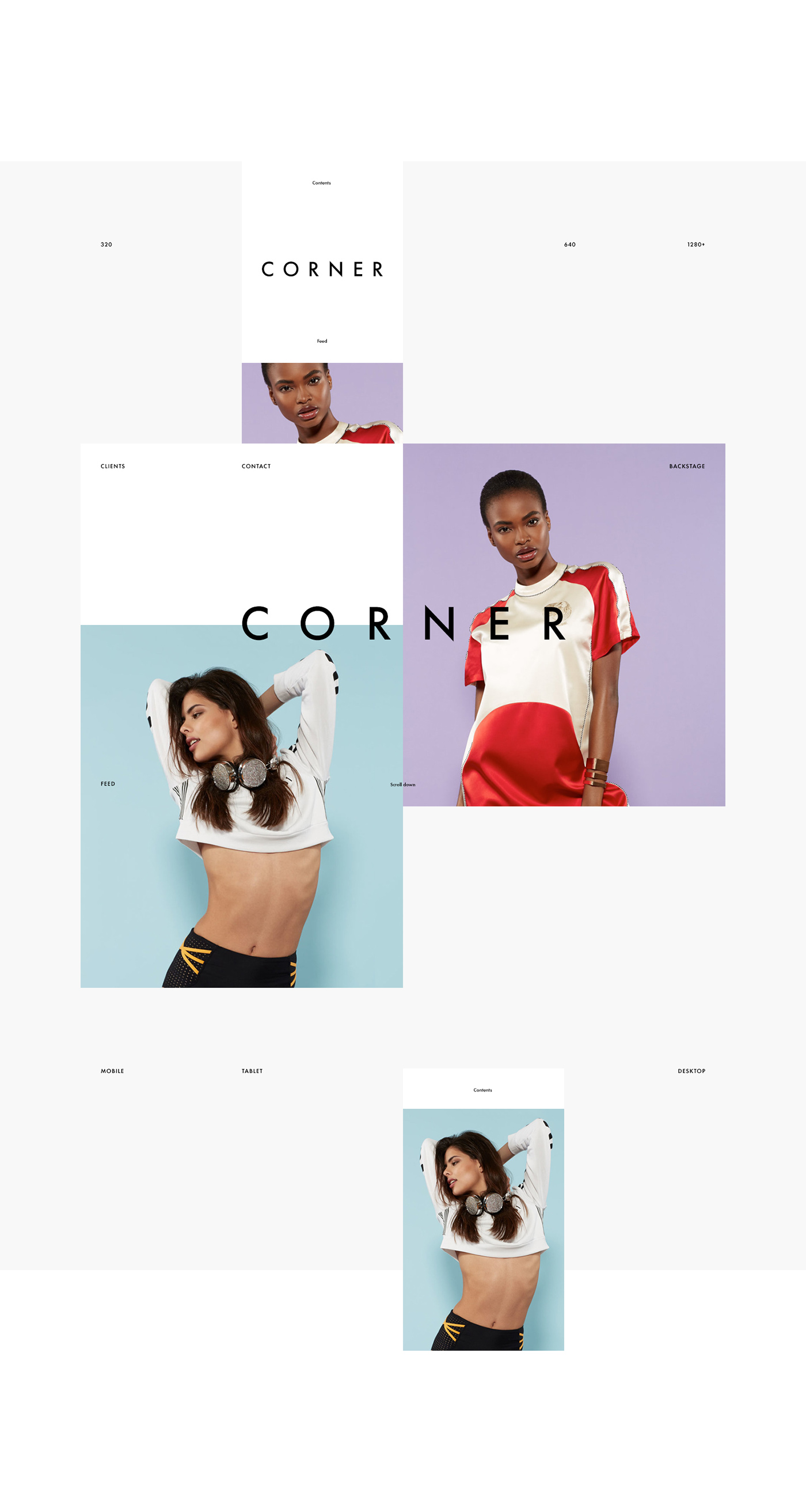
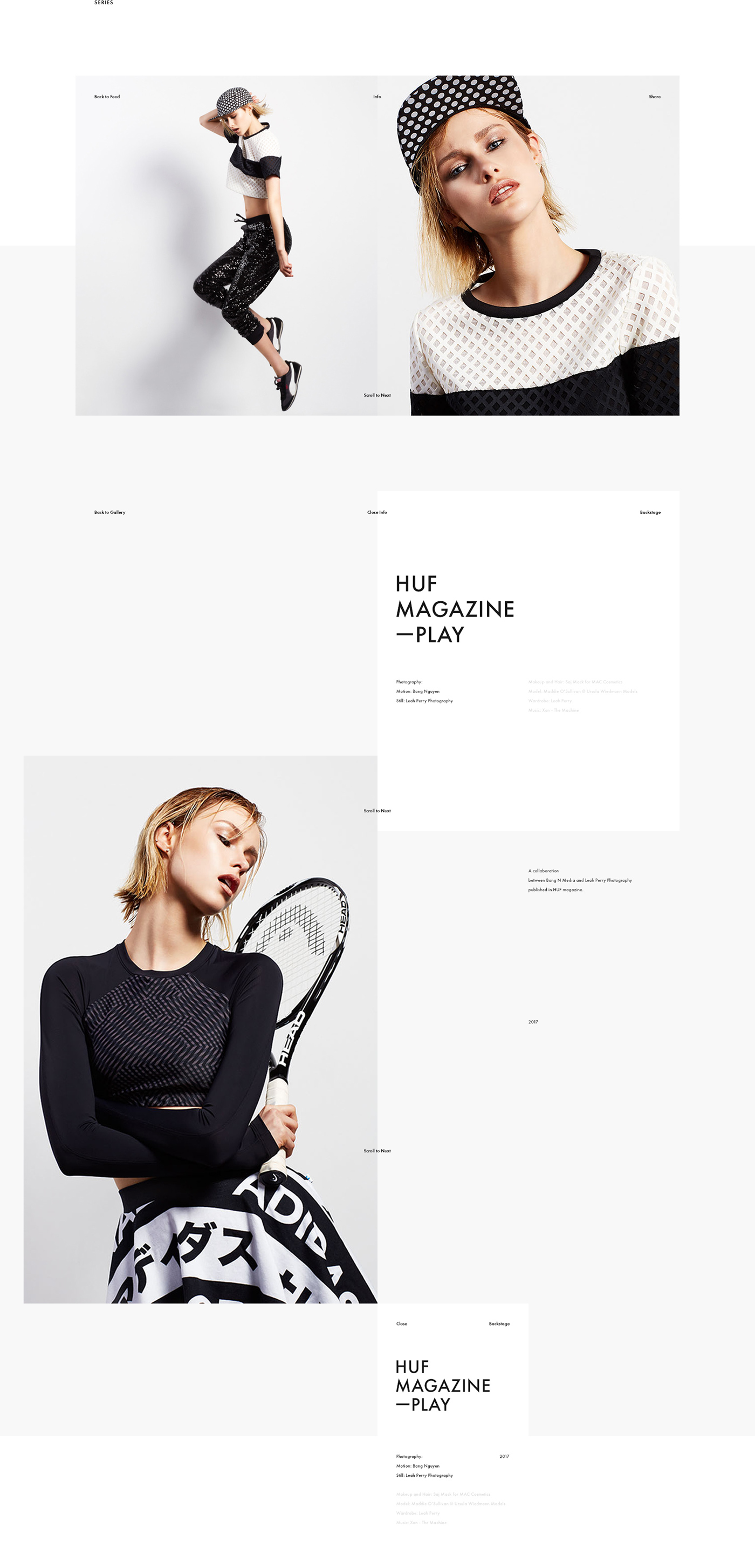
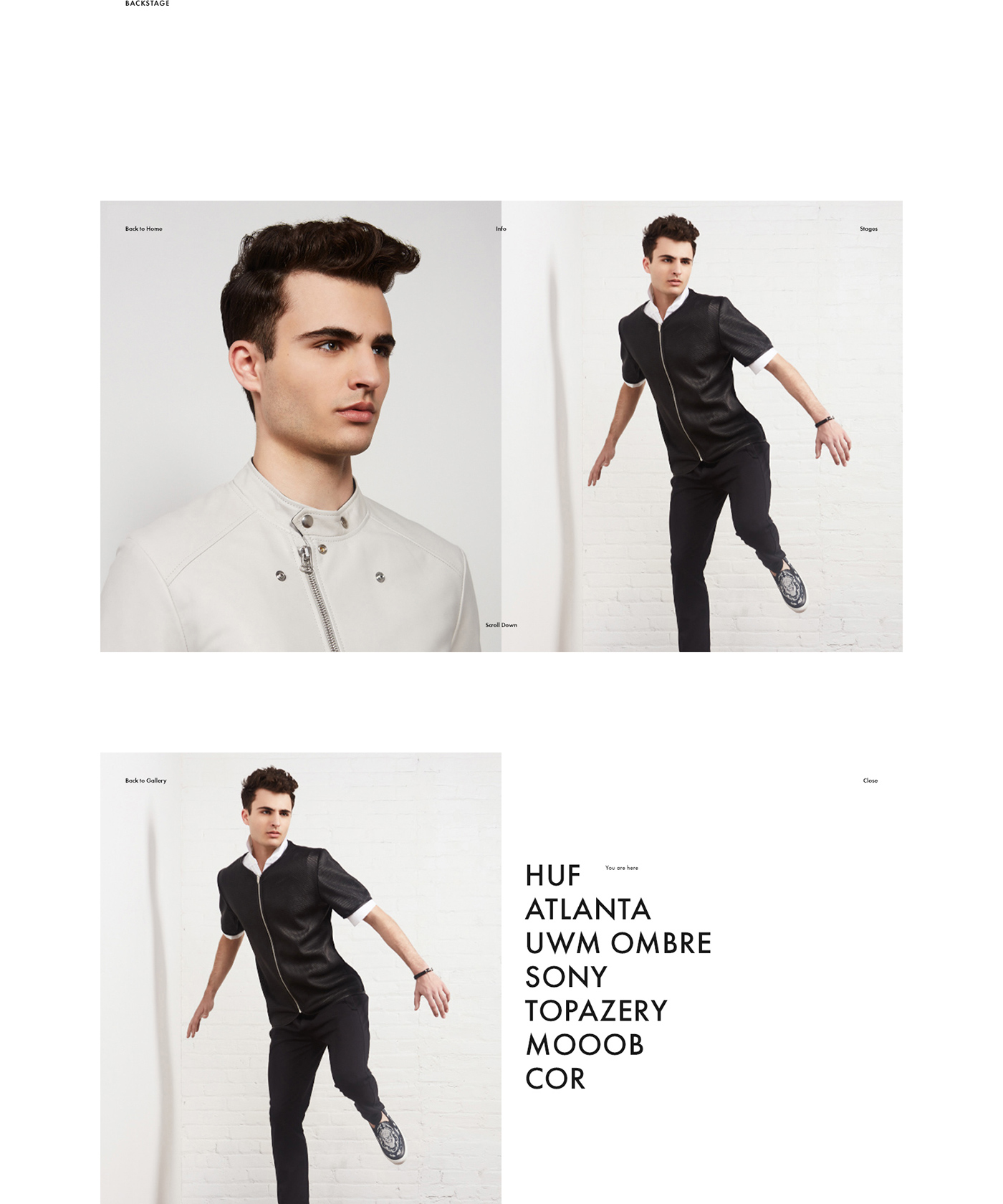
We strive to discover new convenient and yet easy ways for a human to read the interface and simplify navigation patterns. We believe that navigation rules cannot override user's wishes and requirements. In a mutual project with our friends from fashion photo studio Corner we tried to divine how users would navigate through the interface and planed its navigation patters accordingly, what allowed us to focus user's attention just on the content itself, without necessity to think about how to get to the destination points.
Minimalist Web Design