by abduzeedo
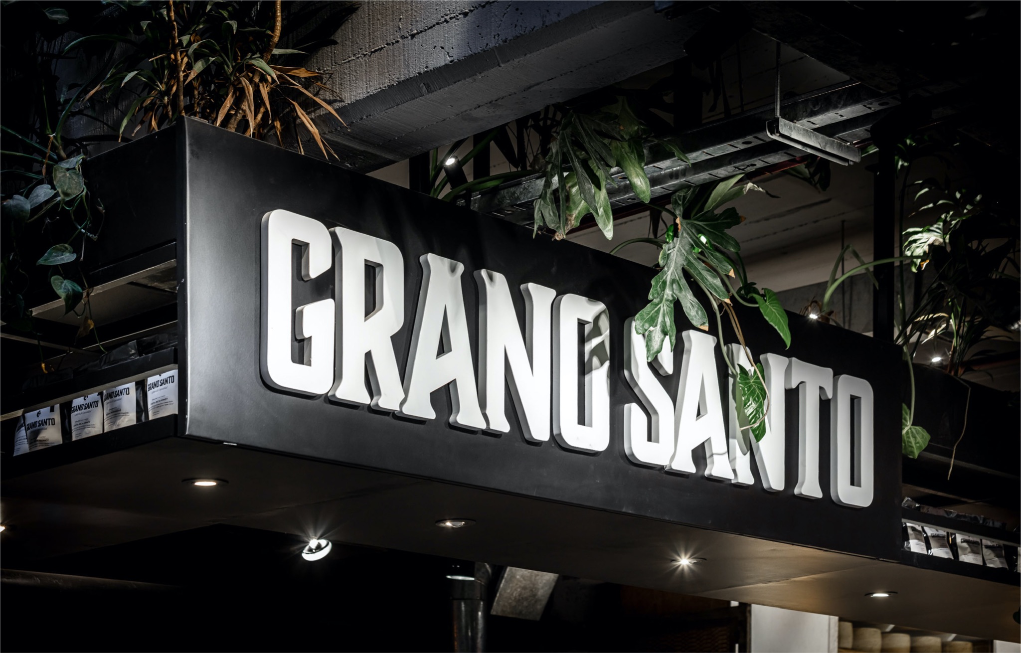
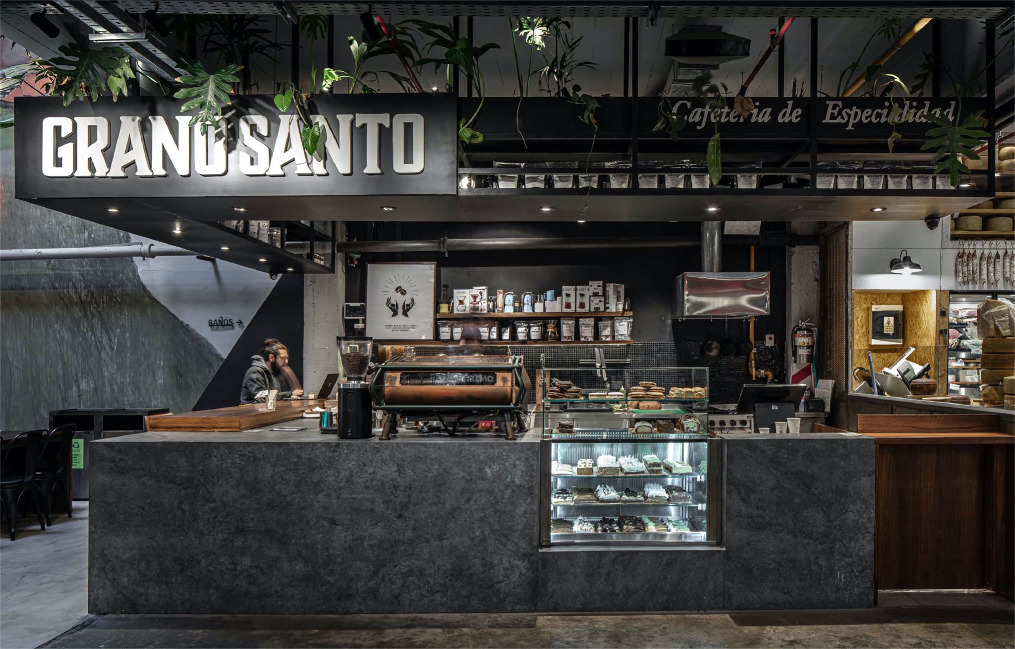
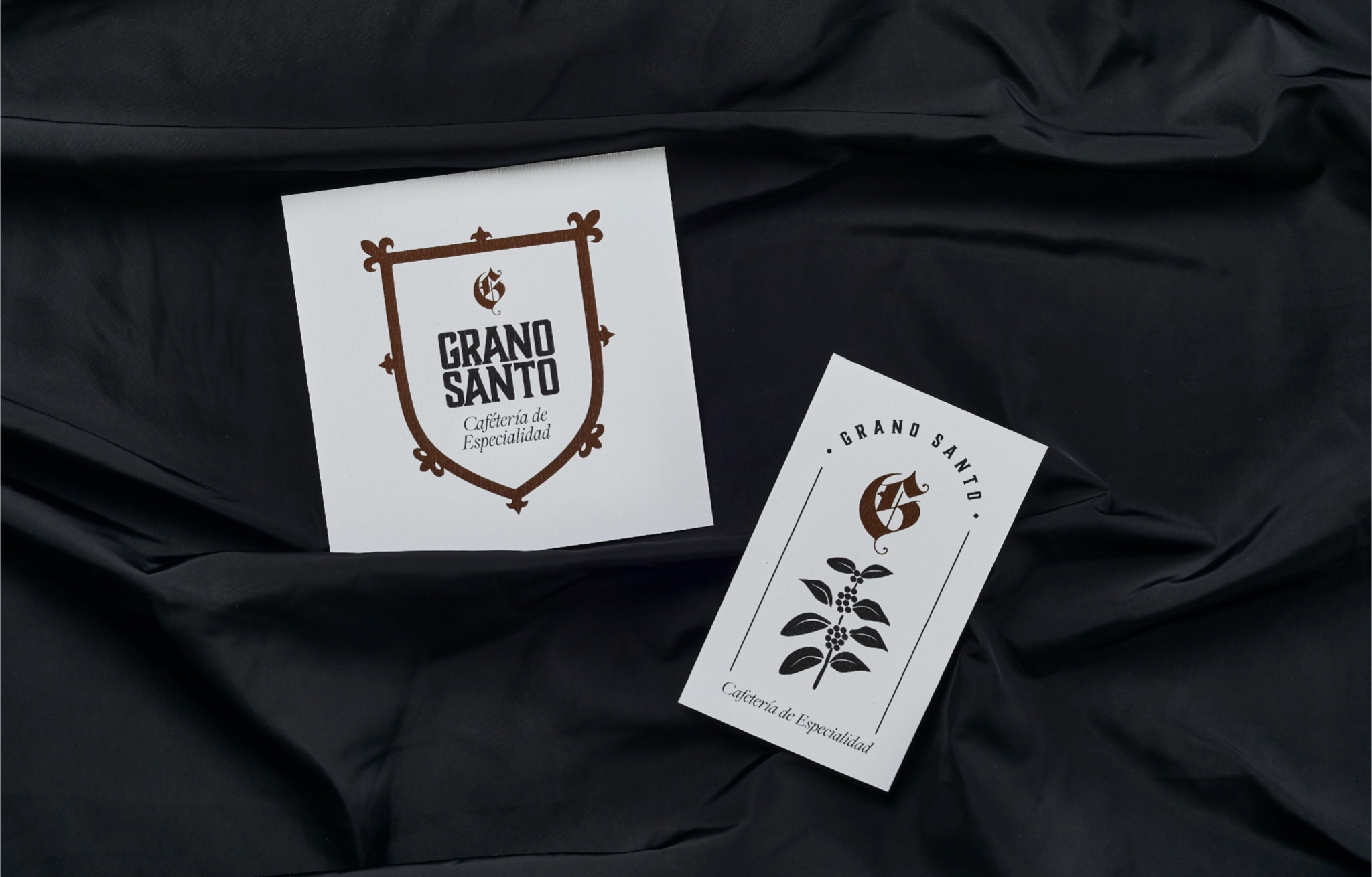
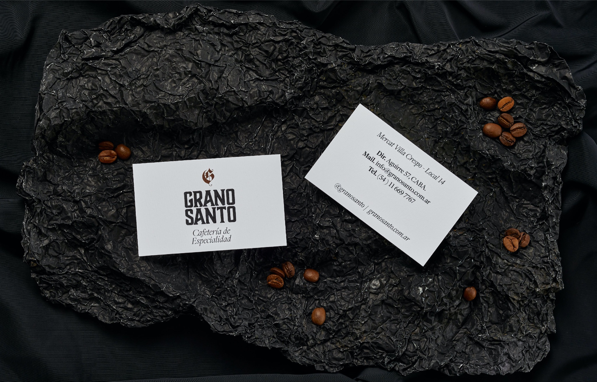
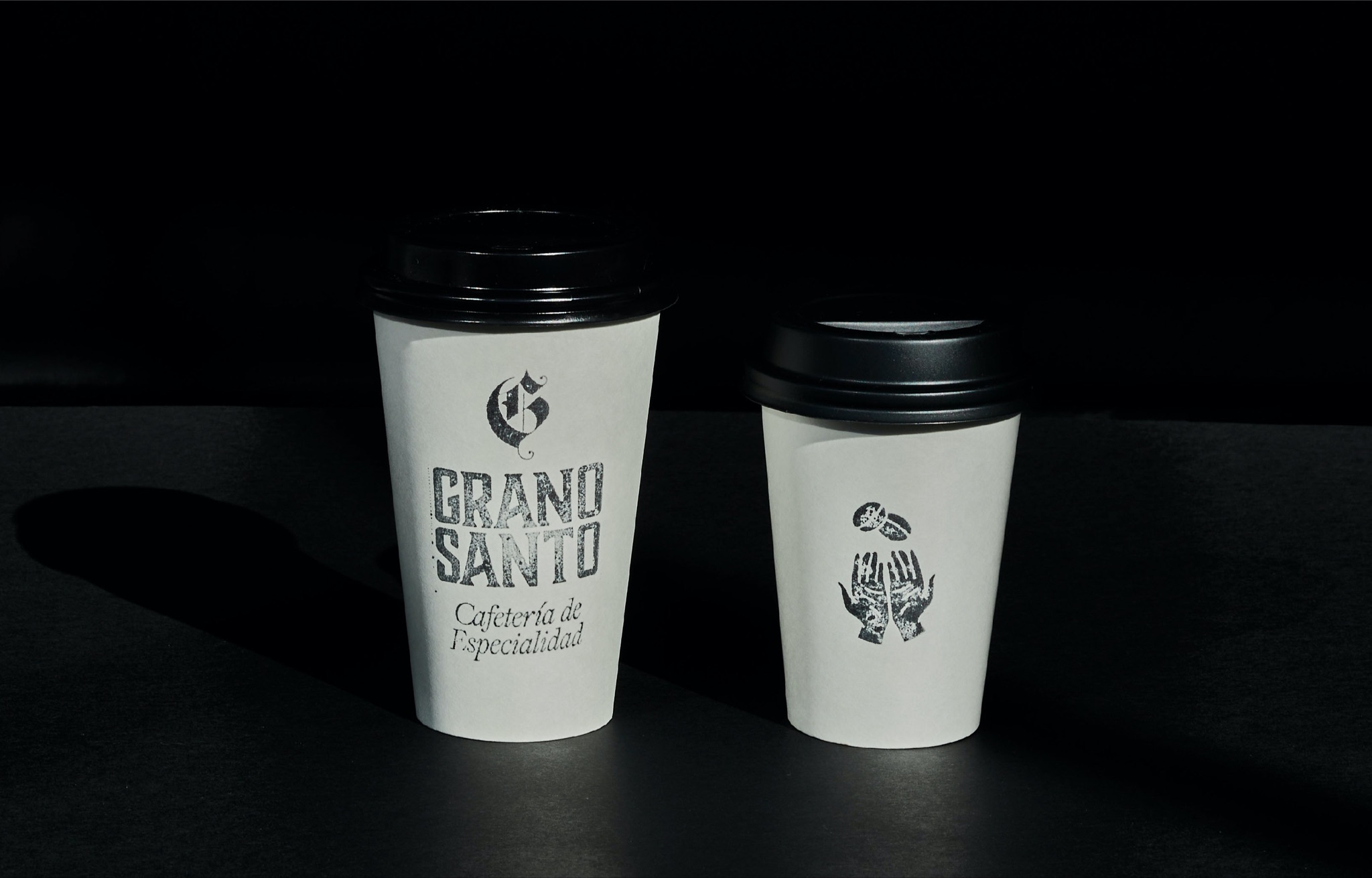
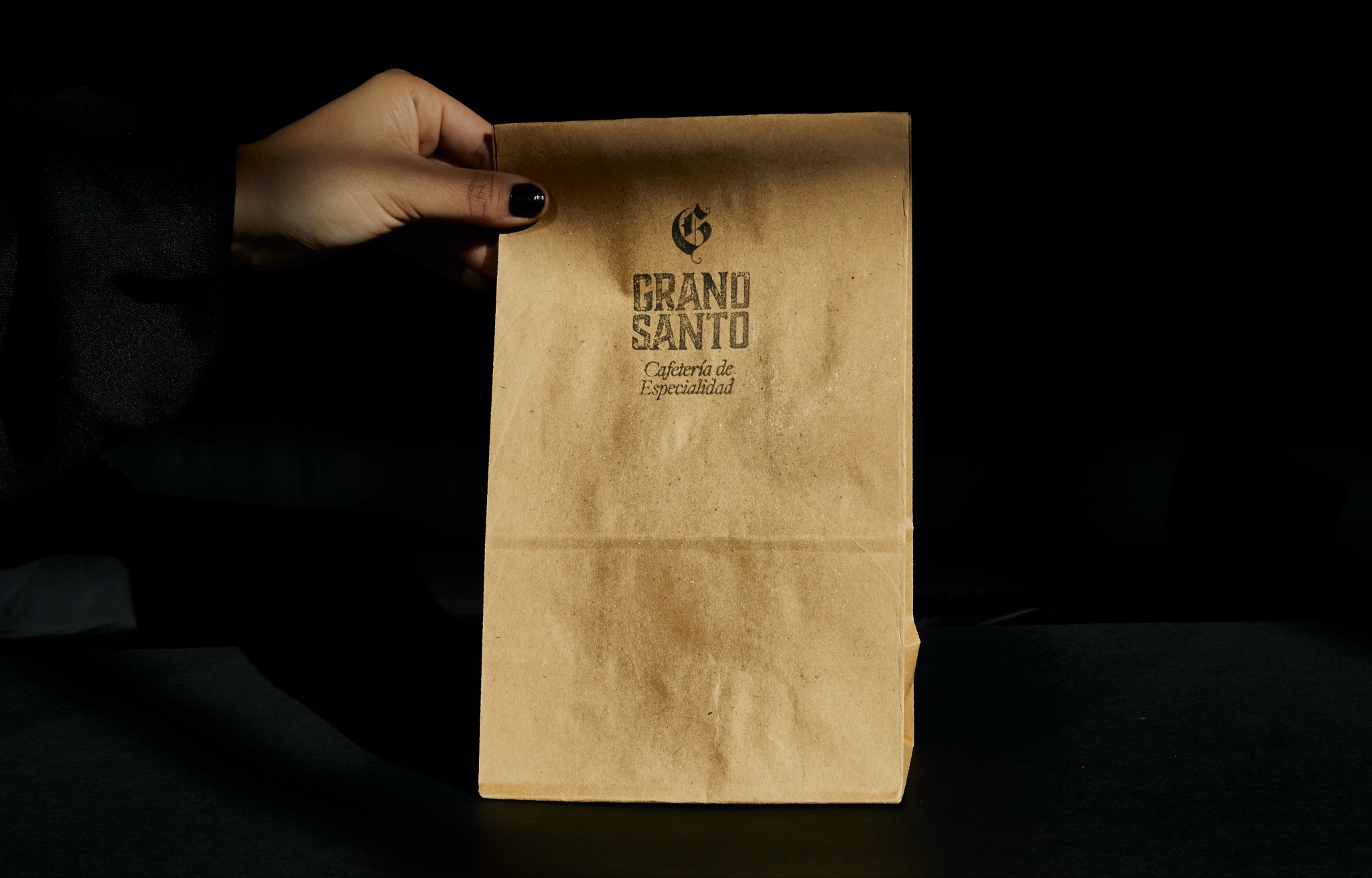
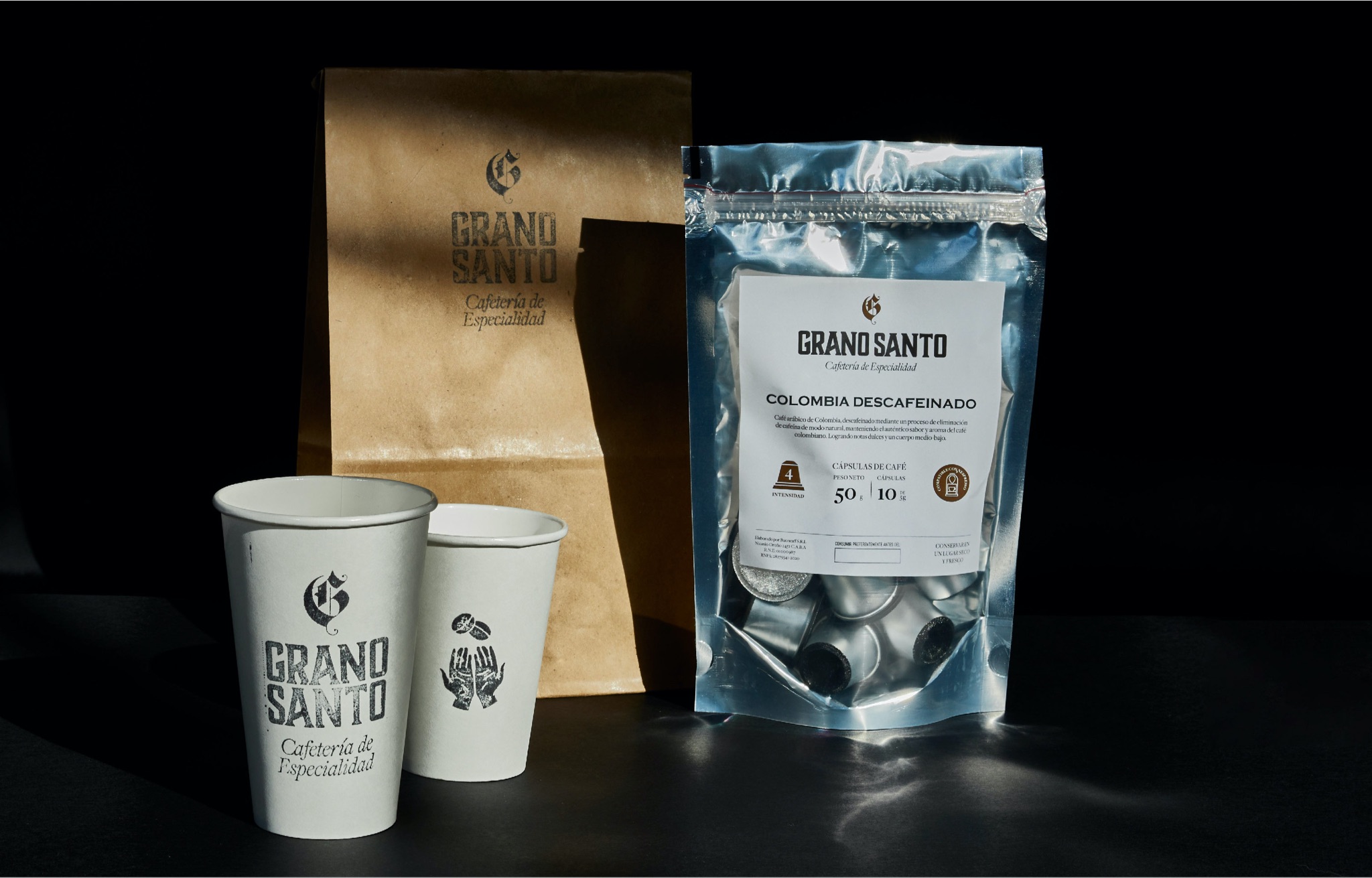
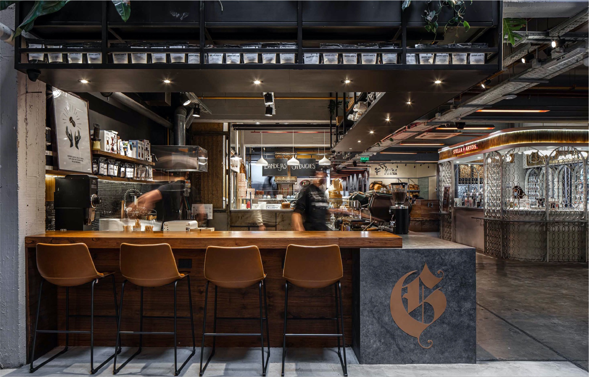
Grano Santo is a specialty coffee shop located in Villa Crespo, Buenos Aires. Estudio Nuar were summoned to create a brand with a retro, "porteño" and cool identity that would value the coffee process, showing it in a simple and attractive way, to bring closer consumers who are not immersed in the field. At the same time, the brand was meant to describe the multiple origins of the product (Kenya, Ethiopia, Guatemala, Costa Rica, Brazil, Colombia) and reinforce the traceability of the grain with clear communication.
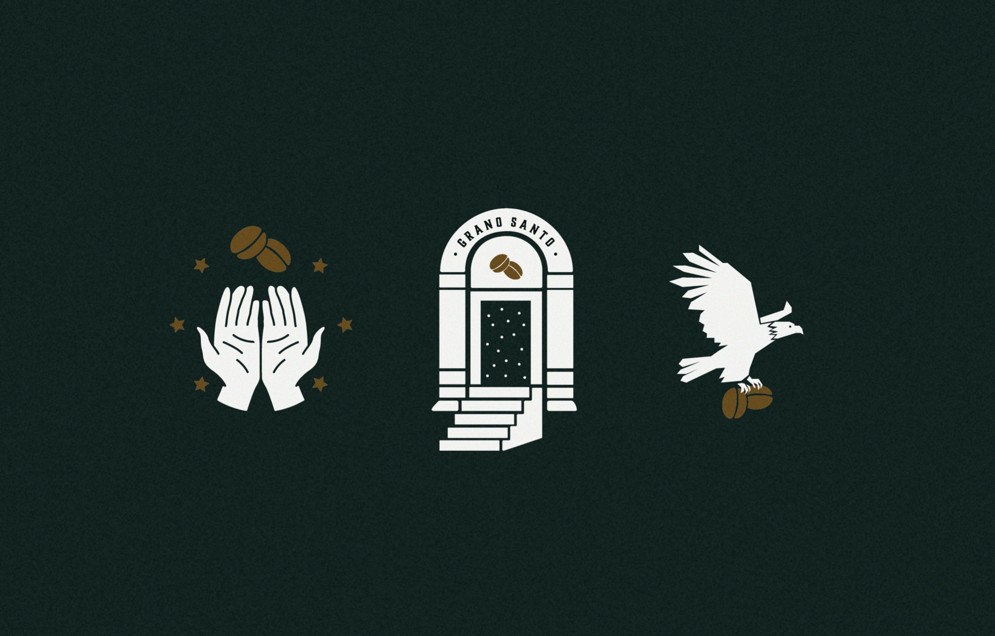
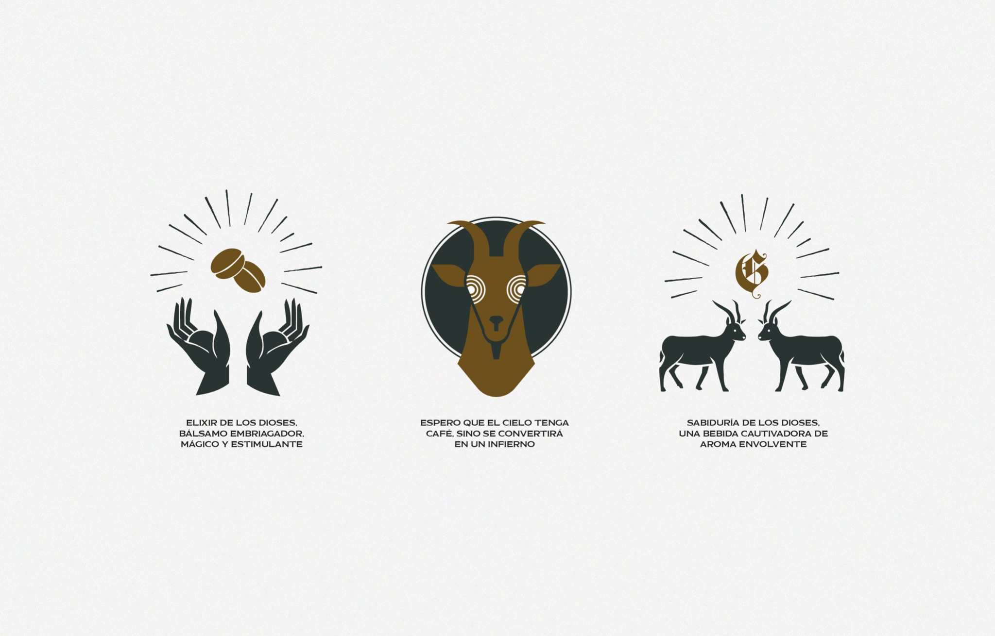
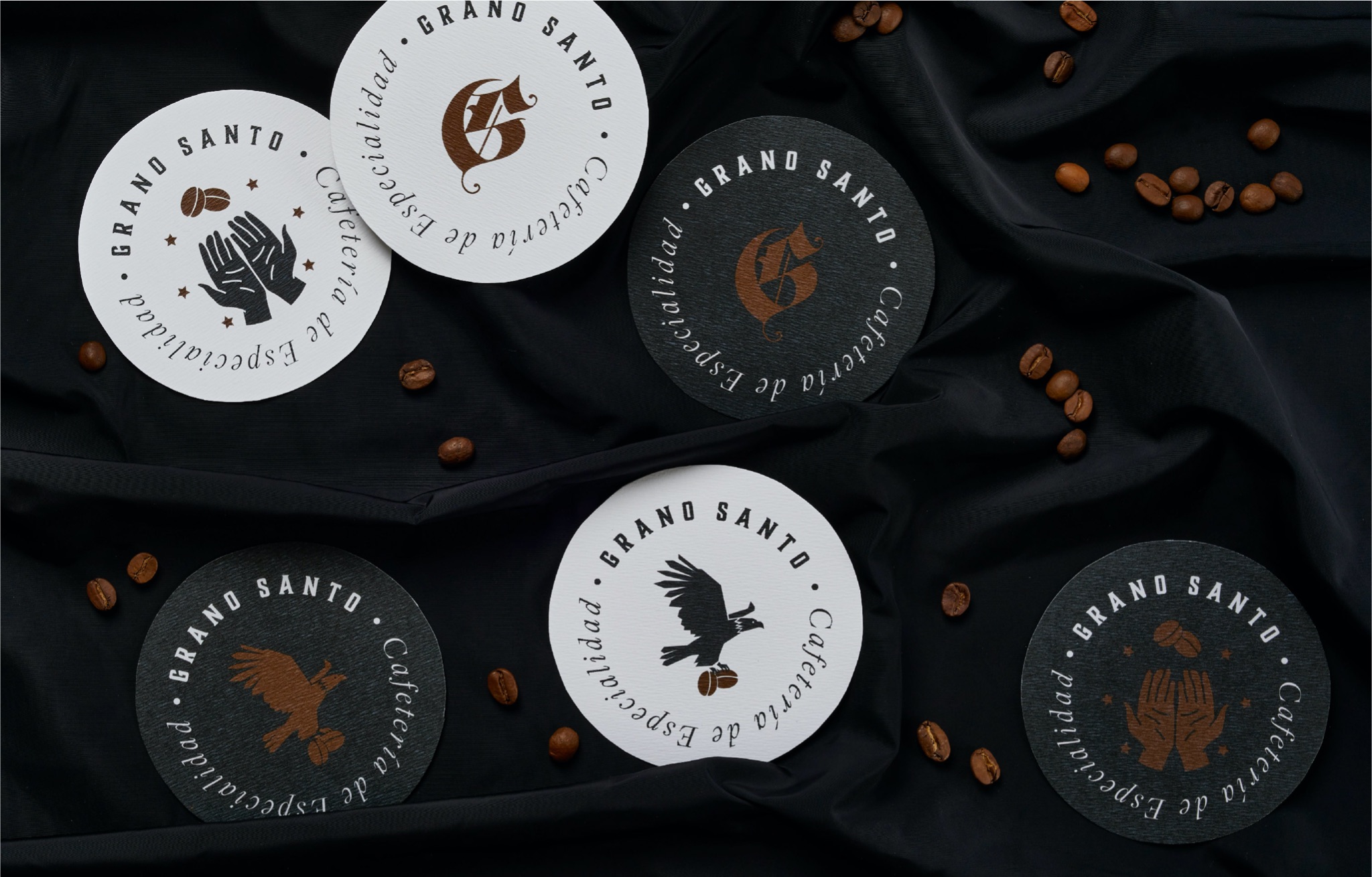
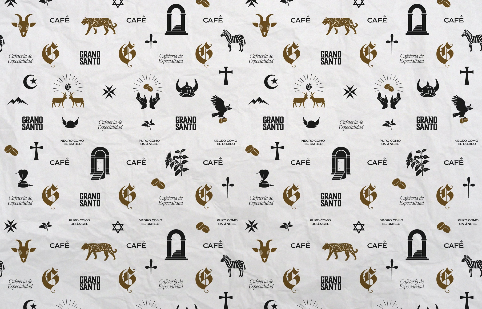
In order to fulfill the request and ensure that the brand had a strong personality, Estudio Nuar took the name ("holy grain") as a conceptual trigger to dive into the world of religions, rituals, and the sacred, studying the history of coffee and rediscovering symbologies that would help us particularize the identity, always playing with irony.
We worked with very varied references to emphasize the multiple origins of the product, as well as the diversity of its consumption (and veneration). We chose fonts with an ancient reminiscence, sober colors that give a dark and stately atmosphere and a system of illustrations that describe different instances of the coffee process. Finally, we reinforced the sacred through the tone of voice and brand phrases.


For more information make sure to check out Estudio Nuar website.


