by AoiroStudio
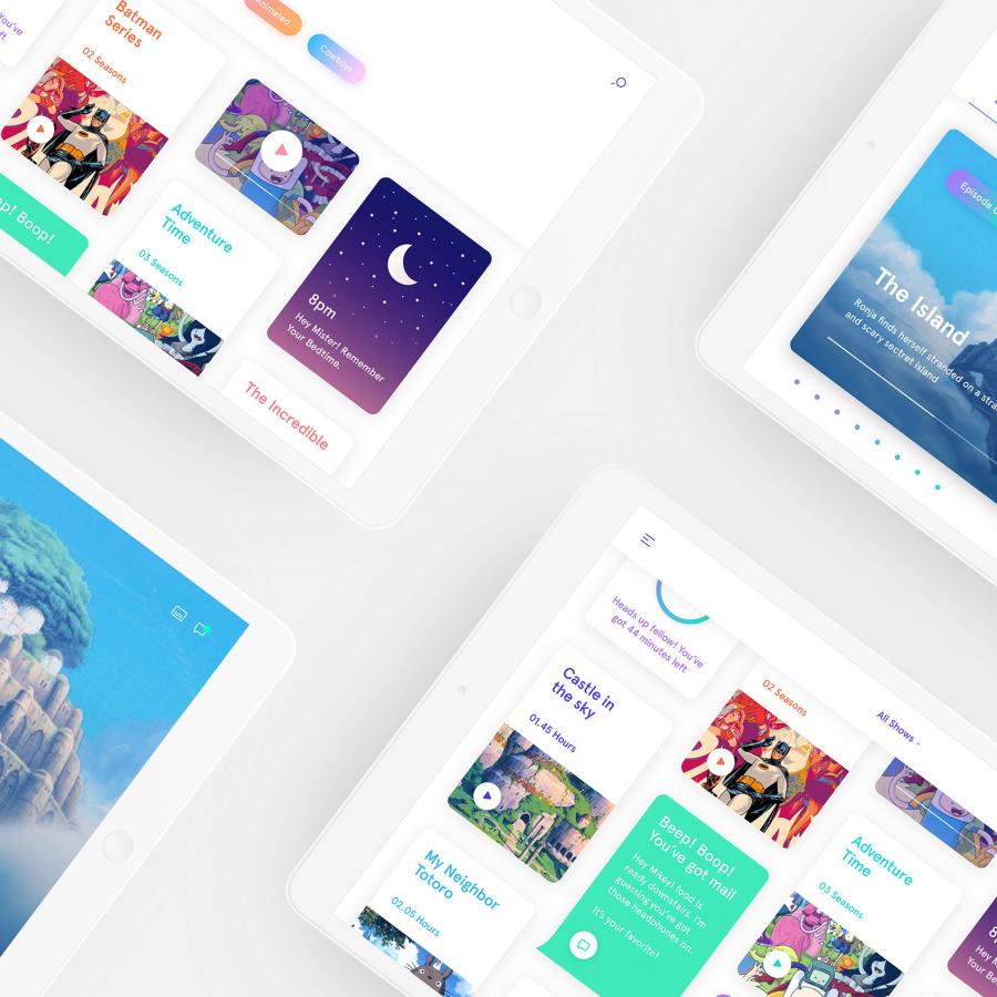
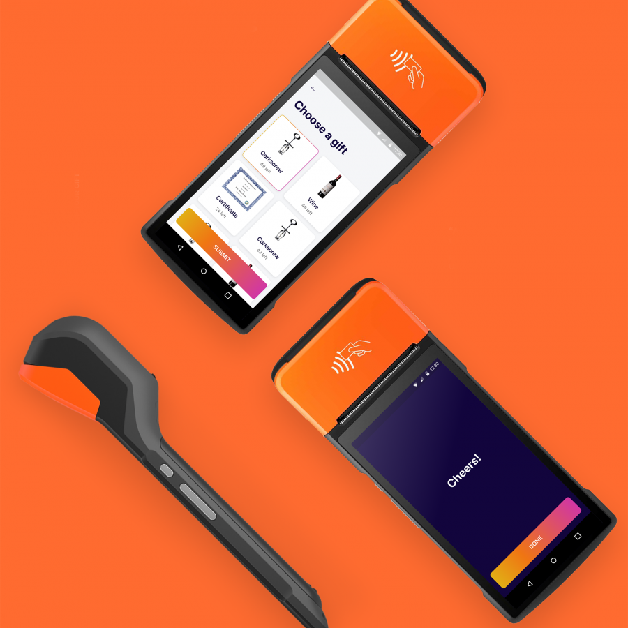
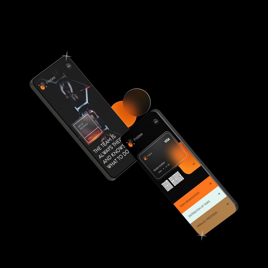
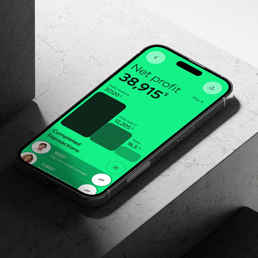
In the bustling city of San Francisco, where innovation and creativity thrive, Rondesignlab, a forward-thinking design agency, has been making waves with their transformative projects. Their latest endeavor involved collaborating with QuickBooks, a renowned financial software company, to modernize their visual style and give it a fresh, contemporary look. With a keen eye for detail and a flair for typography and colors, Rondesignlab has successfully breathed new life into the QuickBooks brand. QuickBooks, a household name in the world of financial management, sought to revitalize their visual identity and stay ahead of the curve in a rapidly evolving market. Recognizing the need for a modern, stylish approach, they turned to Rondesignlab for their expertise in creating visually captivating and impactful designs.
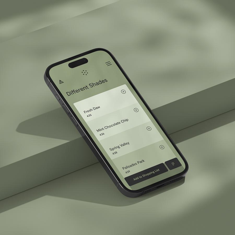
One of the key elements that Rondesignlab tackled in this project was typography. They understood the power of typography to convey personality and evoke emotions. Drawing inspiration from the sleek lines and curves found in modern architecture, Rondesignlab carefully selected a typography style that exuded sophistication and professionalism. The chosen typefaces were not only visually appealing but also legible and versatile, ensuring a seamless integration across QuickBooks' various platforms and marketing materials.
In addition to typography, Rondesignlab explored the creative potential of colors to enhance QuickBooks' visual identity. They carefully curated a palette that struck a harmonious balance between vibrancy and elegance. By incorporating bold, modern hues with more muted tones, Rondesignlab created a visual language that conveyed professionalism, trust, and innovation. This strategic use of colors not only caught the eye but also communicated QuickBooks' commitment to providing cutting-edge financial solutions. By modernizing these elements, Rondesignlab added a touch of contemporary flair to QuickBooks' visual identity, reinforcing their commitment to staying at the forefront of their industry.
The partnership between Rondesignlab and QuickBooks has resulted in a successful visual transformation for the financial software giant. The modernized typography, thoughtfully selected colors, and refined visual elements have given QuickBooks a fresh and contemporary look while retaining its trusted reputation. Rondesignlab's expertise in merging aesthetics with functionality has set QuickBooks on a path to continued success in an ever-evolving industry.
Visual System Refresh
Rondesignlab is a design studio based in San Francisco, CA. You can check out more of their works via the links below:
All product photos are used only for presentation for non-commercial purposes only. All rights reserved.
