Revolutionizing Engine Care: EMOIL's Visual Identity and Packaging Design
Delve deep into EMOIL's branding journey, a synergy of visual identity and packaging design, capturing the essence of automotive care excellence.
The design landscape is constantly evolving, and with the ever-increasing demand for visual storytelling, branding has become an art of its own. Enter EMOIL, a trailblazer in the world of machine oil branding, immaculately brought to life by the creative prowess of Tim Harrison and Tom Bennett.
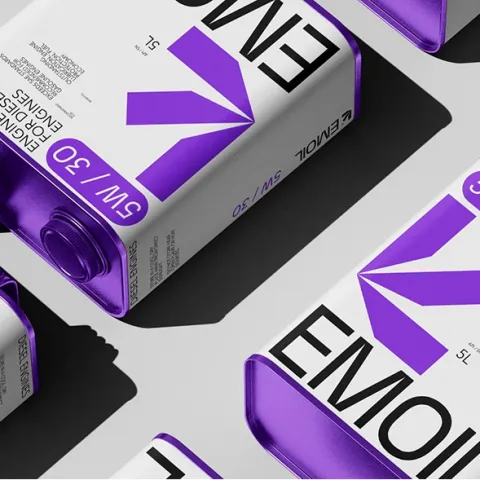
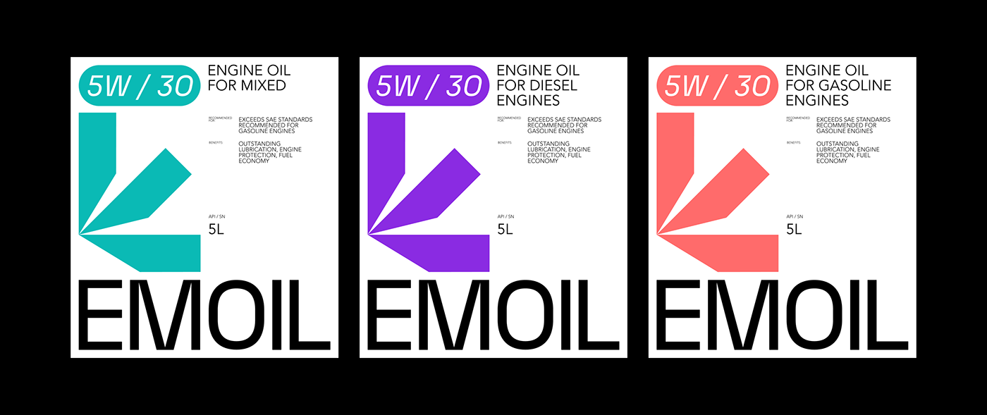
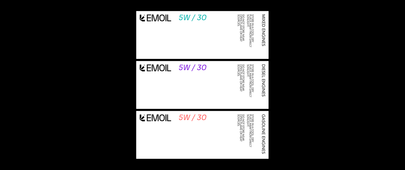
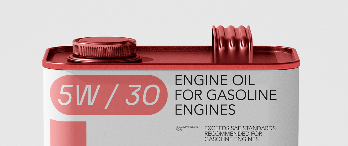
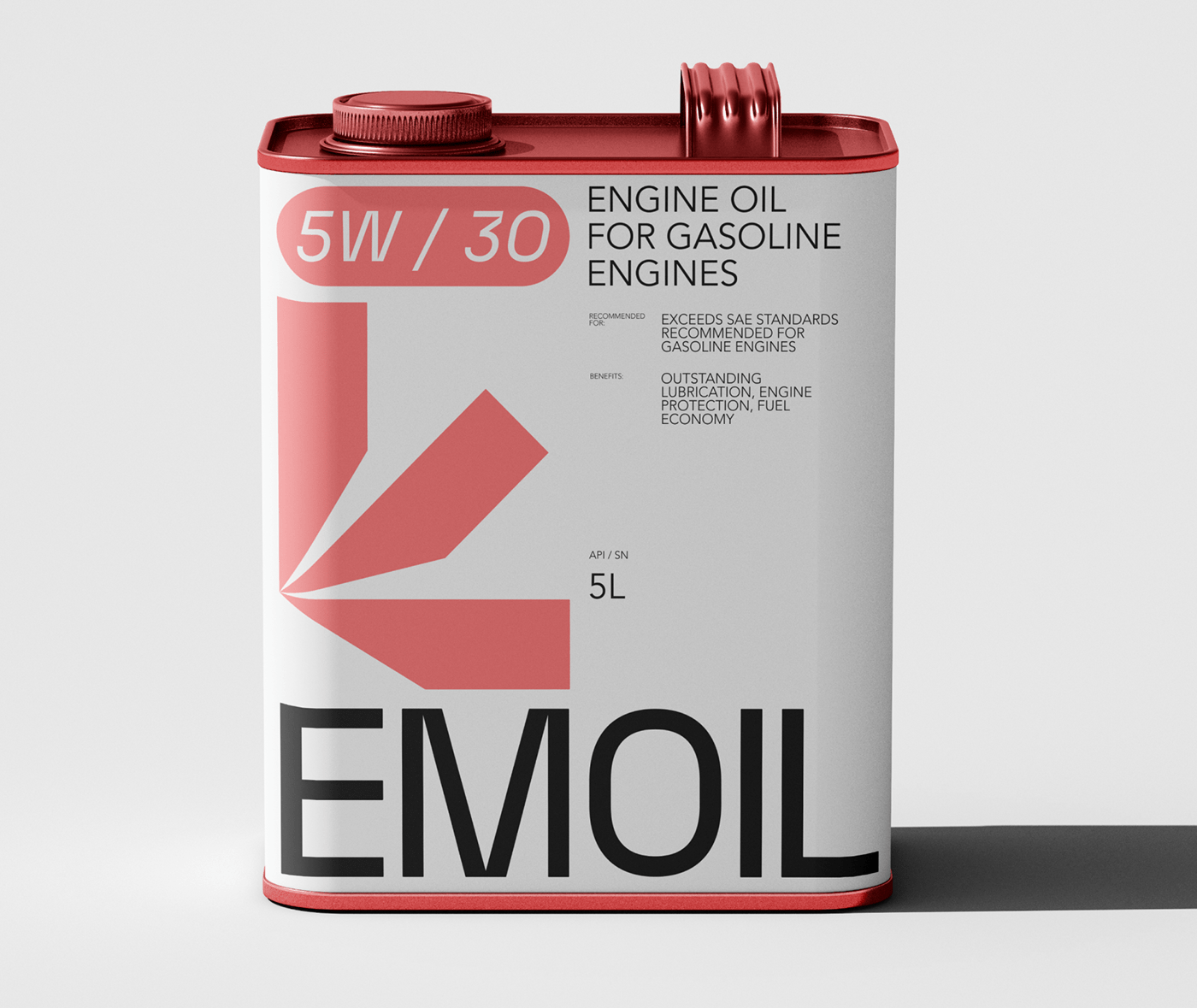
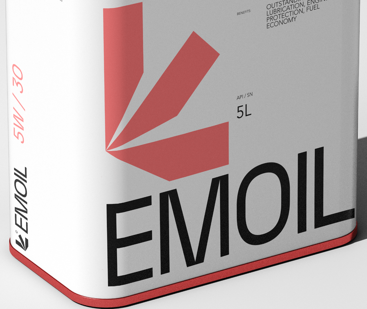
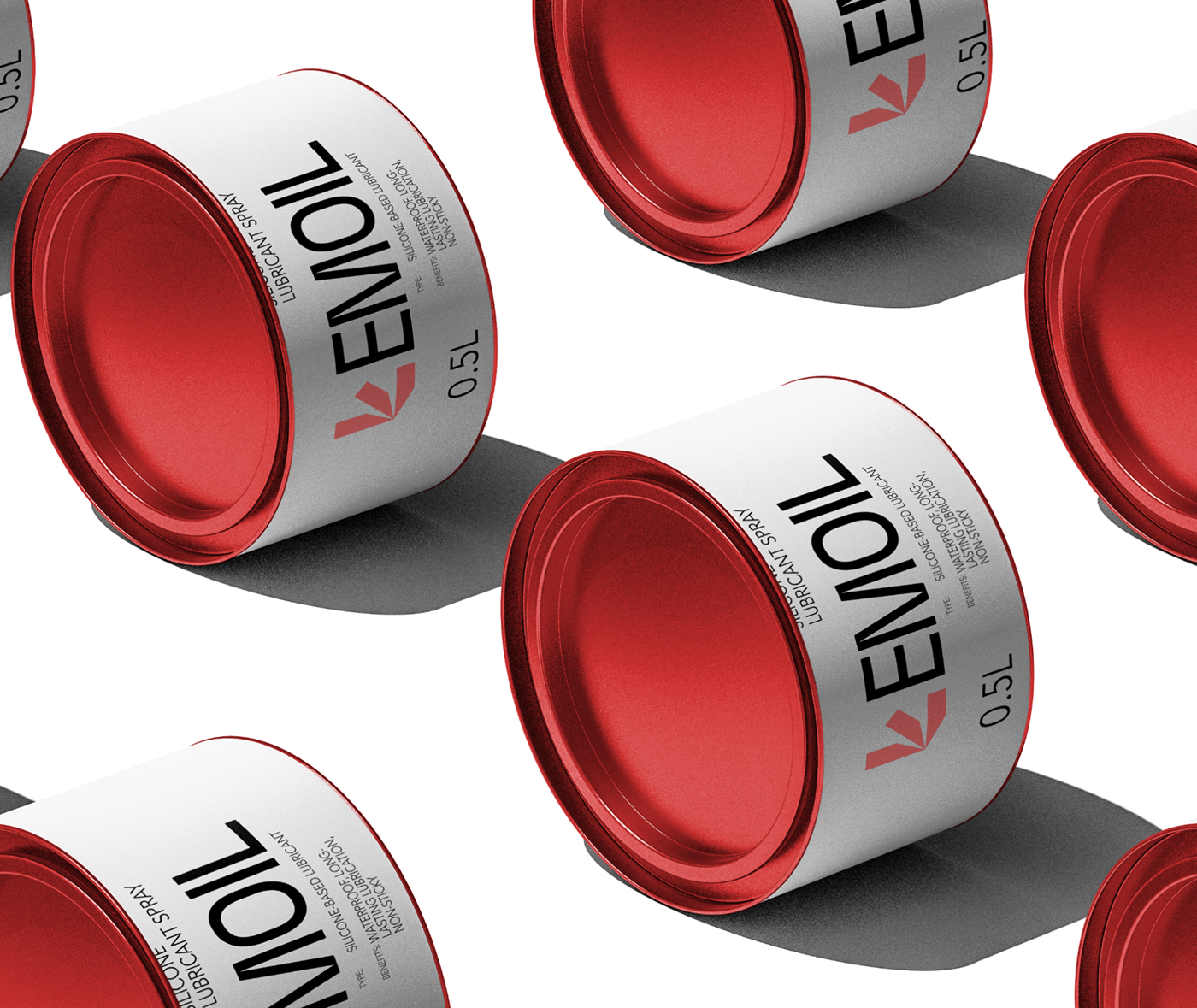
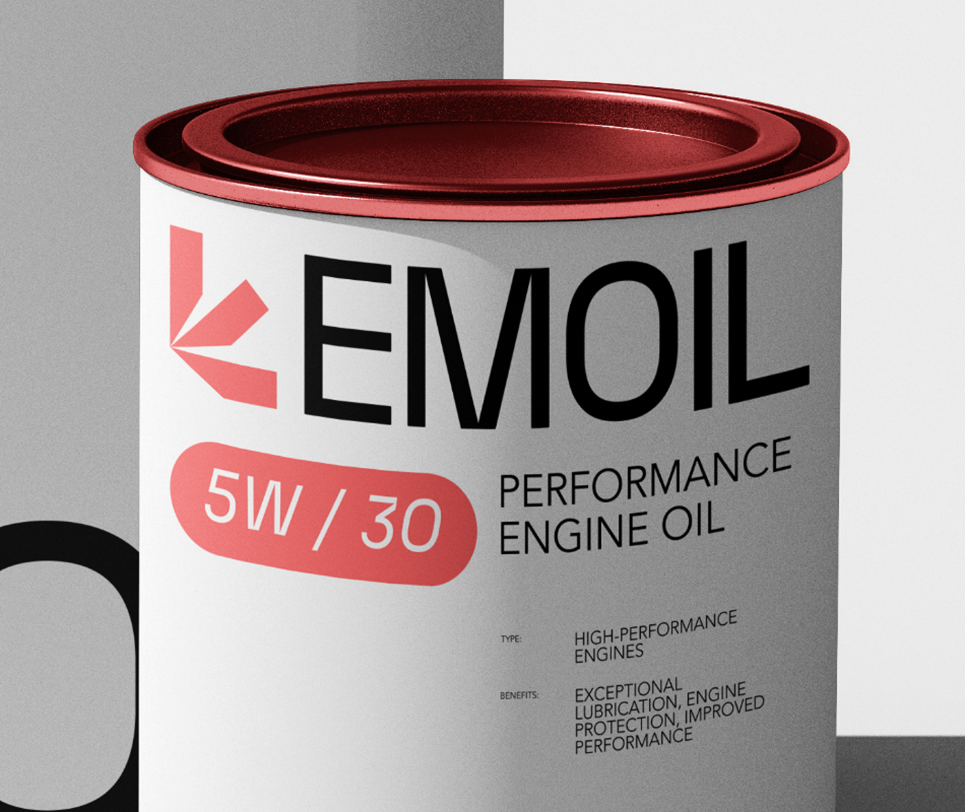
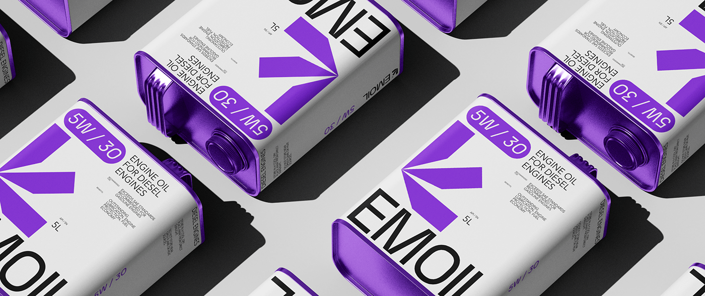
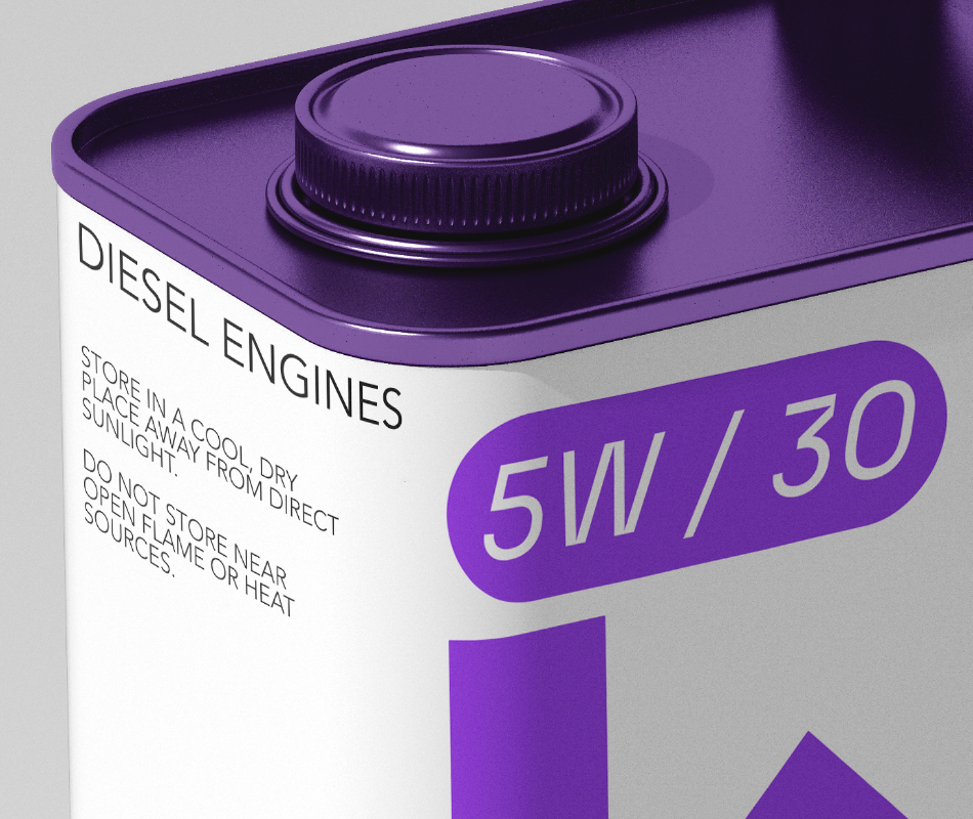
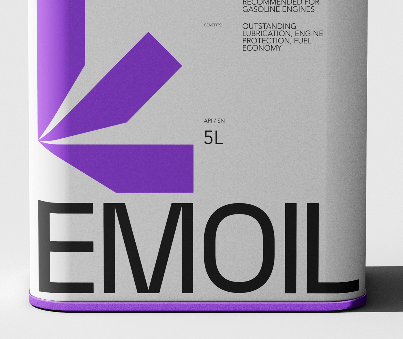
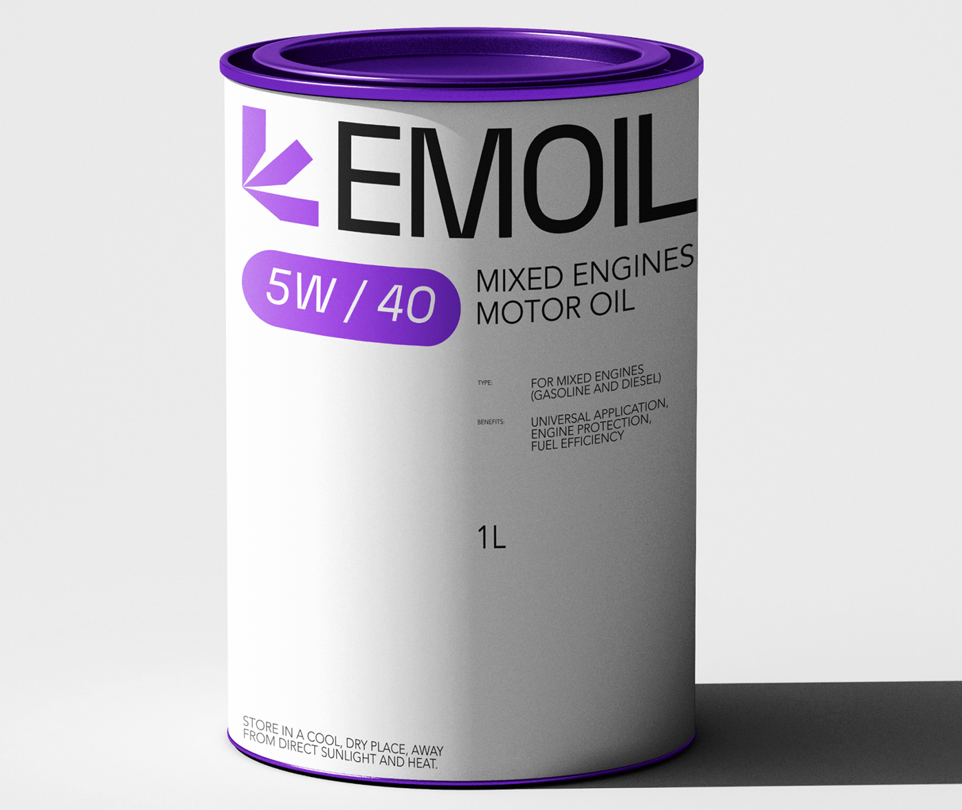
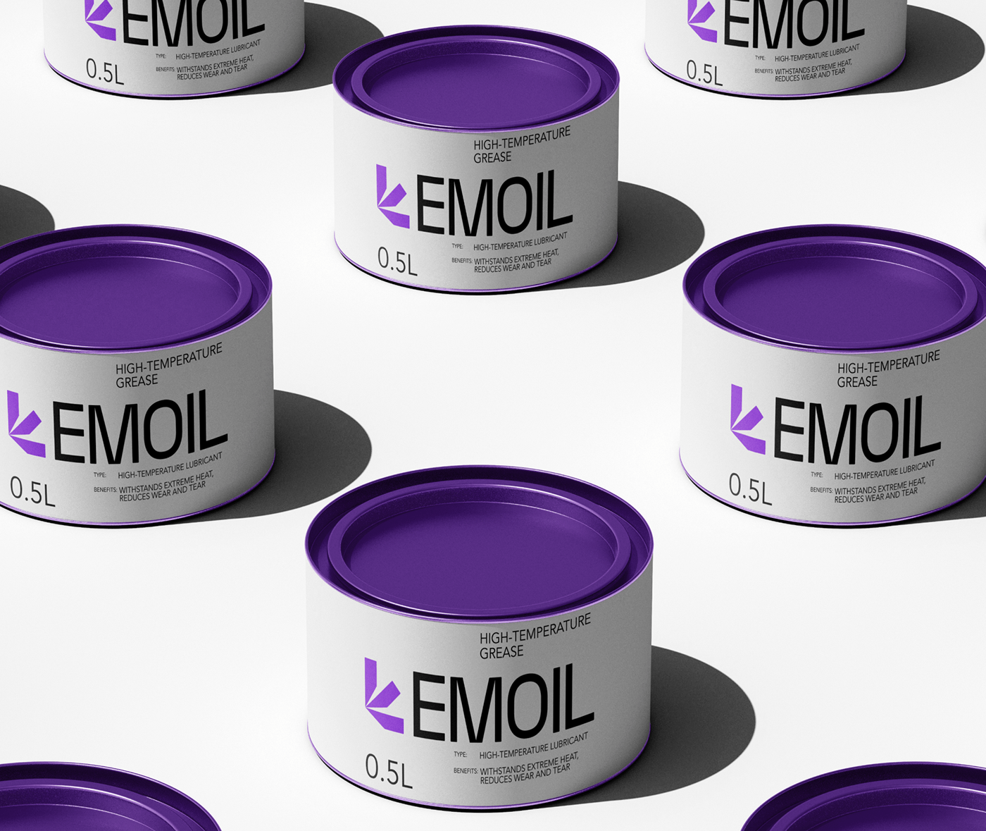
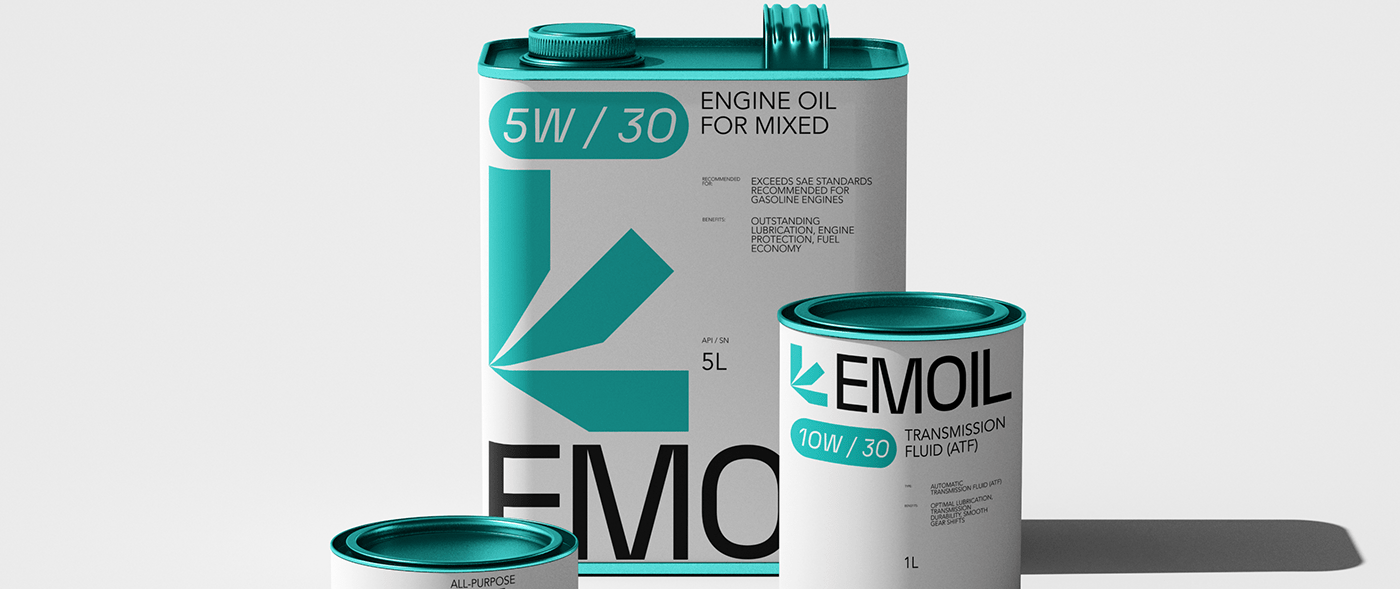
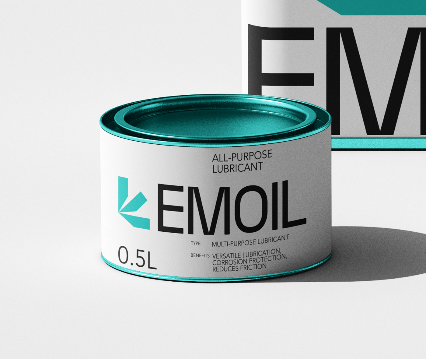
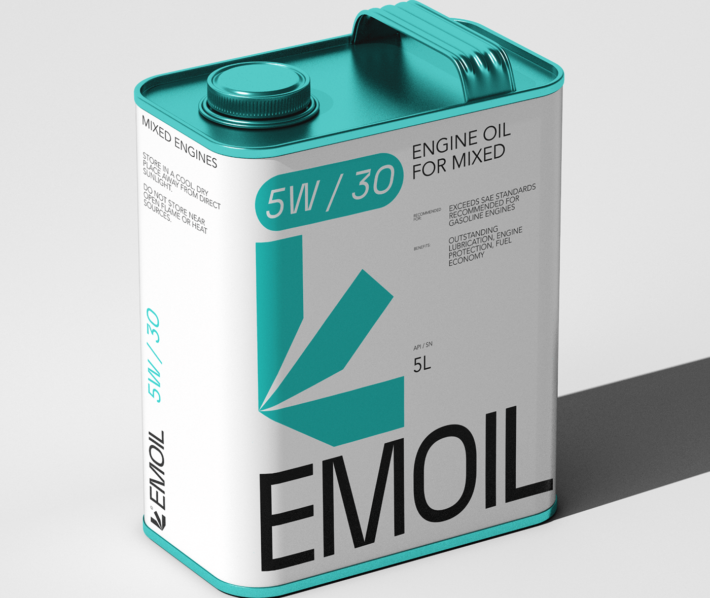
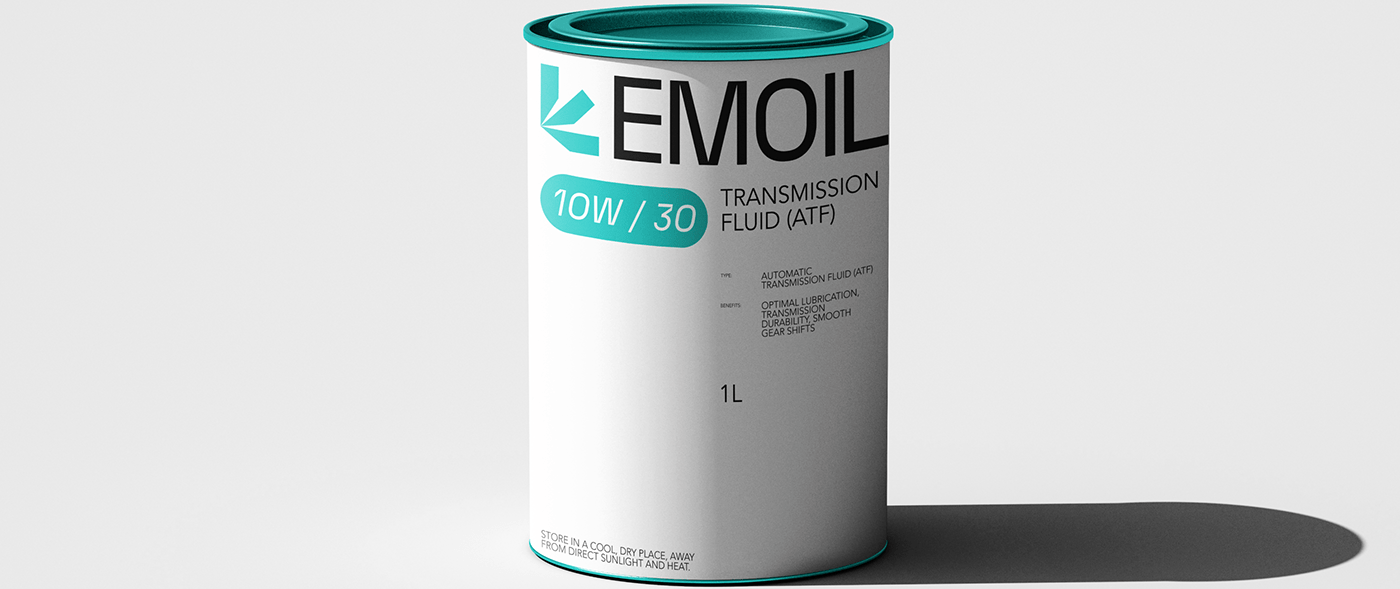
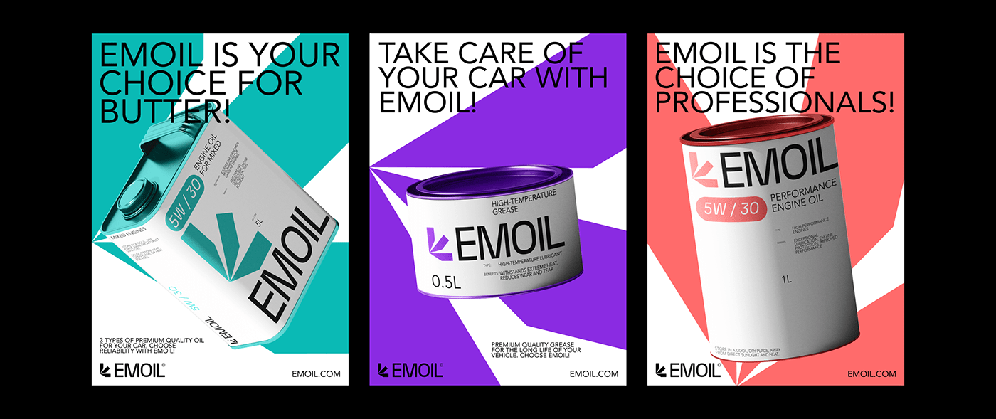
The visual identity of EMOIL is a seamless blend of form and function. The packaging design showcases three containers, each meticulously designed to depict oil pouring into an engine. This powerful imagery doesn't just offer a literal interpretation of the product's application but stands as a testament to EMOIL's commitment to vehicle care. Every drop symbolizes their unwavering dedication to quality, care, and the raw power that their product brings to engines.
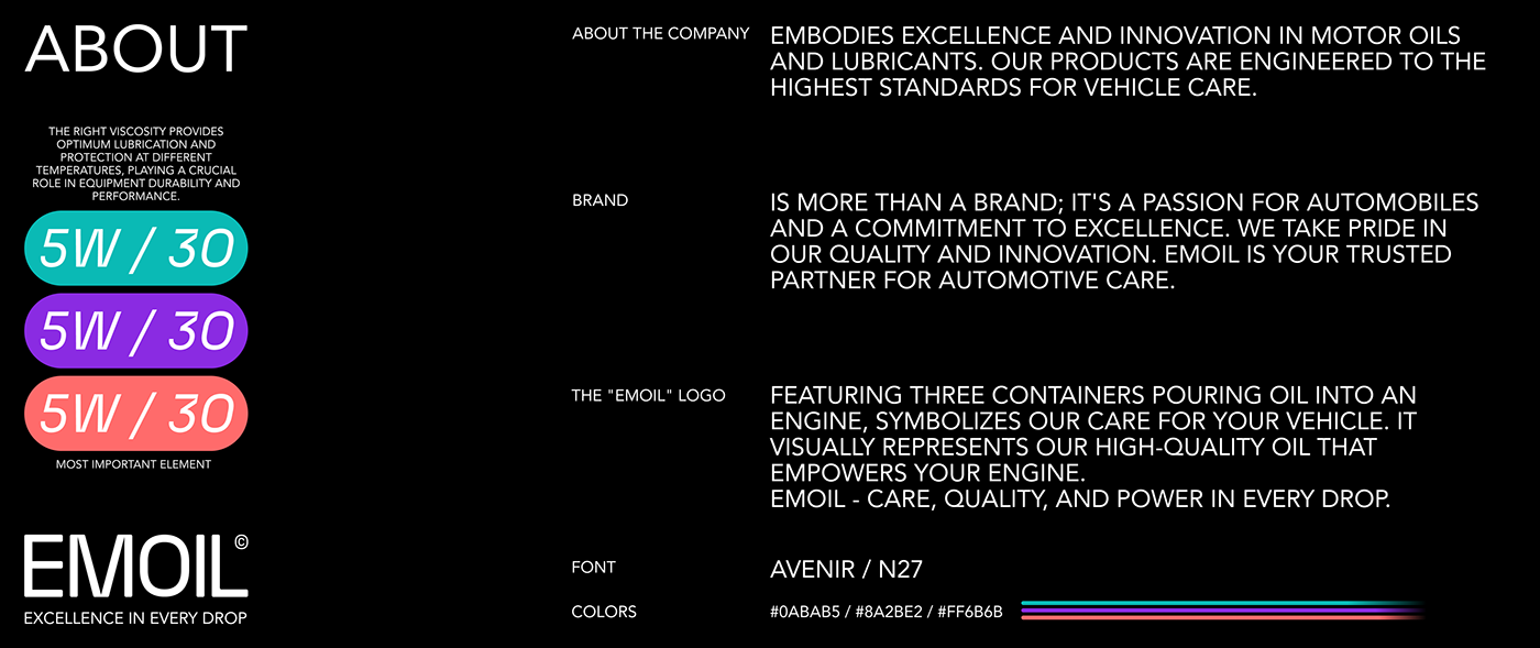
Purple and teal dominate the color palette, lending a regal yet contemporary vibe to the packaging. The bold typography choice, with its crisp edges, complements the brand's essence—excellence and innovation. It's evident that the design isn't merely about aesthetics but resonates deeply with what EMOIL represents. It’s not just oil; it’s a beacon of quality, a promise of performance, and a commitment to automotive excellence.
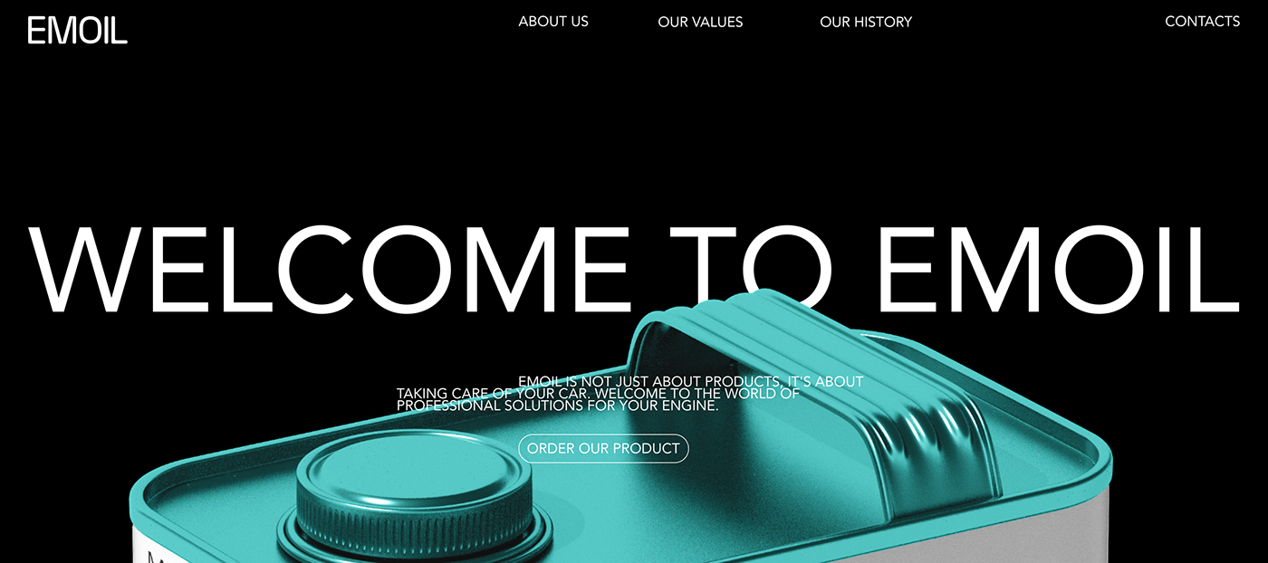
Moreover, the strategic use of whitespace ensures that the branding doesn't overwhelm, letting the product speak for itself. The minimalist approach speaks volumes, emphasizing the brand's core values without the need for excessive flair or ornamentation.
In the vast ocean of branding, EMOIL stands out, not just for its product but for its visual identity that exudes passion for automobiles. It’s more than just a brand; it's a narrative of trust, excellence, and innovation. Through this cohesive packaging design, EMOIL has successfully positioned itself as not just a choice, but a trusted partner for automotive care.
EMOIL's branding journey is a testament to the power of design. It encapsulates the essence of the brand, painting a vivid picture of quality, care, and unparalleled excellence in motor oils and lubricants.
Branding, packaging design and visual identity


For more information check out Tim Harrison and Tom Bennett on Behance.