by abduzeedo
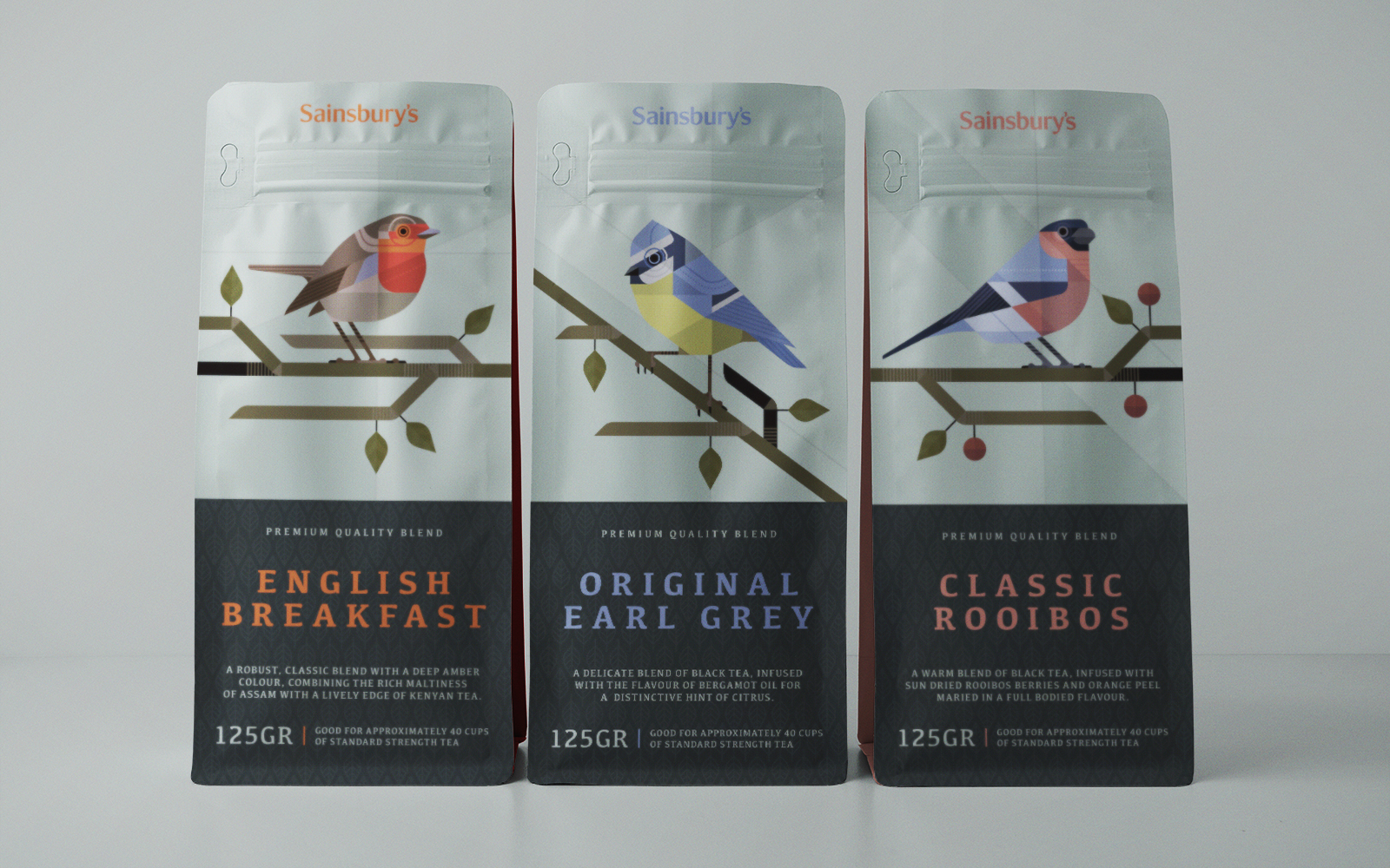
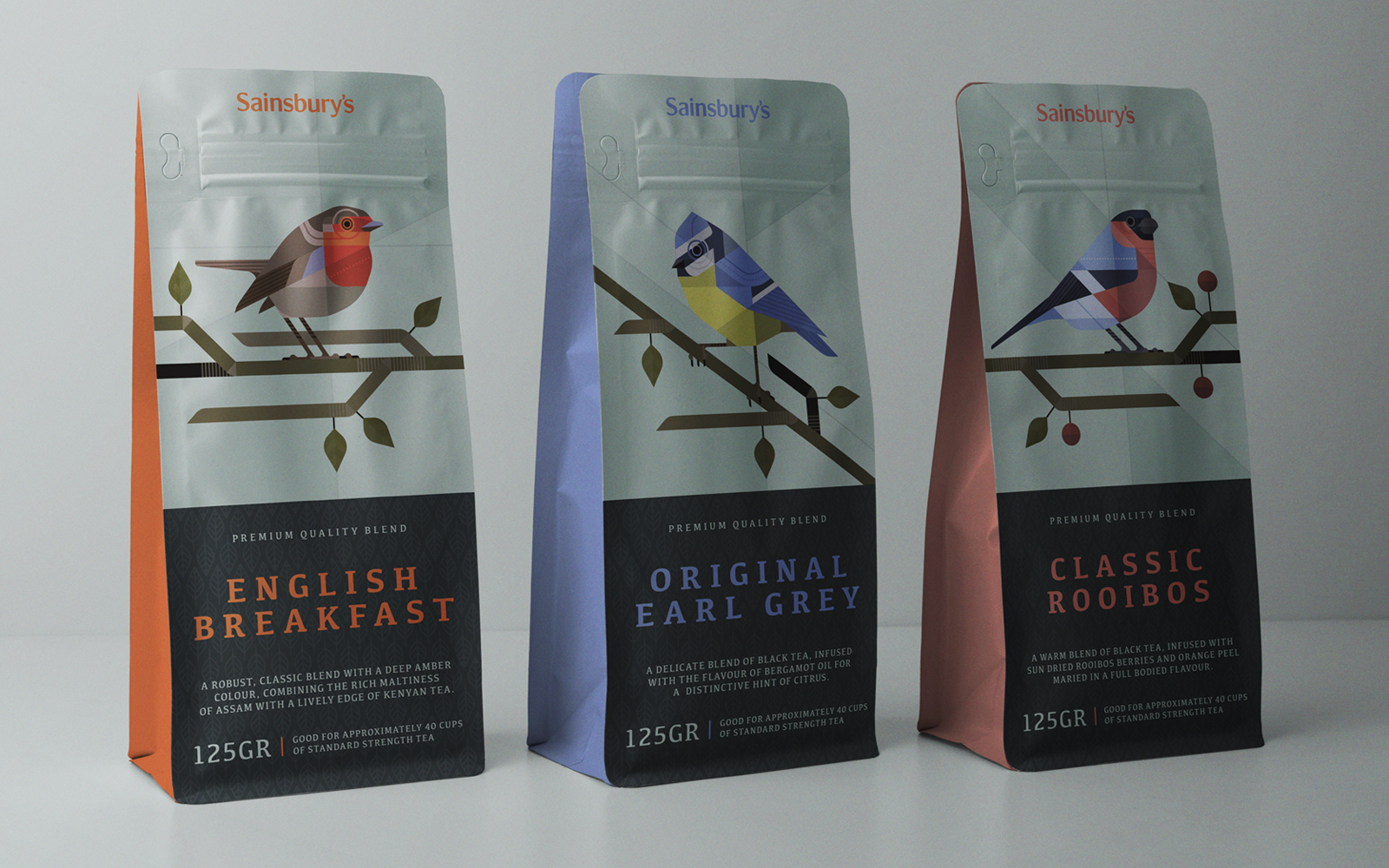
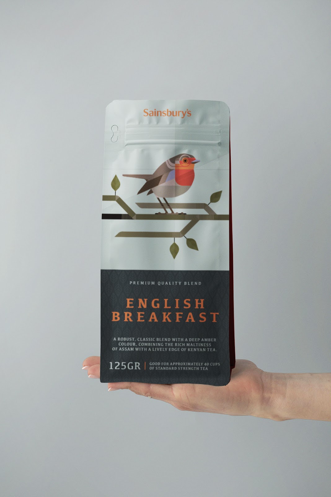
3rd Floor (Bart De Keyzer) love for everything British and experimenting with different illustration styles resulted in this self initiated (concept) project. Like many graphic designers Bart needs to regularly create personal work in order to maintain my sanity. This concept for tea packaging and the accompanying campaign is an example of that.
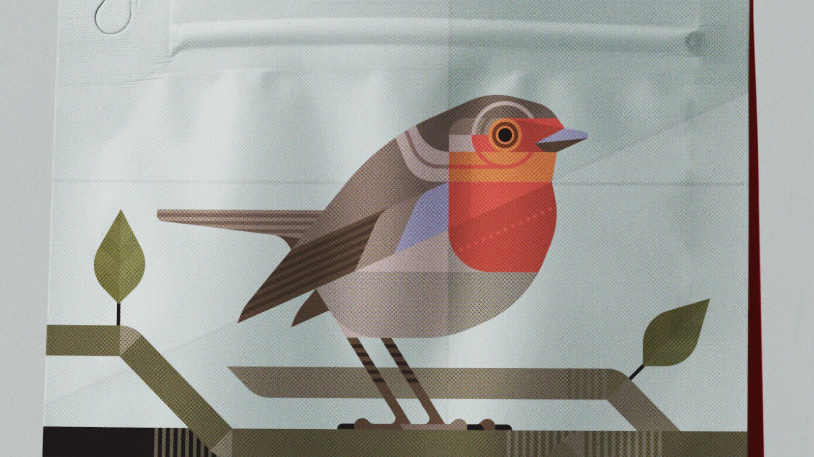
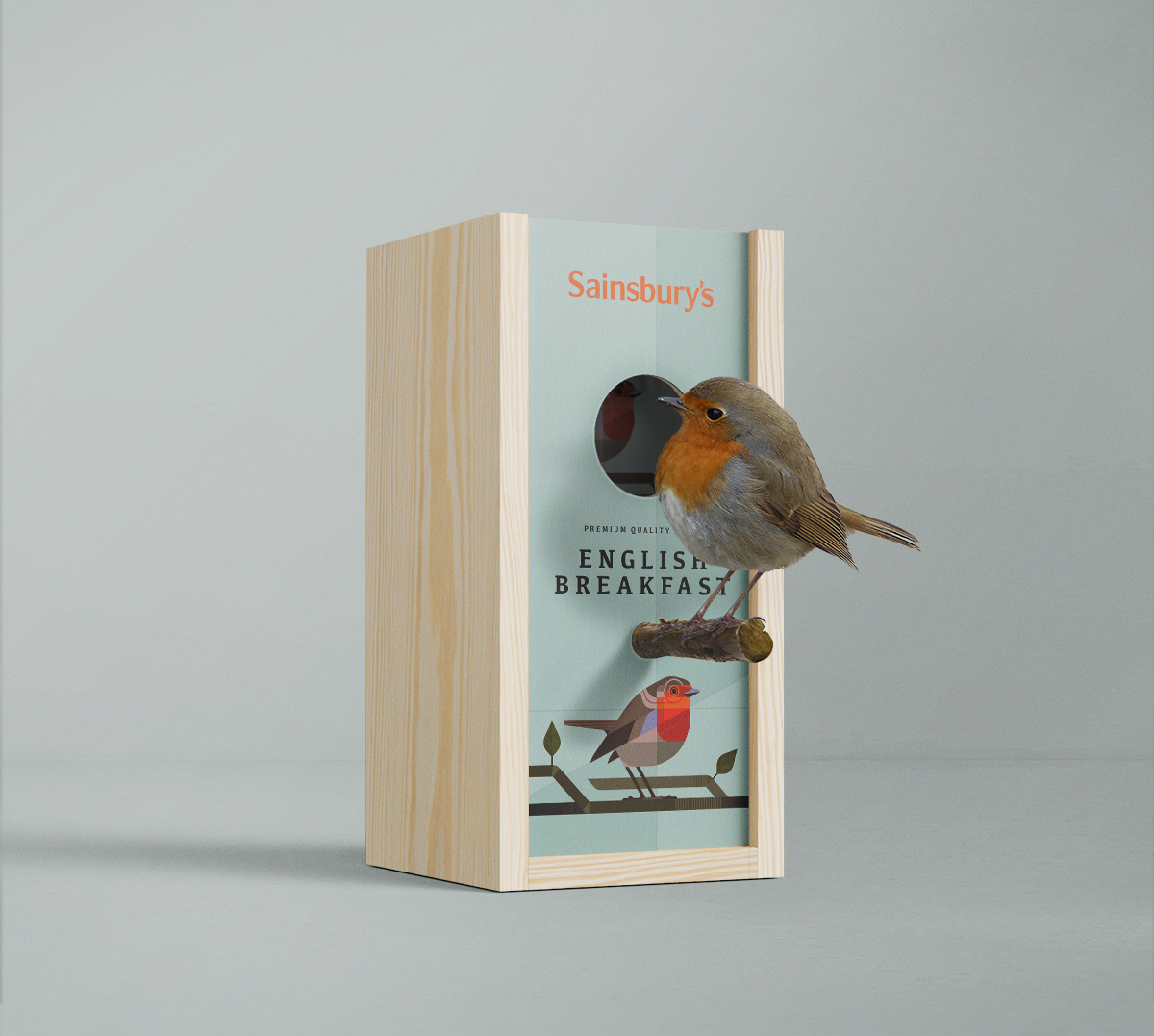
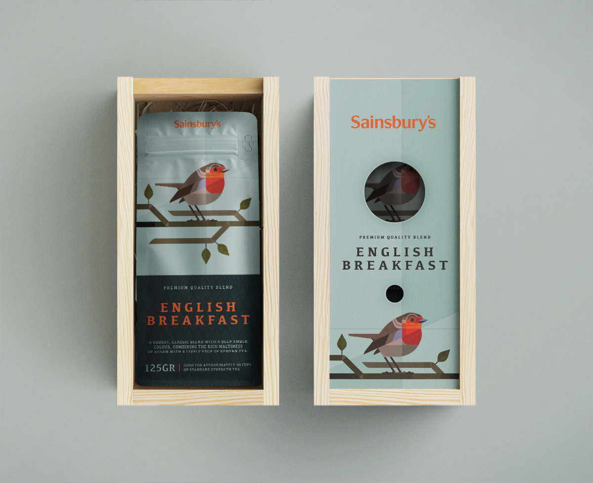
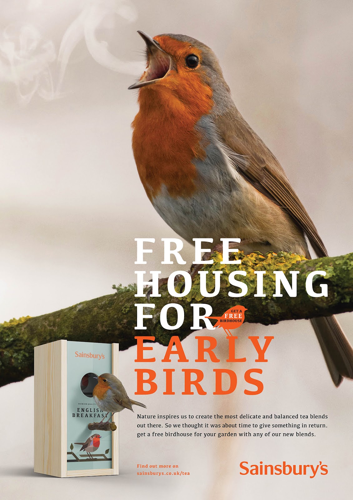
The British aren’t just fond of their tea, they quite like birds as well. So what started out as a set of experimental illustrations of birds based on geometrical shapes and a limited color pallet evolved into a set of packaging designs for tea.
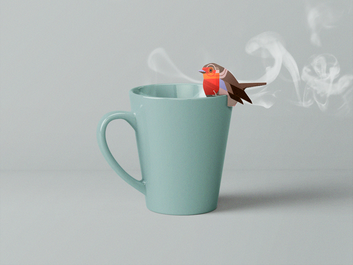
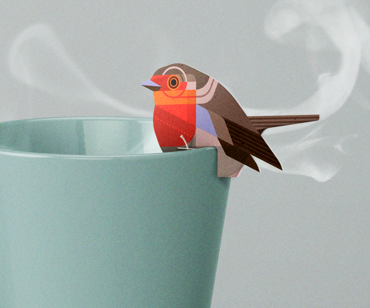
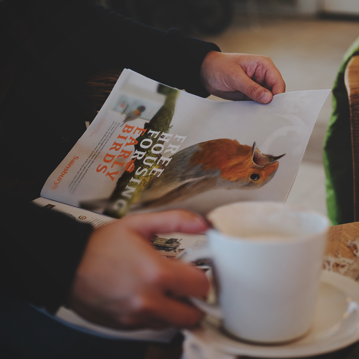
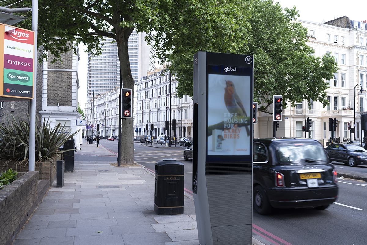
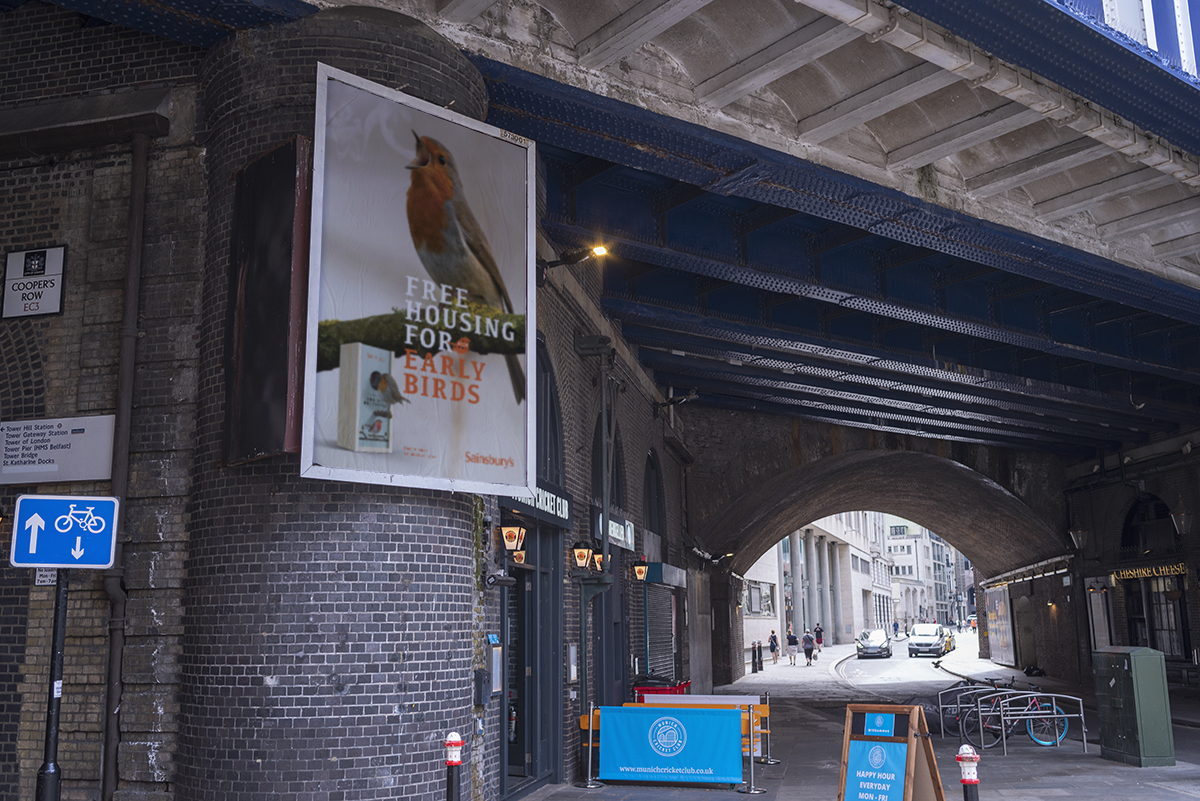
Next to those I’ve also designed the little labels that go on the actual teabags and a give-away; a basic birdhouse; that doubles as a gift box for the packaging similar to the ones that are used for wine bottles. A simple advert and poster complete the set.
For more information make sure to check out 3rd Floor website.


