by abduzeedo
Splinker ID sports branding by Roma Erohnovich and Red Keds: bold tech lettering, a clay-court orange palette, athletic icons, and bold 3D sport mockups.
The startup sits at the intersection of professional sports and social media. Its platform connects athletes, fans, and enthusiasts with brands ready to invest in athletic culture. That dual audience — elite performers and passionate community — drives every design decision in this identity system.
Sports Branding Built on Architecture and Motion
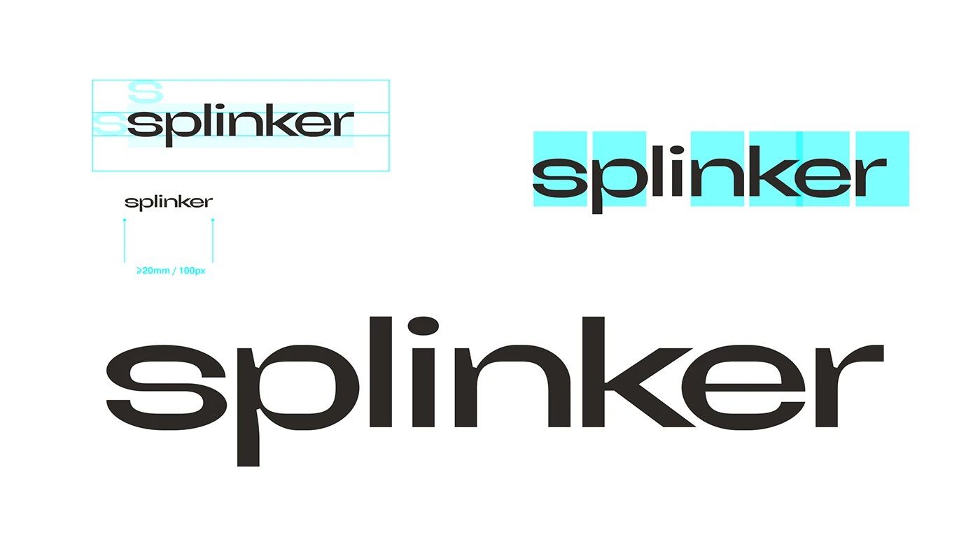
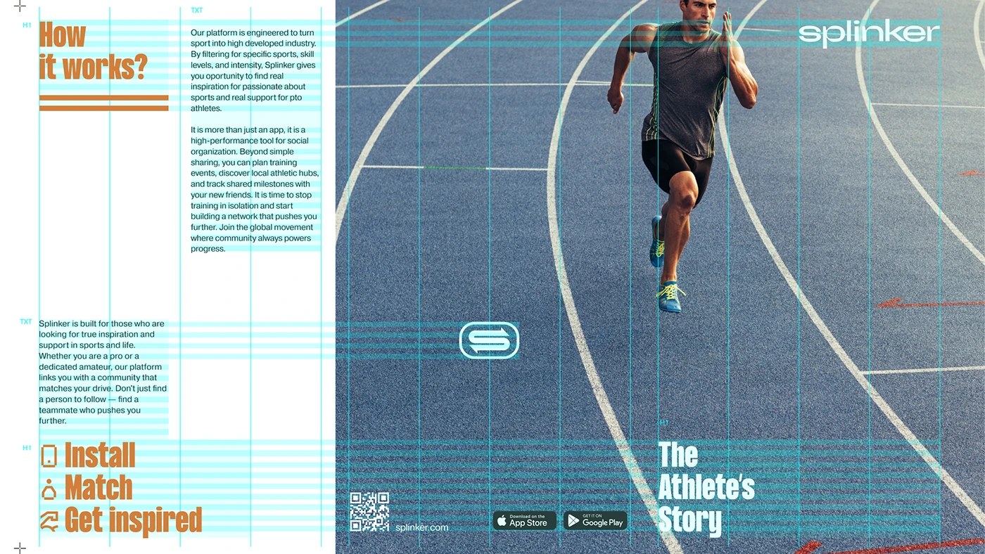
The visual system starts with a deliberate tension. On one side, a classical architectural foundation gives the logo its structural clarity. On the other, hyper-contemporary tech lettering injects forward momentum. The wordmark "splinker" uses a custom-drawn sans-serif with compressed proportions and tight spacing — it reads as disciplined, competitive, fast.
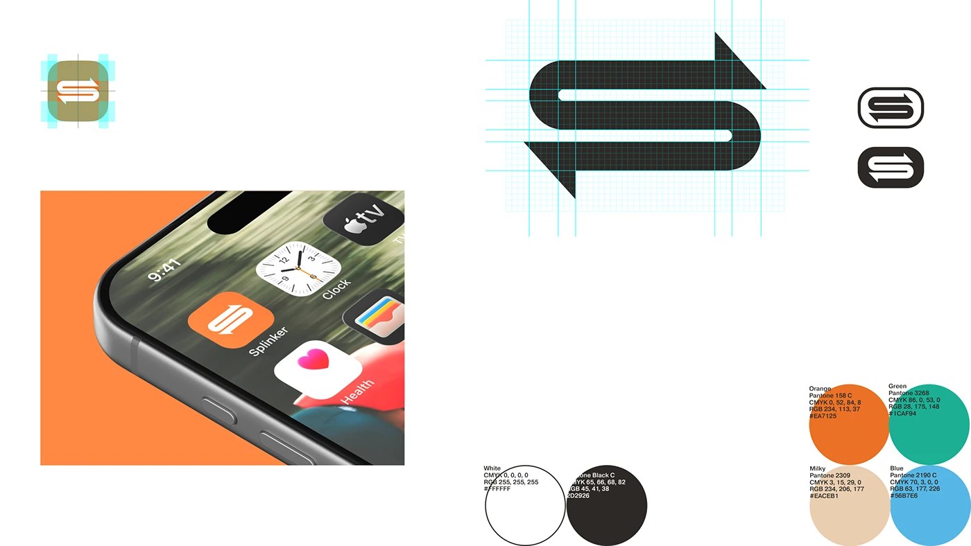
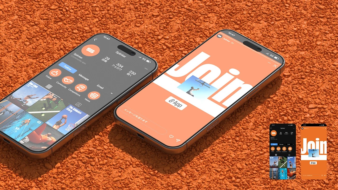
The "S" logomark is a masterclass in geometric restraint. Constructed on a precise grid, it merges two opposing arrows into a single continuous form — suggesting speed, direction, and connection at once. In the app icon, this mark sits inside a rounded square with an earthy dark background, holding its own against any screen environment.
Color is where the sports branding finds its edge. The primary palette pairs Pantone 158 C (a clay-court orange) with Pantone 3258 (an electric teal-green), plus a warm off-white and a cool sky blue. That orange is not accidental — it references the texture of clay courts, the wear of athletic gear, the energy of stadium lights. On darker surfaces the teal pops hard. Together they create a system that feels simultaneously premium and accessible.
The 3D hero visual — a tennis racket, branded ball, phone, stopwatch, and jump rope scattered across a clay court — establishes context immediately. This is sport lived as identity, not sport watched from a couch. The objects are arranged with the deliberate looseness of a photographic flat lay, but the 3D rendering gives them a controlled, product-catalog precision. Every surface carries the mark.
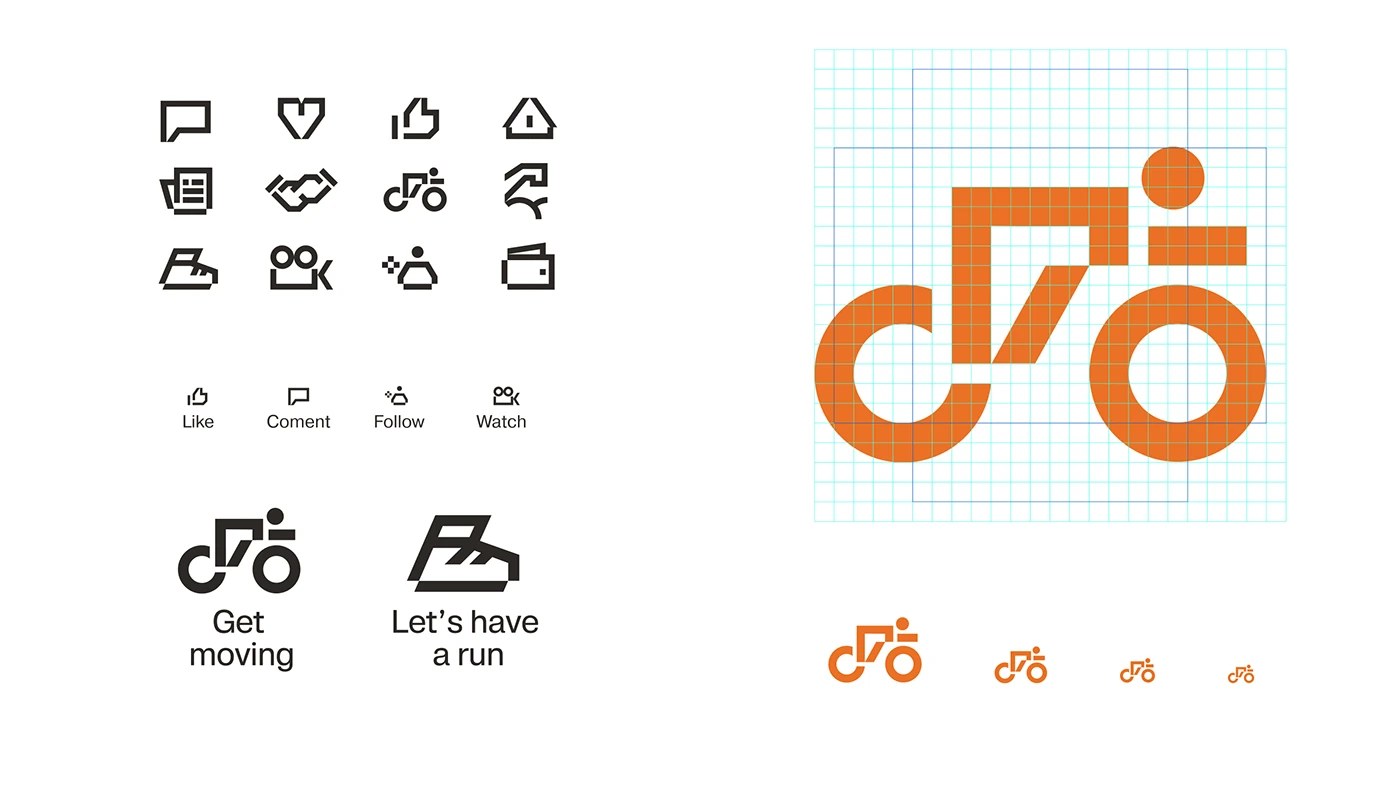
The icon system extends this logic across UI. Twelve platform icons — for actions like liking, commenting, following, watching — are drawn in a consistent stroke weight with subtle curves that echo the logomark's geometry. Each icon handles differently from a standard UI kit: the figures have athletic posture, the forms imply movement. It is a small detail, but it signals that this is a purpose-built platform, not a generic social app with a logo slapped on top.
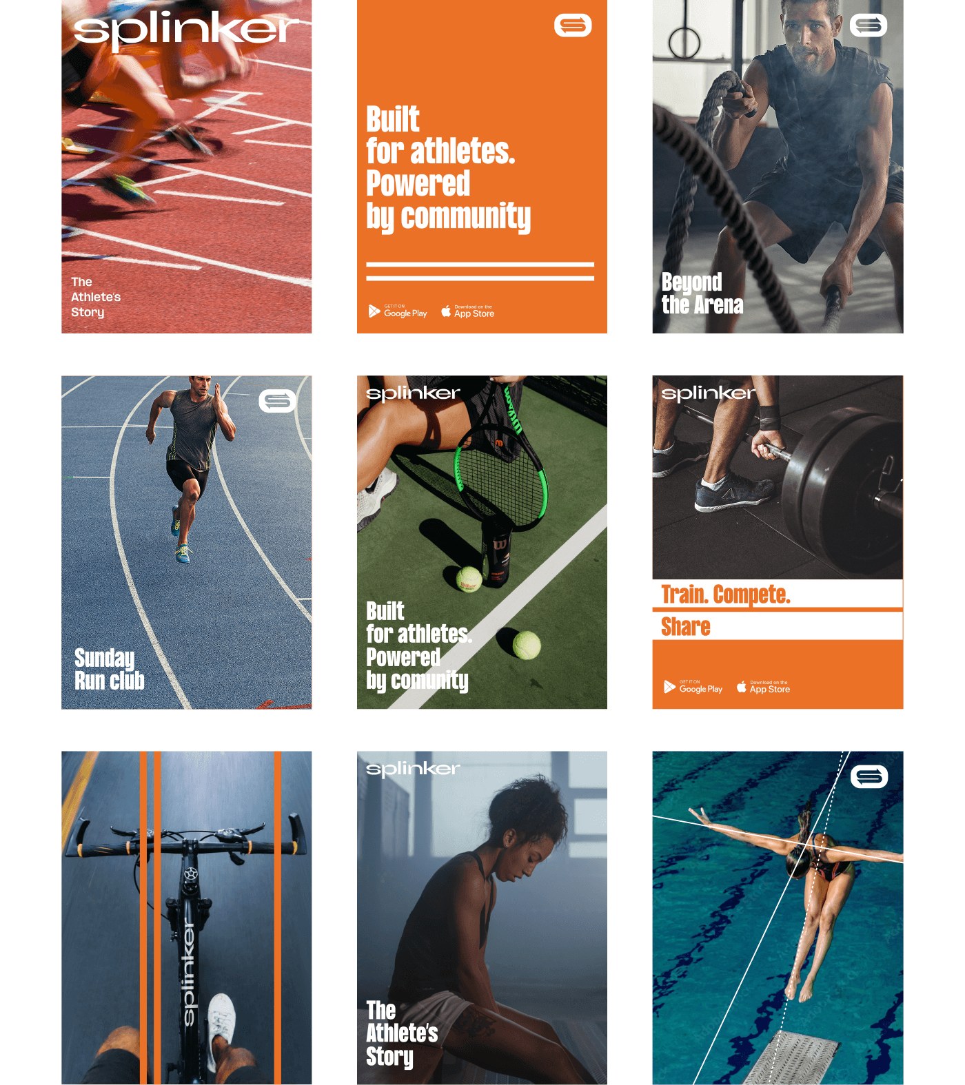
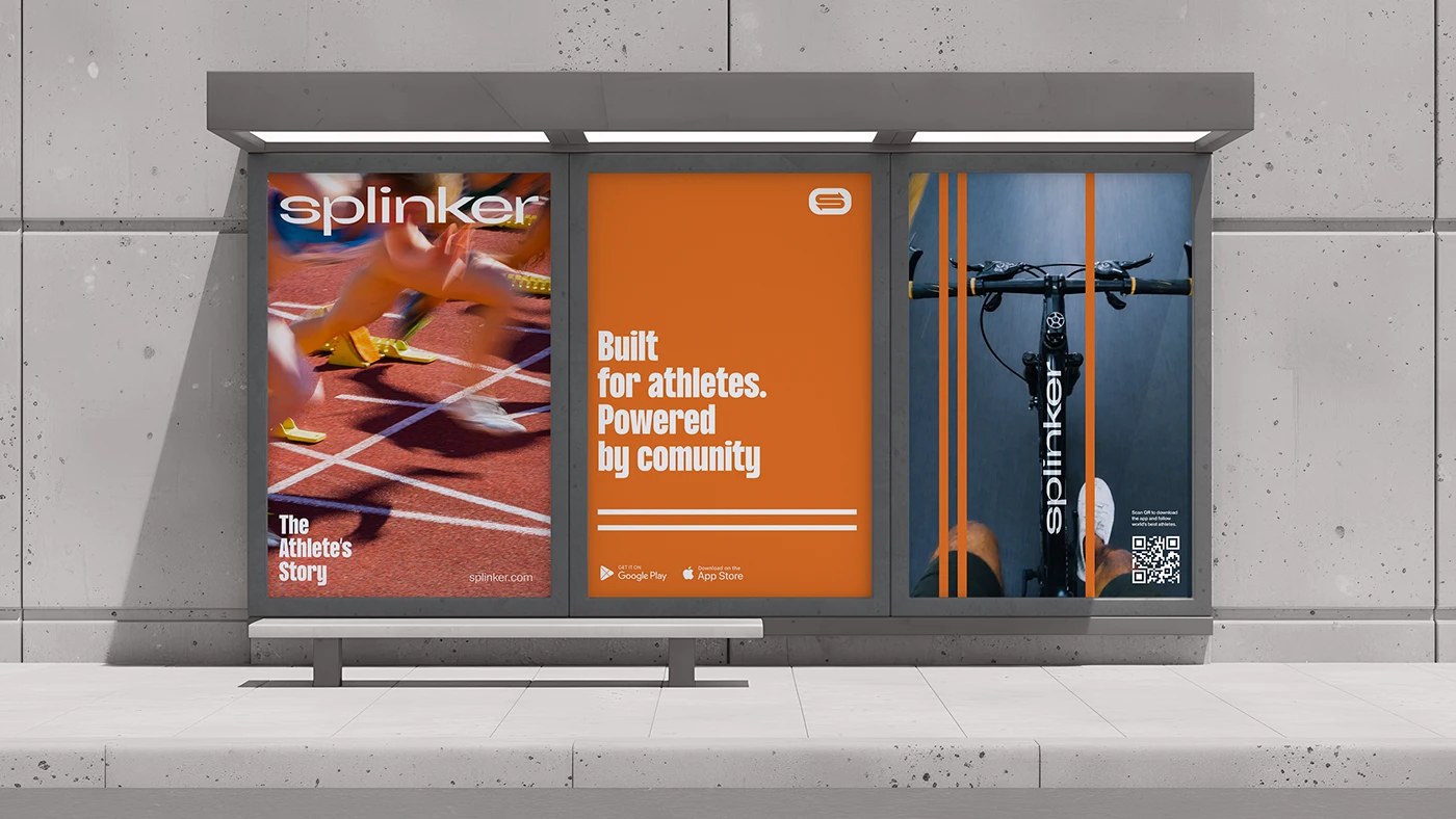
Social media templates use the full color range. A grid of nine posts shows athletes in motion — sprinters, cyclists, tennis players, swimmers — each framed by the brand's line-graphic overlay and bold wordmark. The tagline "Train. Compete. Connect." functions as a three-beat manifesto. It tells the athlete exactly what the platform offers and in what order. Strategy embedded in copy.
What Roma Erohnovich and the whmkst team have delivered is a sports branding system that earns credibility with its details. The typography, the grid construction, the palette specificity, the 3D staging — nothing here is casual. This is visual identity as product design: every touchpoint considered, nothing left to chance.
Credits
Design Lead: Roma Erohnovich (whmkst)
Creative Agency: Red Keds
Design Team: Artyom Trofimov, Ilia Klimov, Genie Nikolaeva
Tools: Adobe Illustrator, Figma, Fontlab Studio, 3ds Max, Blender 3D