by abduzeedo
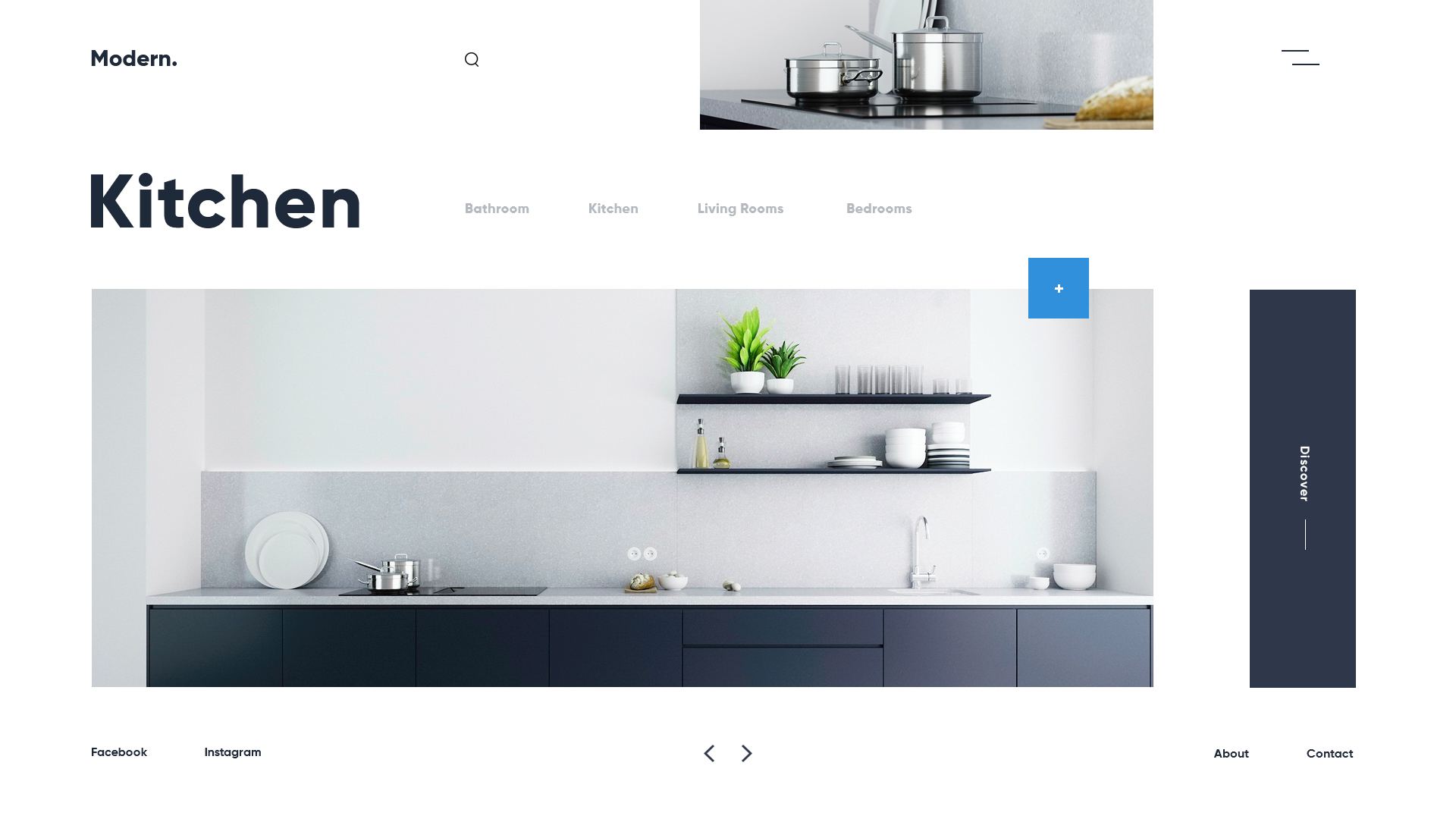
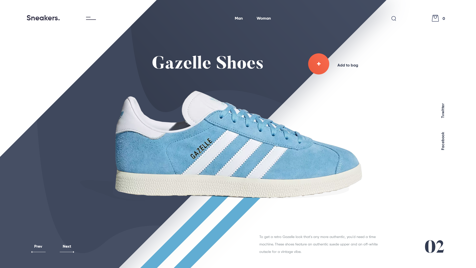
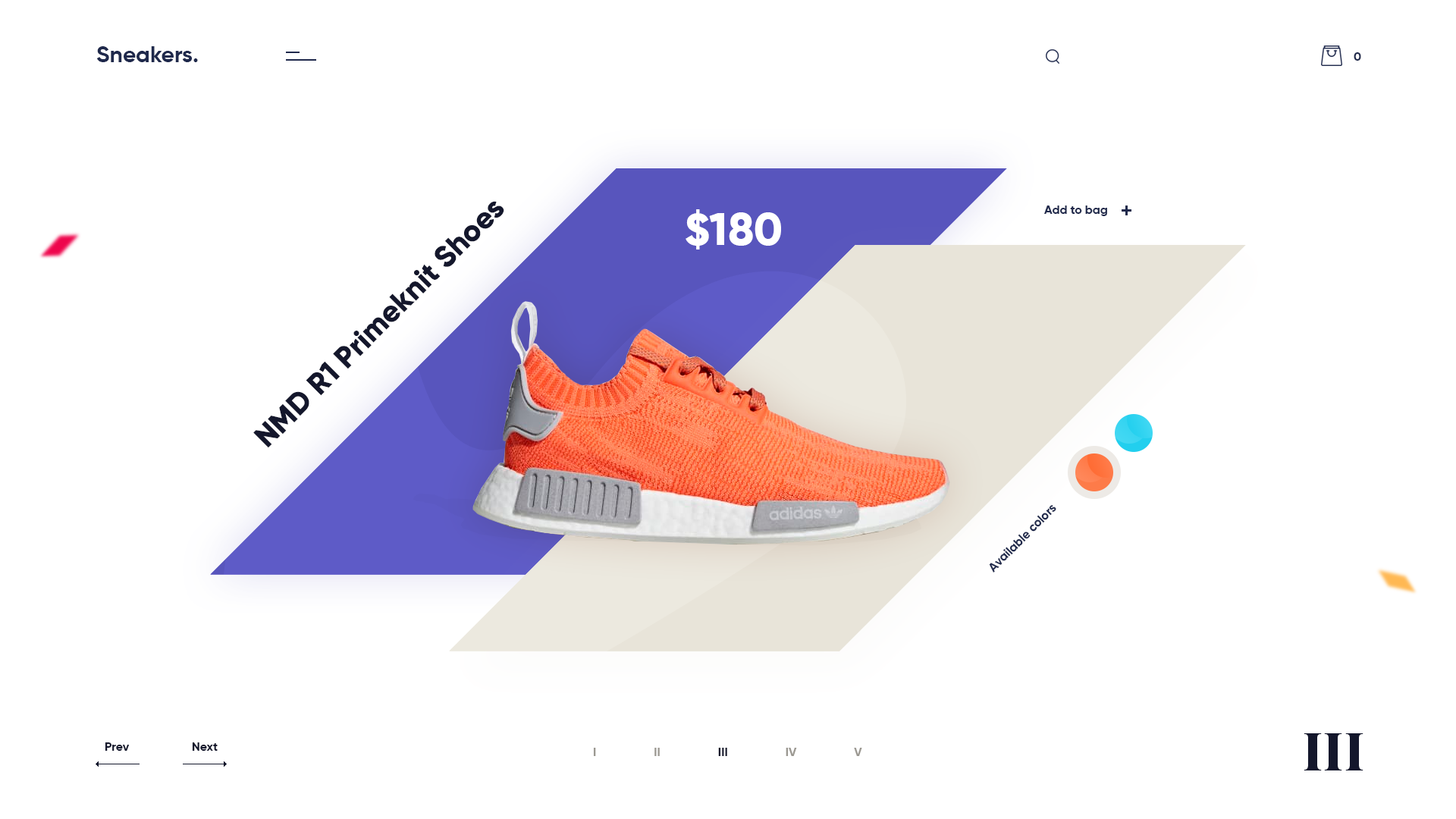
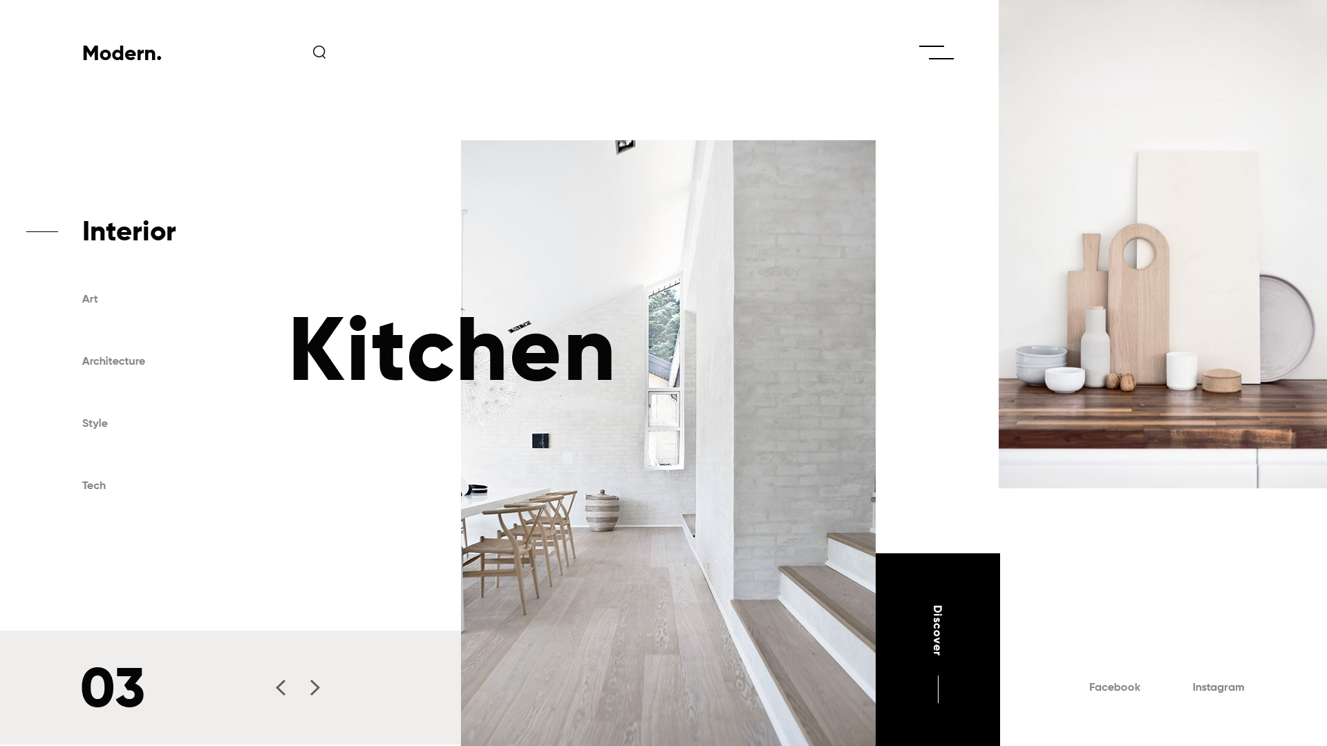
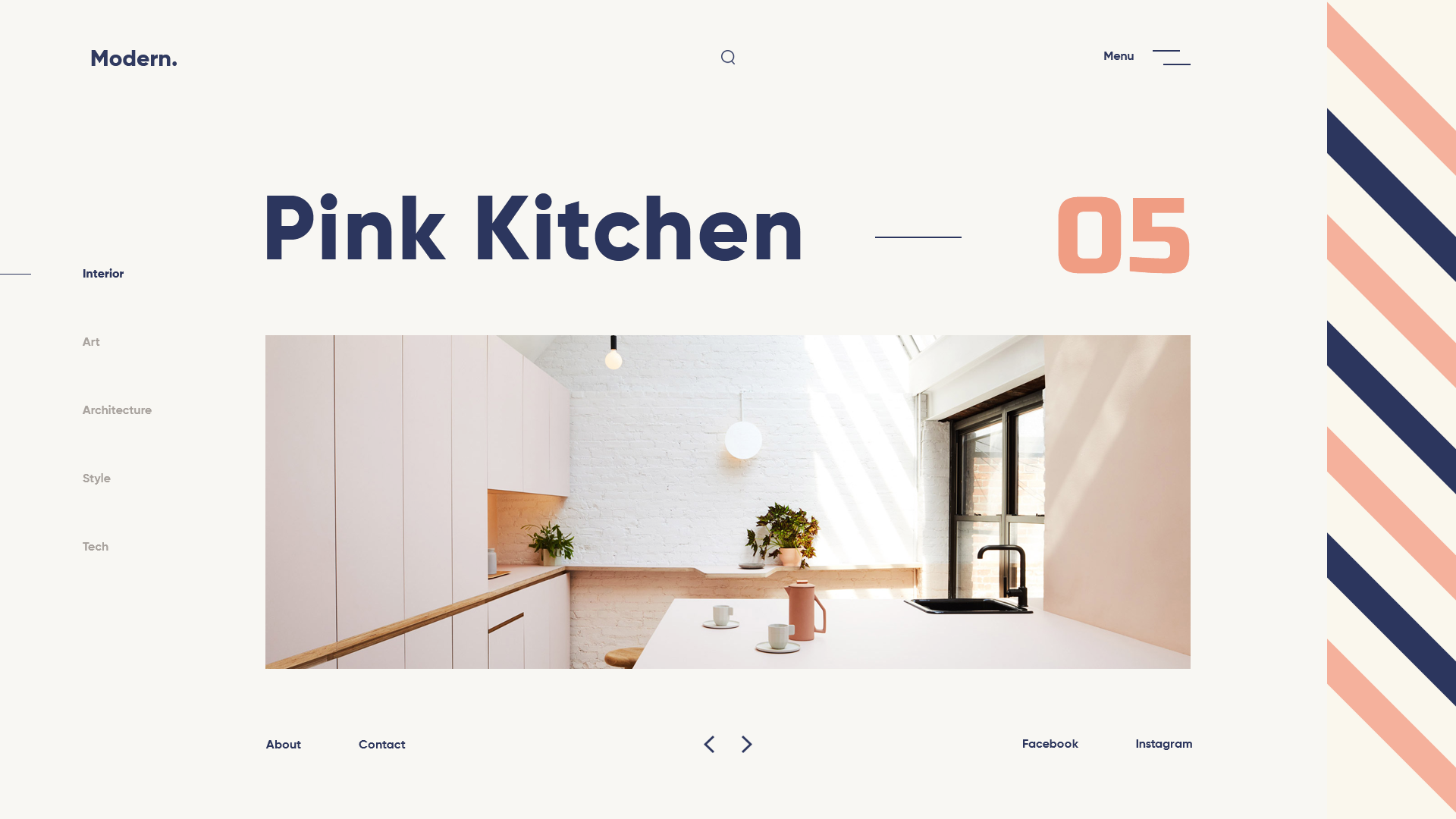
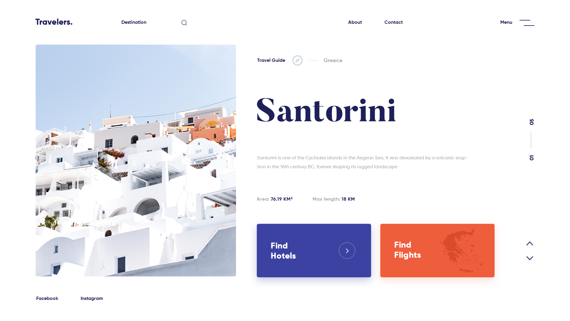
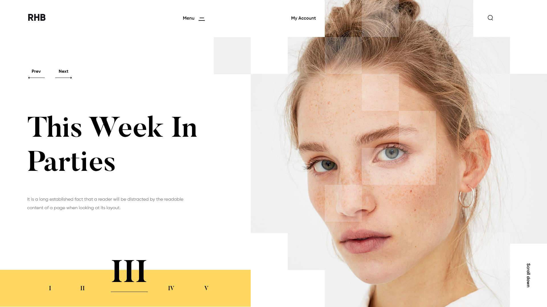
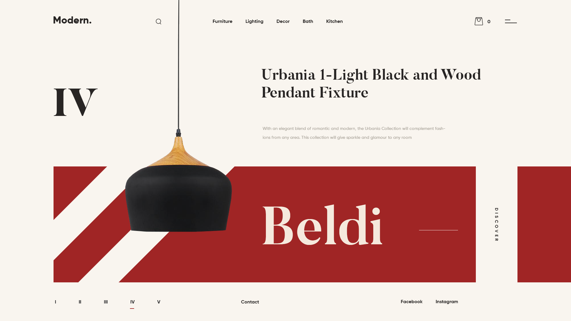
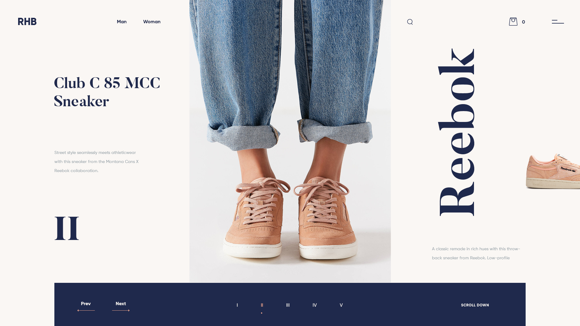
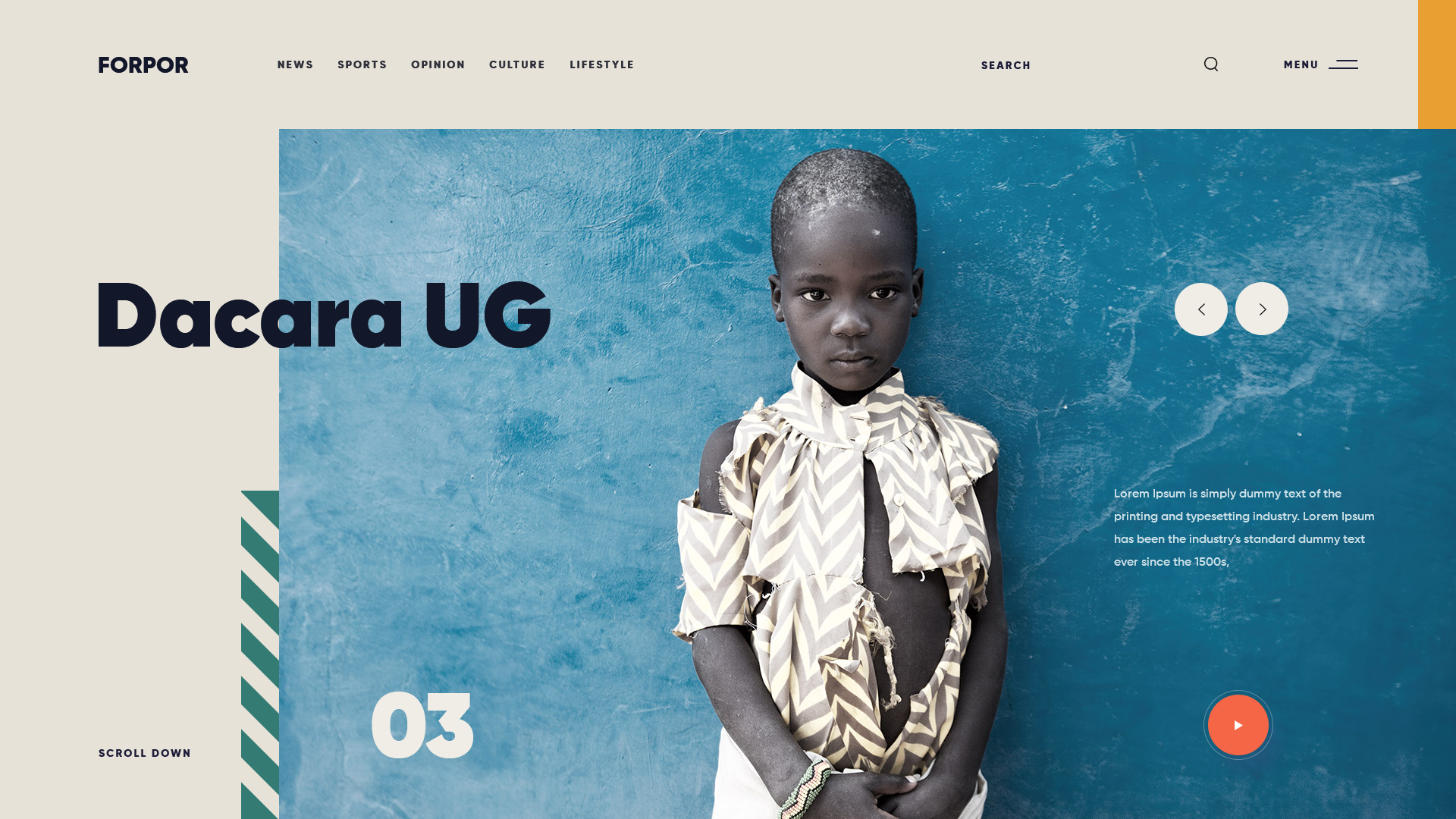
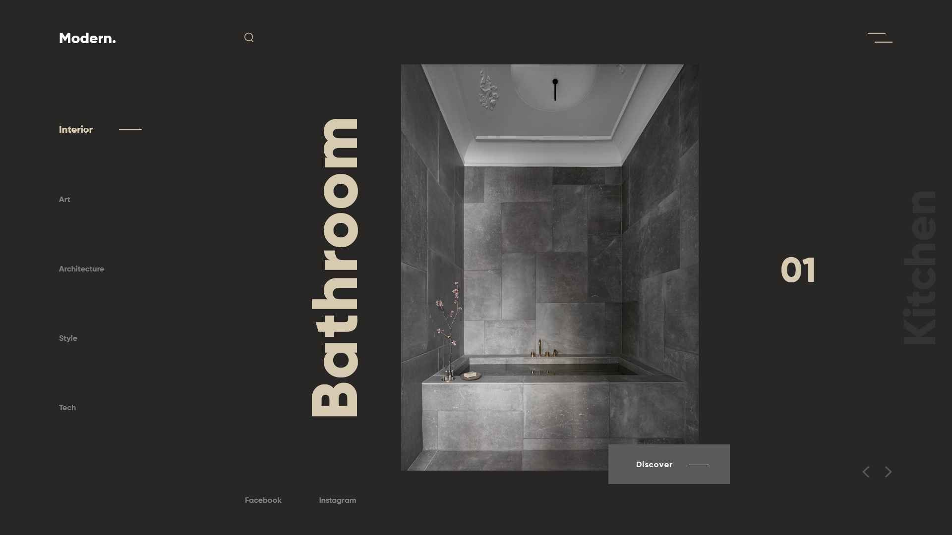
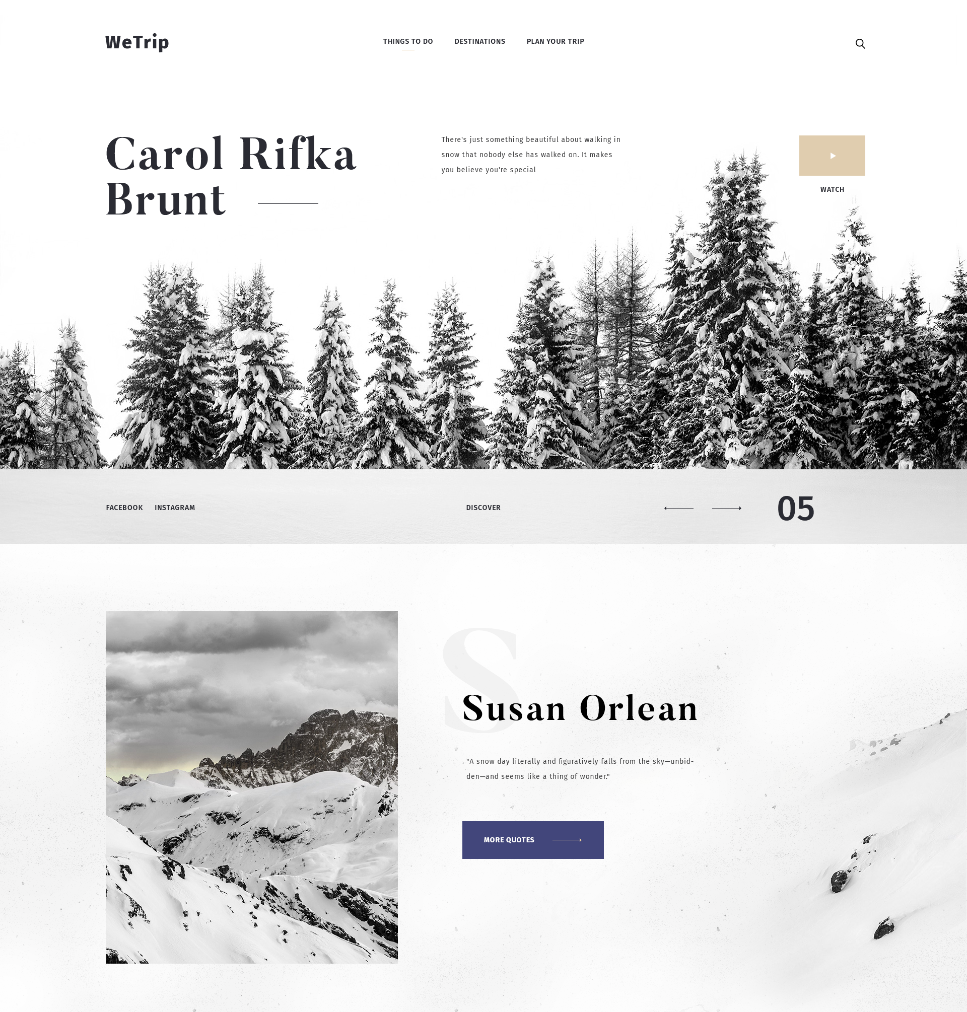
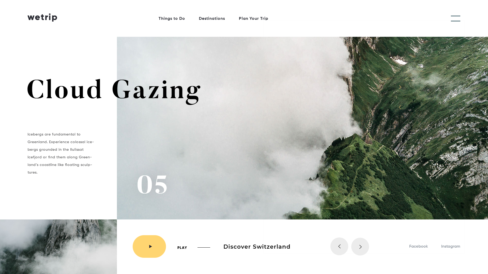
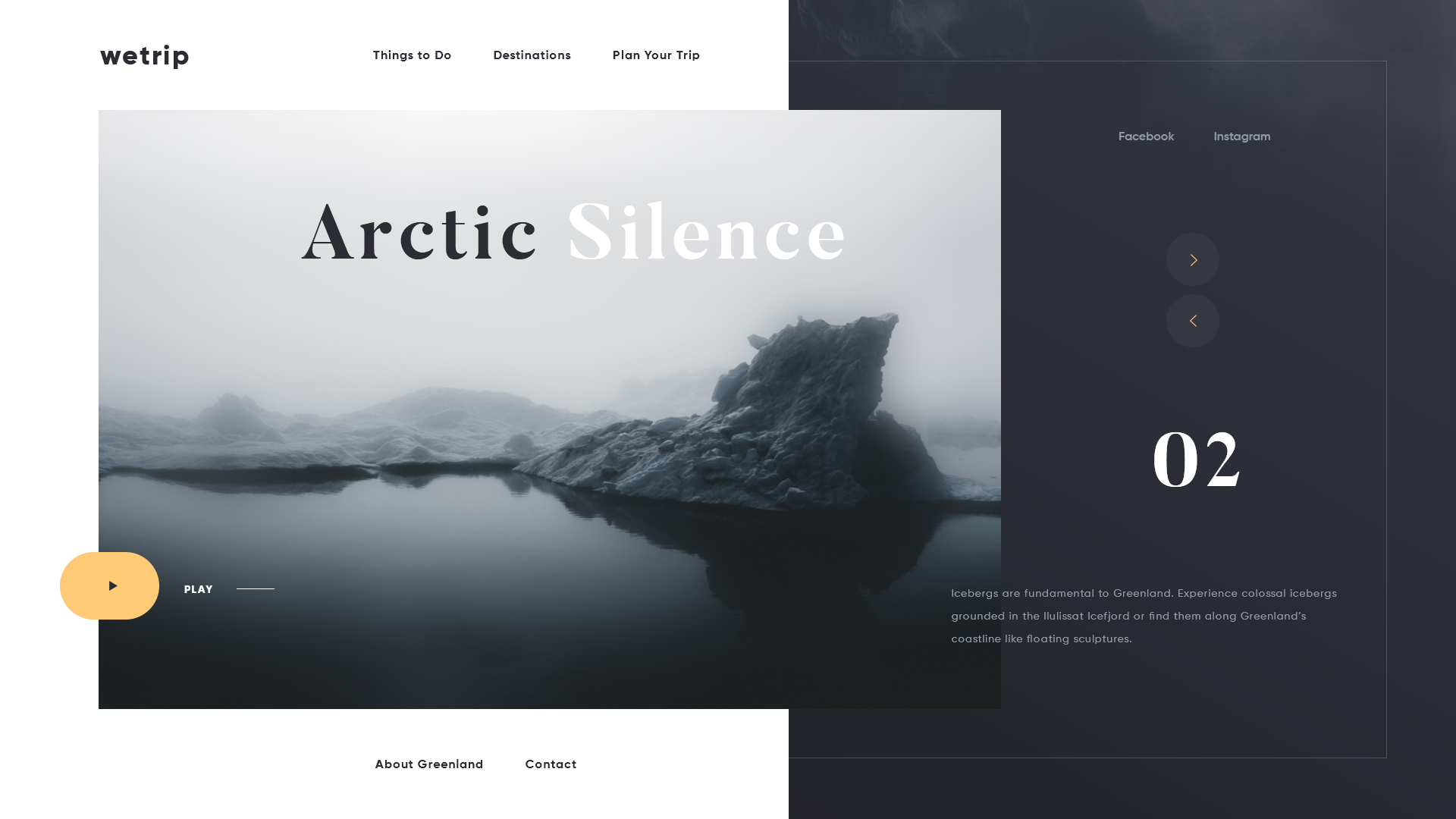
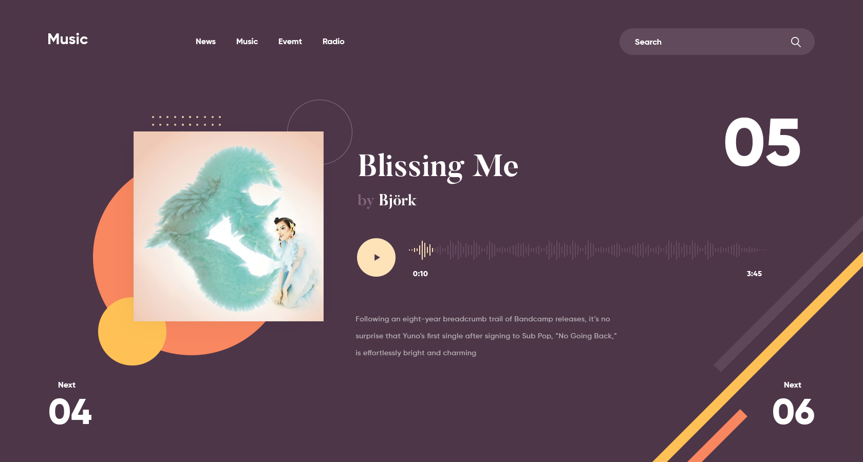
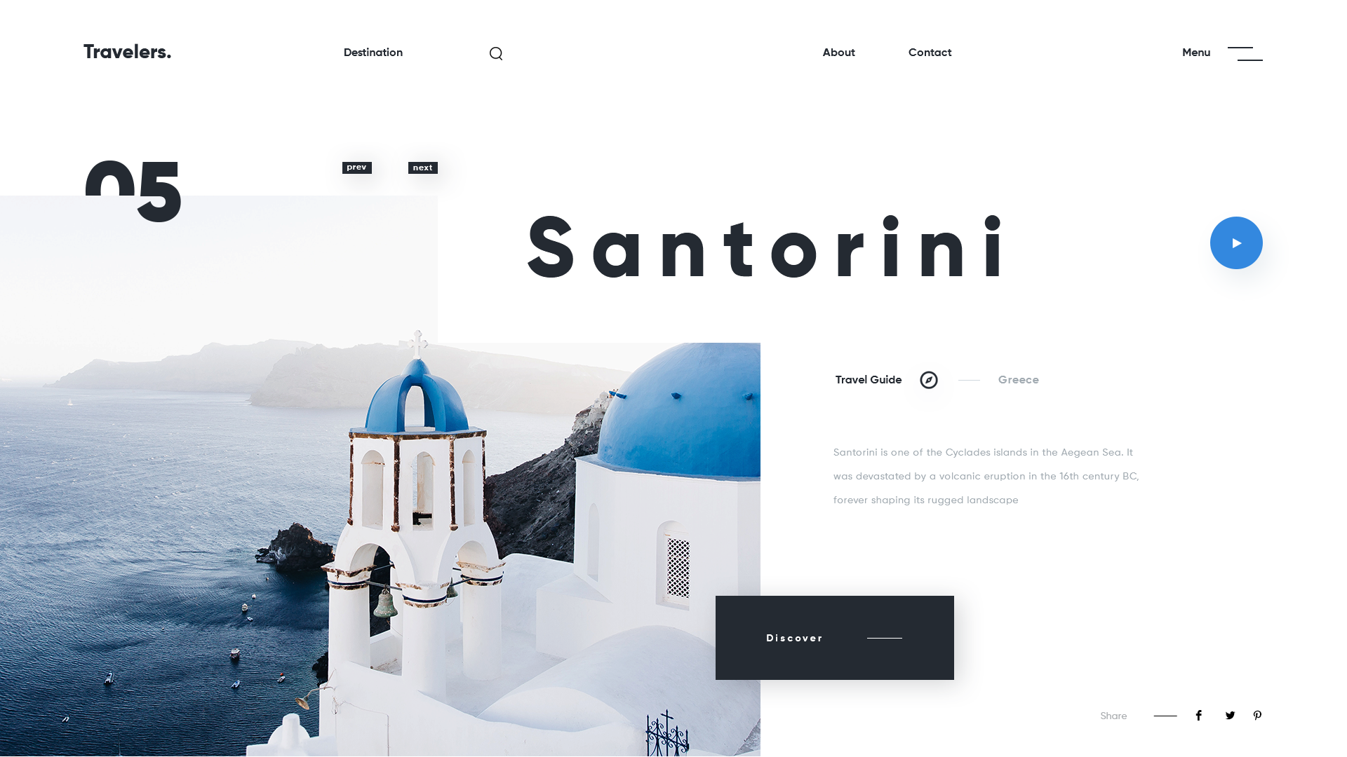
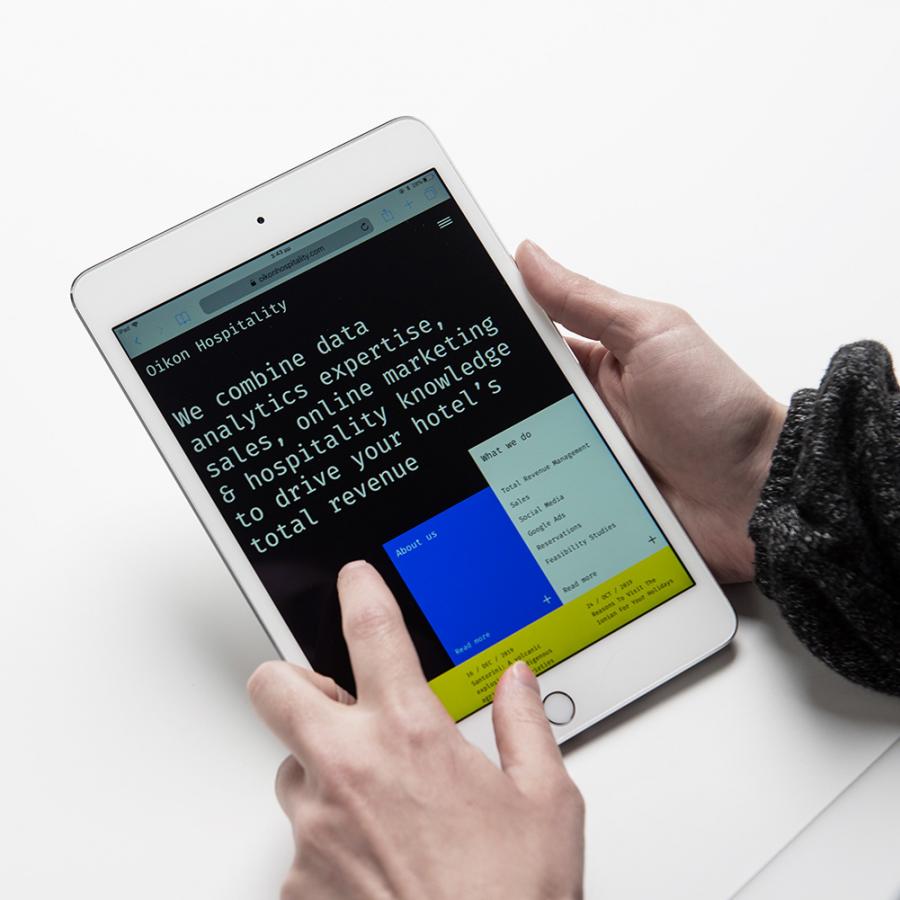
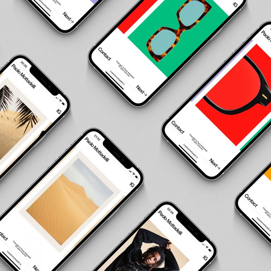
Giga Tamarasvili is a designer based in Tbilisi, Georgia and he has been sharing some very inspiring web design projects on his Dribbble profile. They all feature a very simple and highly editorial style. There's a great typography contrast, which helps with the hierarchy of the page as well as an always excellent imagery selection. I particularly like the style of his work, it seems to be what I call the new trend in web design. You can see a clear grid, perhaps 12 or 16 columns, and there's always a big bold headline followed by small texts used for either navigation or regular content. They are also quite flat, no shadows, very much like a printed paper on a stylish magazine.
My biggest concern as I try to recreate this style for Abduzeedo is how it would adapt for different screen sizes. I understand that they probably will work amazingly well for desktop cases when the screen is at 16x9 or 4x3. But what happened when you have a massive monitor or a small laptop? How do they look on portrait mode on iPad? I'd love to see those explorations when designers present this type of work. Nonetheless, it's quite inspiring.
For more information about Giga make sure to check out his work at:
Web design
