by abduzeedo
A few weeks ago, or I’d say months, I shared a collection of designs that used a quite common pattern, very rounded corners. I went a bit further and said that those images represented what I called a new design trend for 2019. So why are you coming back with this, you might ask. Well, I would love to share two things, first a few more examples to illustrate my statement and second to put some thoughts out there. How does that sound?
Here’s a collection of images I got from the popular section on Dribbble. Before any thoughts on why I wanted to say that these comps look quite good. They all share a very refined and with pleasant aesthetics, or in other words, beautiful visual design. And visual design will be the lenses I want to focus on for these.


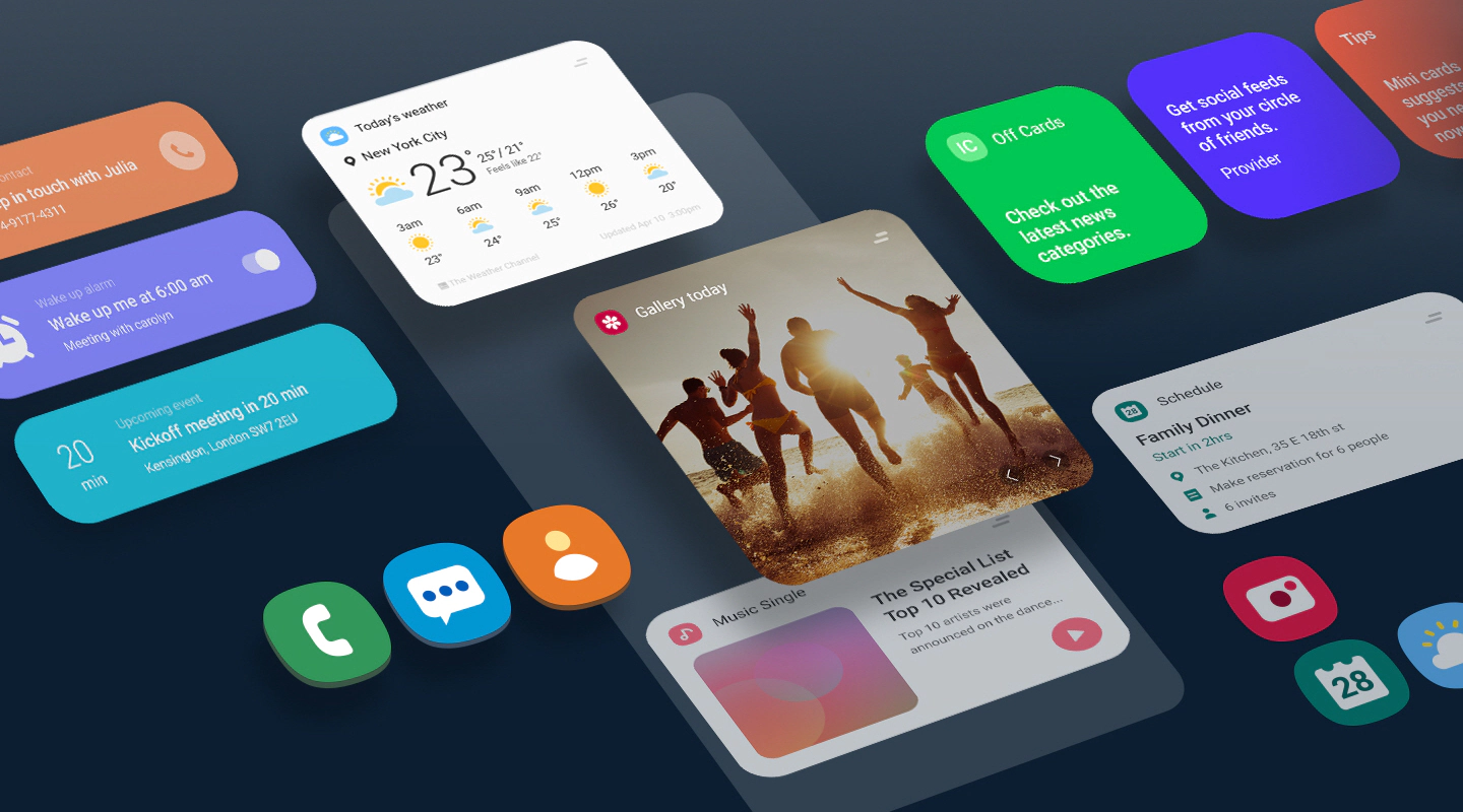
So why have we seen so many of these quite similar design solutions? It’s a great question and to be honest, I really don’t know. I myself used some rounded corners similar but not as strong as those in some projects, however I have some hypotheses.
Bezel-Less screens
If you follow the mobile phone industry you notice the trend of phones becoming just a pure piece of screen. No more bezels. You also noticed that the phones all adopted a more rounded look, with some new exceptions like the Sony Xperia line and the brand new Samsung Note 10. I also believe Apple might have been the pioneer here with super rounded corners in iOS 7-9. I don’t remember. However I assume that the designers tried to harmonize the hardware and the software, which is always nice.
UI Kits and the internet
One of the best things that happened to the design community was the proliferation of services that allow us not only to share, but also to commercialize our work in addition to just provide design services. It allows us to earn a passive income and help the overall design quality to be elevated across the board. One side effect, however, was the spread of similar visual patterns independent of branding and style. A good example of what I am talking about is Google Material Design. Despite being a phenomenal system that made Android amazing in my opinion, it didn’t give much room for diversification in terms of UI in the past. I believe that it’s much more flexible.
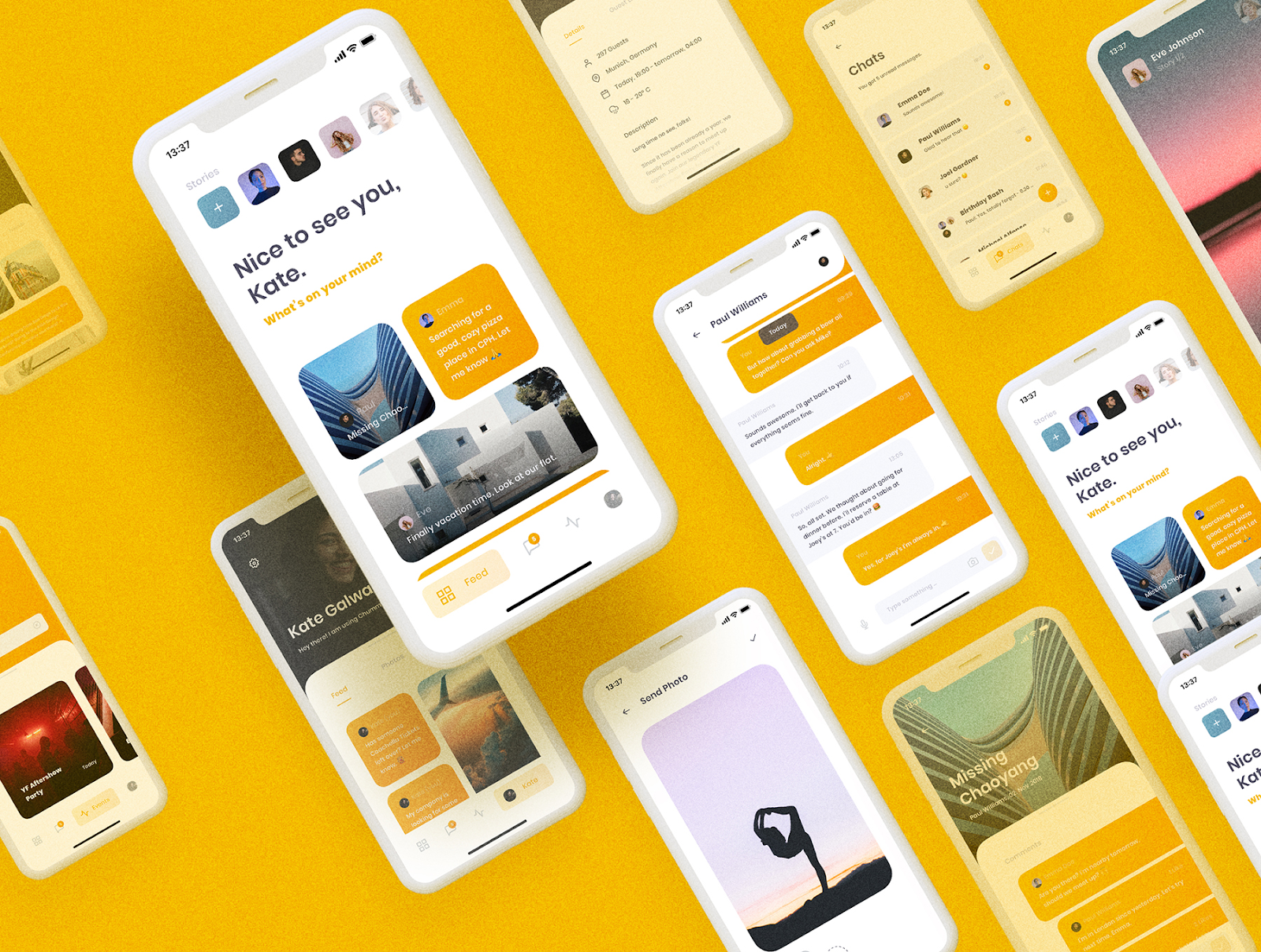
In terms of rounded corners we see tons of examples online of projects that literally look like they were created by the same designer for the same product/brand. In my opinion I think this is bad because it sort of diminishes the importance of the designer’s work, in adapting branding values through an interface that is simple and friendly for the users. If that means rounded corner, that’s okay, but for your next project, please think a bit deeper before just following trends.
If the brand means rounded corner, that’s okay, but please think a bit deeper before just following trends.


