by ibby
Sangria Creative Studio rebrands La Reale with bold illustration, witty storytelling, and a playful camel mascot that transforms craft beer packaging.
The craft beer aisle is often predictable: distressed typefaces, rustic color palettes, and tried-and-true tropes. La Reale, an Italian Pale Ale, wanted to push beyond that formula. With Sangria Creative Studio, the brand introduced a design system that’s bold, humorous, and layered with storytelling, a visual identity that doesn’t just package beer but creates a universe around it.
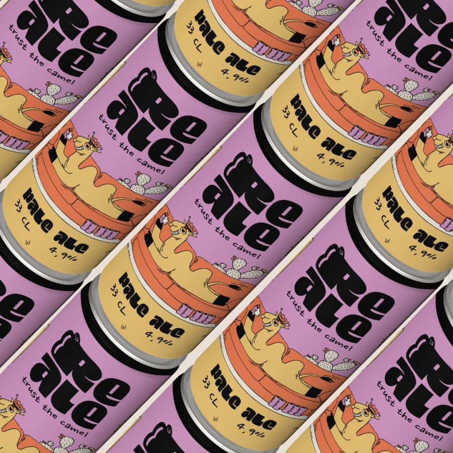
At the core of the rebrand sits La Reale’s camel. Not stoic or utilitarian, but relaxed, crowned, and beer in hand, a mascot that signals wit as much as heritage. Around this character spins a world of desert symbols and nostalgic objects: tiled tables, potted cacti, retro televisions, and even a fridge packed with beer. The result is a narrative that instantly makes La Reale memorable and fun.
Illustration as Identity
Rather than leaning on minimalism or aggressive graphics, Sangria built a handcrafted illustrative style: crisp outlines, vibrant tones, and a balance of playful pastels and grounded earth hues. Typography carries subtle storytelling cues too, with the letter “R” shaped with twin humps, echoing the camel’s silhouette, a small but clever nod to brand continuity.
Visual Identity
The strength of this project lies in how the identity travels. Sangria’s team created a visual ecosystem that extends well beyond the can. Posters, merchandise, and branded graphics show off quirky phrases like “Beer You Always” and “Turn Me On, Pour One Up”, amplifying the humor and charm.
Posters & Campaign Graphics: Bold compositions pairing illustration with playful copy give La Reale a voice that feels both graphic and tongue-in-cheek.
Packaging & Labels: From full-wrap cans to secondary graphics, each element tells part of the brand’s story while keeping a cohesive aesthetic.
Logo Variations: The camel icon and wordmark are reimagined across lockups and badges, designed to adapt from beer cans to social feeds without losing their punch.
