by abduzeedo
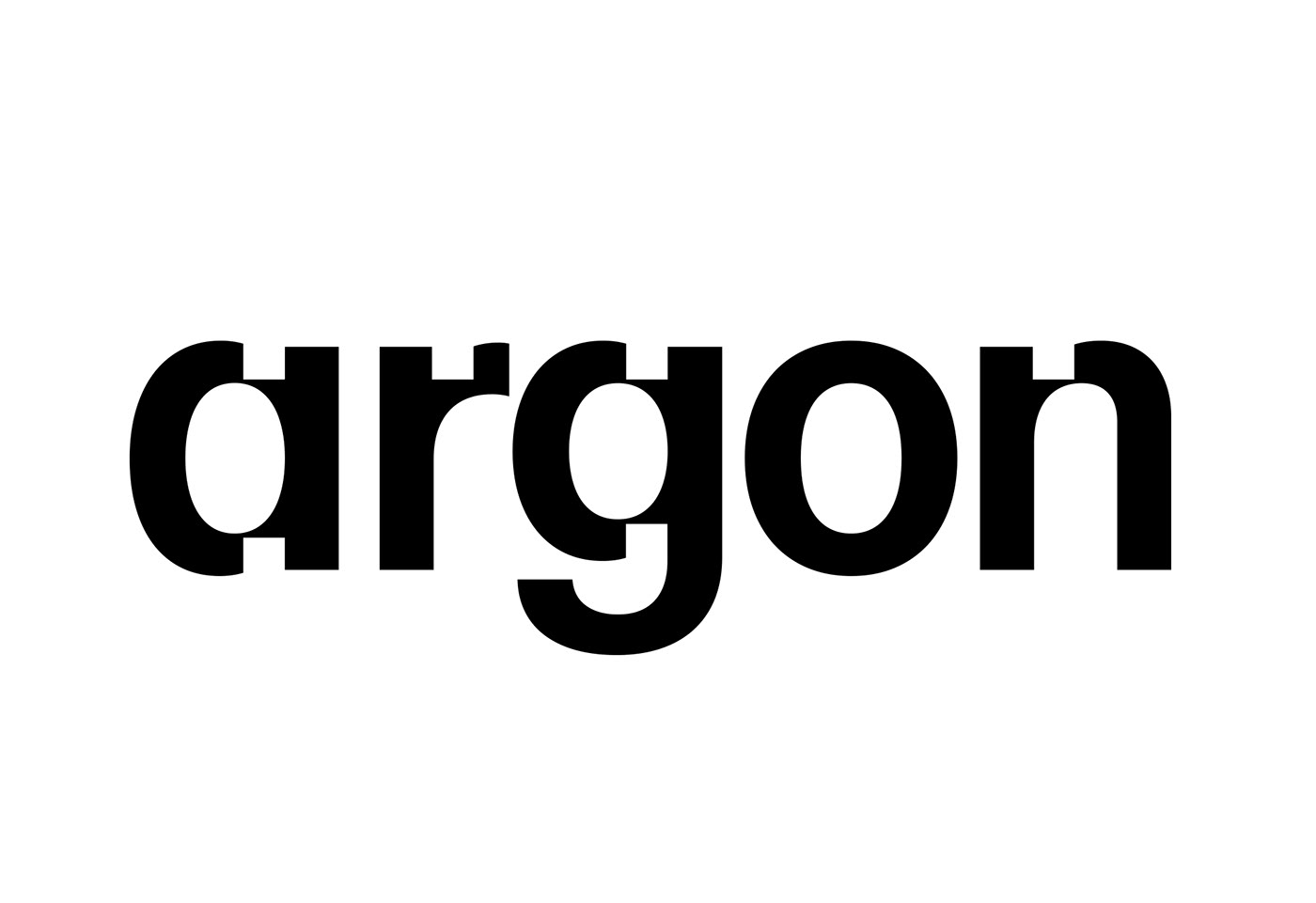
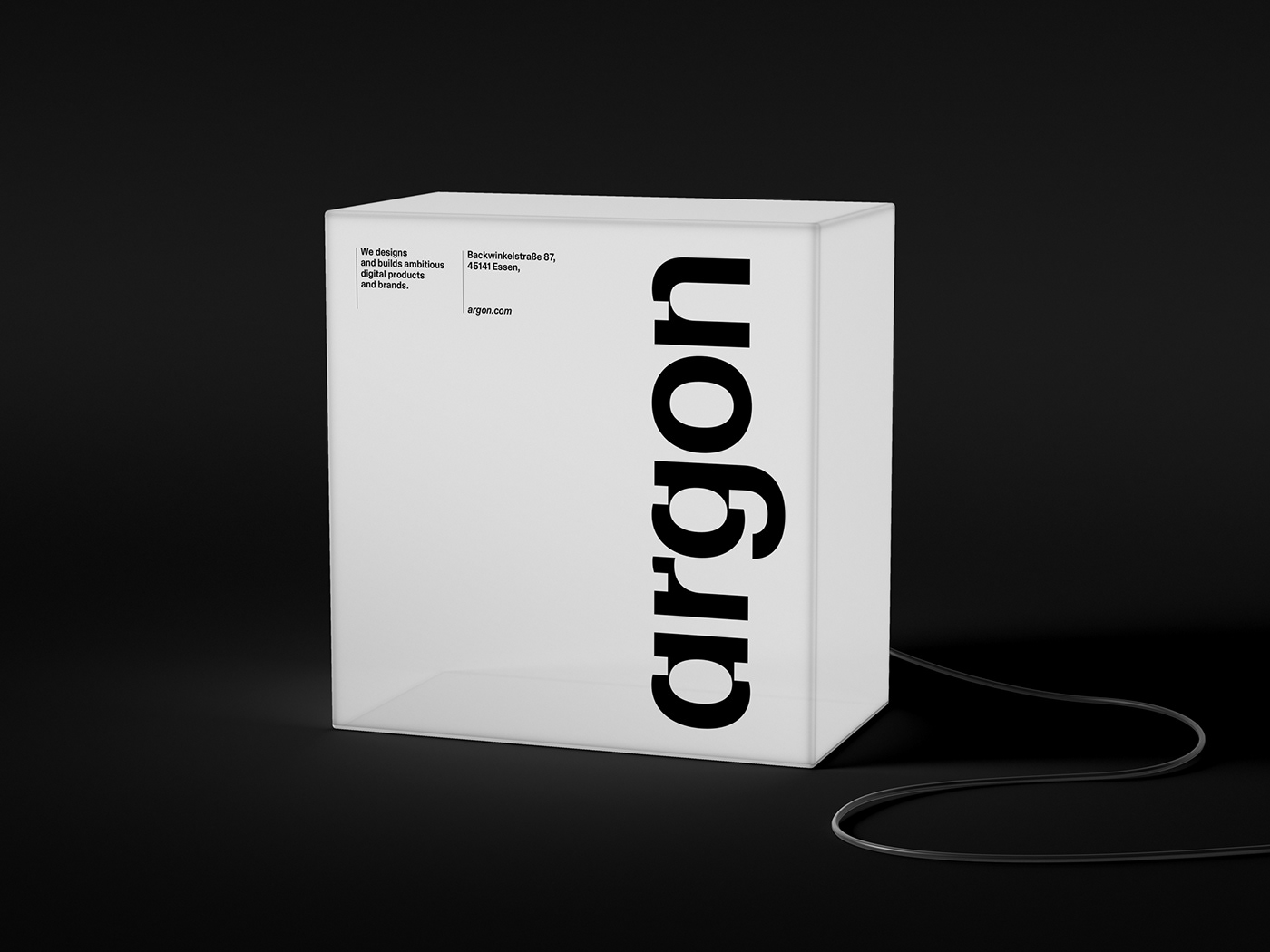
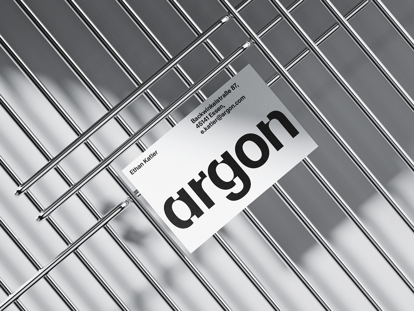
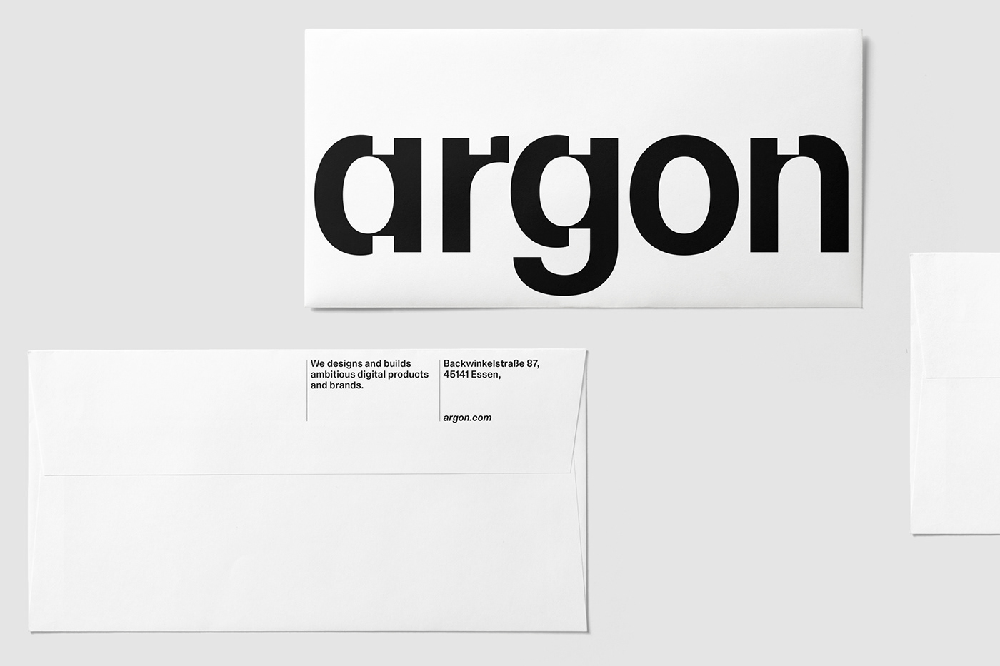
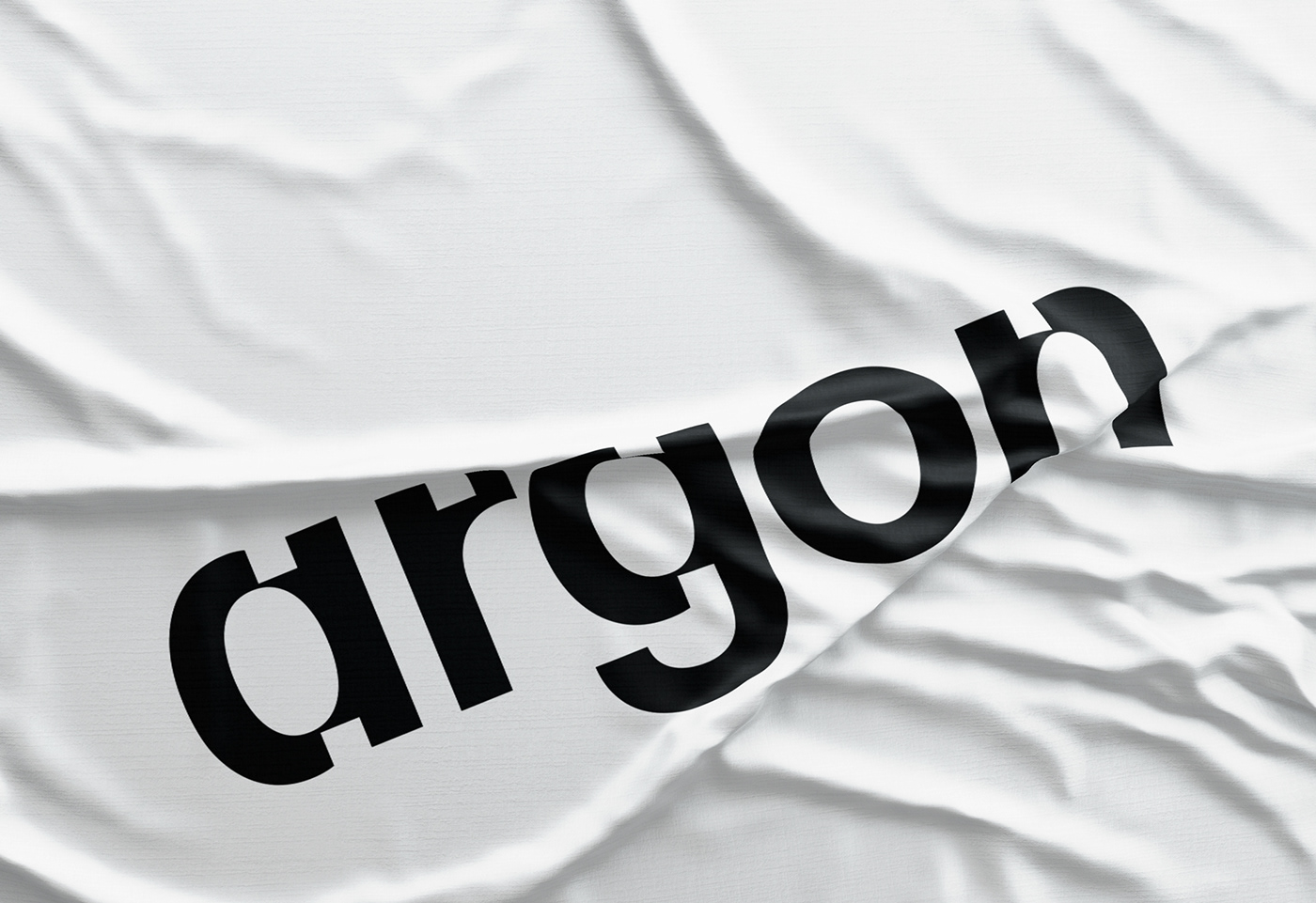
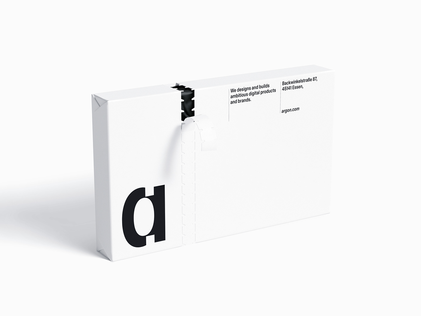
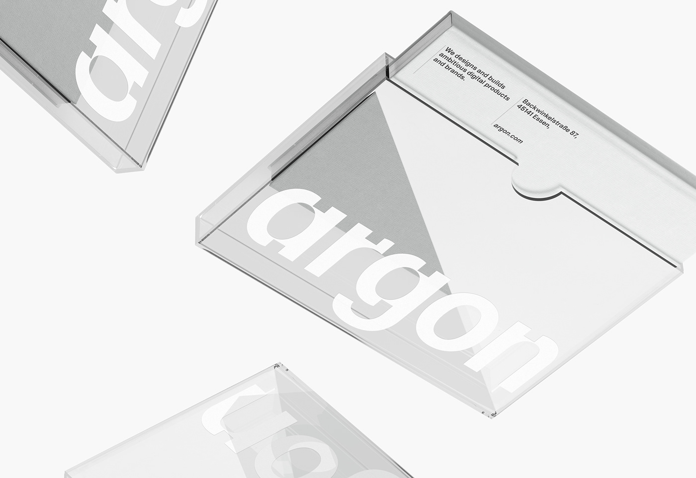
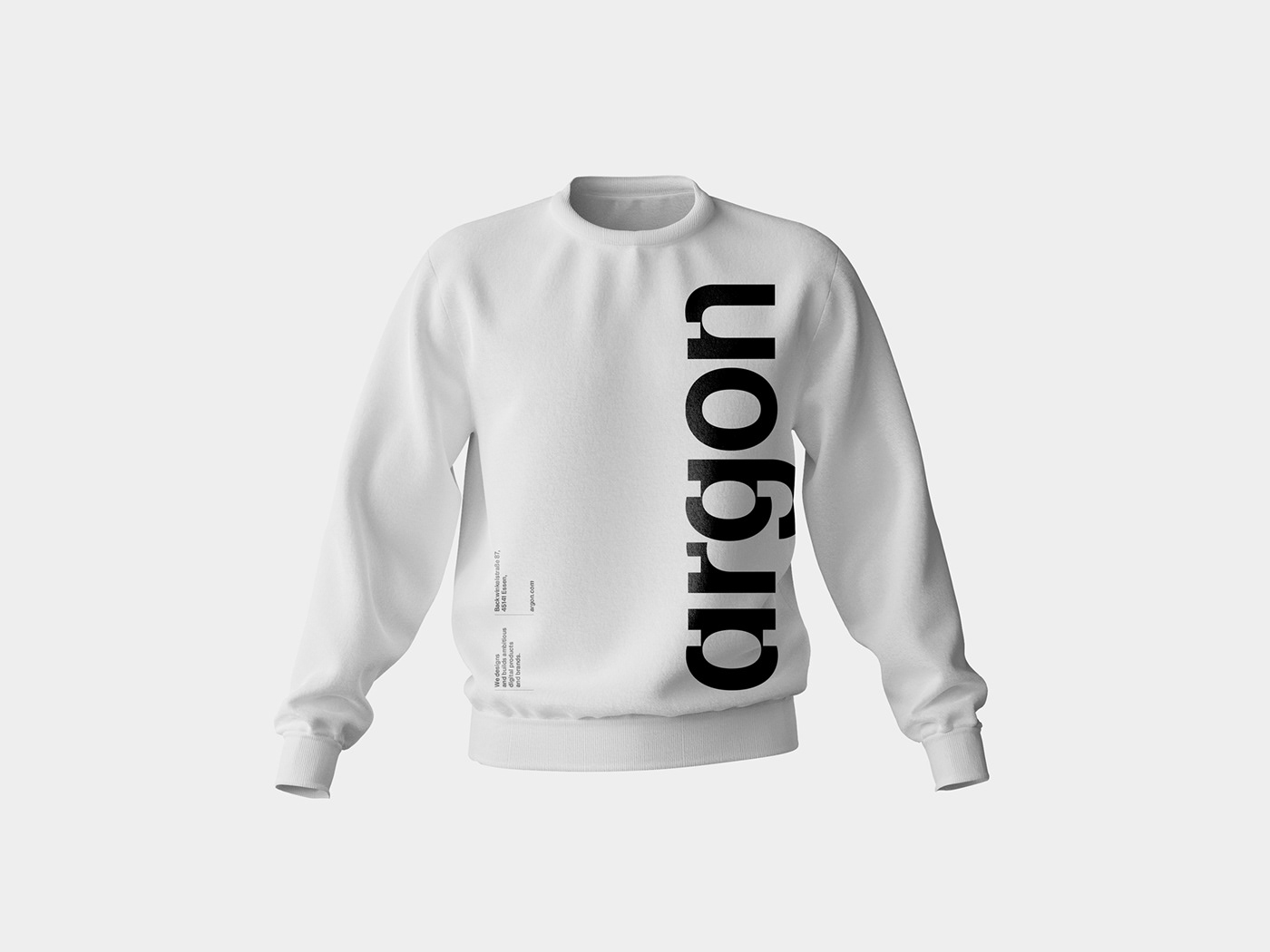
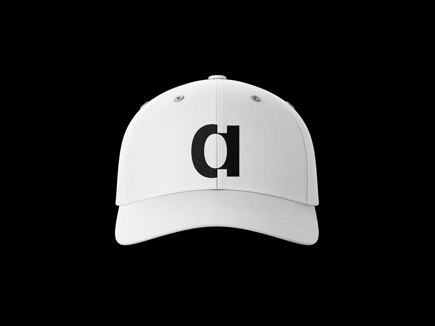
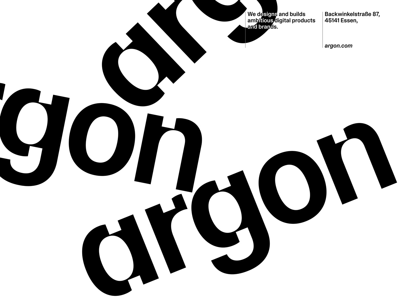
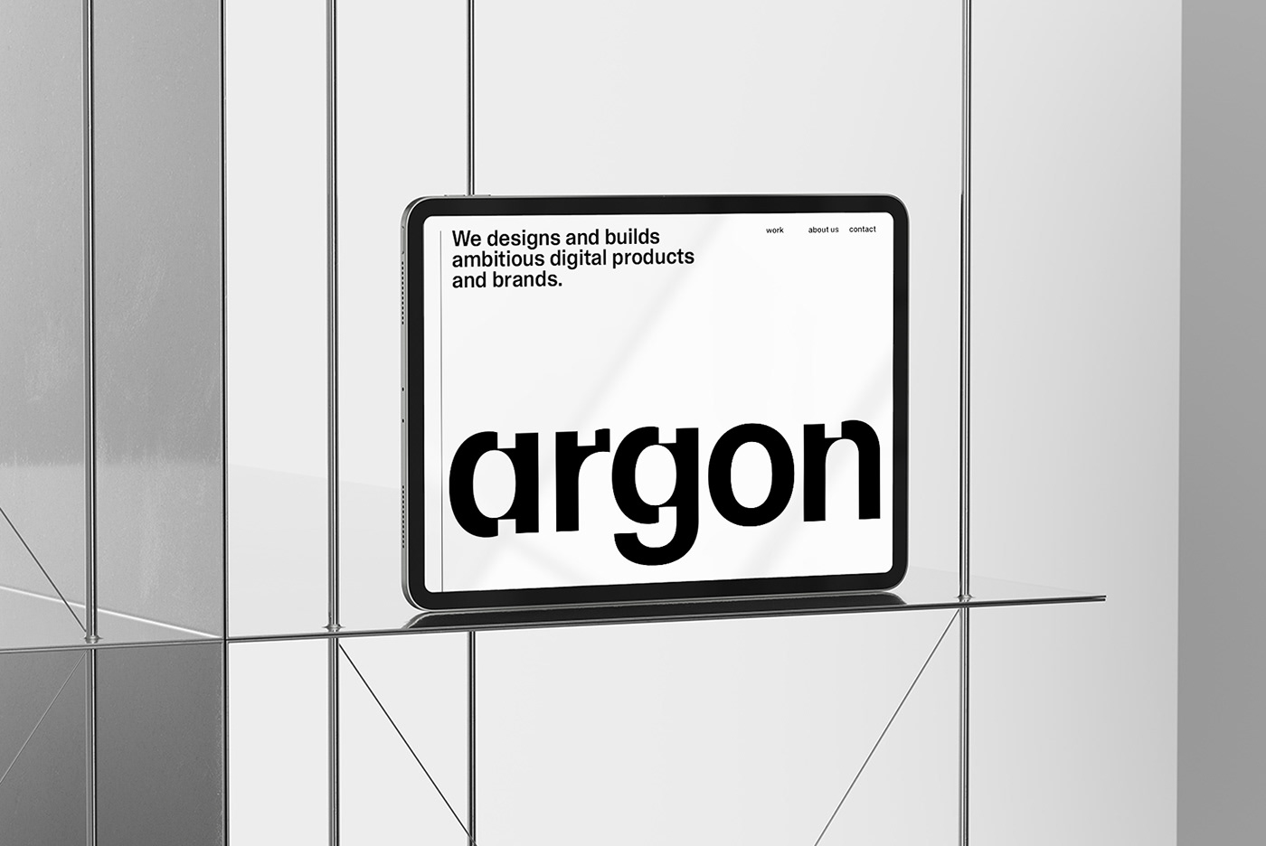
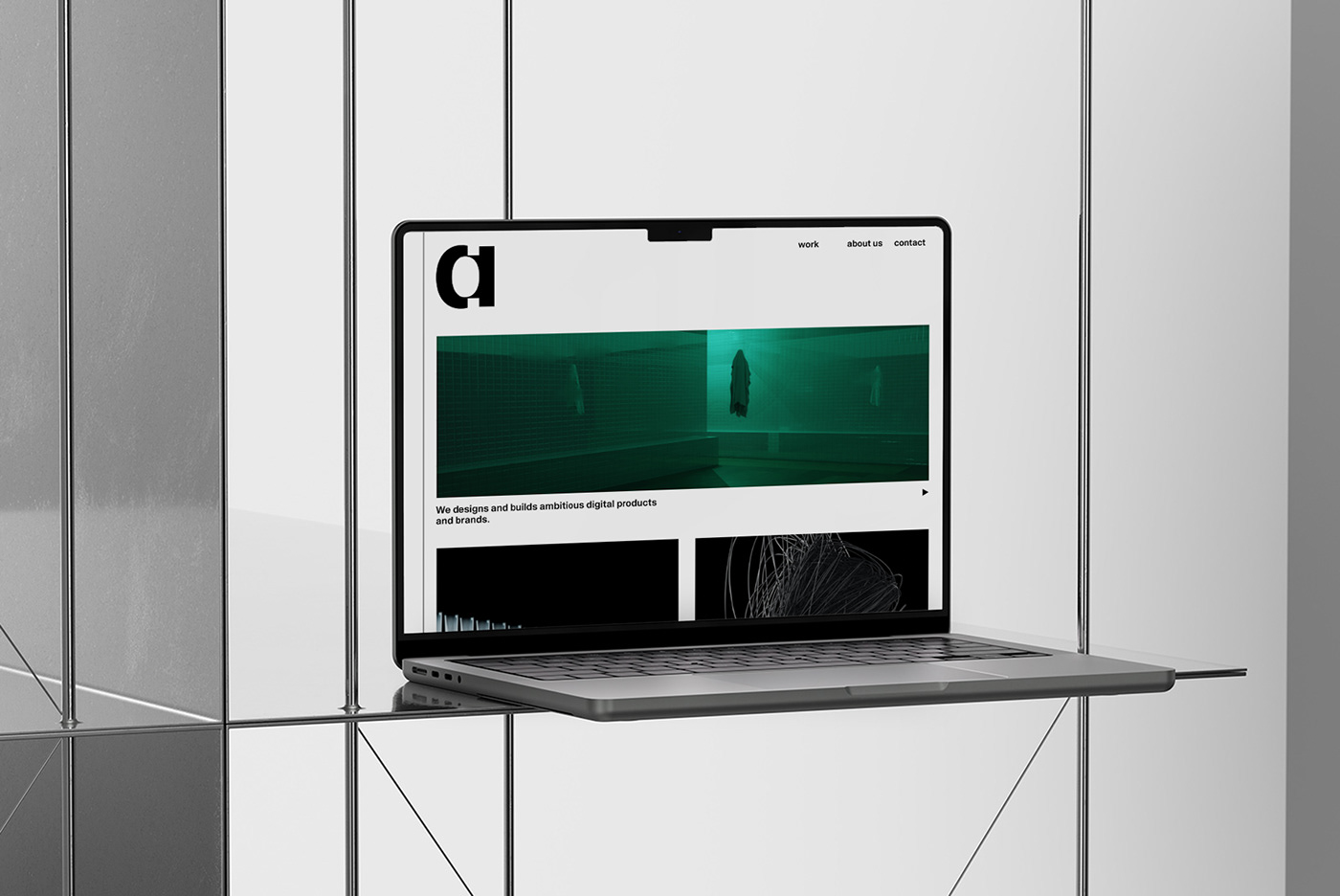
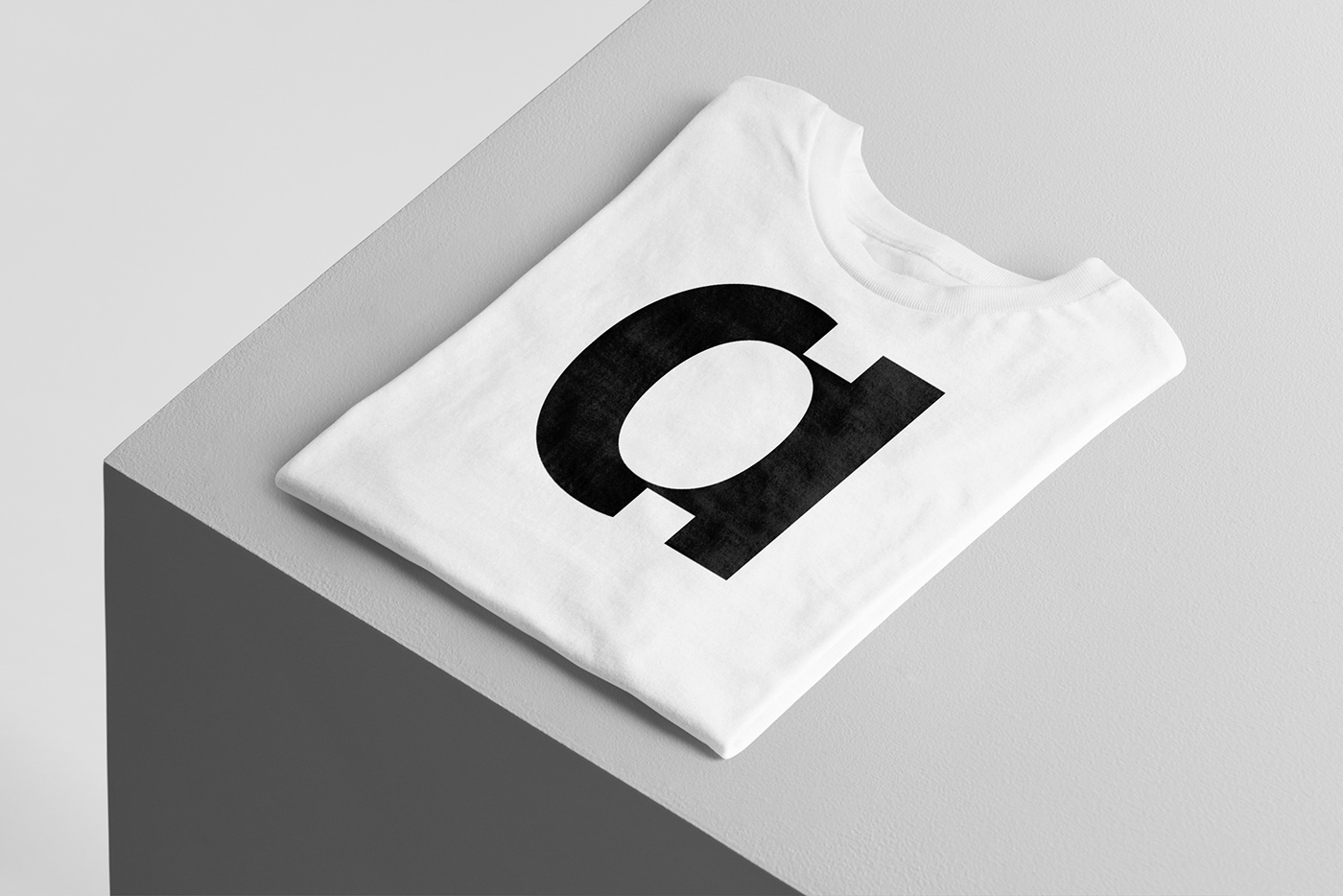
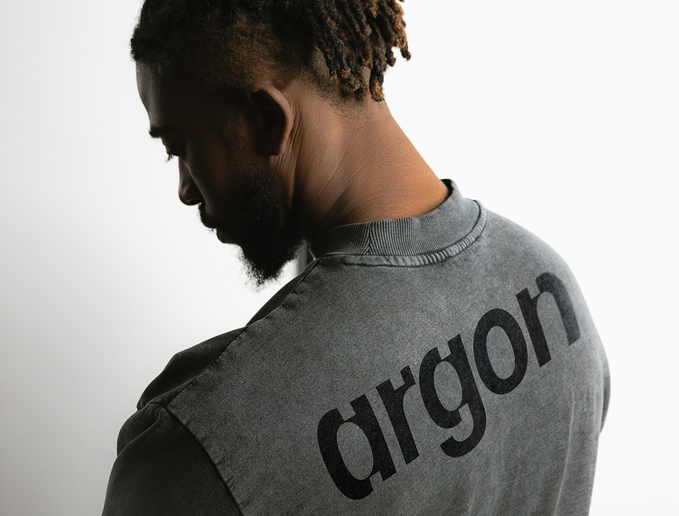
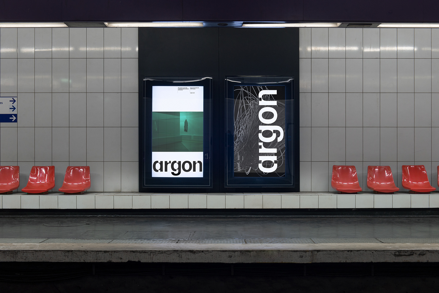
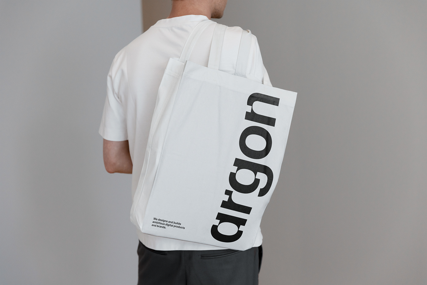
Jarosław Dziubek shared a branding and visual identity with a minimalist style using just typography and the use of a clean, sans serif font for Argon. The font is used consistently across all branding materials, such as business cards, marketing materials, and the company website.
The color palette is simple, with a focus on neutral colors such as black, white, and gray. To create a cohesive brand identity Jarosław established a clear typographic hierarchy, using different font sizes to distinguish between different levels of information and to draw the viewer's attention to important elements.
Overall, the goal of the branding and visual identity was to create a sleek, modern, and professional look that reflects the company's focus on efficiency and simplicity.

For more information make sure to check out Jarosław Dziubek on Behance and Instagram.


