by abduzeedo
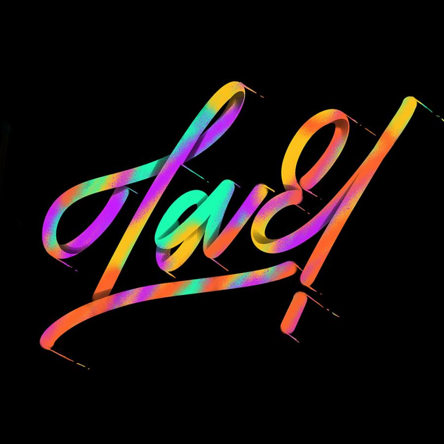
The "36 days of type" challenge never ceases to inspire me. There is always a new take on how to create a beautiful mix of typography, colors, and layout. For this post, I'm excited to feature the work that Maria Giemza created for her contribution. It's an amazing, sometimes abstract take on the alphabet blending perspective and architecture illustration to create unique compositions. In addition, the color palette she picked is quite beautiful.
Maria Giemza is an illustrator from Berlin with a super inspiring portfolio. Make sure to check out all of her amazing projects at http://mariagiemza.com/
Typography


