by AoiroStudio
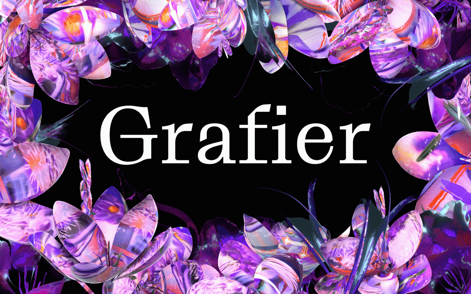
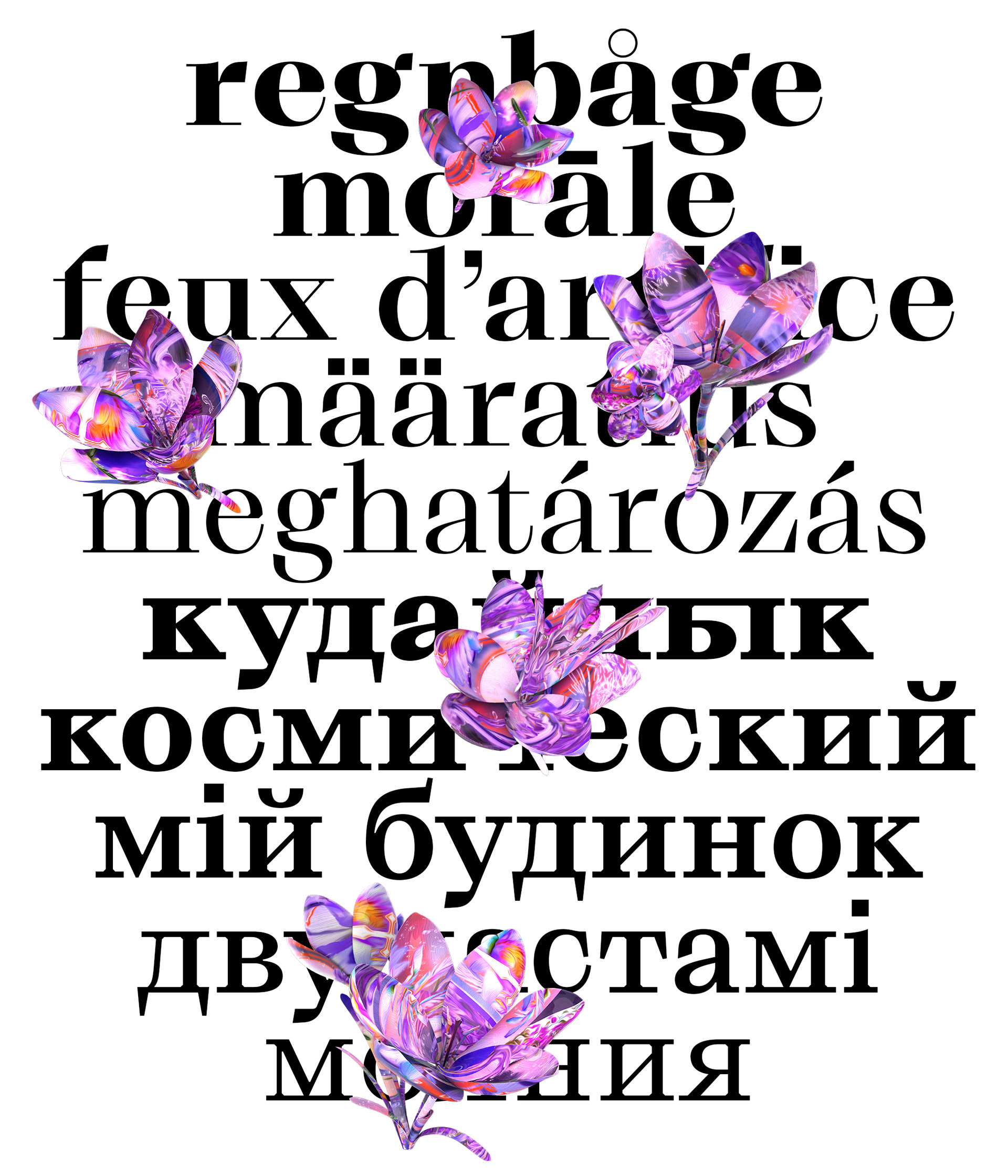
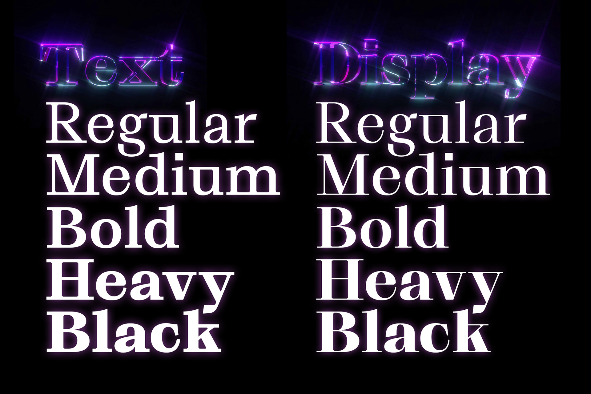
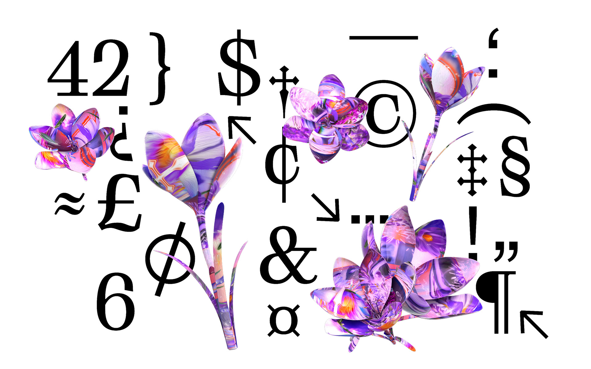
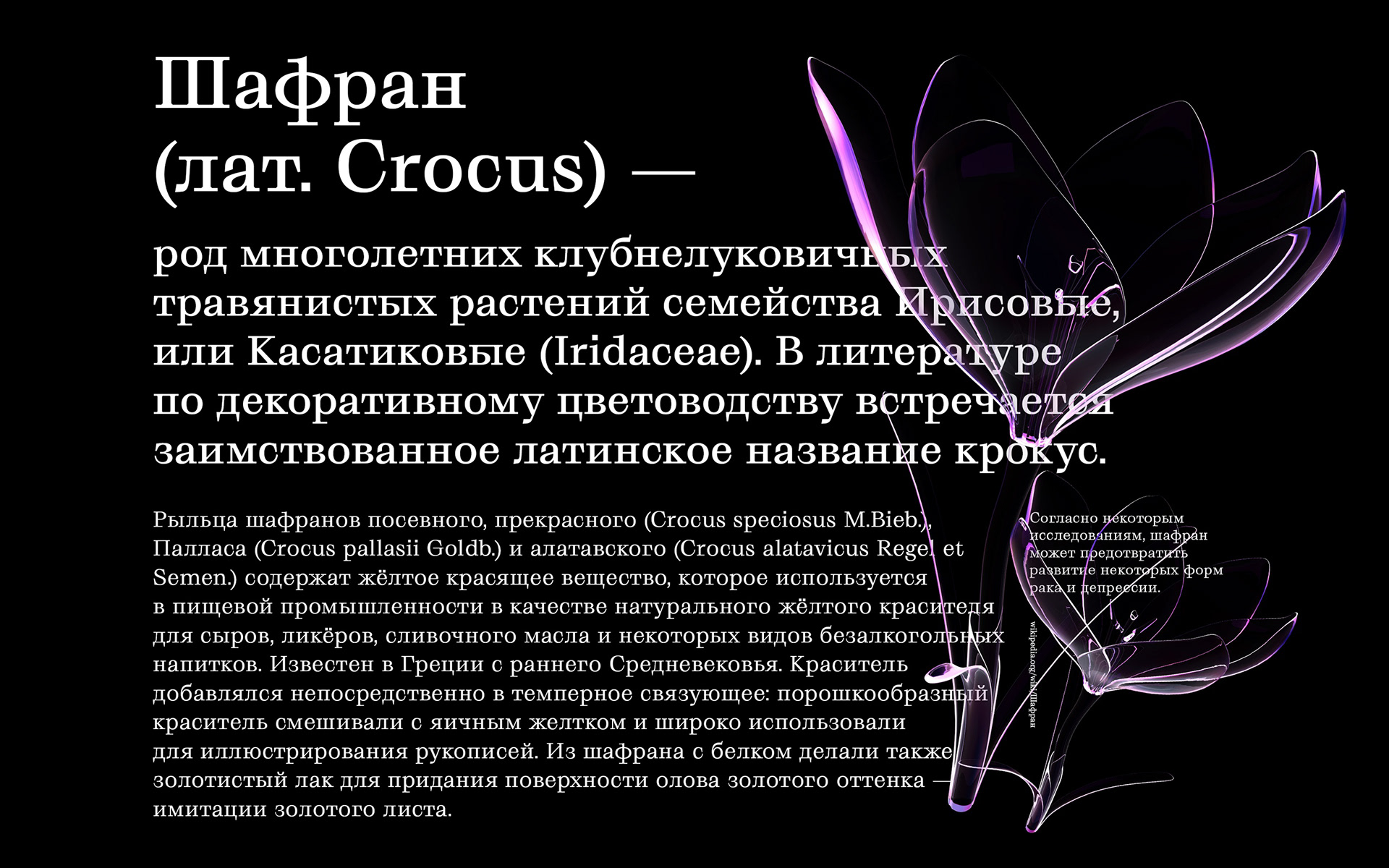
We have the running conversation that a serif typeface isn't generally the strong opinion when speaking about 'product design' because of its readability and constraints. But who cares! I think there is a definite purpose for a serif type and let's take a look at Grafier Serif Typeface and its variables by Alex Slobzheninov. This font family consists of 10 styles: five weights from Regular to Black in two contrast variations. It's a perfect combination in play with a sans-serif font!
Typography


 By
By About Alex Slobzheninov
Alex is a typographer based in Prague, Czech Republic, his work is all related to typeface. Make sure to follow and support his work on Instagram and more.


