by abduzeedo
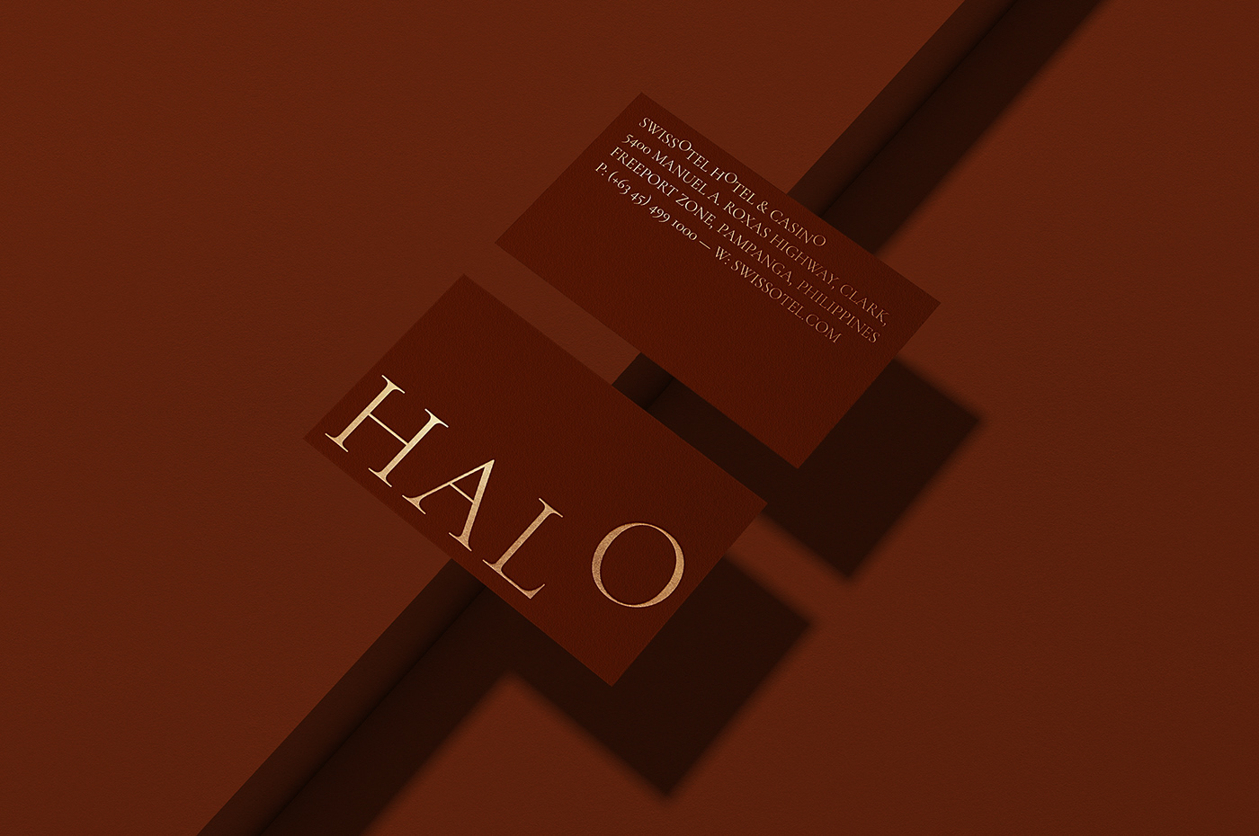
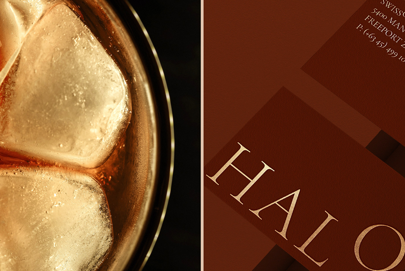
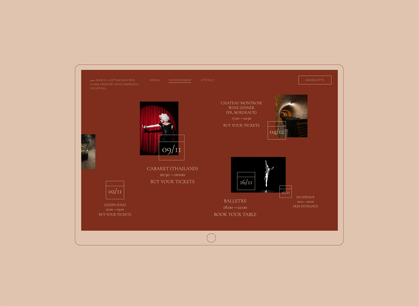
Sharmaine Zuidgeest, Andrew Millington, Liger Pham, Matt Millard and PurpleAsia ® shared a beautiful branding and visual identity project for Swissotel. Drawing inspiration from Manila’s Bar 360 and Raffles Singapore, Halo is a circular entertainment bar with high-end cocktails and bites. As the primary entertainment venue in the nine-outlet casino, Halo needed to stand out and draw attention as a place of energetic entertainment and memorable good times, be it day or night.
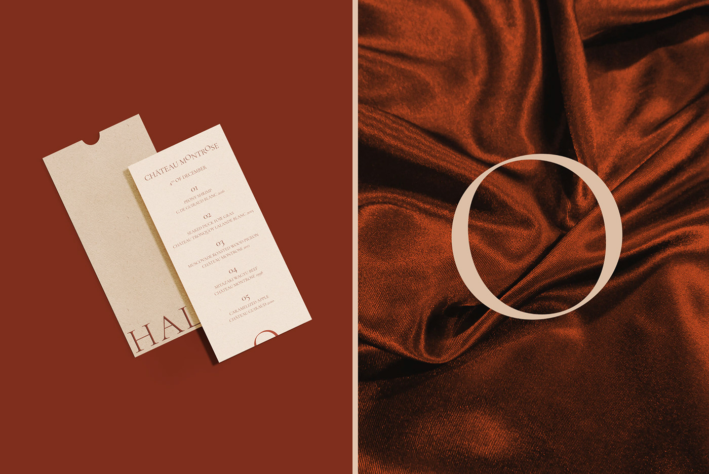
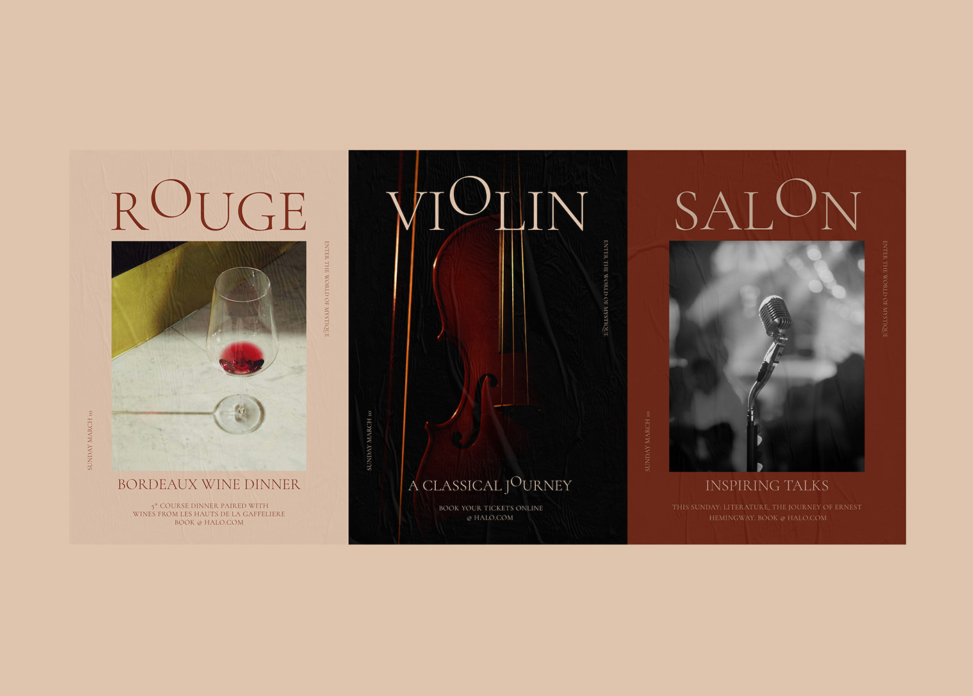
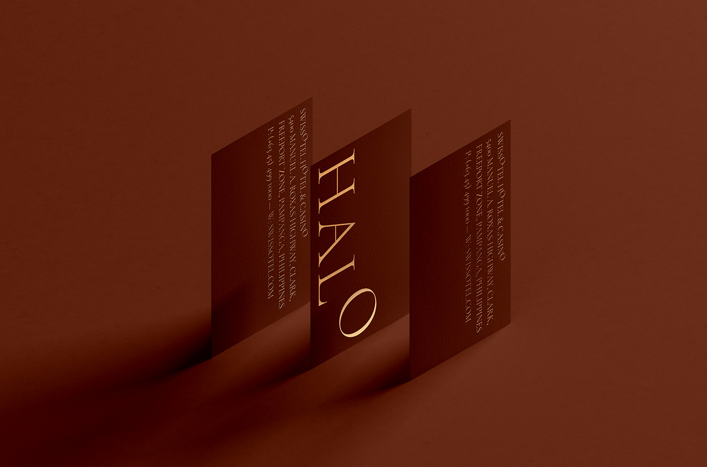
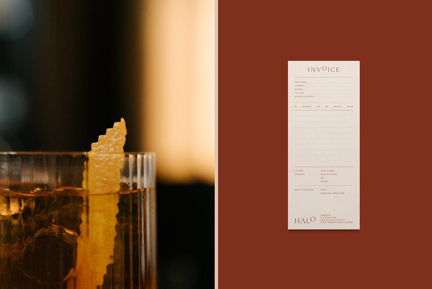
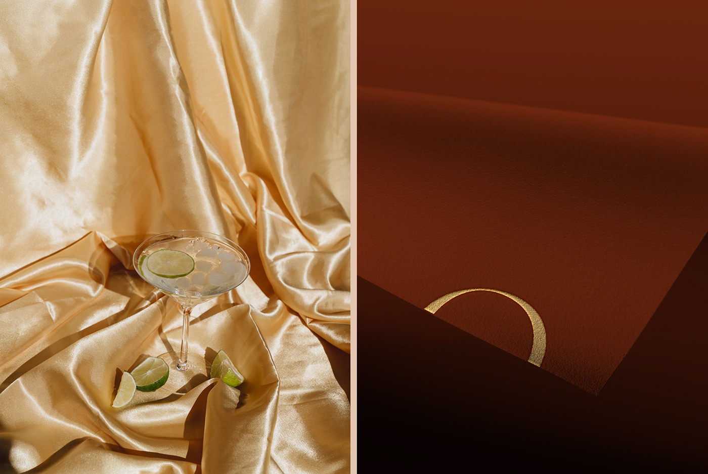
The name is a promise of a light, bright, and entrancing experience in a semi-relaxed lounge setting. The brand is a mix of elegance and burlesque alongside tradition and playfulness. Guests looking for a drink, make a new friend, or celebrate a win will find exactly what they’re looking for at Halo.
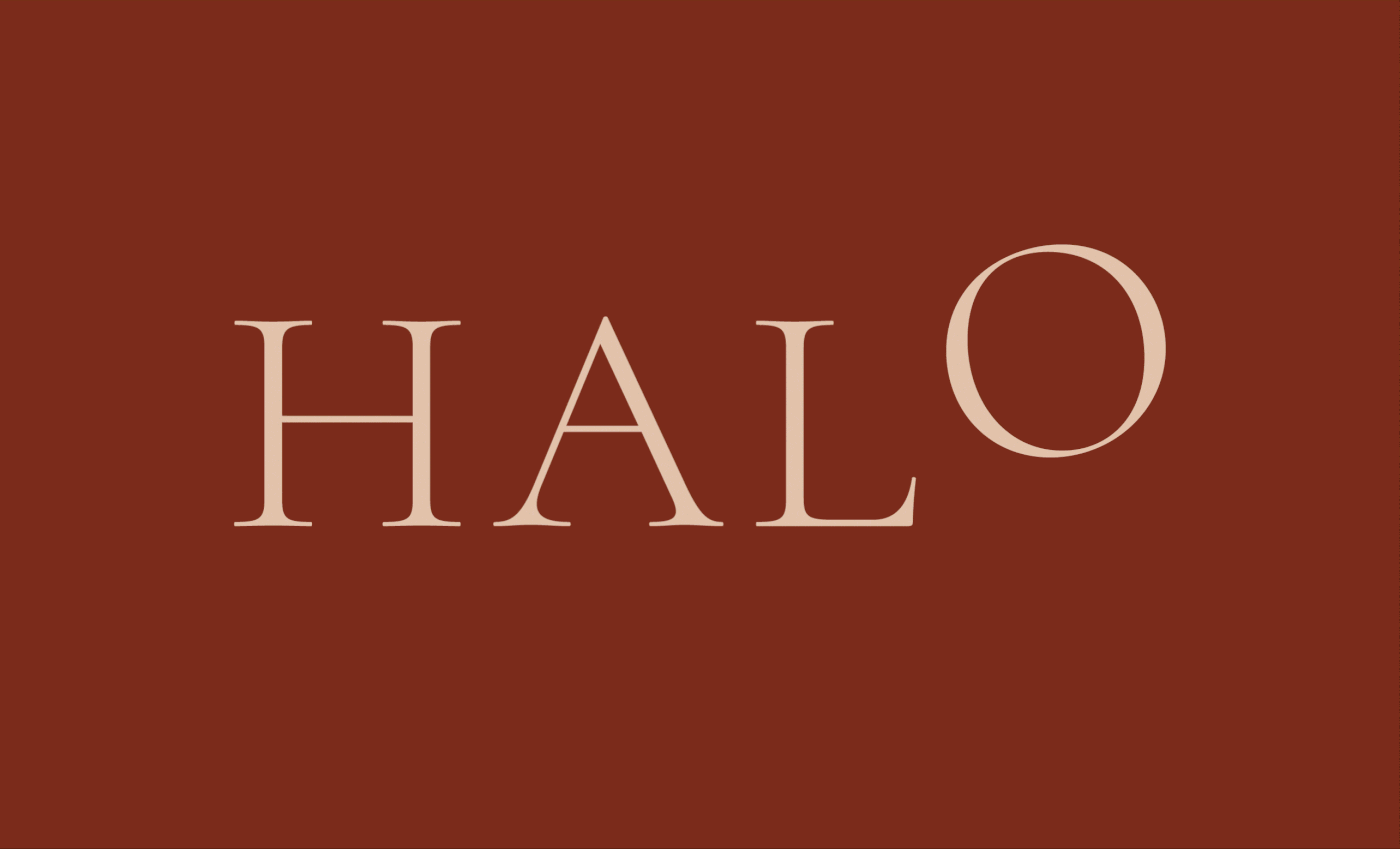
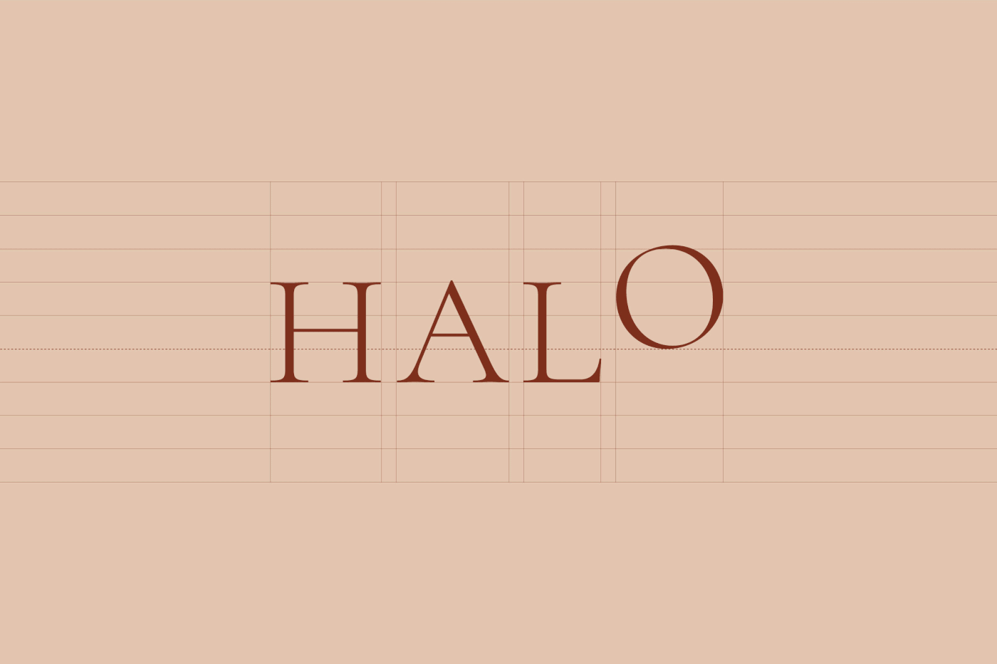
The logo is formed using a modern sans-serif font to reflect the elegance and prestige of the bar itself. The perfectly rounded “O” pops out compared to the rest of the wordmark to emphasize Halo as an otherworldly experience. The overall design is clean and minimal to maintain the bar’s elegance.
Credits
- Location: Clark, Philippines
- Company: PurpleAsia
- Client: Swissotel

")


