Human Layer Security — Branding and Illustration
A digital and physical brand identity for Human Layer Security — a grounds-up reimagining of the IT security professional’s print magazine for the 21st Century — taking form in an interactive website, trailblazing online community, and quarterly print magazine about the changing world of cybersecurity.
Project Abstract
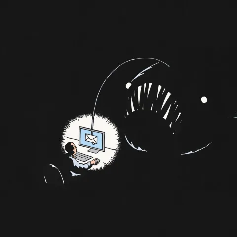
Human Layer Security is the philosophy of practicing cybersecurity with a distinct focus on people: Security Managers, Employees, Civilians, and Attackers. Powered by machine learning to automatically detect the mistakes or malicious behaviour of people using digital systems, this is the leading idea behind Tessian’s platform and commercial success.
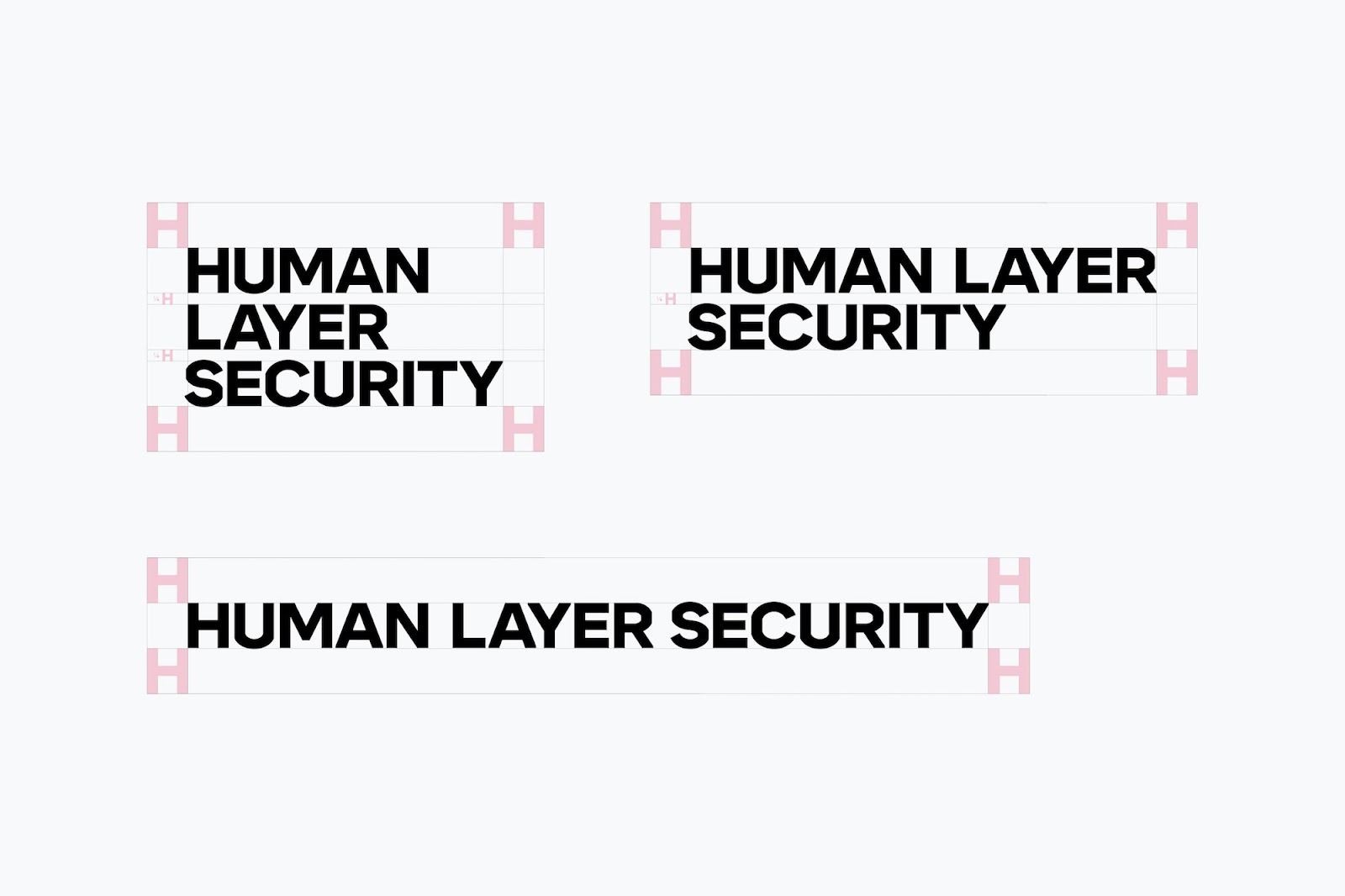
The identity for Human Layer Security feels unconventional in any setting — much less the rigidly corporate world of cybersecurity. Approaching the design with a maximalist, “more-is-more” philosophy, the team sought to marry the crisp, orthogonal structure of security & information technology with a patchwork of illustrative styles, an electrifying palette, and bold typography.
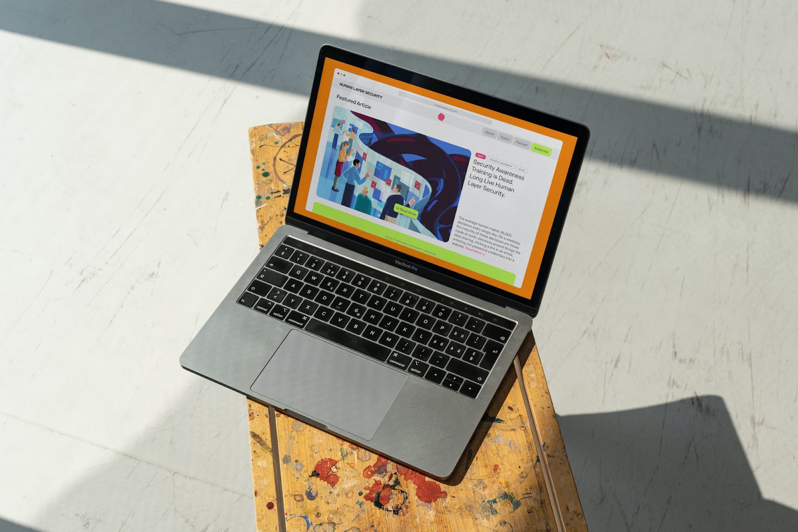
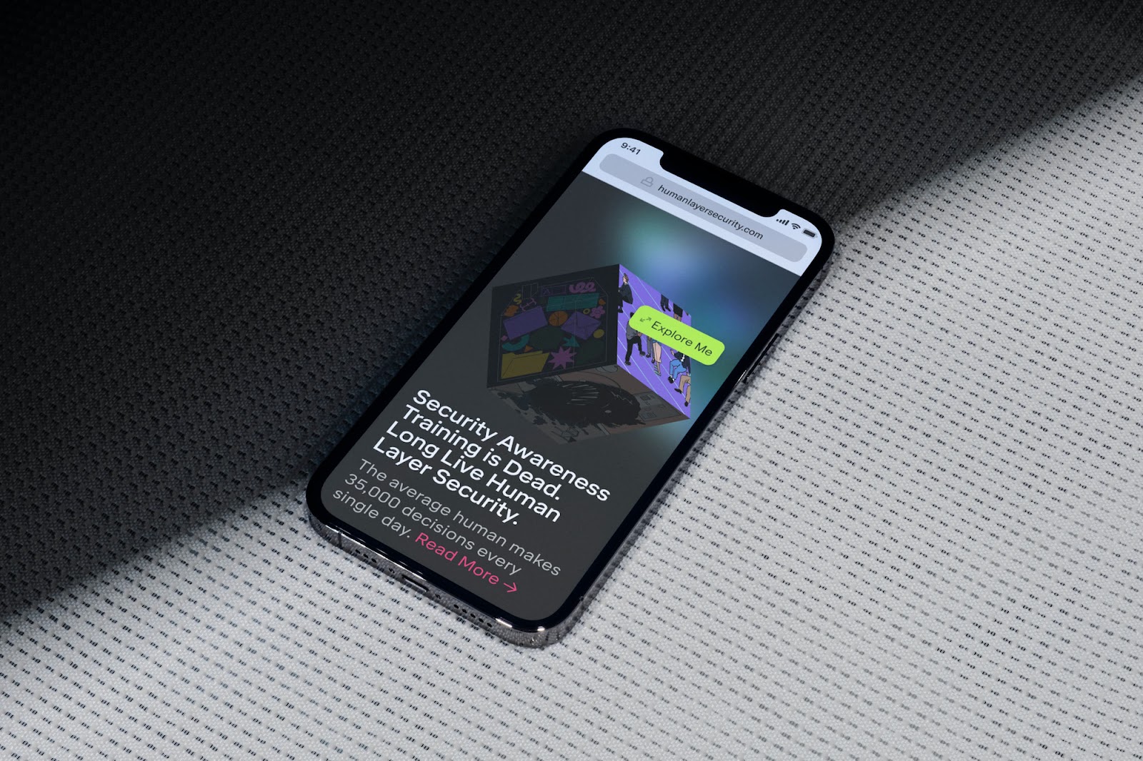
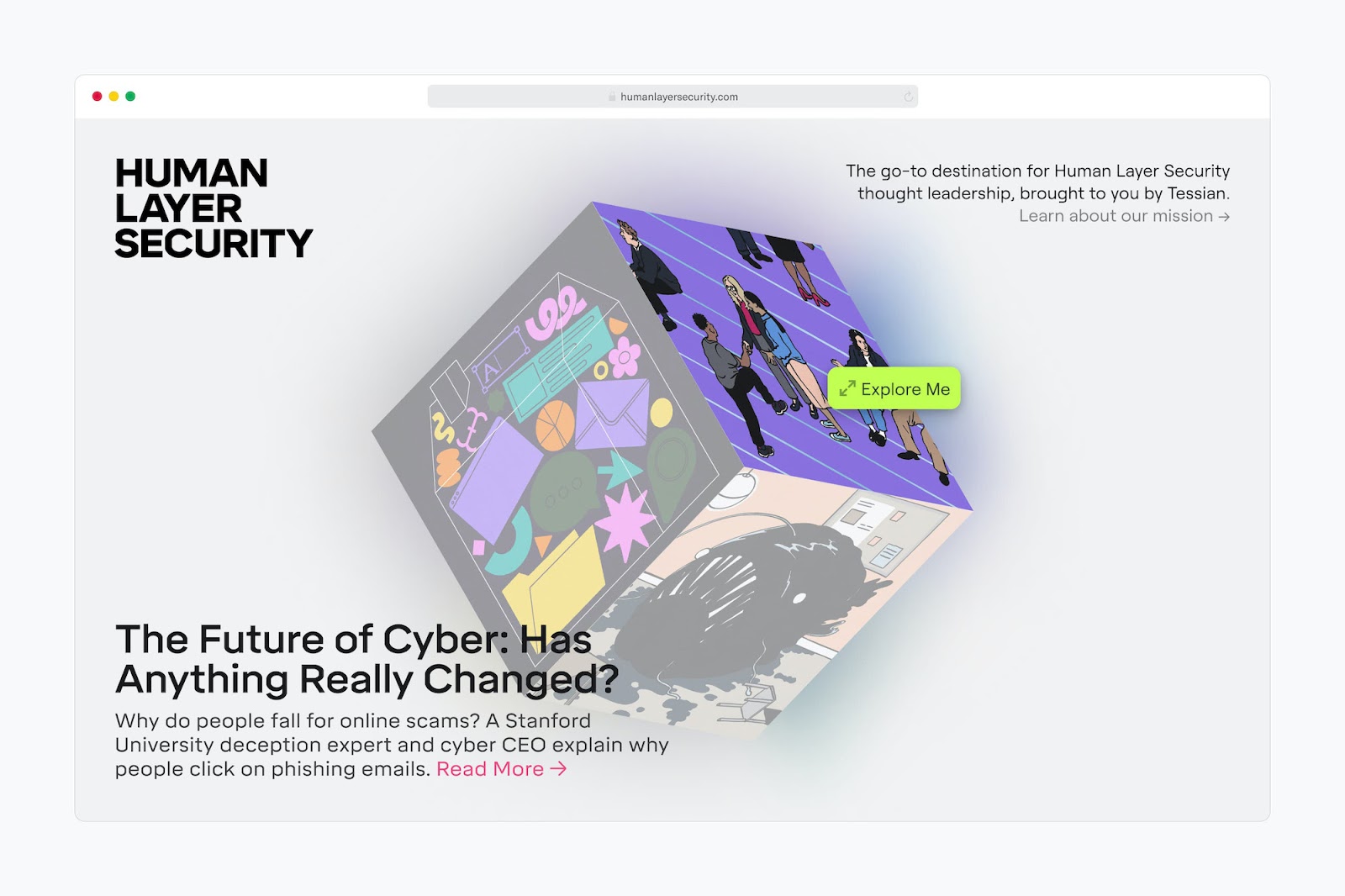
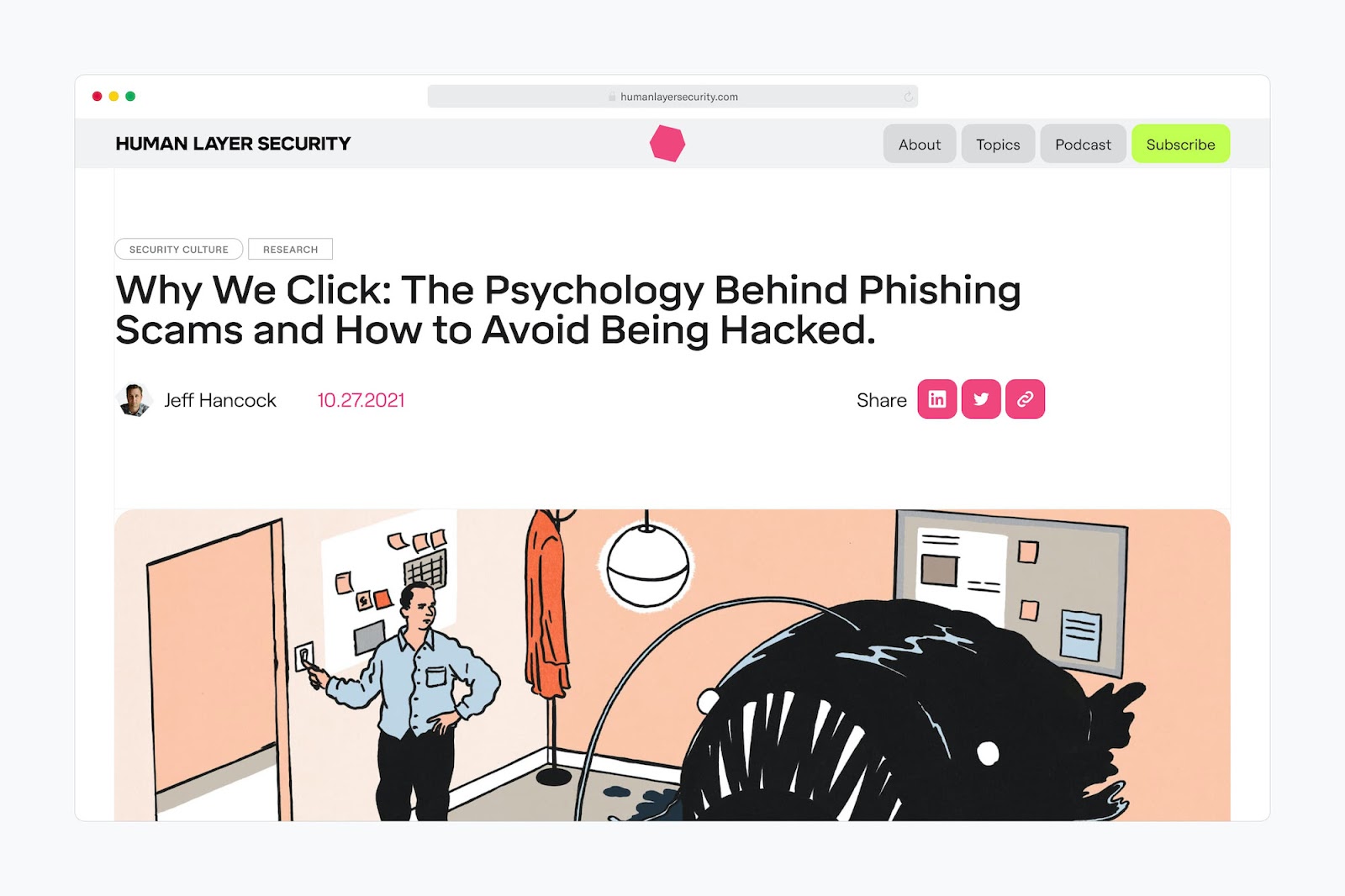
The result is as much disciplined as it is unflinchingly proud in an industry whose most famous export is ‘boring powerpoint presentations’ — and full of visual hieroglyphs tying digital and physical executions together — The Cube, the main navigational element on the website, becomes an ownable motif with authors framed in profile, and elements of the website’s blog are recreated with printed “buttons”.
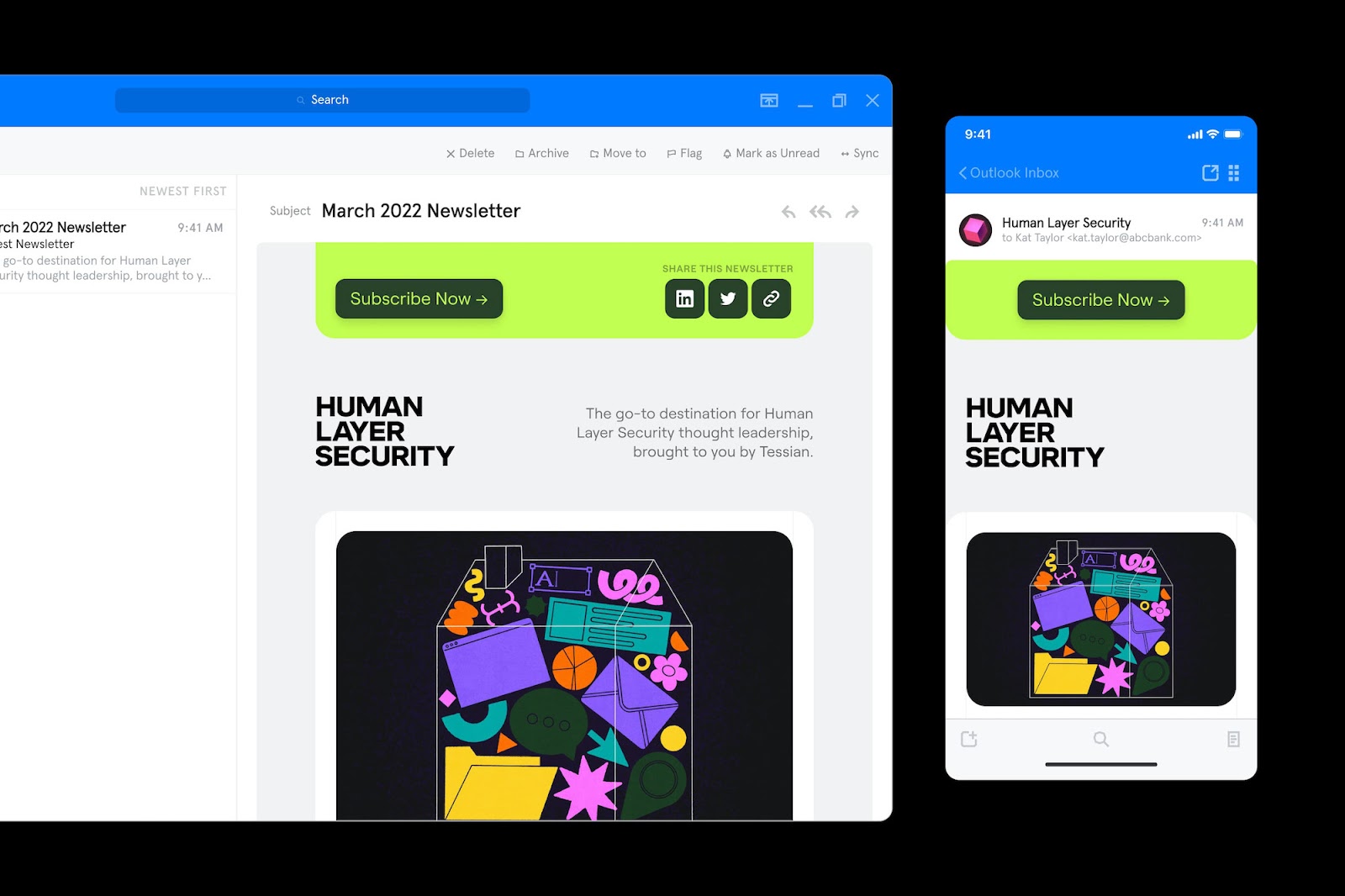
The Cube forms a cornerstone of the Human Layer Security identity, being the main navigational element as you enter the website. Hovering over each face presents an array of articles to read and share — pasted with rich illustrated artwork. In other brand activations, the cube becomes an ownable motif — authors are framed in profile, and social posts are identified with a bold pink cube. Alongside an interactive website, deliverables included email newsletters, social activations, and merchandise.
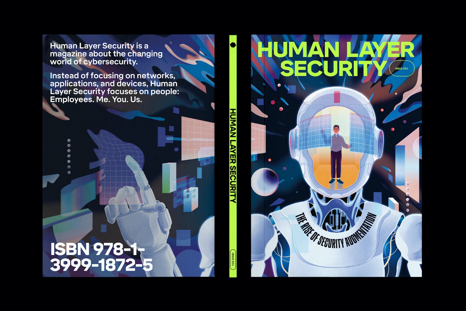
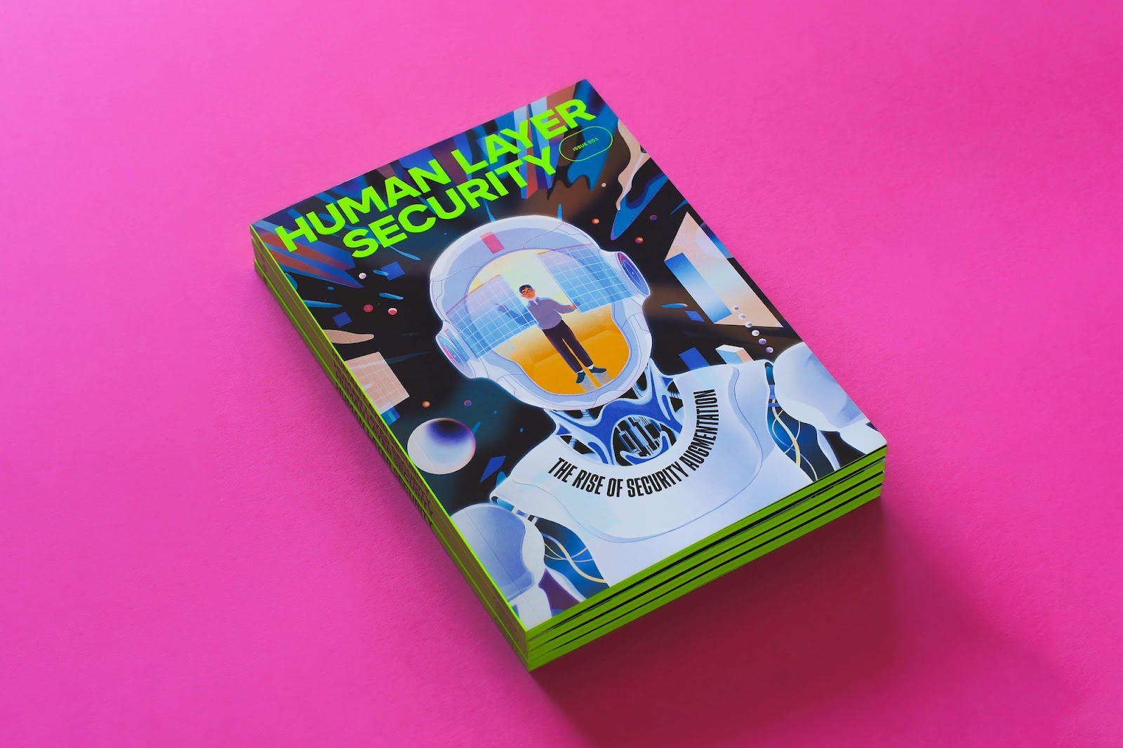
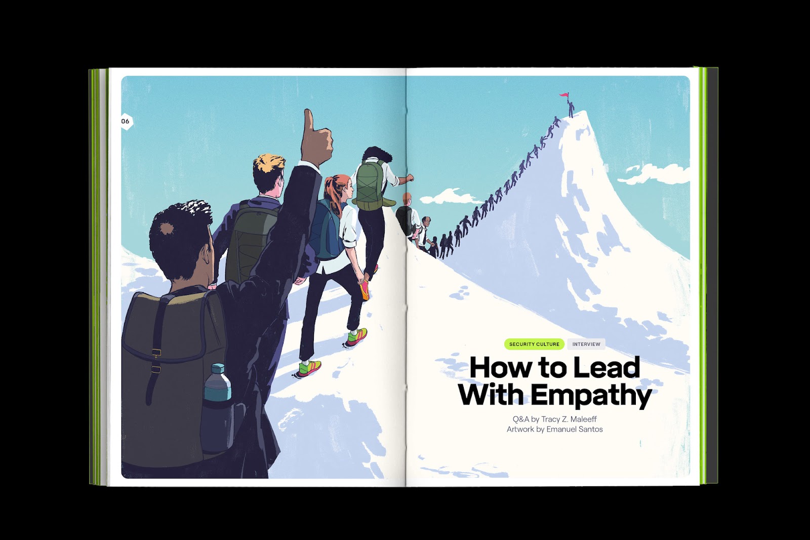
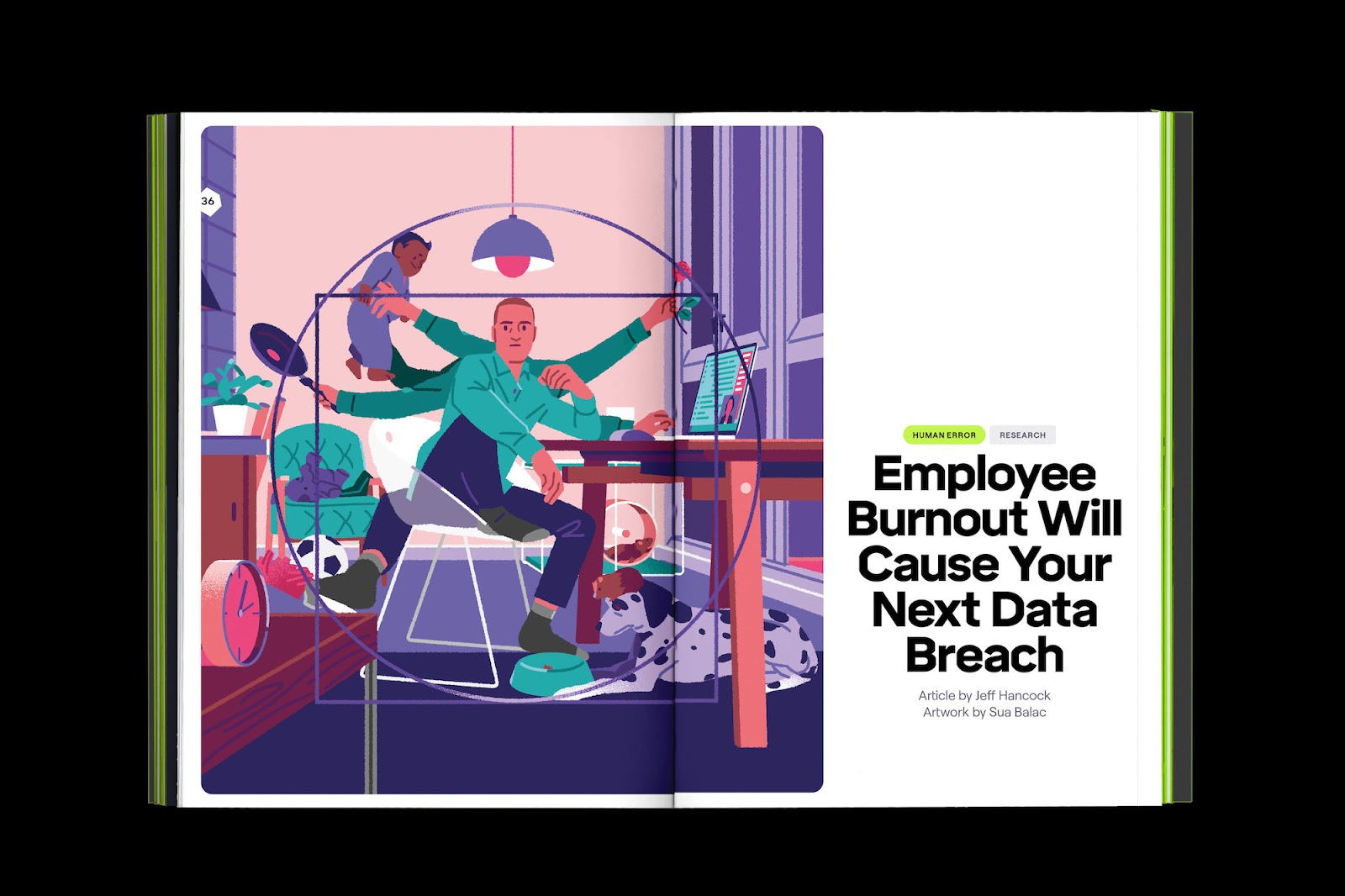
For 2022, ambitions extended to a printed quarterly magazine — featuring 7 of the industry’s leading voices — presented with the very same characterful and intentional design of its website. In a custom 170mm x 240mm format and splashed with an unmissable custom Pantone, the magazine demands attention and admiration — and faithfully brings the digital into physical by careful use of digital motif; buttons, rounded corners, and a visible superstructure in the form of the line grid.
Credits
- Designed by Leon Brown with support from Mihai Toma and Anita Arabadzhieva.
- Printed by Presssision Ltd.