by abduzeedo
In the contemporary realm of design, evoking emotions and constructing narratives is paramount. Lukas Majzlan's recent endeavor in branding and visual identity for Bloom Robbins perfectly encapsulates this. Rooting the brand's essence in three keywords – Unbridled, Playful, and Feminine – Majzlan crafts a narrative that doesn't just speak to the audience but resonates with them on a personal level.
Bloom Robbins is not just a brand; it's an embodiment. It reflects the multifaceted nature of every woman: at times playful, occasionally fierce, but always imbued with a sense of femininity. It's a pivot from the tales of yore, from stories like Robin Hood. Where Robin Hood is history, Bloom Robbins is her story. The brand represents not just a product but a journey, a feeling, a statement.
Logo Design
A name like Bloom Robbins isn't just a label; it's an incantation. It evokes images of a modern-day heroine. Naturally, a typographic logo, with its inherent ability to convey personality through letterform, was the ideal choice. Lukas sifted through countless concepts and fonts, finally selecting one that strikes a balance between playful unconventionality and feminine elegance. To further bolster its versatility, the logo offers two variations. The primary variation employs a coloured background mask, accentuating its presence and ensuring optimal contrast across diverse backgrounds.
Typography Choices
Typography, the unsung hero of branding, plays a pivotal role here. The story of Bloom Robbins isn't just in its name or its logo, but also in the typefaces that carry its voice to the audience. To mirror the brand's duality and its pillars, two distinct typefaces were chosen.
Firstly, there's the soft serif, Mikela. Its gentle curves and elegant form bring forth the brand's playful and feminine undertones. It feels like a whisper, a lullaby, a secret shared between friends.
Contrasting Mikela is Monument Grotesk. This font, edgy and bold, is a departure from the traditional. It's the fierceness in every woman, the unbridled spirit that refuses to be tamed. Together, these fonts not only embody the brand's spirit but also accentuate each other, especially when paired with specific colour combinations.
In conclusion, the new visual identity of Bloom Robbins, designed by Lukas Majzlan, isn't just a brand design; it's a story, an emotion, a movement. Through thoughtful choices in typography, color, and design principles, Majzlan has turned branding into an art, proving once again that design is not just about aesthetics but about connecting, resonating, and inspiring.
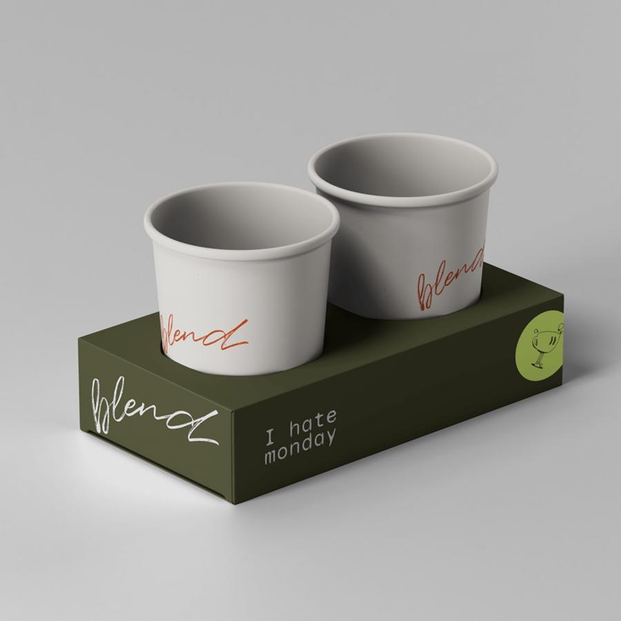
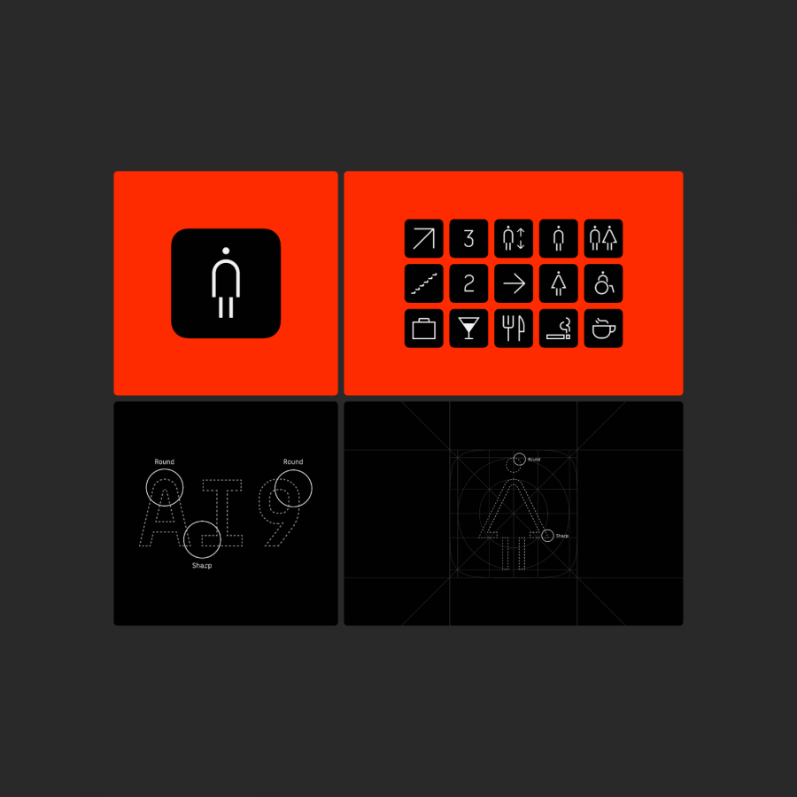
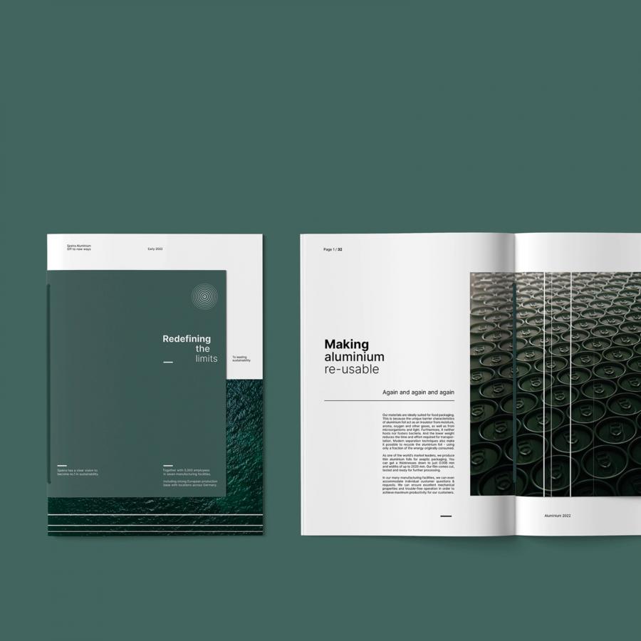
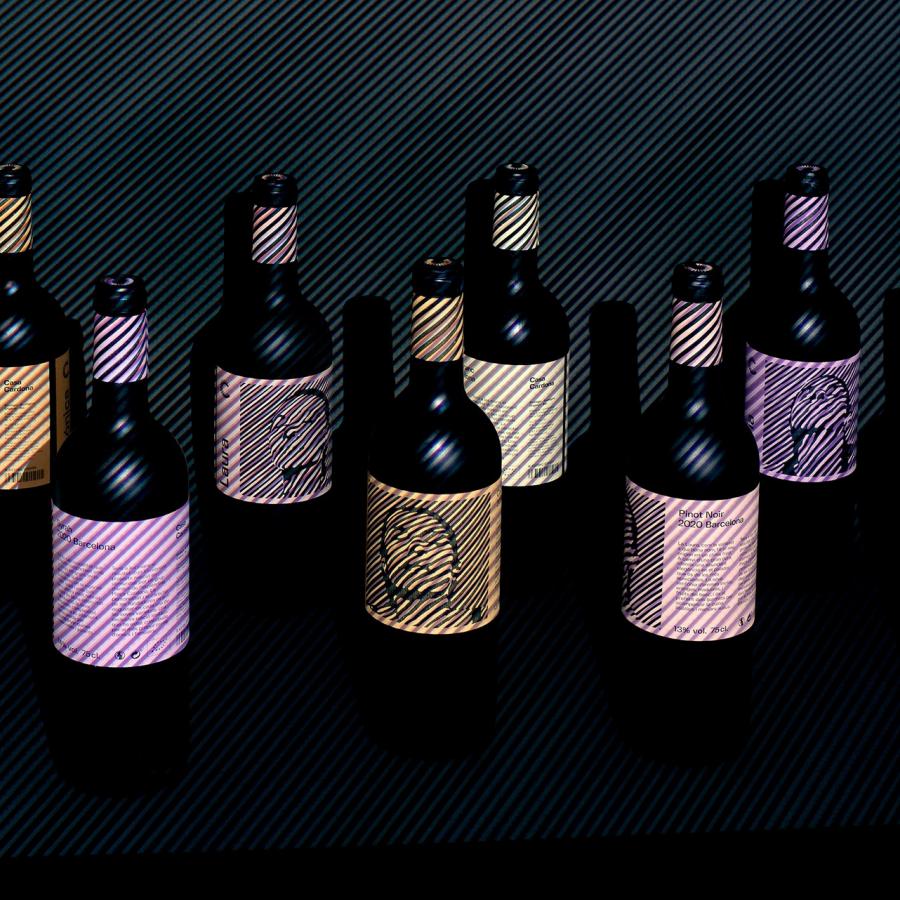
Branding and visual identity artifacts
For more information make sure to check out Lukas Majzlan website or follow him on Behance.
