by abduzeedo
Explore the New Narrative's branding and visual identity, a testament to minimalist design excellence by Anvar K.
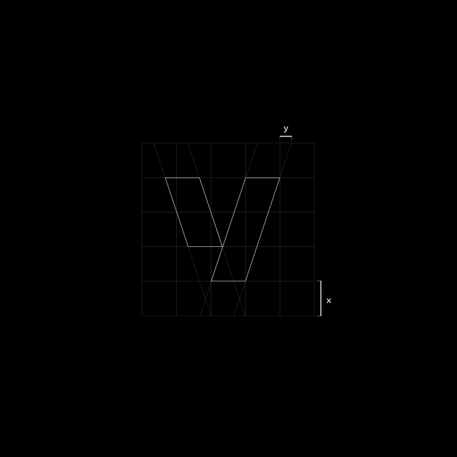
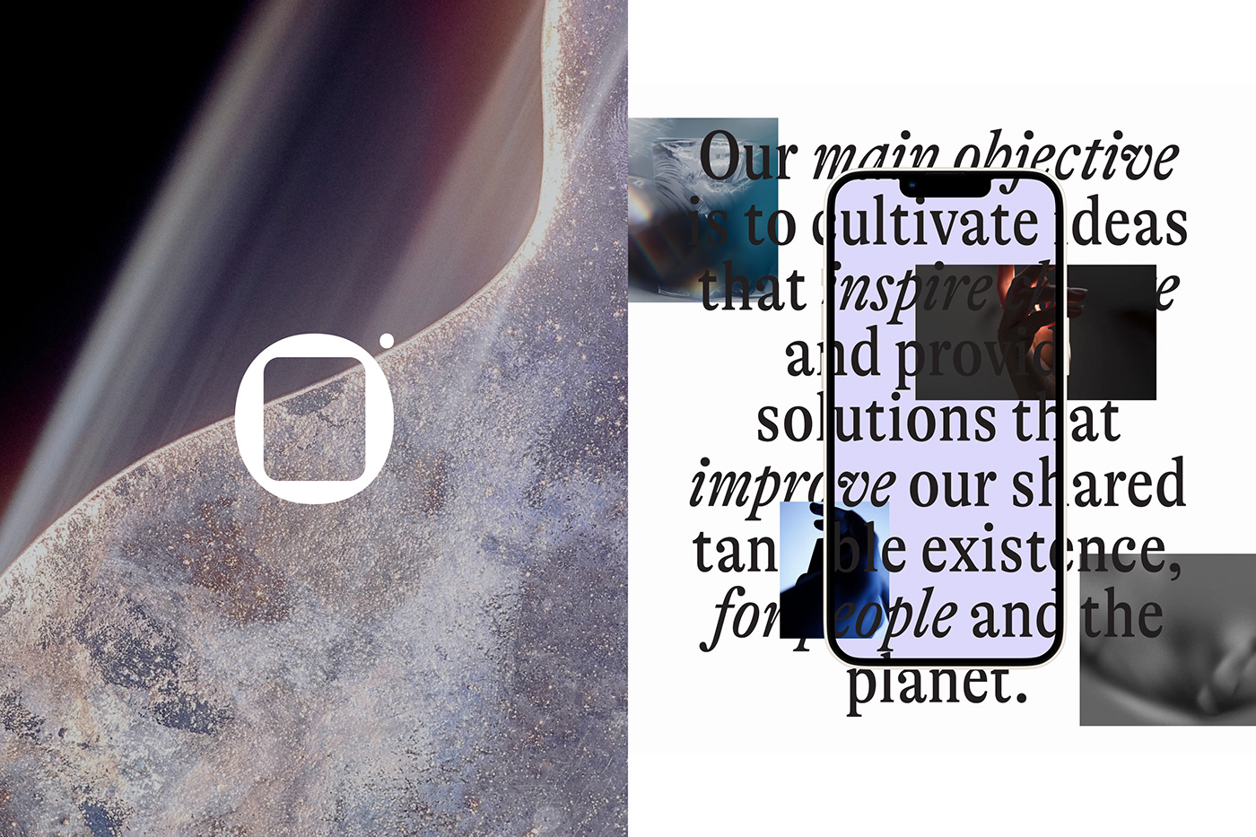
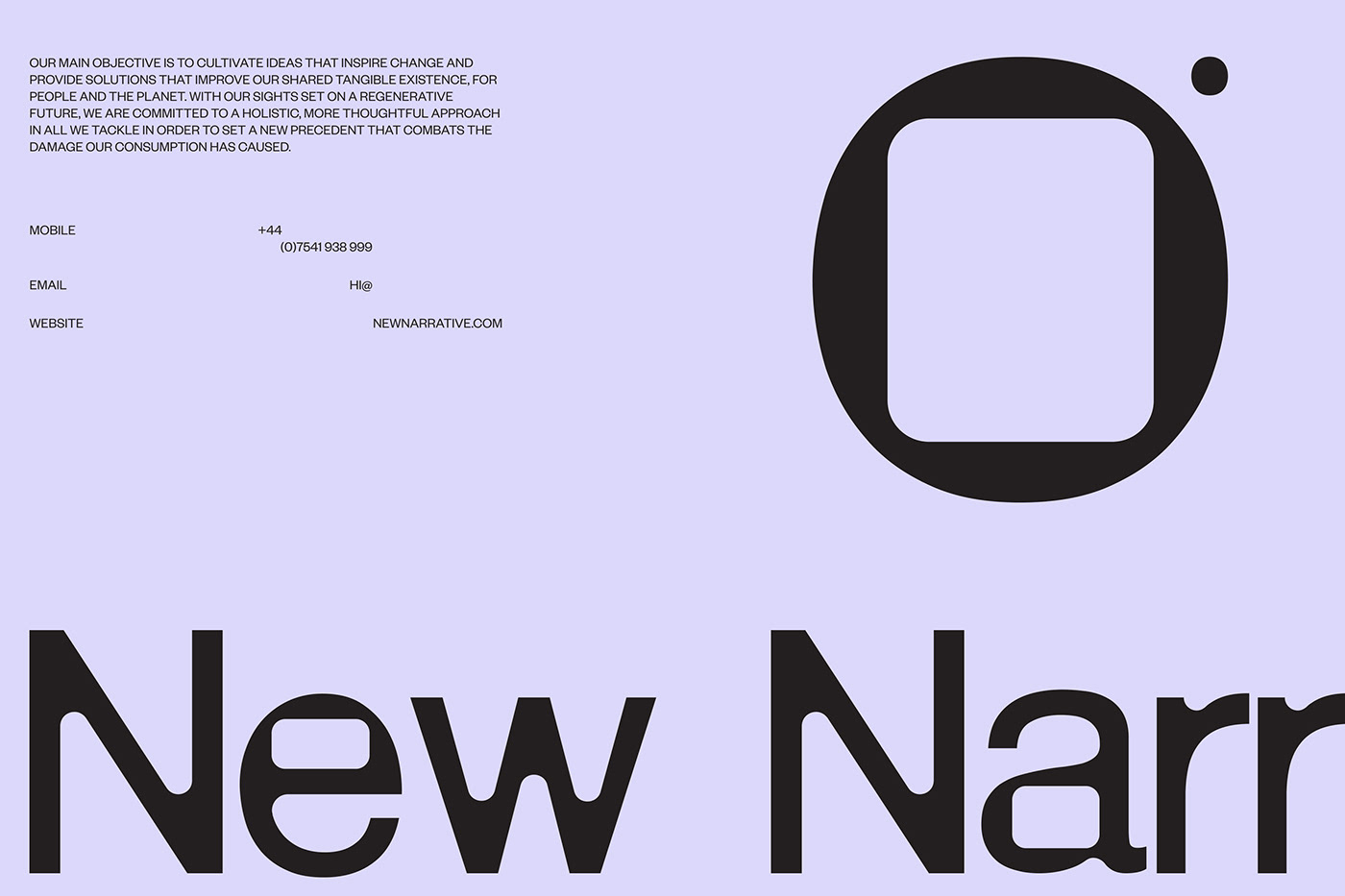
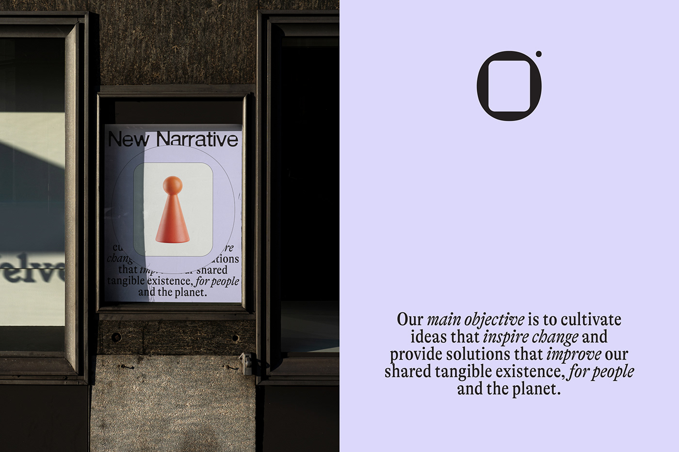
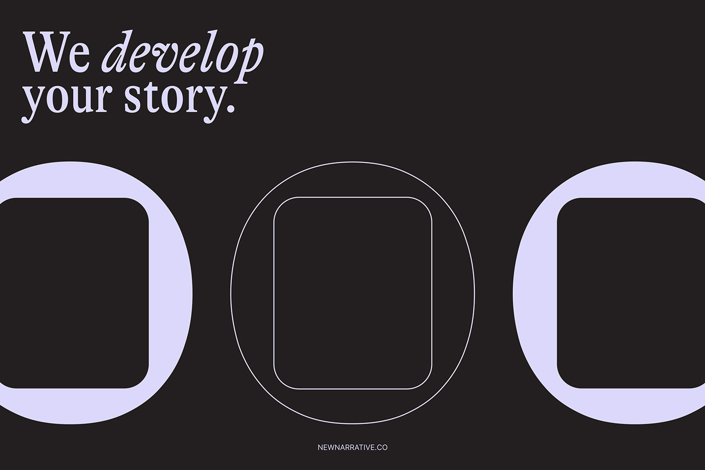
In the realm of design, the essence of a brand is often captured through the simplicity and precision of its visual identity. Anvar K.'s design for New Narrative, a London-based design and development agency, exemplifies this principle. The concept hinges on a fundamental geometric relationship—a circle embracing a rounded square. This motif resonates through the entire branding, symbolizing unity, stability, and a forward-thinking mindset.
Anvar K.'s approach to New Narrative's visual identity is rooted in the philosophy that less is more. The logo's clean lines and balanced proportions convey a sense of clarity and focus that aligns with the agency's mission. The circle, a timeless symbol of totality, encompasses the square, which represents order and foundation. Together, these shapes illustrate the agency's holistic and structured approach to design and development.
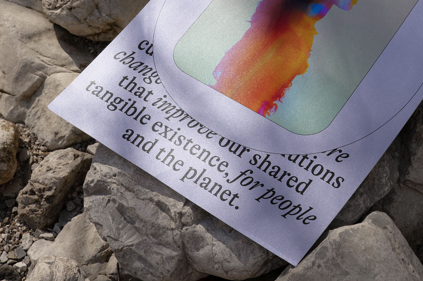
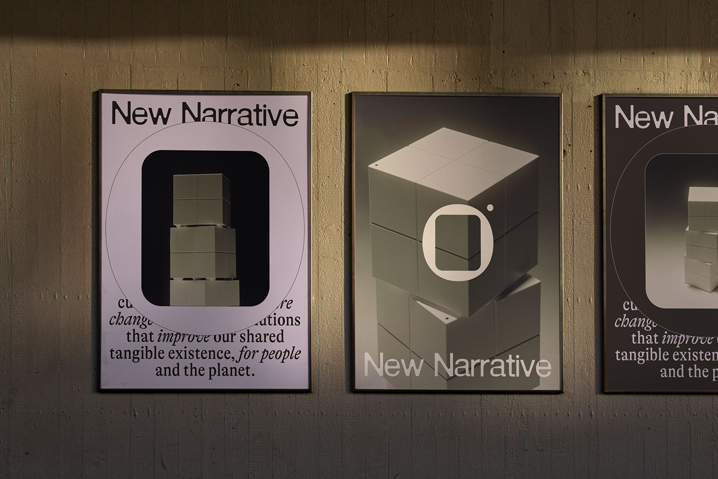
The typography mirrors the logo's geometry, reinforcing the brand's cohesive image. The use of a bold, sans-serif font ensures legibility and modernity, while its spacing and alignment with the logo shapes maintain the integrity of the visual flow. The strategic use of negative space within the logotype further highlights the brand's core values of openness and potential.
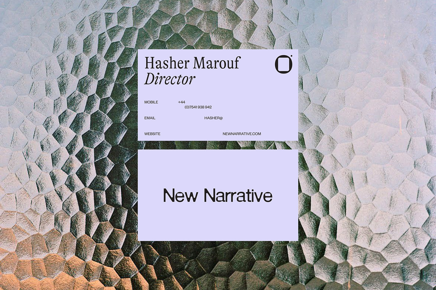
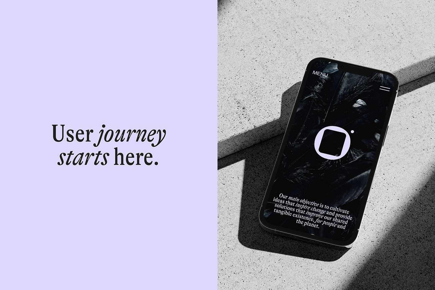
Anvar K.'s color selection for New Narrative's branding adds to the visual impact. The chosen palette speaks to a contemporary audience while maintaining the versatility necessary for various applications. It reflects the brand's adaptability and its embrace of innovation.
In crafting New Narrative's branding and visual identity, Anvar K. has created more than just a logo; he has developed a visual language that encapsulates the agency's ethos. The design stands as a testament to the power of minimalist branding—a clear beacon in a crowded market. It invites the viewer into a narrative that is both new and enduring, a story told in the universal language of shape and form, speaking volumes without excess.
Branding and visual identity artifacts 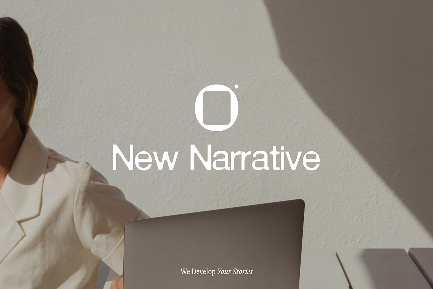

For more information make sure to check out Anvar K on Behance and website.
