by abduzeedo
Discover NobleForma's branding and visual identity, a minimalist masterpiece by Tim Harrison, featuring Helvetica Neue and a distinct color palette.
In the world of branding and visual identity, few projects exemplify the power of minimalism as strikingly as NobleForma, designed by Tim Harrison. This project is a deep dive into how simplicity can speak volumes, embracing the essence of the brand through a restrained yet impactful design approach.
Harrison's work for NobleForma centers around a logo that explores the interplay of the initials 'N' and 'F'. This choice is not merely aesthetic but symbolic, embodying the brand’s identity in a concise visual form. The logo’s clean lines and balanced proportions reflect a sophisticated understanding of branding fundamentals.
The choice of typography in NobleForma’s branding further reinforces the minimalist ethos. Helvetica Neue, known for its clarity and versatility, is employed with skillful restraint. Its sans-serif form offers a modern, uncluttered look, resonating with the brand's forward-thinking vision. This typeface selection is critical, as it sets the tone for all communication, ensuring consistency and recognizability.
Color plays a pivotal role in Harrison's design. The palette of Silver Blue, Sky Blue, Dark Grey, and Sand Brown is both unique and harmonious. These colors blend to create a visual identity that is fresh yet grounded, versatile yet distinct. The use of these colors across various mediums adds depth and texture to the brand, making it stand out in a crowded marketplace.
Lastly, the implementation of a clear and beautiful grid system in the design and visual identity materials showcases Harrison’s attention to detail. This structured approach not only aids in maintaining visual consistency across different platforms but also enhances the usability and readability of the brand’s materials.
In conclusion, Tim Harrison’s work on NobleForma is a masterclass in minimalist branding. By focusing on the essentials - typography, color, and structure - he crafts a visual identity that is both elegant and functional. This project serves as an inspiration for designers aiming to create impactful branding with a minimalist touch.
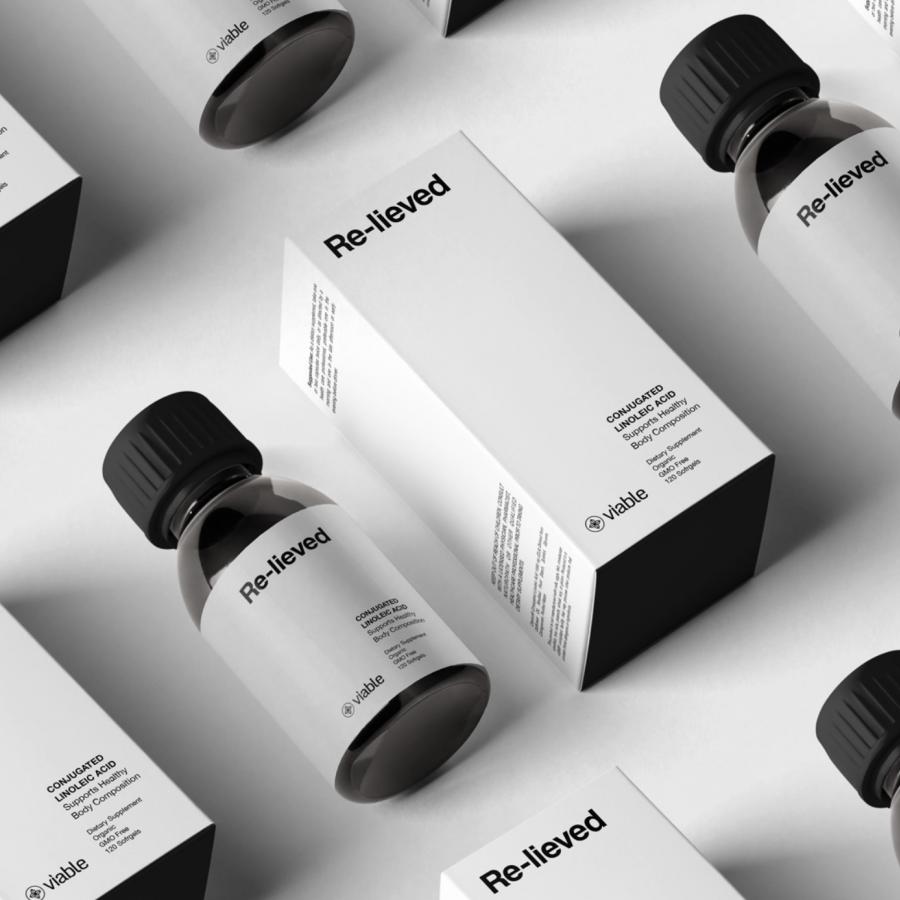
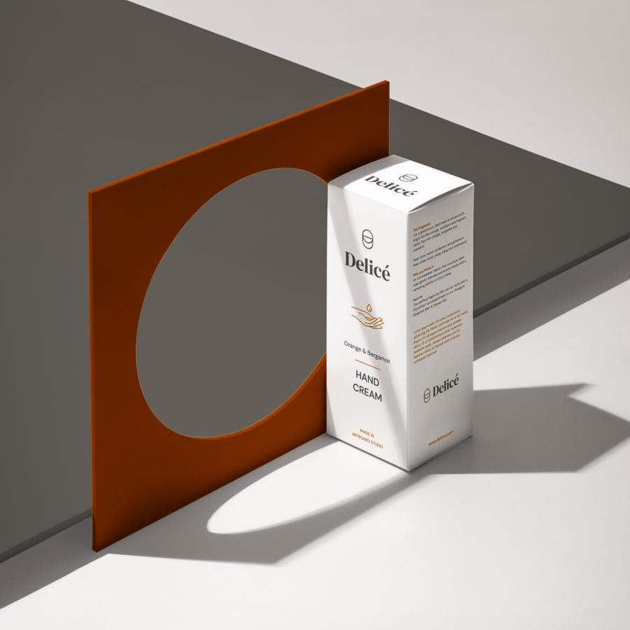
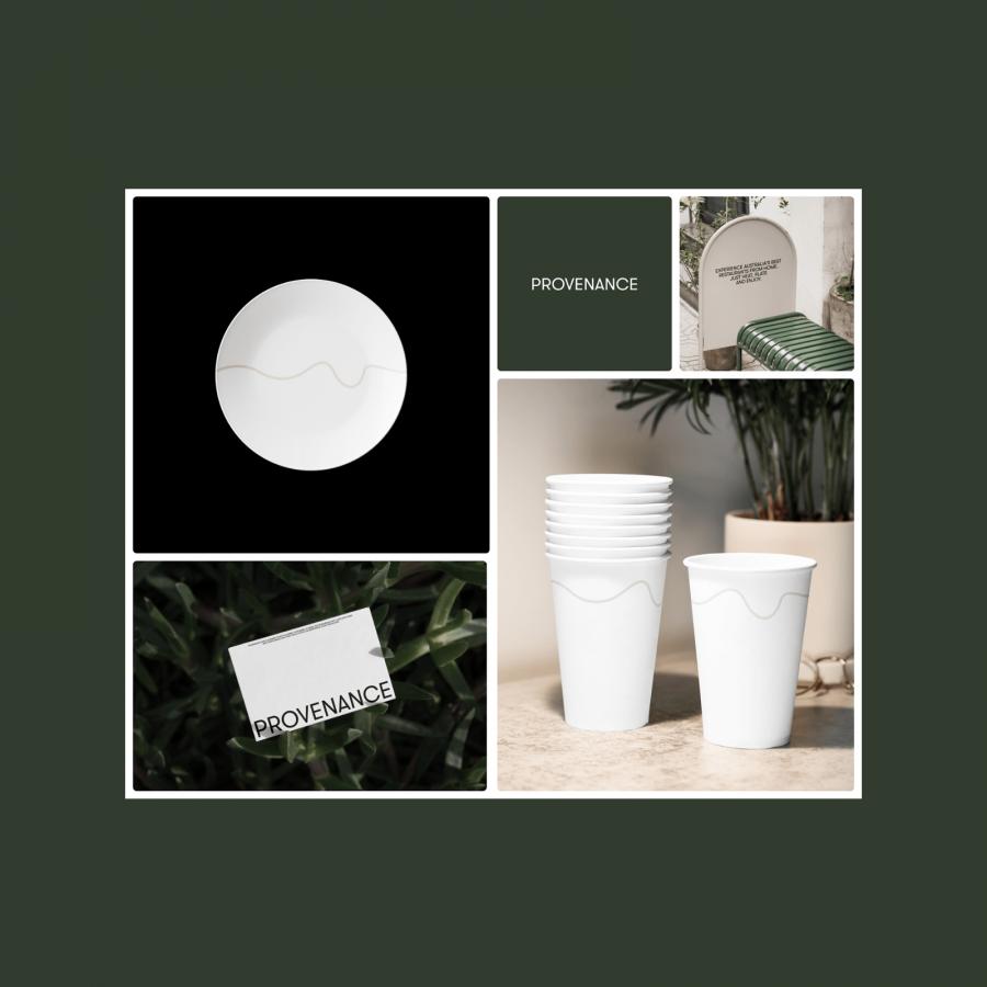
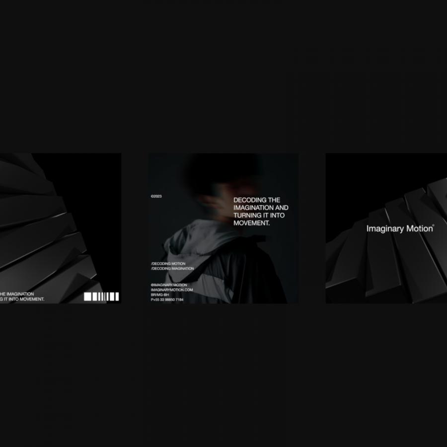
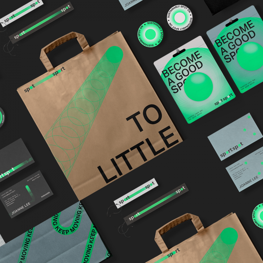
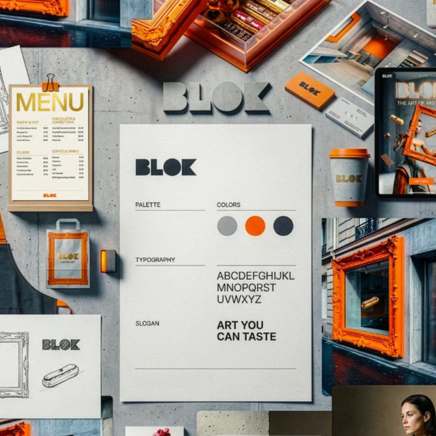
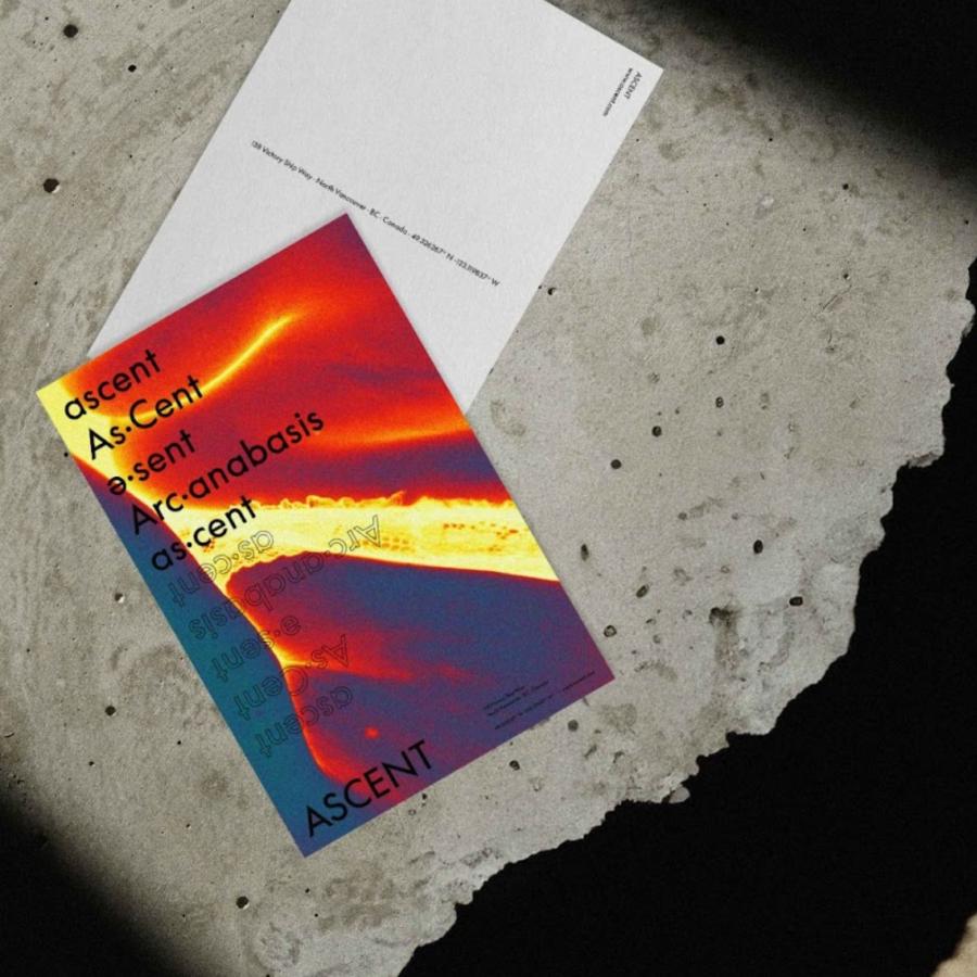
Branding and visual identity artifacts
For more information check out Tim Harrison on Behance
