by abduzeedo
Discover how subtle changes to the iconic chevron and wordmark achieve a fresh, modern look while retaining branding and visual identity recognition.
Daniel Lasso recently shared his involvement in the Plex logo redesign. Tasked with maintaining brand recognition while creating a more welcoming feel, Lasso focused on a key element: the chevron. This iconic shape remains central, but the overall design is simplified.
The new logo features a lowercase wordmark with softer, rounded edges. Gradients are replaced with solid colors, contributing to a clean, modern aesthetic. This minimalist approach aims to make the Plex brand more approachable and inviting to new users.
Lasso explains, "The goal was to capture Plex's distinctive character while also introducing a warmer, more welcoming tone." The redesign achieves this by balancing the familiar chevron with a fresh, simplified wordmark. The result is a logo that feels both recognizable and revitalized.
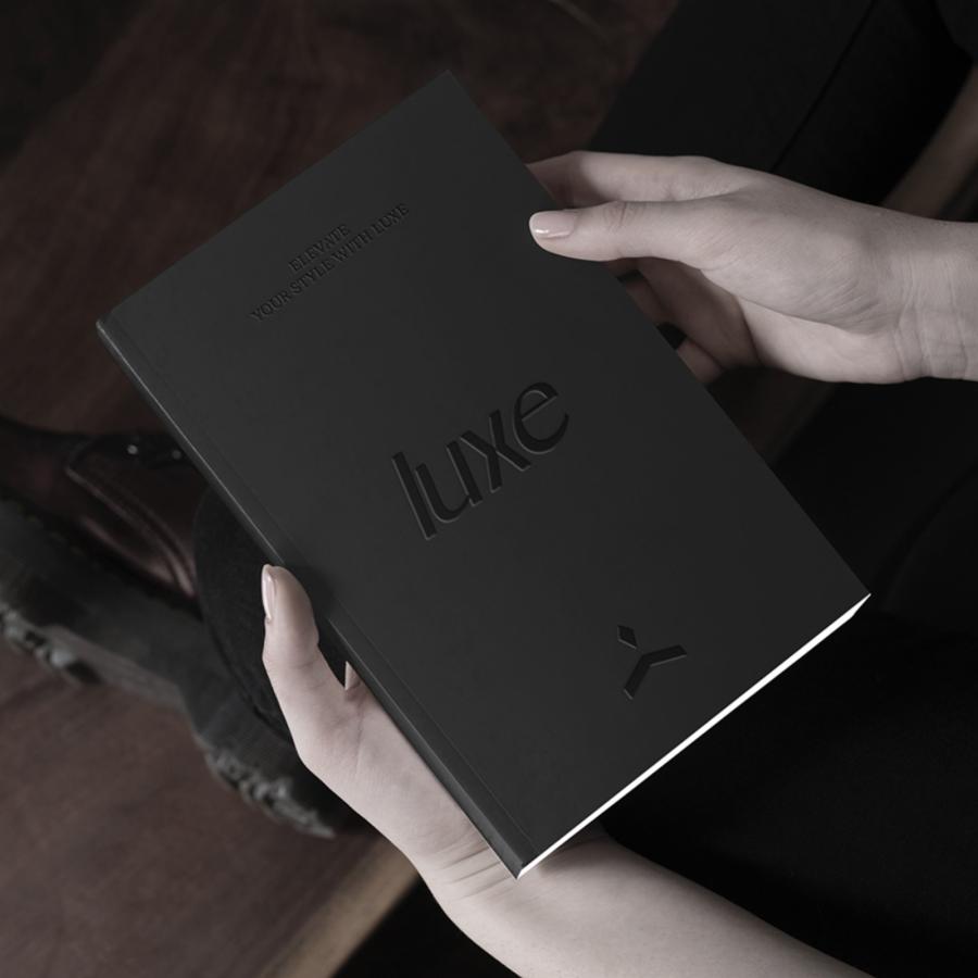
The proposal I’ve created retains a key element from the original design: the chevron. As a central and iconic part of Plex’s identity, the chevron remains a prominent feature in the updated logo. My proposal embraces a simpler, more minimalistic approach, featuring a lowercase wordmark with rounded, softer edges and no gradients. This design aims to convey a more inviting and personable identity.
This project highlights the power of subtle changes in branding. By carefully adjusting existing elements and embracing a minimalist philosophy, Lasso has successfully evolved the Plex identity. The new logo retains its distinctive character while projecting a more friendly, inviting vibe. It's a testament to the impact of thoughtful, strategic design.
Branding and visual identity artifacts
For more information make sure to follow Daniel on Behance and Instagram
