by abduzeedo
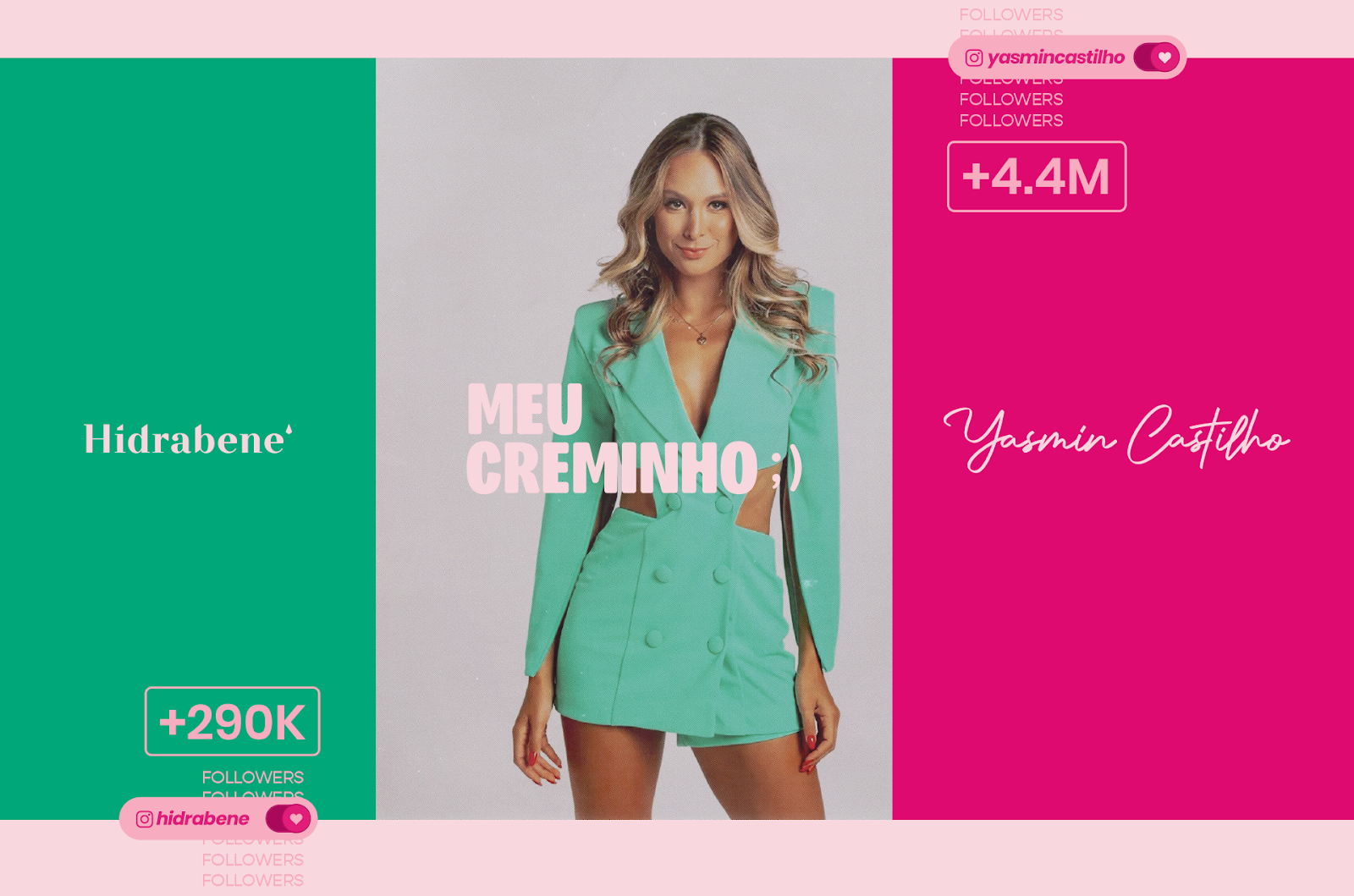
Explore Yasmin Castilho's collaboration with Hidrabene, featuring a limited edition moisturizing cream collection. Discover the captivating branding and packaging design elements that bring this influencer's personality to life in every detail.
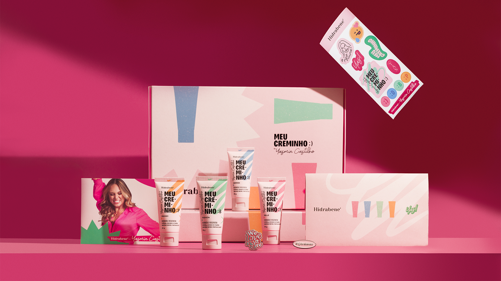
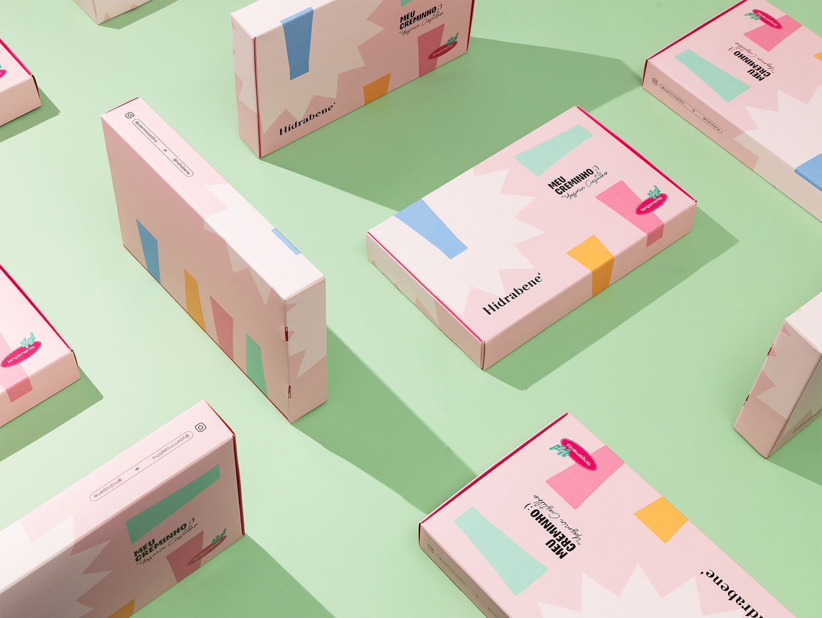
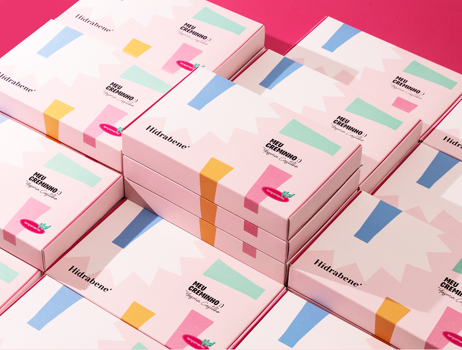
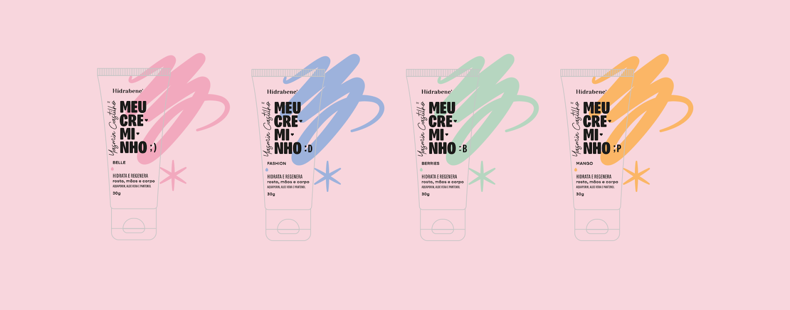
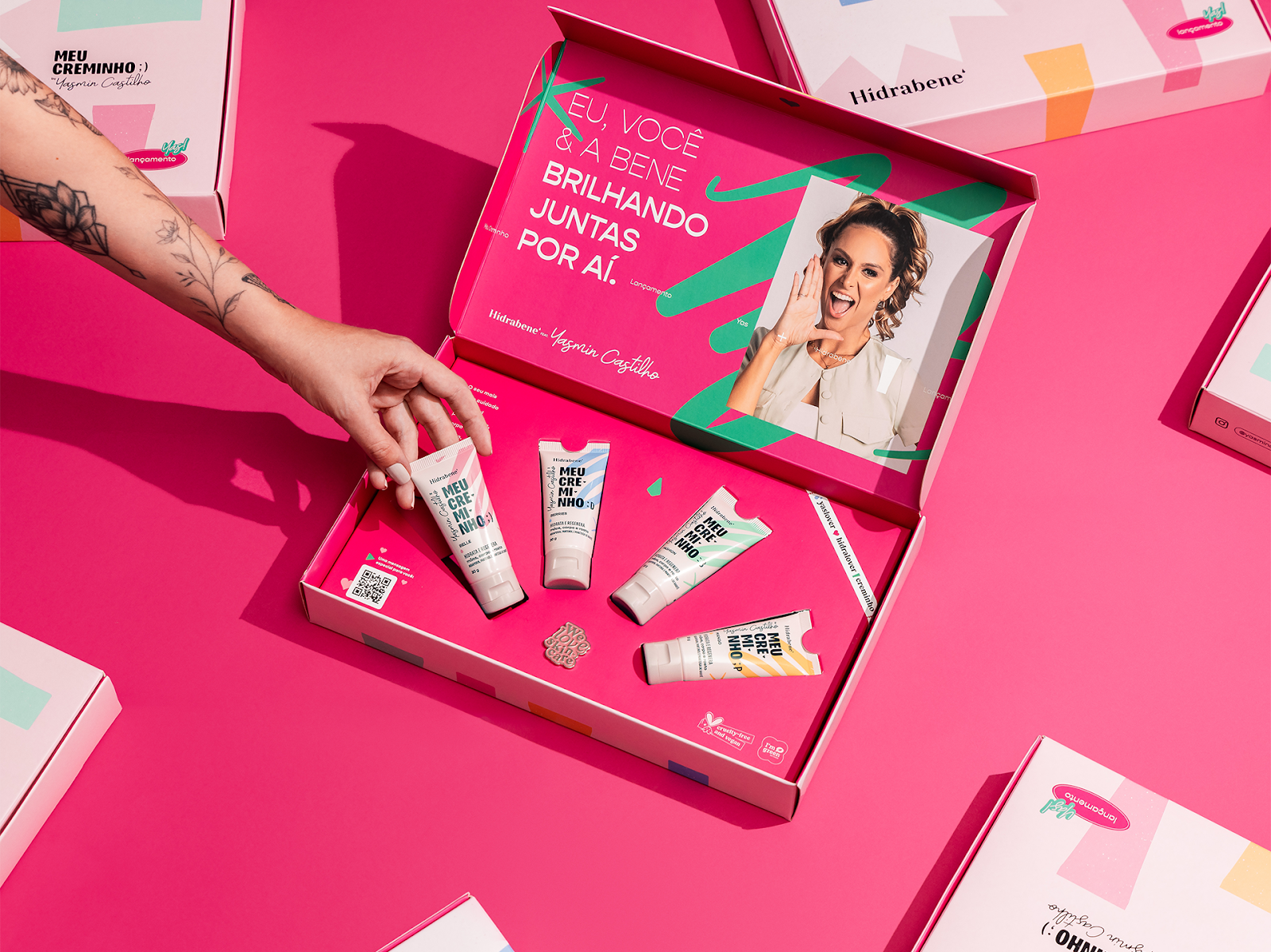
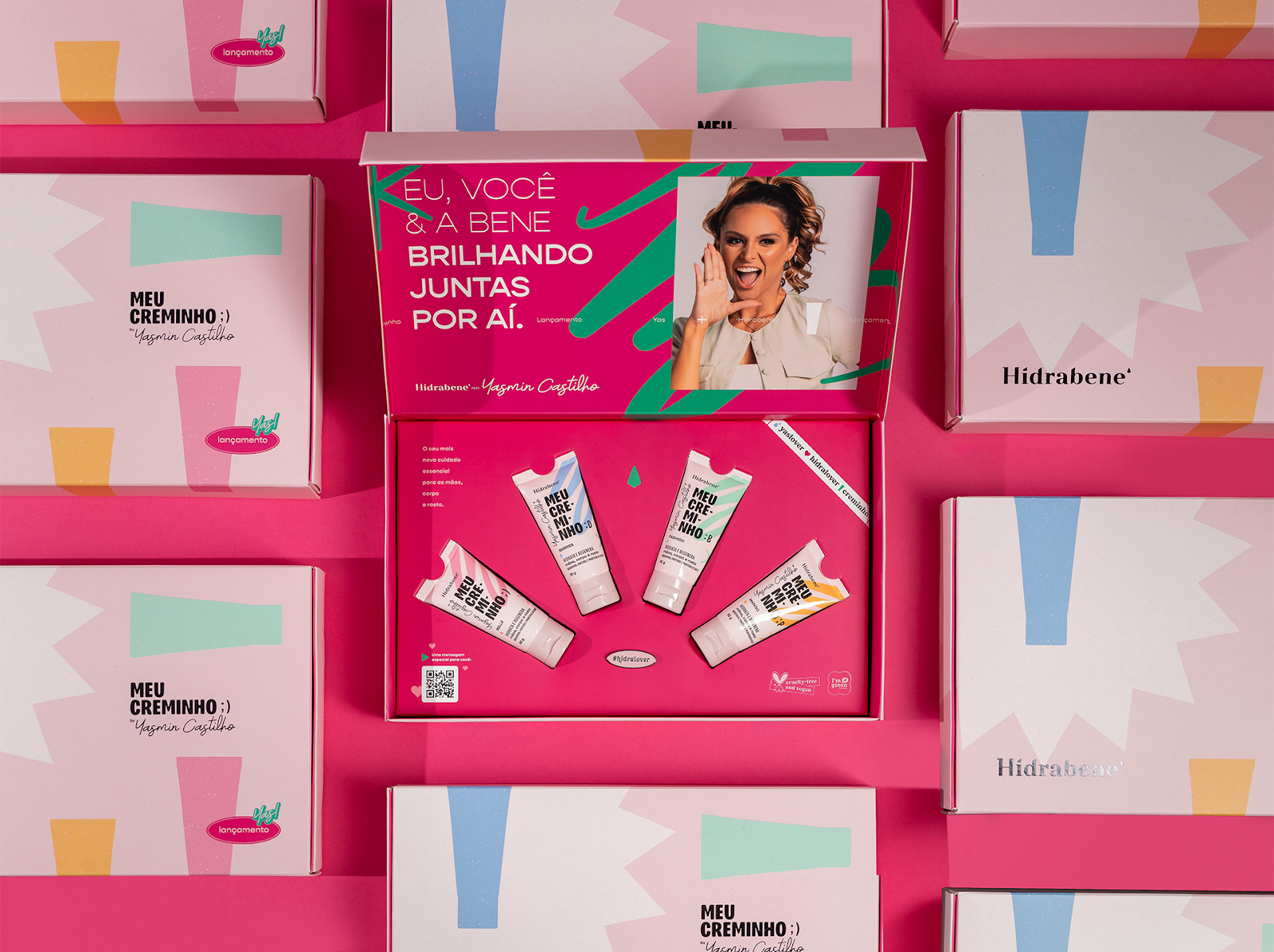
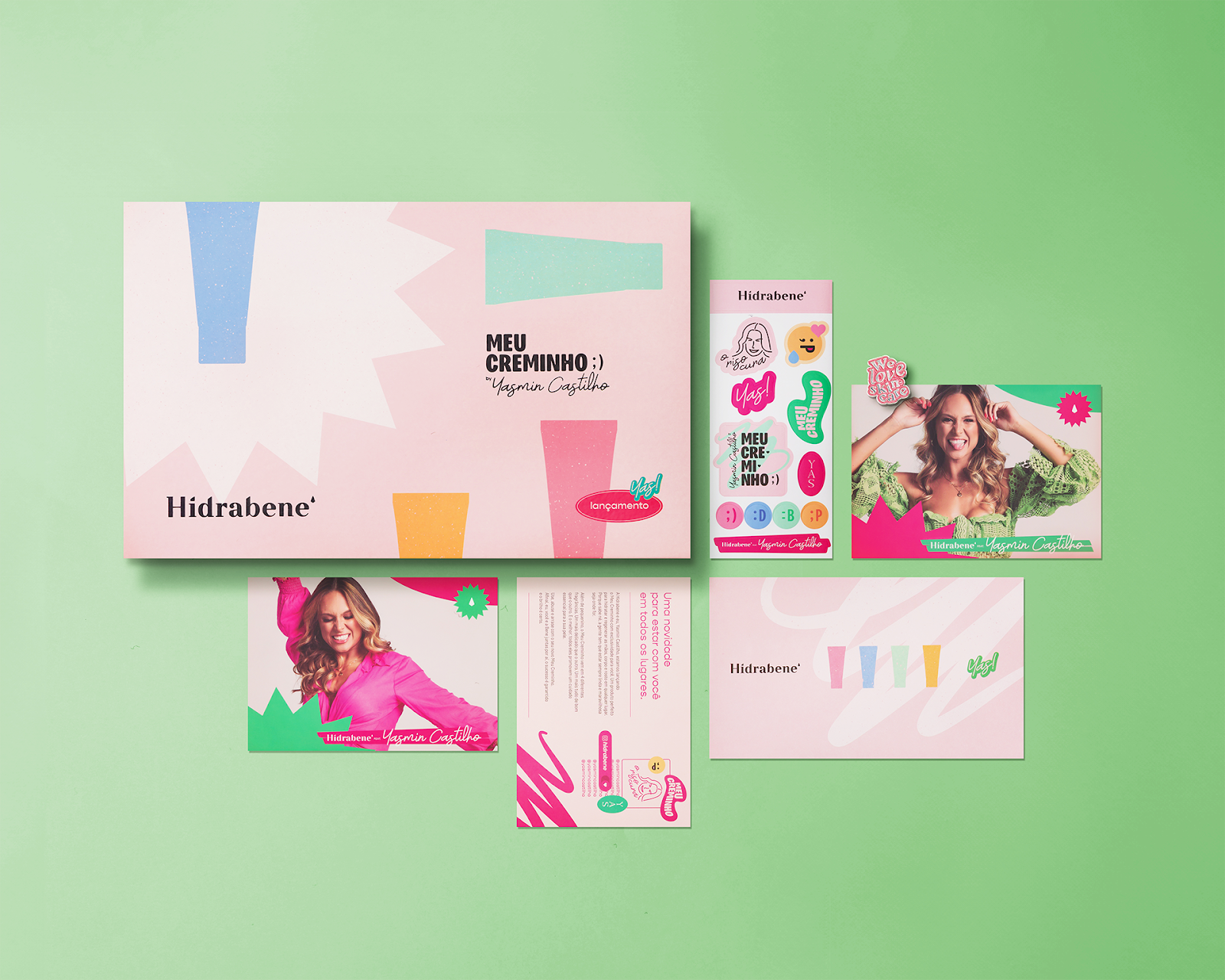
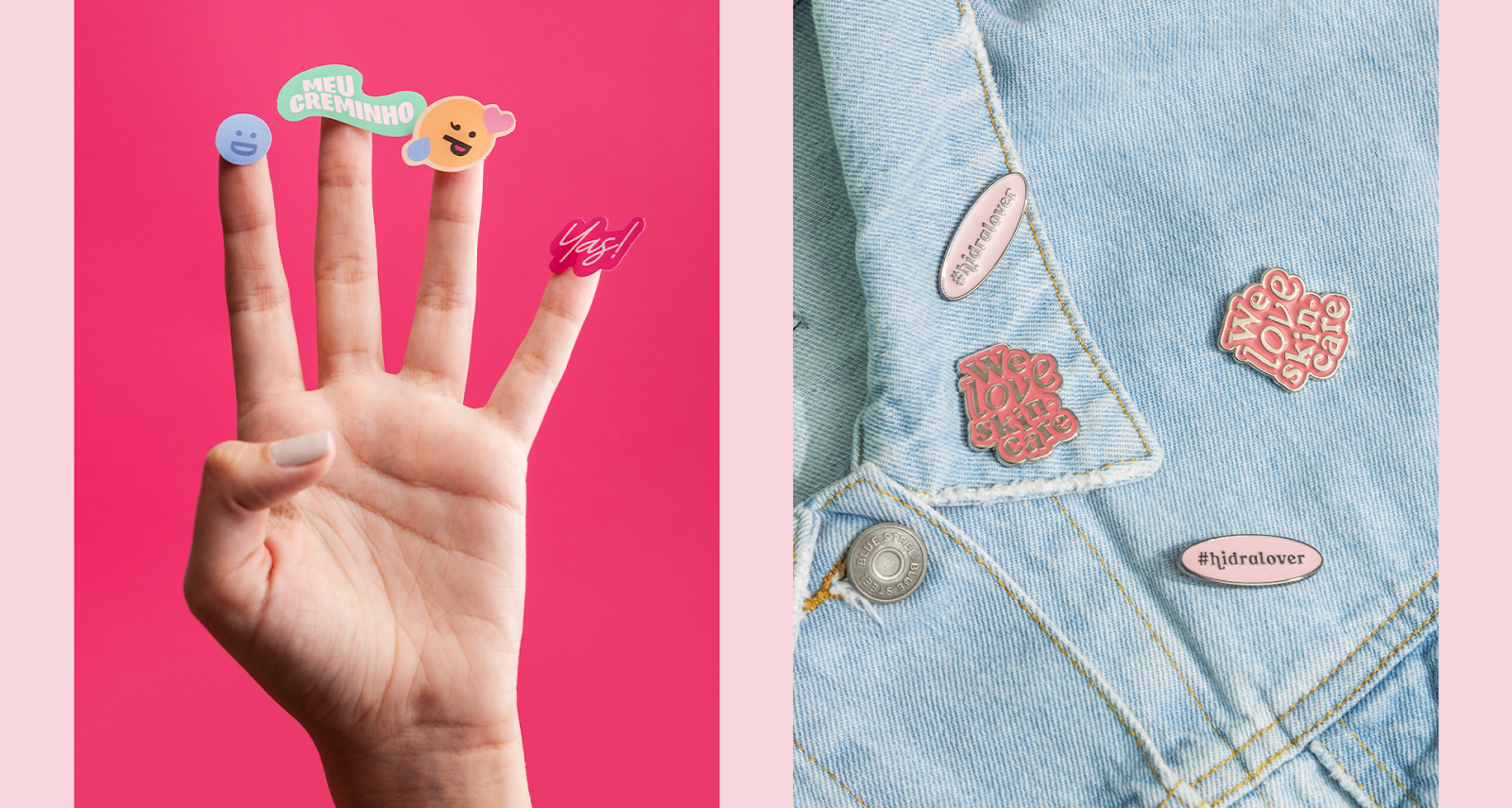
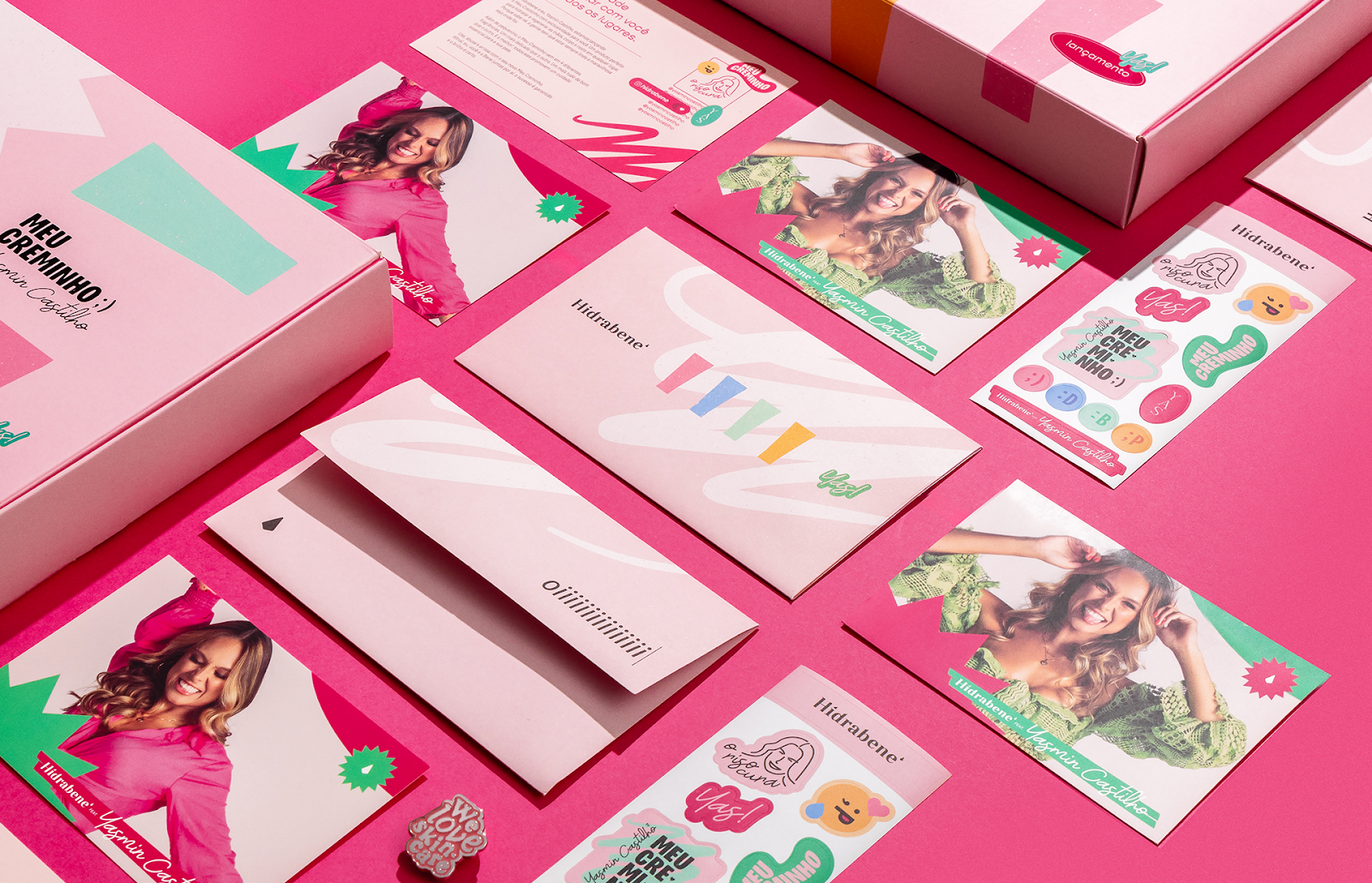
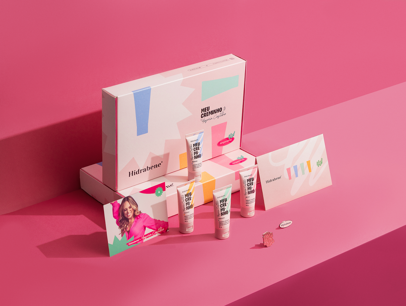
Yasmin Castilho, renowned for her infectious energy and relatable approach to self-care, partnered with Hidrabene, a leading skincare brand, to launch "Meu Creminho" – a limited edition line of moisturizing creams infused with a touch of playful whimsy. This project was brought to life by @feitorialab, who developed the entire visual identity, encompassing everything from a press kit with printed materials and pins to four unique scented creams housed in a thoughtfully designed box.
The core concept behind "Meu Creminho" is the translation of Yasmin's vibrant personality into a tangible aesthetic. Her signature blend of lightheartedness, warmth, and humor forms the foundation for a visual language that seamlessly blends with Hidrabene's existing brand identity. This careful integration ensures a cohesive experience for consumers while staying true to both brands' core values.
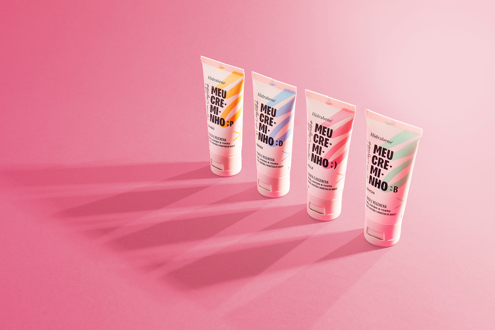
The collection takes inspiration from Yasmin’s defining characteristics: determined, loving, centered, and lively – each represented by distinct colors: green, red, blue, and yellow. These hues are reflected in the packaging design of each cream, creating a visual narrative that speaks to the multifaceted nature of her personality.
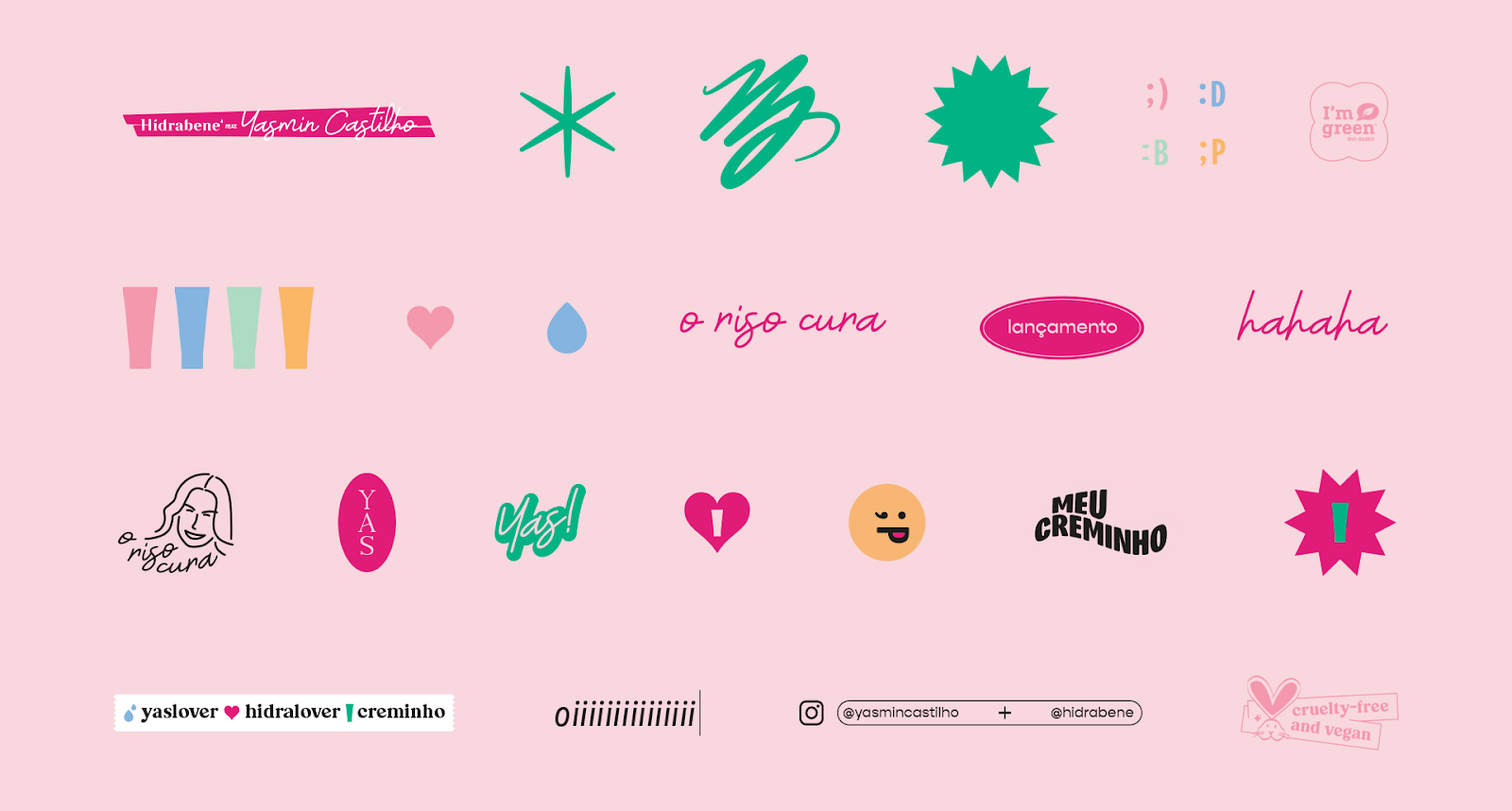
Adding another layer to this sensory experience, @feitorialab designed graphics with a playful, charismatic appeal reminiscent of emojis and laughter simulations. Phrases used by the influencer are incorporated into the designs, further personalizing the brand interaction and creating a sense of intimacy with the consumer.
This careful attention to detail extends to every element of the project, from the color pink representing Hidrabene's established brand recognition at the point of sale to the choice of materials and textures for the packaging, all contributing to an immersive experience that goes beyond just skincare.
Learn more about feitorialab.com
Branding and packaging design artifacts
Credits
- Customer service: Karine Bono.
- Graphic designers: Alex Reuter e Juliano Jover (@feitorialab)
- Copy: Chico Kretzer.
- Approval: Yasmin Castilho, Lucas Provesi e Gregory Rizzoto.
- Photography: João Pedro Varela.
- Print (box): Gráfica Ascurra / Rômulo Laforce.
- Print (stickers, envelope and postal cards): MarauGraf / Rafael Andreis.
- Print (tube): C-Pack.


