Tram Cream Coffee: A Journey in Branding & Packaging Design
Explore how Bracom crafted Tram Cream Coffee's branding and packaging design, blending Vietnamese heritage with modern design for a multi-location chain.
The design world is always moving. Think of busy "stations." They inspired Tram Cream Coffee. This project, by Bracom, is more than just branding. It tells a story with every visual part. It asks us to pause and refresh.
Tram Cream Coffee gets its meaning from the idea of a "station". This is a place for connection and rest. New ideas can start here. Bracom designed the brand and also told its story. They reimagined this idea with a fresh look. Their goal was to build a strong, emotional world for a coffee chain with many locations.
The Branding Hurdles
Bracom faced key challenges. First, they needed a meaningful brand story. This story had to connect emotionally. It also needed to build long-term brand love, especially for future growth. Second, they had to design a visual identity. It needed to be inspiring but also easy to use. It had to stand out but also be simple to copy across stores and products. Finally, they had to finish the whole branding process quickly. They could not sacrifice quality or future use.
A Creative Strategy: The "Station" Reimagined
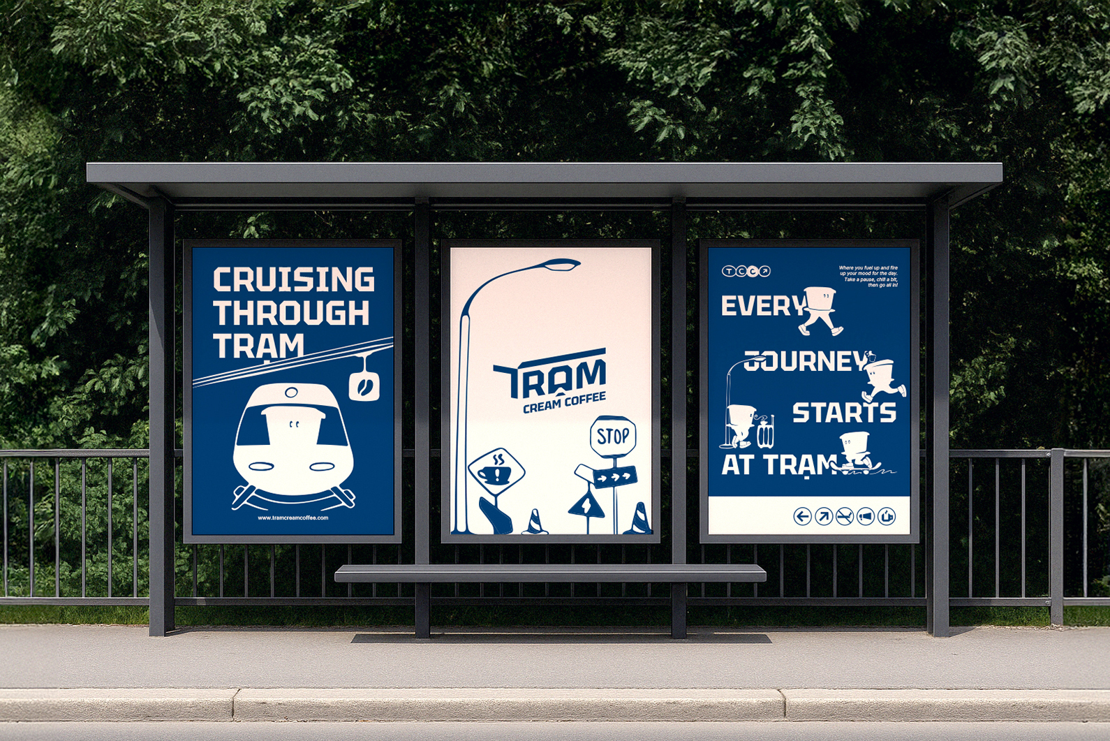
The creative strategy changed the idea of a "station". It became a mental pause, not just a physical stop. It's a place for inspiration. Ideas can land, rest, and then fly again. This artistic vision became a two-part plan. It used visual symbols and emotional stories. The brand took ideas from transport buildings and Vietnamese coffee history. It also used modern graphic design. The brand mixes practical needs with feelings. It combines clear messages with warmth. Tram becomes a journey for creativity and connection. It invites people to stay, feel, and start new.
From Vision to Experience: Design Solutions
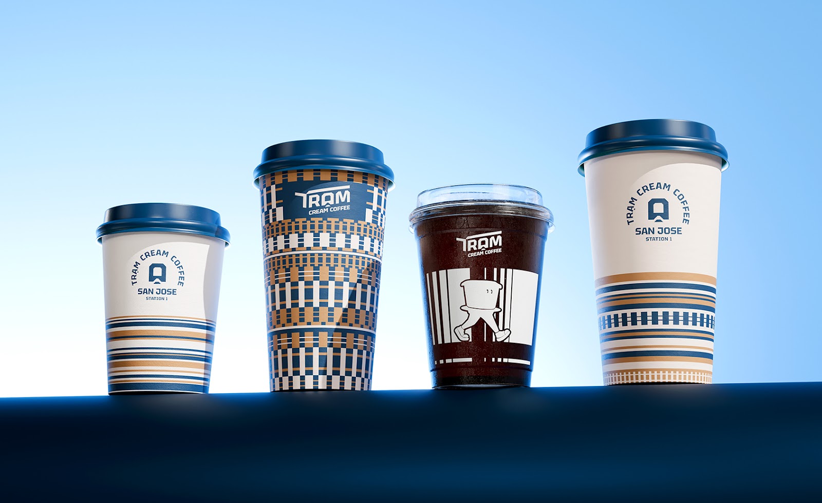
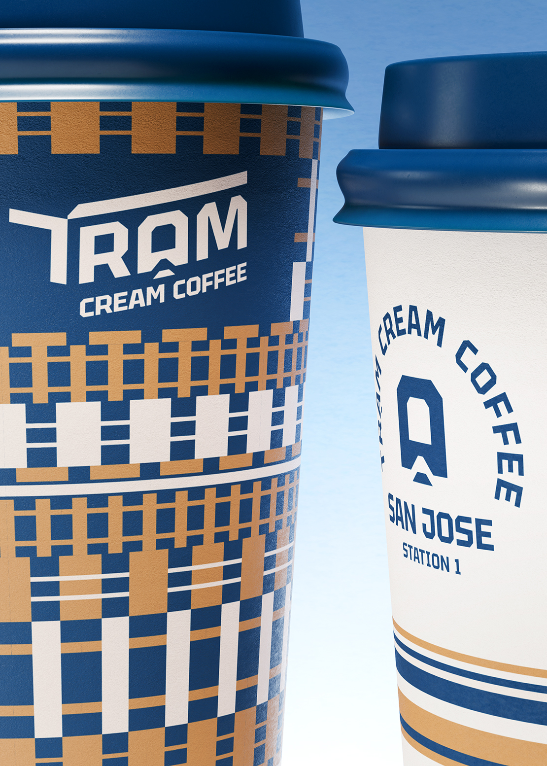
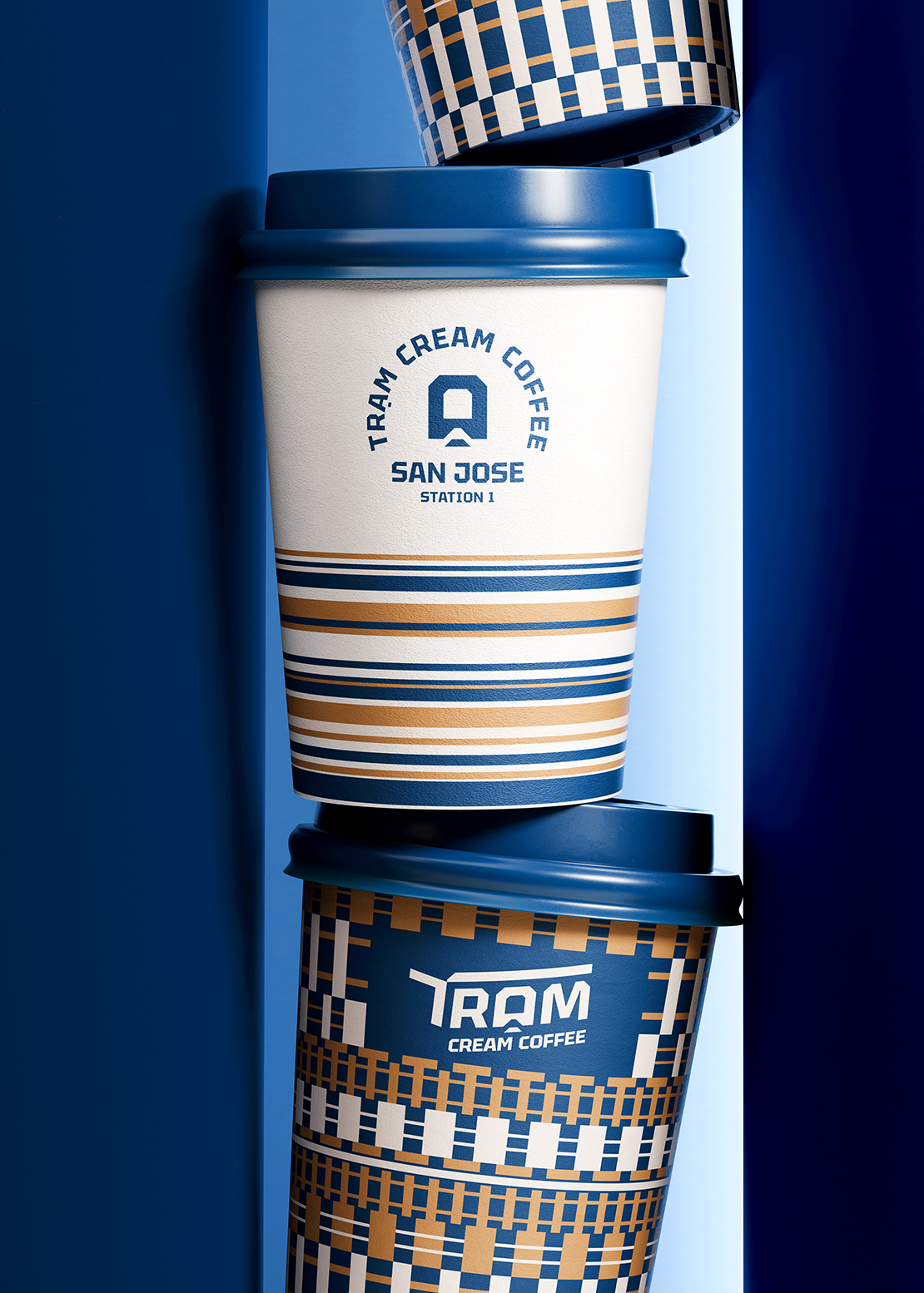
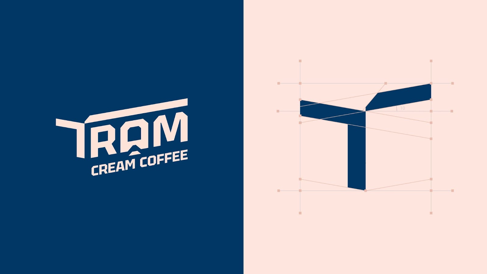
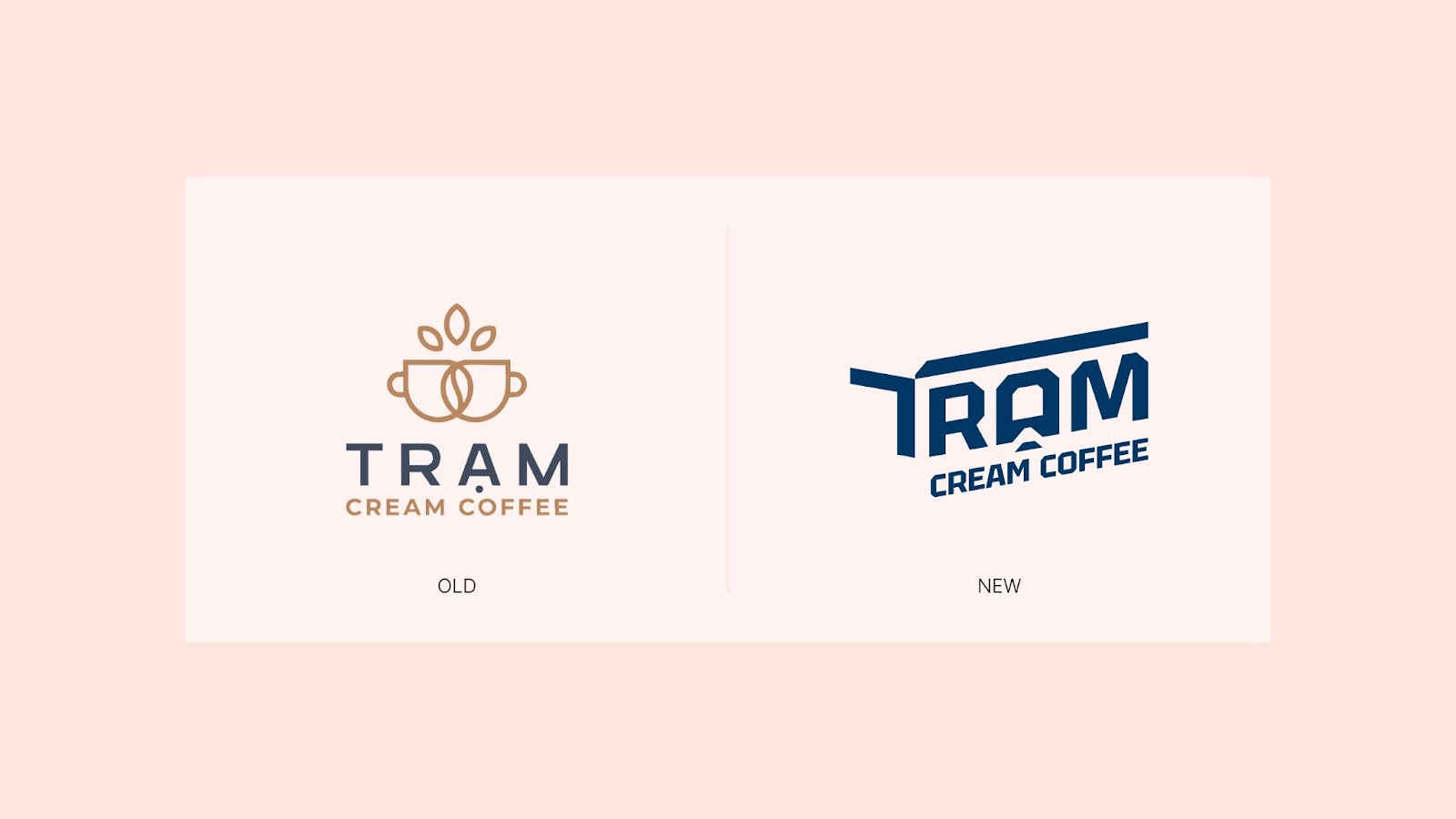
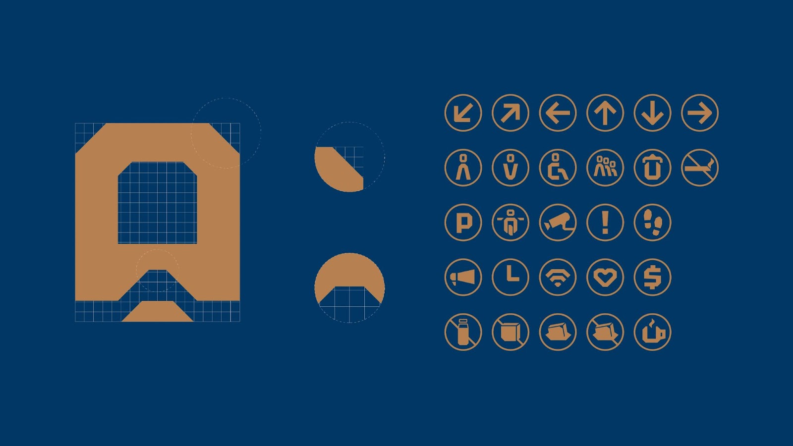
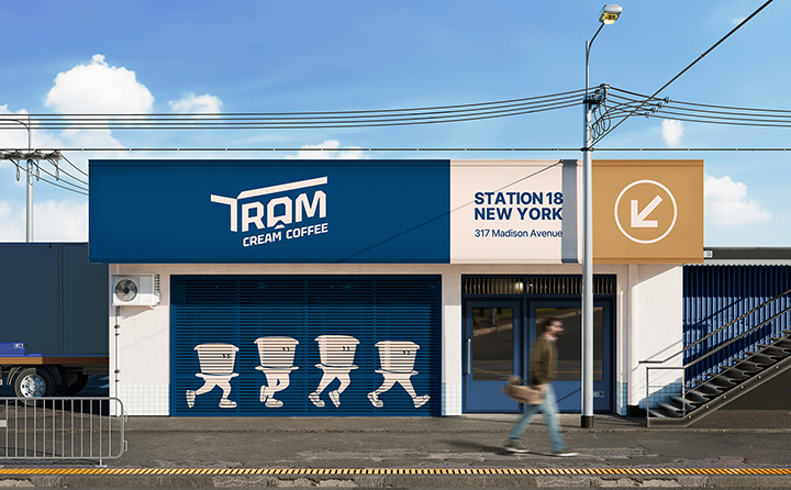
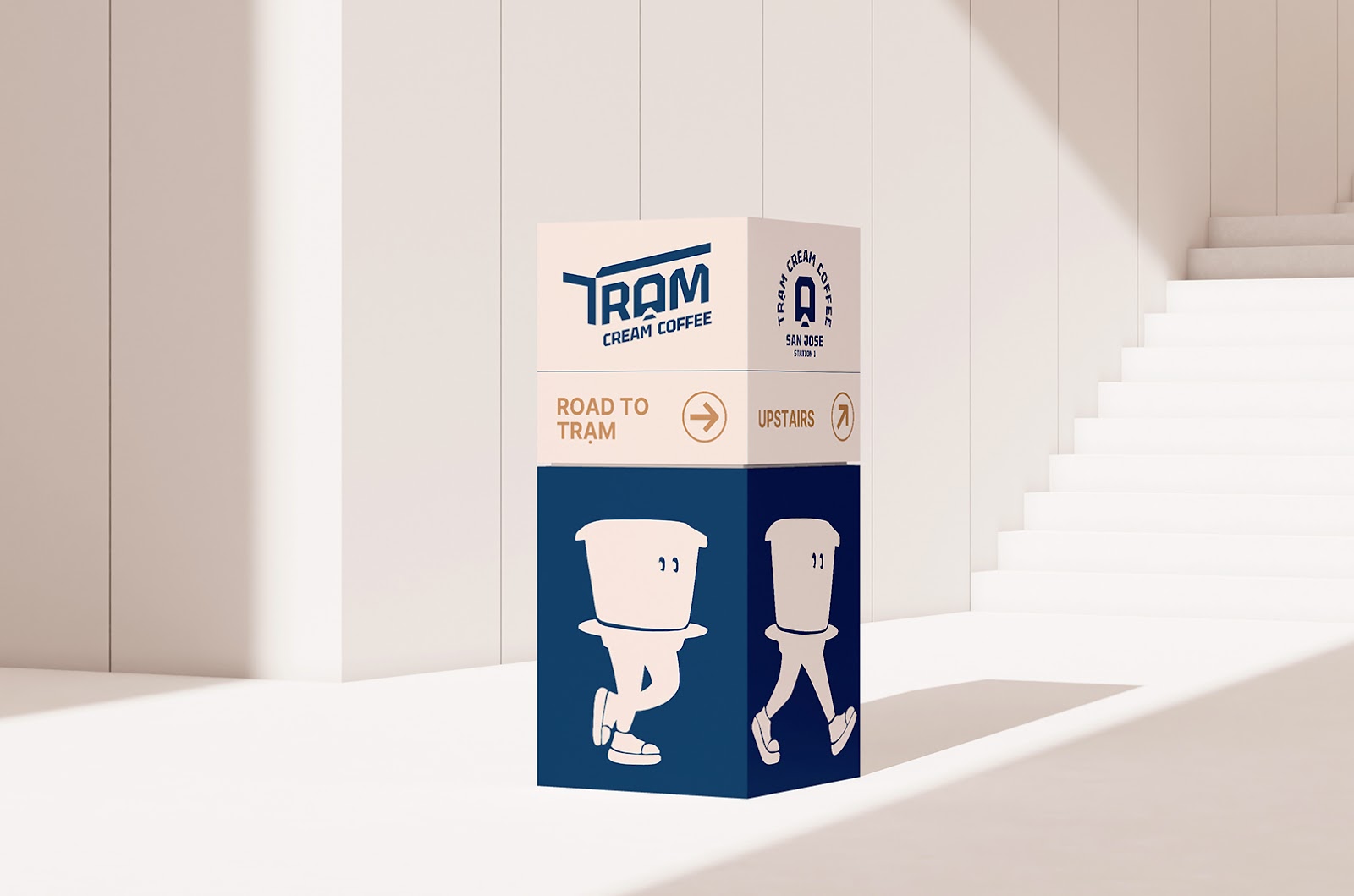
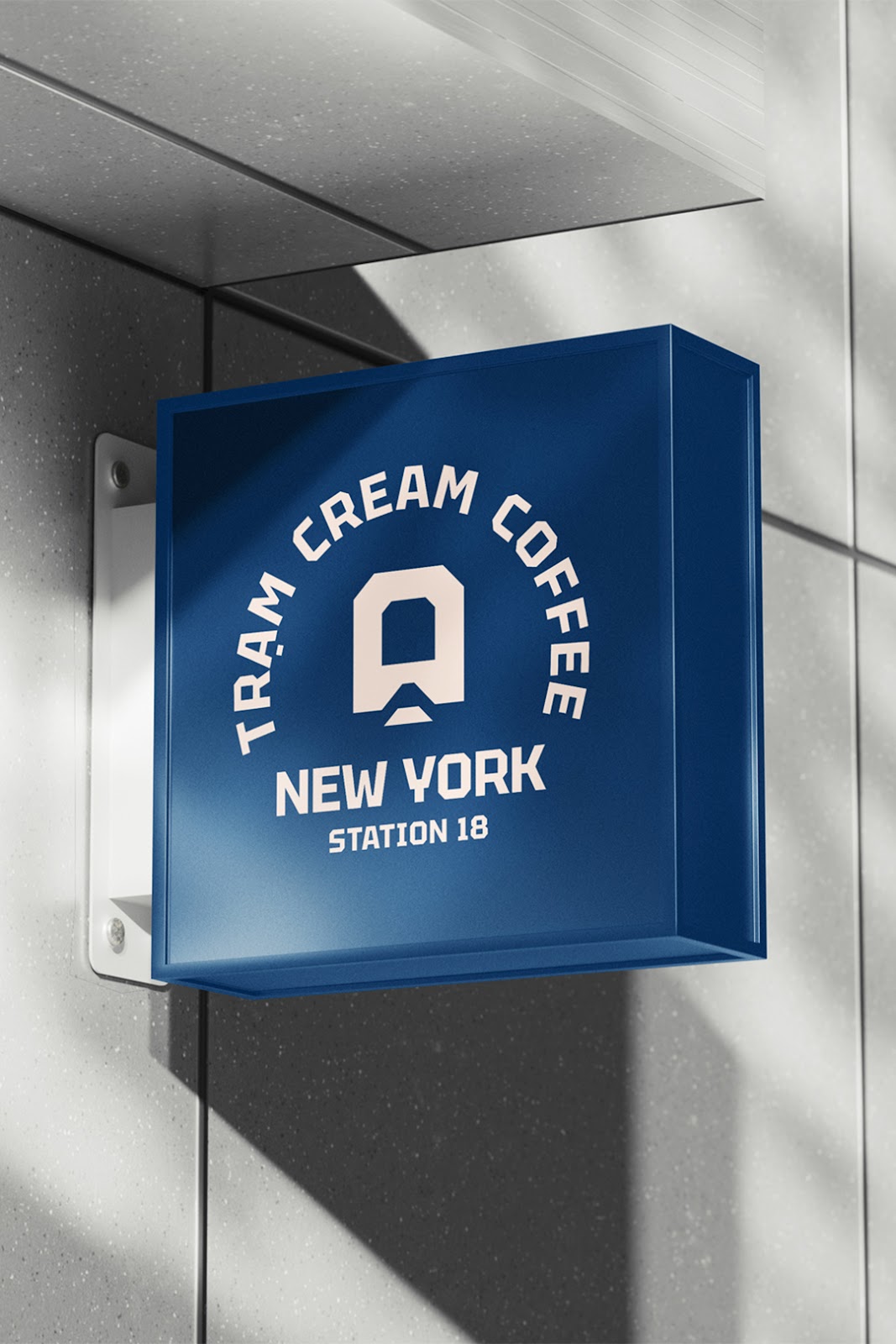
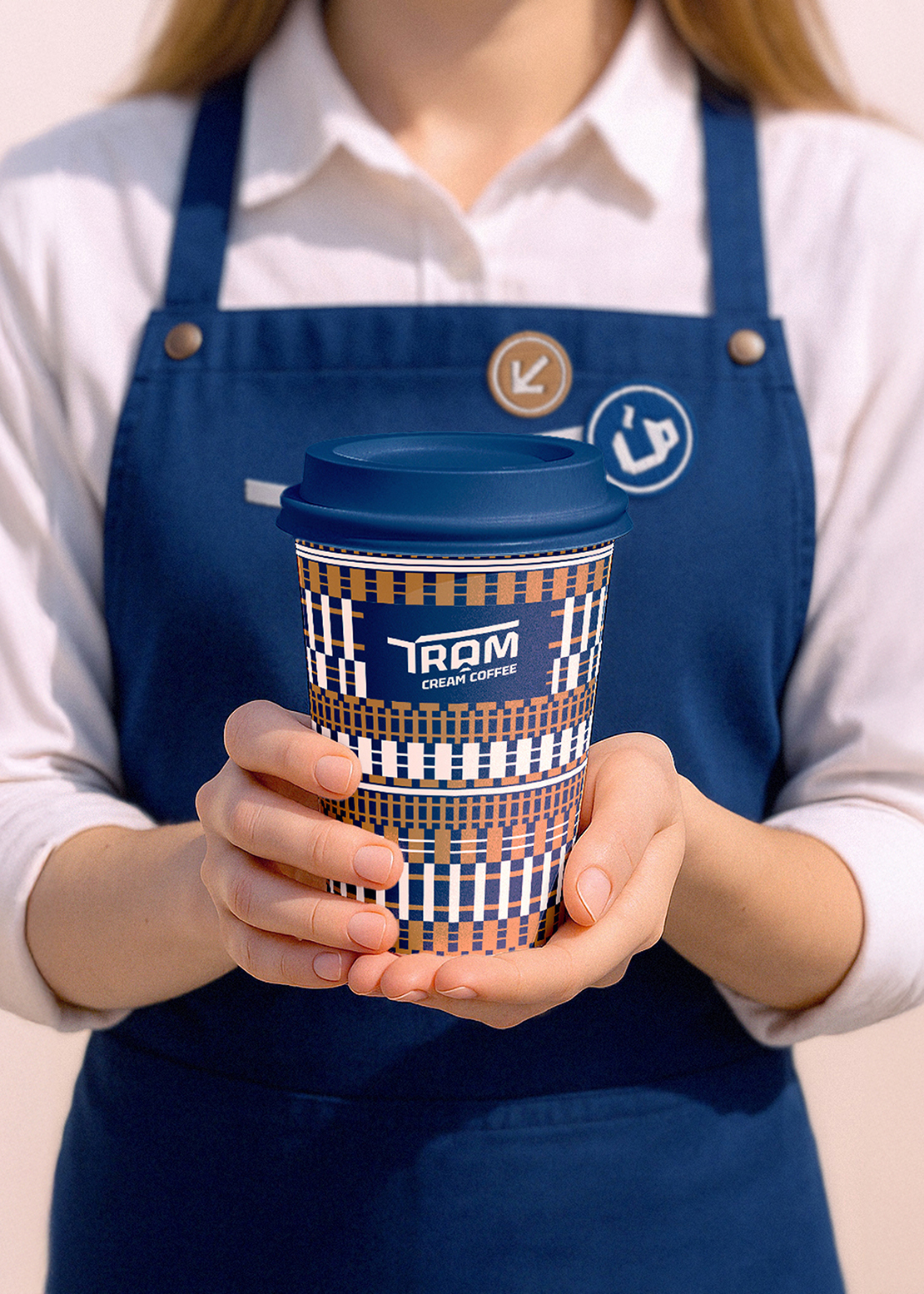
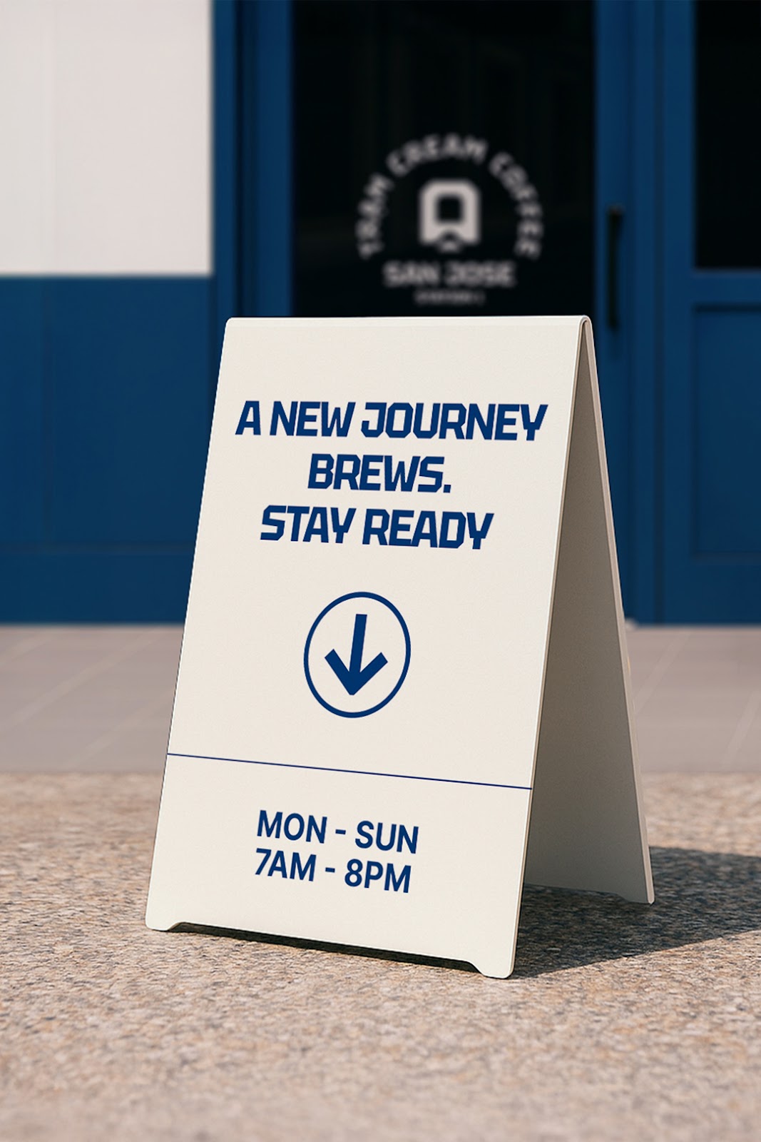
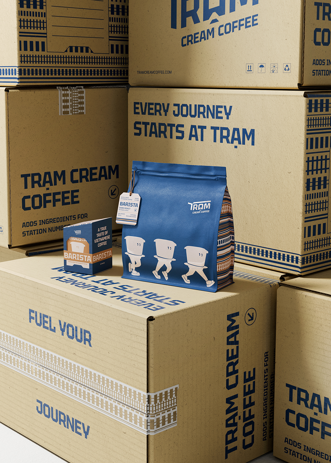
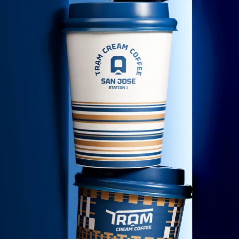
Logo Design: The logo looks like a station roof. It's a simple but symbolic shape. Its clean, strong lines show reliability and safety. The upward movement suggests direction and purpose. This is where your journey starts.
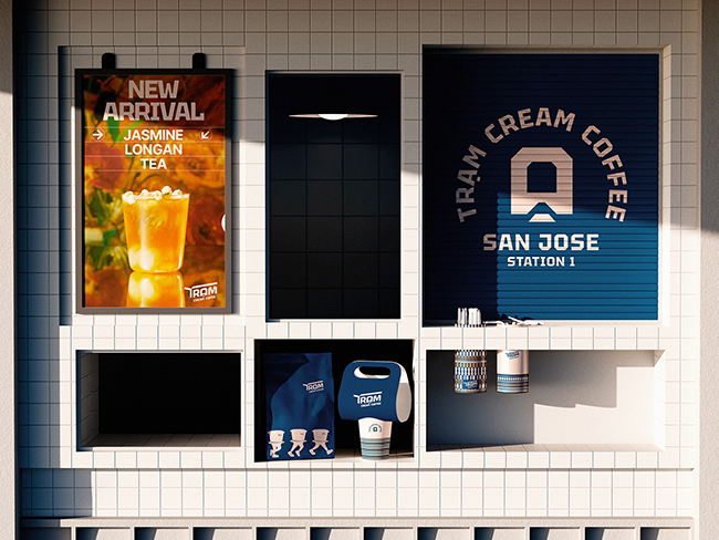
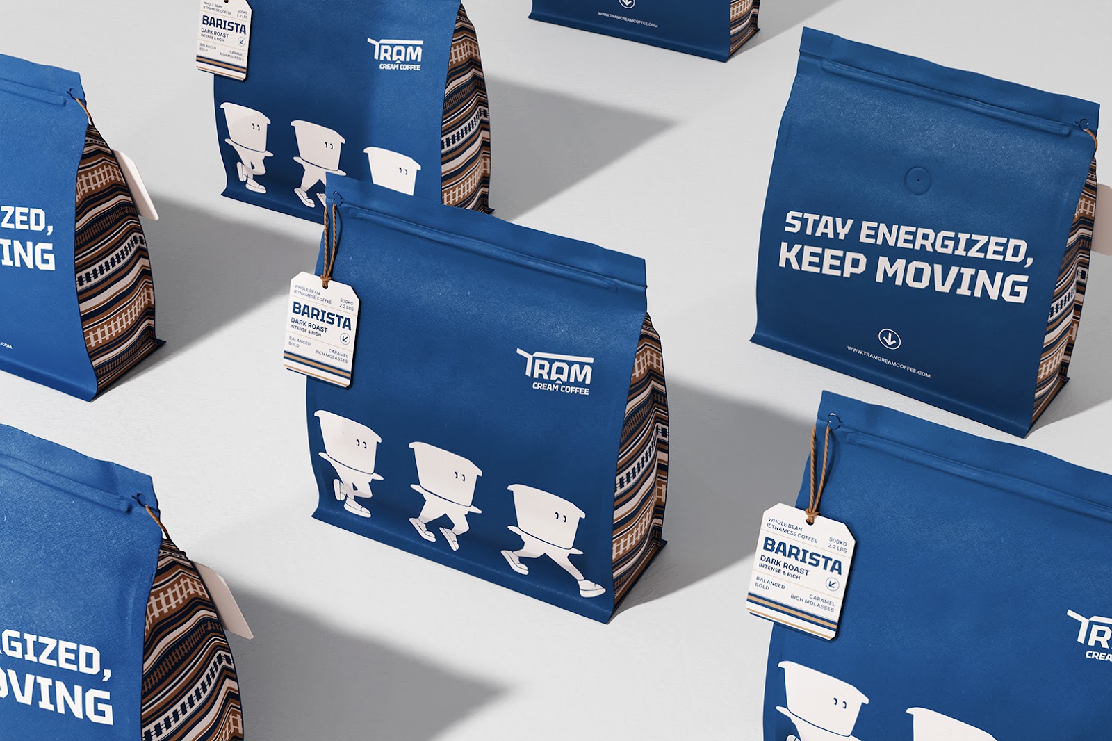
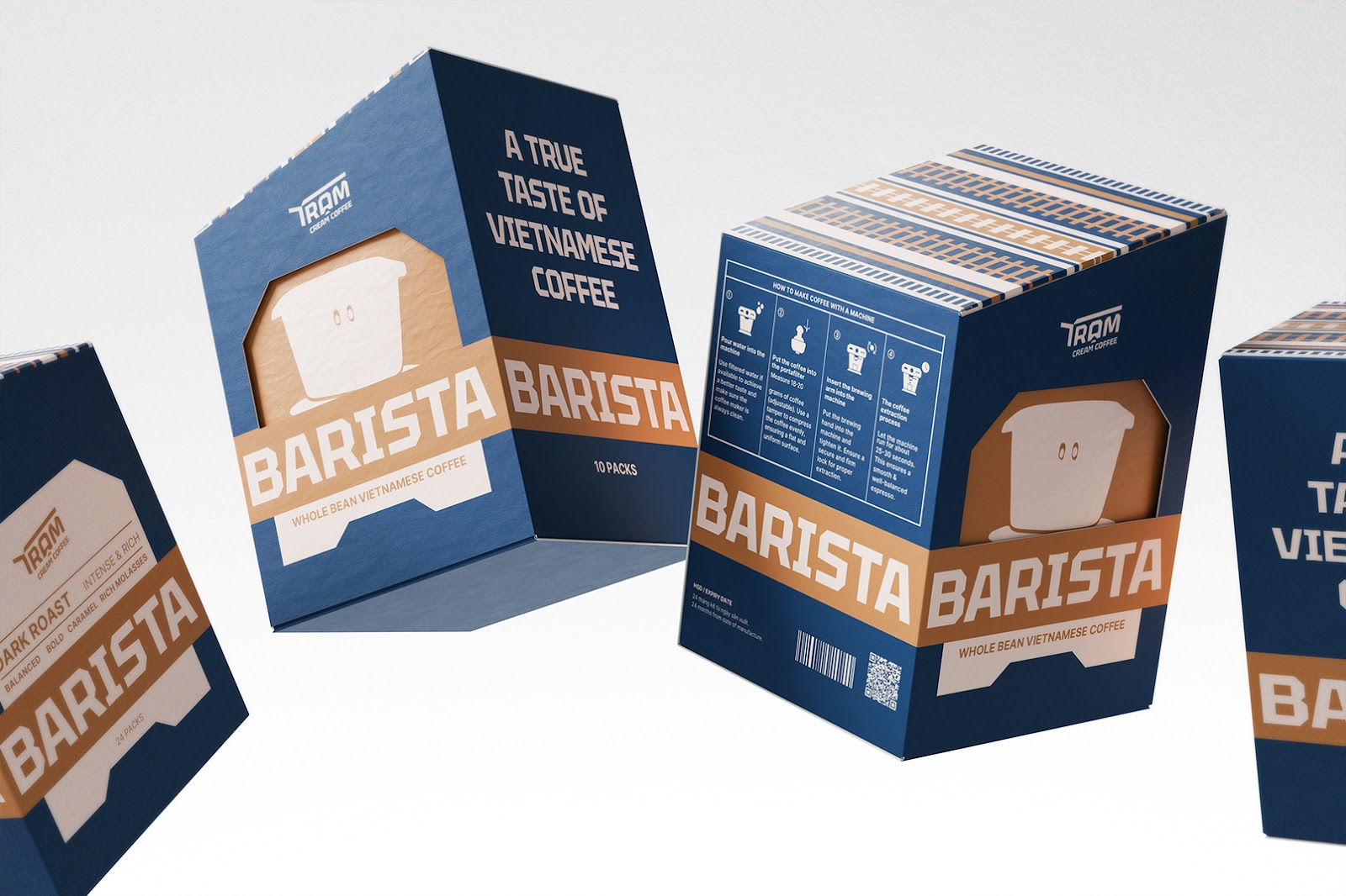
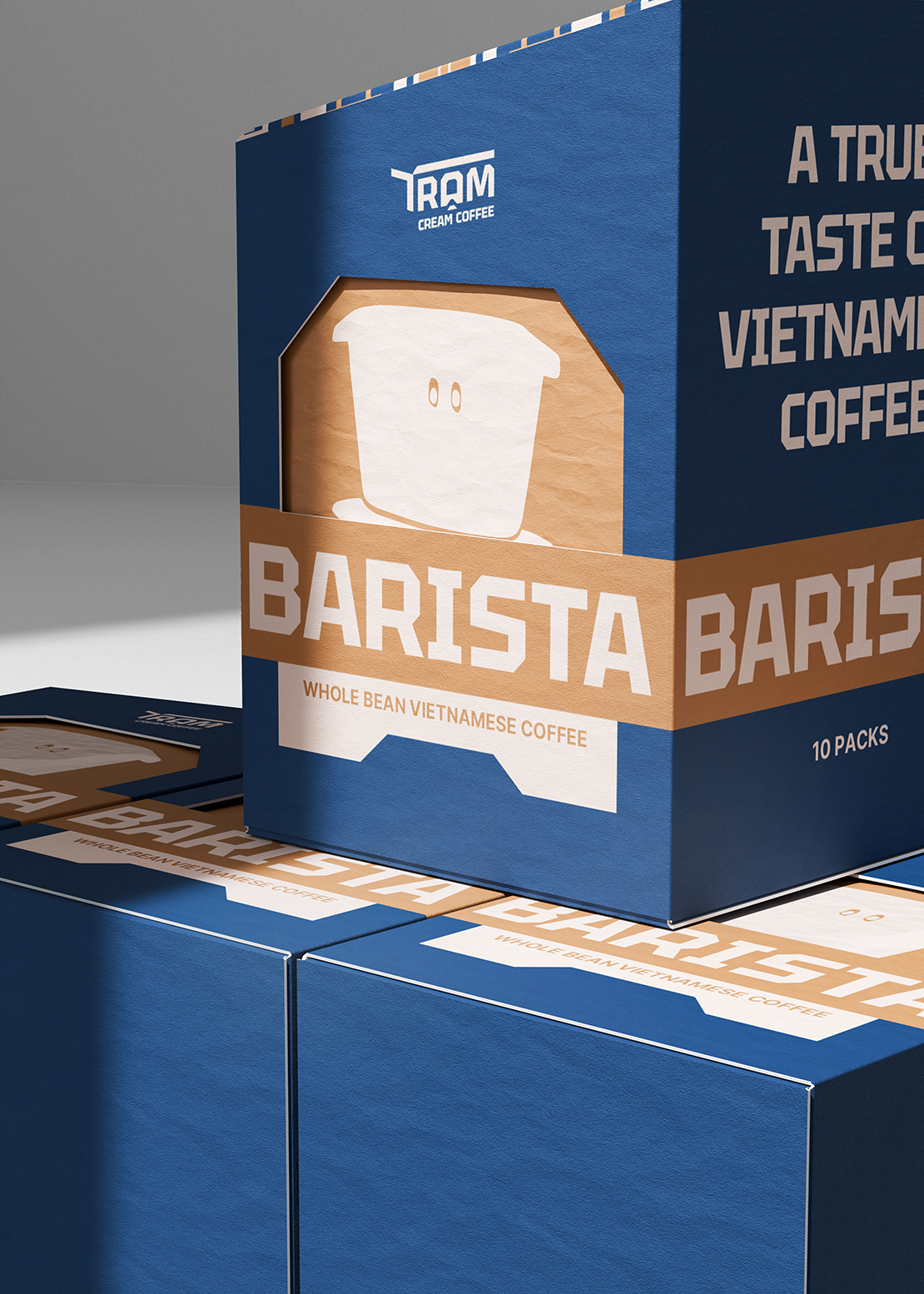
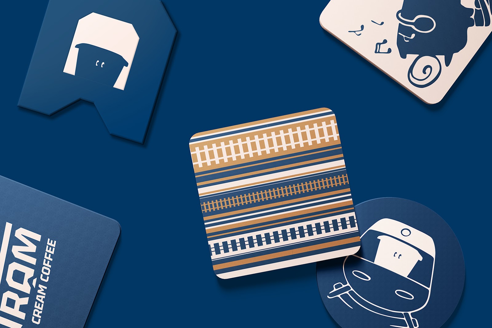
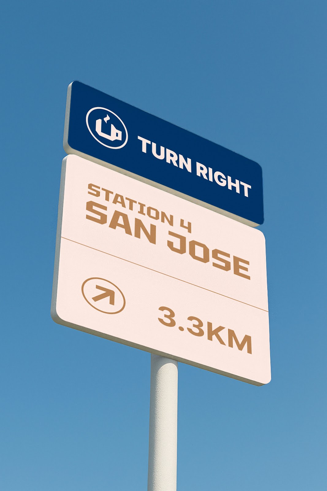
Graphic System: Train tracks and signs are the main visual elements. They became modern patterns that show movement. These patterns appear on packaging, signs, and uniforms. This creates a clear and recognizable system. Station sign grids influenced the text layout. This gives the design a structured but active feel. It reminds you of signs in train stations.
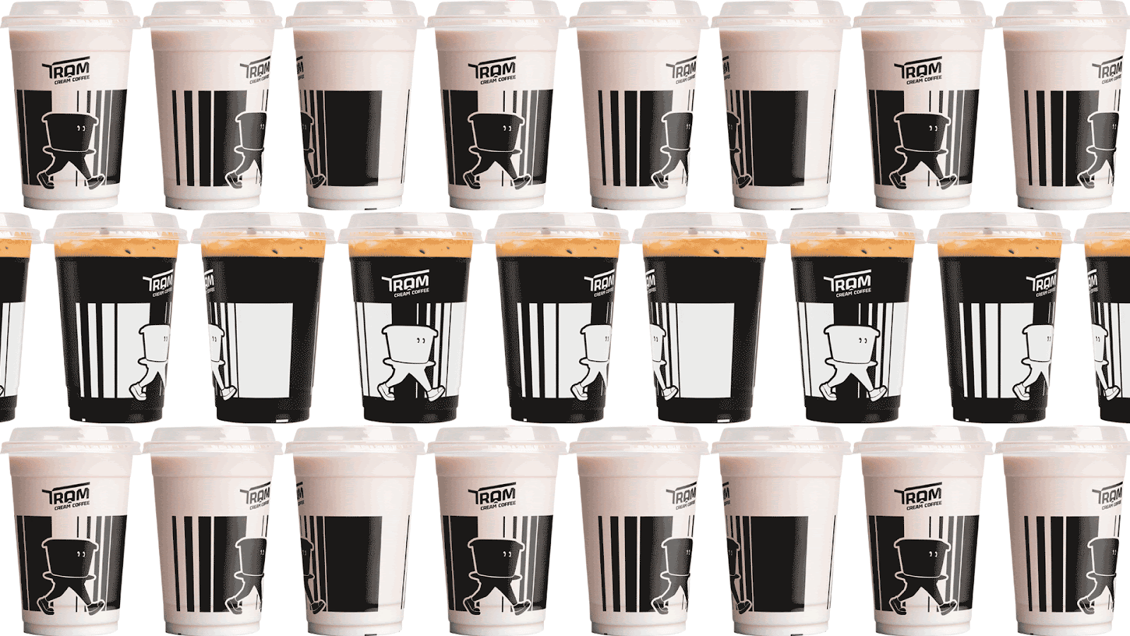
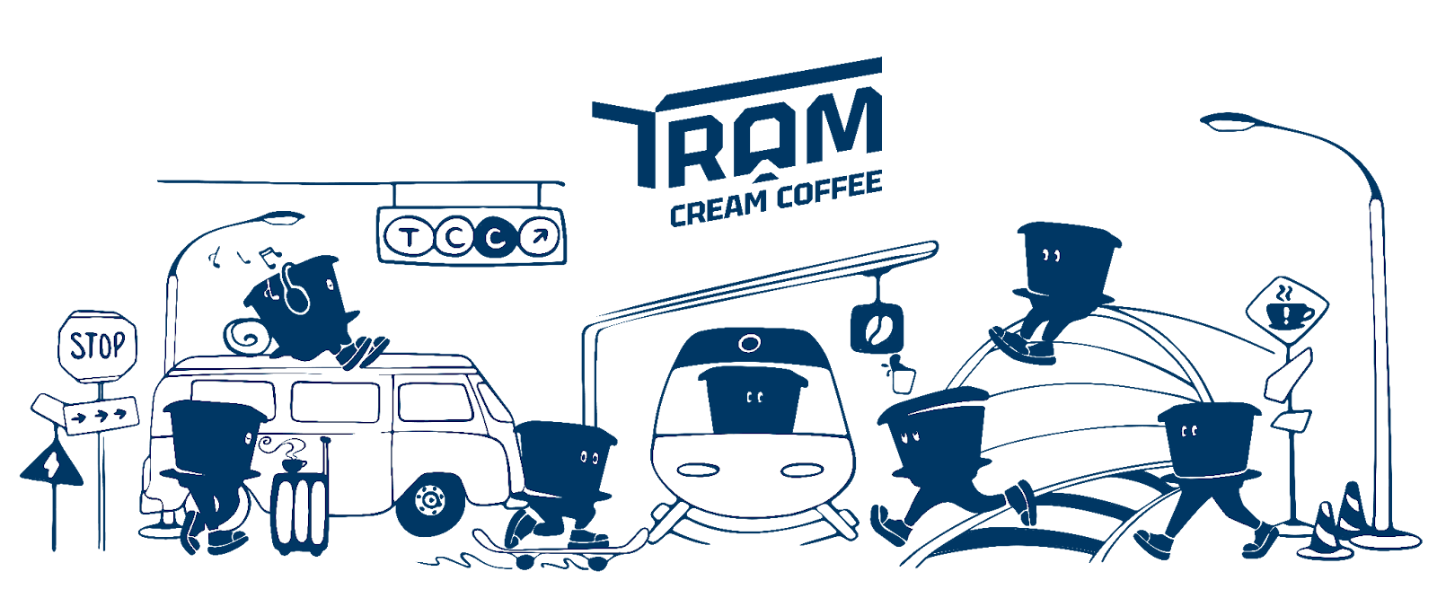
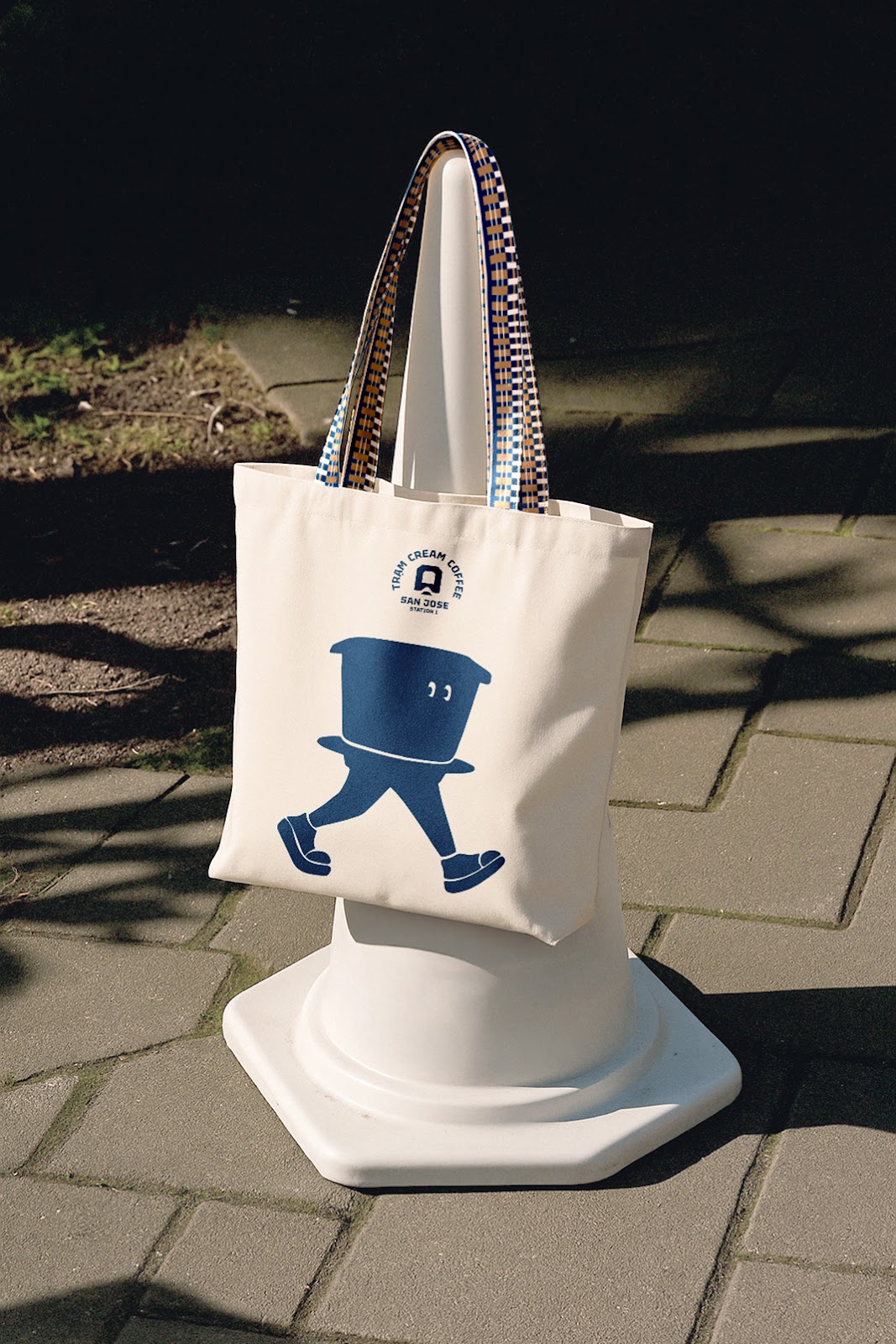
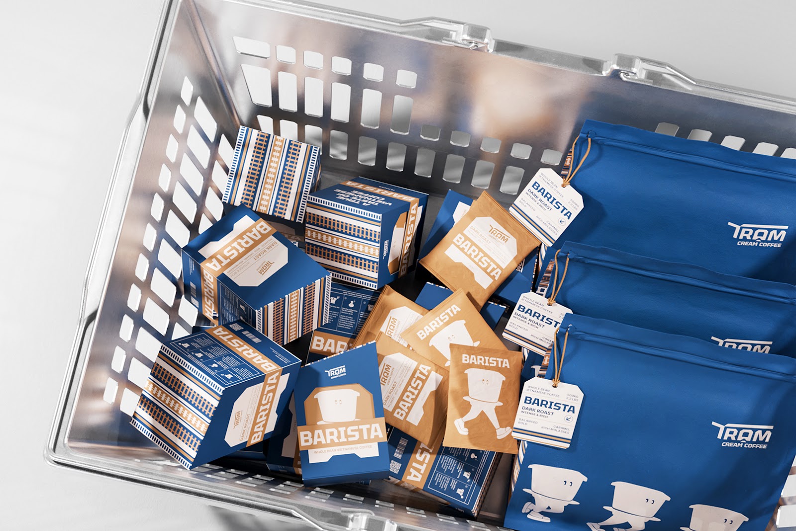
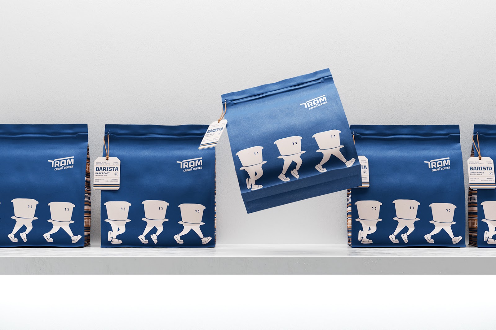
Celebrating Vietnamese Heritage: The Vietnamese phin coffee filter is central to the brand. This well-known brewing tool became a fun mascot. It's a walking phin with small eyes and running shoes. This shows the brand's energetic spirit. The phin travels with Tram to every place. It brings both culture and coffee to everyone it meets.
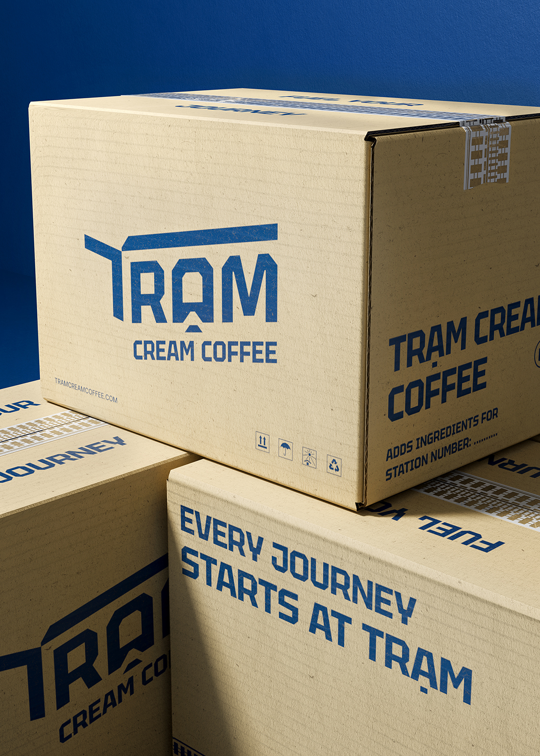
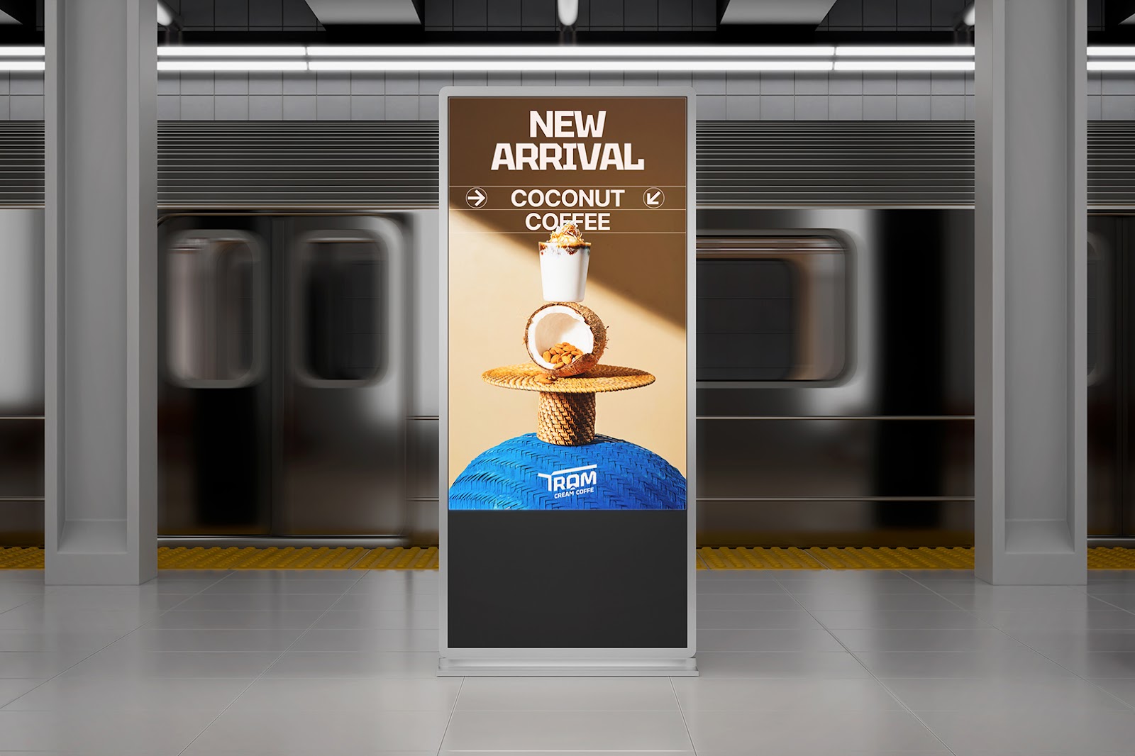
Design Applications: Branding and Packaging Design Artifacts: Every item is like a mini-station. This includes product packaging, uniforms, hoodies, tote bags, and posters. They all tell a clear story. Examples are "Fuel your journey" and "Power up your day". The main color is deep blue, showing intelligence and trust. Creamy beige adds softness and balance. These colors show both modern energy and Vietnamese comfort.
The careful use of design elements makes the brand experience memorable. Bracom created more than a brand; they built a heartfelt station for everyone to enjoy.
See more of Bracom's work: https://www.behance.net/gallery/223947593/Tram-Cream-Coffee
Branding and visual identity artifacts