by abduzeedo
Explore Maxon's unified brand identity film, where a modular honeycomb vision is brought to life through motion design. Watch as Cinema 4D and ZBrush unite.
Maxon is a name that every digital artist knows. They make tools that help us build worlds. From 3D modeling to motion graphics, their software is the backbone of the industry. Recently, the company decided it was time for a change. They rolled out a brand-new look for their growing family of tools. To celebrate this, they released the Maxon One Brand Expression film. It is a stunning look at how a brand can move.
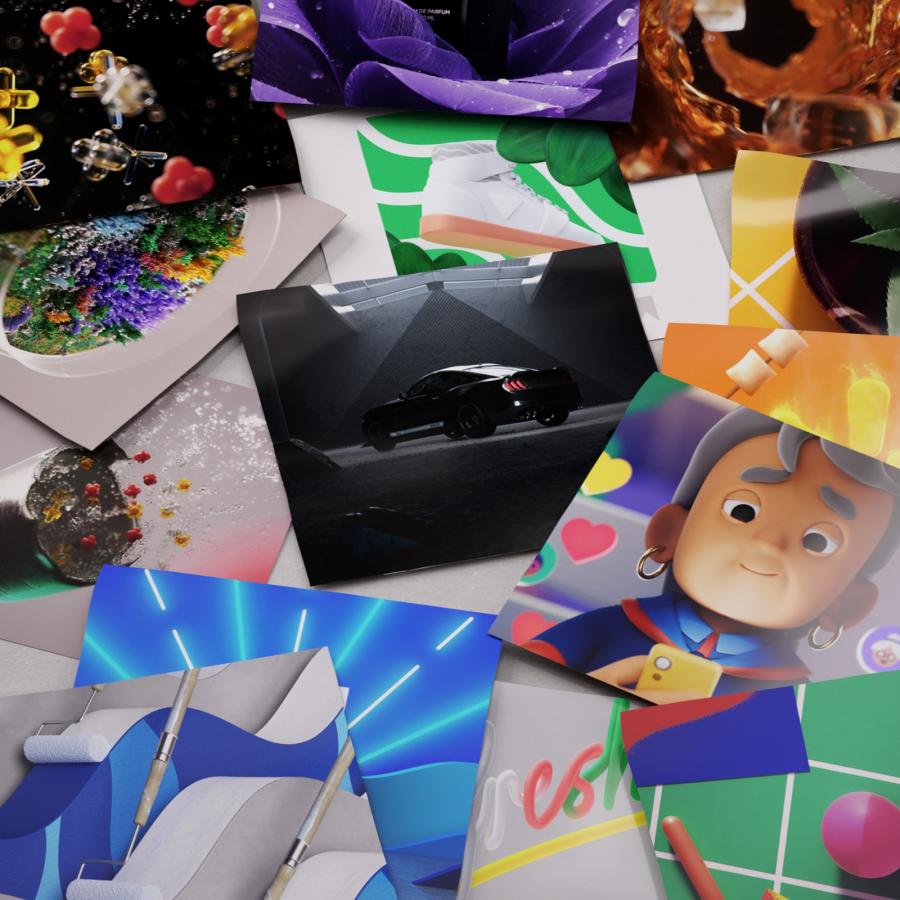
The project was led by Creative Director Leo Hageman. His goal was clear. He wanted a visual style that felt like Maxon. At the same time, he wanted to show what makes each tool special. This is not an easy task. You have Cinema 4D, Red Giant, ZBrush, and Redshift. Each one has its own personality. The film brings them together into one story. It shows that while they are different, they work best as a team.
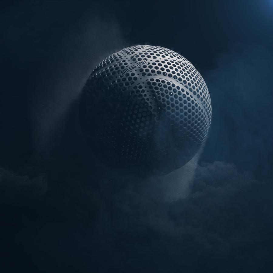
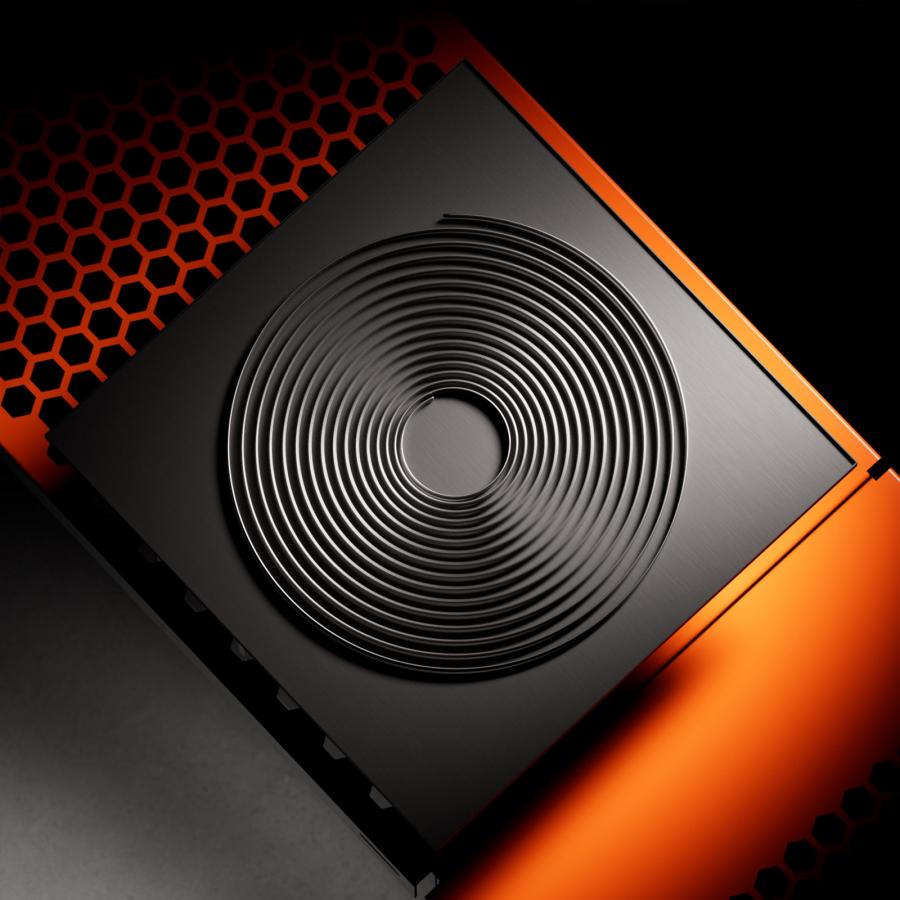
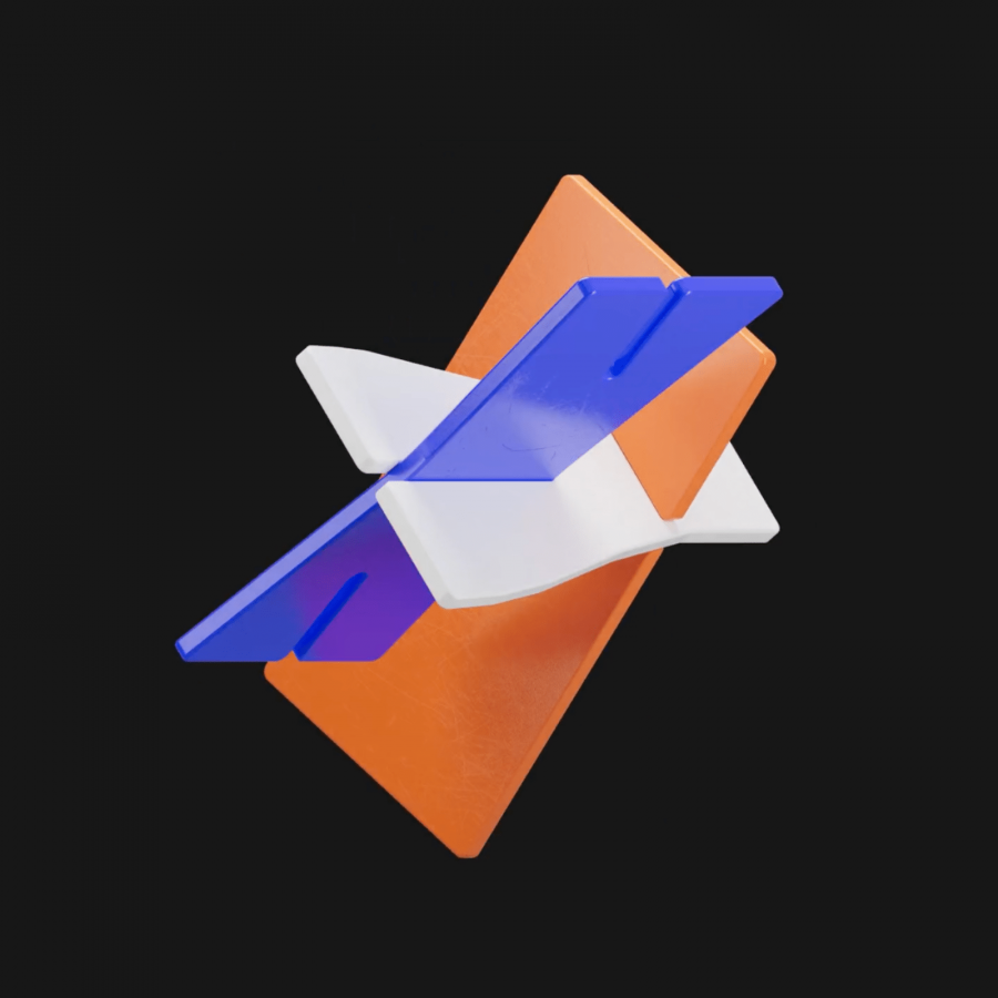
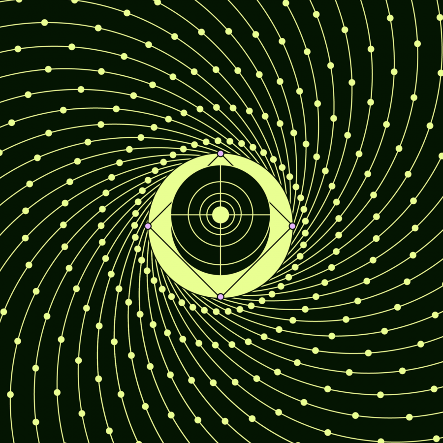
The biggest challenge was the "honeycomb" look. This modular system is the core of the new identity. The team had to figure out how to make it move. In motion design, you have to balance two things. You need abstract shapes. You also need clarity. The film does this by weaving real features of the software into the scenes. You see bits of the tools you love, but they are part of a larger, beautiful flow.
A consistent geometric style keeps everything tied together. The rhythm of the motion is the key. It shows how one tool feeds into the next. It feels like a seamless loop. This represents the real-world workflow of artists. We jump from modeling to rendering every day. The film captures that feeling. It makes the software feel like a living thing. It is not just code. It is a partner in the creative process.
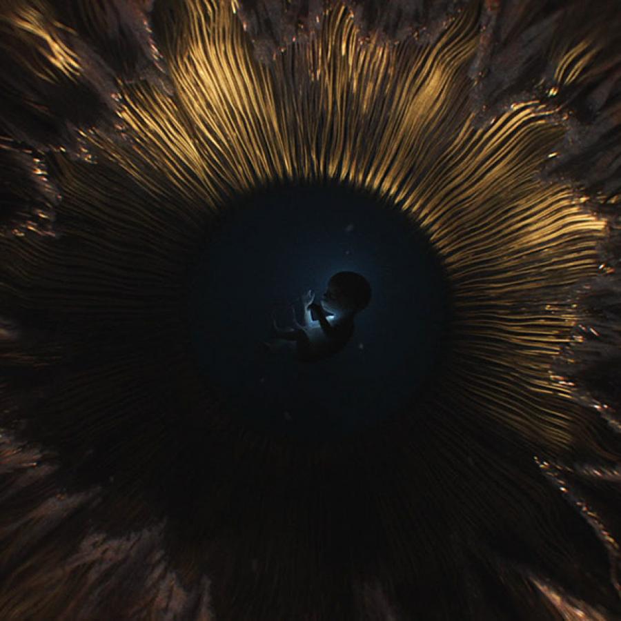
The film was brought to life by Xinyue (Casey) Gu. She handled the design, animation, and editing. The work is crisp and full of energy. It also features artwork by Pablo Munoz Gomez. His ZBrush work adds a layer of high-end detail to the film. It proves that Maxon is not just about tools. It is about the art that people make with them. The colors are bold, and the lines are sharp. It looks like the future of tech.
In the end, this project is a lesson in unity. You can have many different products and still have one voice. Maxon has found a way to honor its past while looking forward. This film sets a high bar for motion design in branding. It is simple, smart, and very effective. It reminds us why we love these tools in the first place. They are built for us, the creators.
The images for this project are located after this text.
Credits: Project by Xinyue (Casey) Gu
Motion Design
Stills
