by abduzeedo
Gwen Geng's X Games rebrand builds a bold identity from angular forms, perspective type, and city color codes for a new generation of action sports fans.
X Games has always lived at the edge. Skateboarding, BMX, motocross, snowboarding — the event has defined extreme sports culture since the mid-1990s. But visual identities age. What read as edgy a decade ago can feel stale today. Designer Gwen Geng took that challenge head-on with a full rebrand that spans logo, typography, website, app, social media, billboards, printed collateral, and merchandise.
The result is a cohesive system that earns its boldness through formal precision rather than noise.
X Games Rebrand Logo and Identity System
The centerpiece of the X Games rebrand is the mark itself. Four angular parallelogram bars arranged around a center point form an X through negative space. The bars don't connect — they lean into each other at opposing angles, creating visual tension. It reads as motion before you fully register the letterform. That gap between the bars is the whole idea: extreme sports live in the gap between the ground and gravity.
The mark scales cleanly. At large sizes, each bar's slant is explicit and architectural. At small sizes — as a social media avatar or app icon — the four-bar grouping still reads as a cohesive unit. This is the test of a well-constructed logo, and the X Games rebrand passes it.
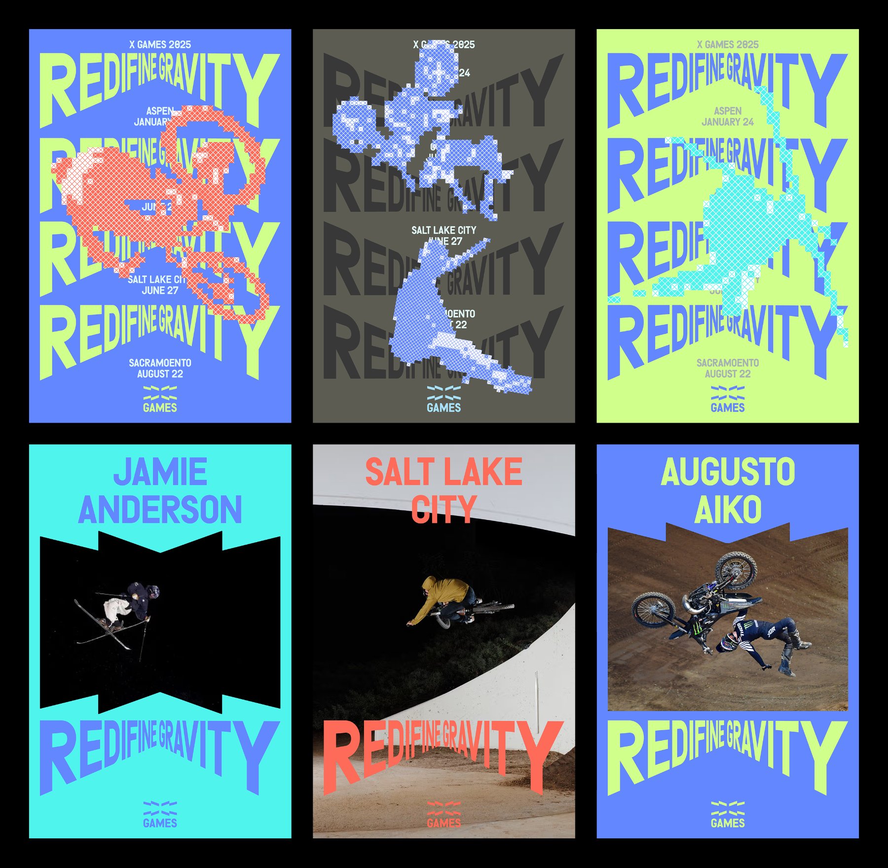
The type system leans on the Denim typeface, set with an exaggerated perspective treatment. Text appears to recede into a vanishing point, or push forward out of the plane. It doesn't just describe the "go extreme" mentality — the letterforms perform it. The perspective effect is most visible in headlines like "REDEFINE GRAVITY," where the stacked text creates a forced recession that suggests acceleration rather than stillness.
X Games Rebrand Color System and Event Applications
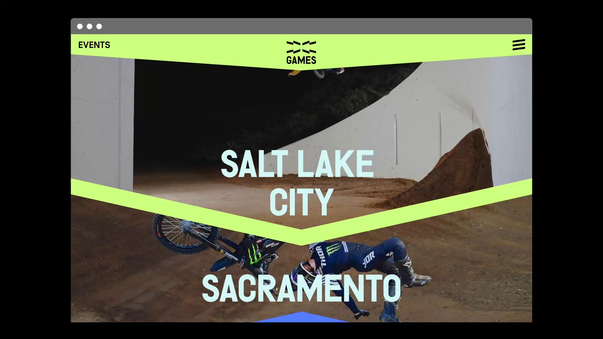
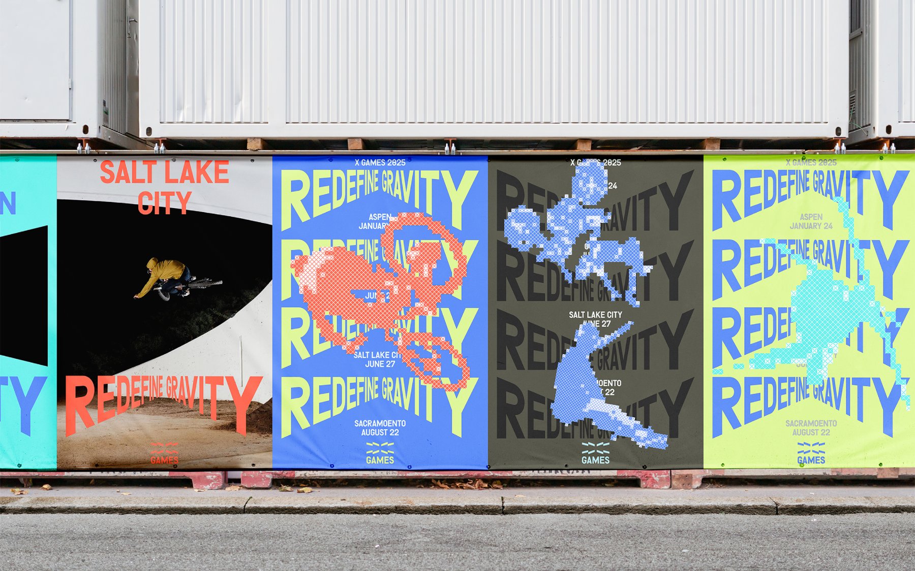
One of the sharper decisions in the X Games rebrand is the location-based color coding. Each event city gets its own palette. Aspen uses a cool teal. Salt Lake City uses a muted olive green. Sacramento sits in deep blue. A warm coral orange runs through the campaign posters. These aren't arbitrary swatches — they help an audience navigate a multi-city, multi-discipline event calendar without relying solely on text labels.
The outdoor billboard series shows this system at its most direct. Printed panels photographed against real warehouse walls pair BMX action photography with "REDEFINE GRAVITY" headlines set in the perspective Denim type. The halftone country map overlays — showing the continental United States as a rasterized dot field — add a secondary visual layer that feels both contemporary and referential to early 90s print culture. The combination of photo, type, halftone, and flat color fields holds together across all four panels without any single element overpowering the others.
The printed collateral extends this logic to physical event materials. Event maps use the same halftone treatment. Name tags and tickets carry the angular mark prominently. A teal-and-dark background palette keeps everything readable under the conditions of a live event — outdoor light, quick glances, moving crowds.
X Games Rebrand Website and App Design
The website and event app round out a system that moves fluidly from large format print to small screens. The homepage leads with full-bleed action photography — aerial snowboard footage, ski competition wide shots — with the X Games mark centered in the navigation bar. Event listings use the location color system as row dividers, making the schedule scannable at a glance.
The companion app takes the typographic energy of the print work and adapts it for mobile interaction. Bottom navigation labels read "SCHEDULE SCHEDULE" and "RESULTS RESULTS" in large oblique type — a deliberate repetition that mirrors the pulsing energy of the event rather than sanitizing it into clean UX conventions. The schedule screens list disciplines (Men's Ski Knuckle Huck, Women's Snowboard Big Air, Monster Energy Men's Snowboard Superpipe) with teal date headers that match the broader identity.
What Gwen Geng delivers here is a brand system that feels earned. The angular mark, the perspective type, the location color codes, the halftone overlays — each decision connects back to the same formal logic. Nothing is decorative for its own sake. The X Games rebrand makes a clear argument: extreme sports culture deserves visual design that is as technically rigorous as the sports it represents.
X Games Rebrand Logo
![]()
X Games Rebrand Identity and Billboards
X Games Rebrand Typography and Website