by abduzeedo
Xolve Branding built Beinbe from scratch — a Vietnamese functional food brand with branding that balances scientific authority and natural elegance to lead a new conversation in wellness.
The name itself — a play on the Vietnamese phrase for inner beauty — sets the tone for everything that follows. Xolve approached the project not as a surface-level packaging exercise but as a full brand architecture challenge, building a visual system that could carry real substance across product lines, retail environments, and digital touchpoints while staying rooted in warmth and clarity.
Vietnam's wellness market is crowded. Conflicting claims, quick-fix promises, and generic aesthetics make it hard for any brand to stand apart. Beinbe's founders saw this clearly and brought a sharp question to Ho Chi Minh City studio Xolve Branding: how do you build a brand from zero that speaks with real authority, yet feels honest and human?
Beinbe Branding: Strategy Before Identity
Xolve's answer started with strategy, not aesthetics. The team identified a single governing idea — helping women achieve deep beauty, effortlessly. Not "fixing" flaws, but nurturing a cellular-level state of health. This pivot from correction to cultivation shaped every downstream decision, from the name to the packaging grid.
The "Magician" brand archetype anchors the identity. It frames Beinbe as a knowledgeable guide, someone who distills complex nutritional science into simple daily rituals. That positioning is precise. It gives the brand permission to be both intellectual and warm — rare in a category that usually chooses one or the other.
Naming and Logotype Design
The name Beinbe is a portmanteau of "Be" and "Inner Beauty." That combination does more than sound good. "Inner Beauty" states the scientific promise: formulations that work from within. "Be" adds a quieter, emotional register — presence, self-acceptance, a state of being rather than striving.
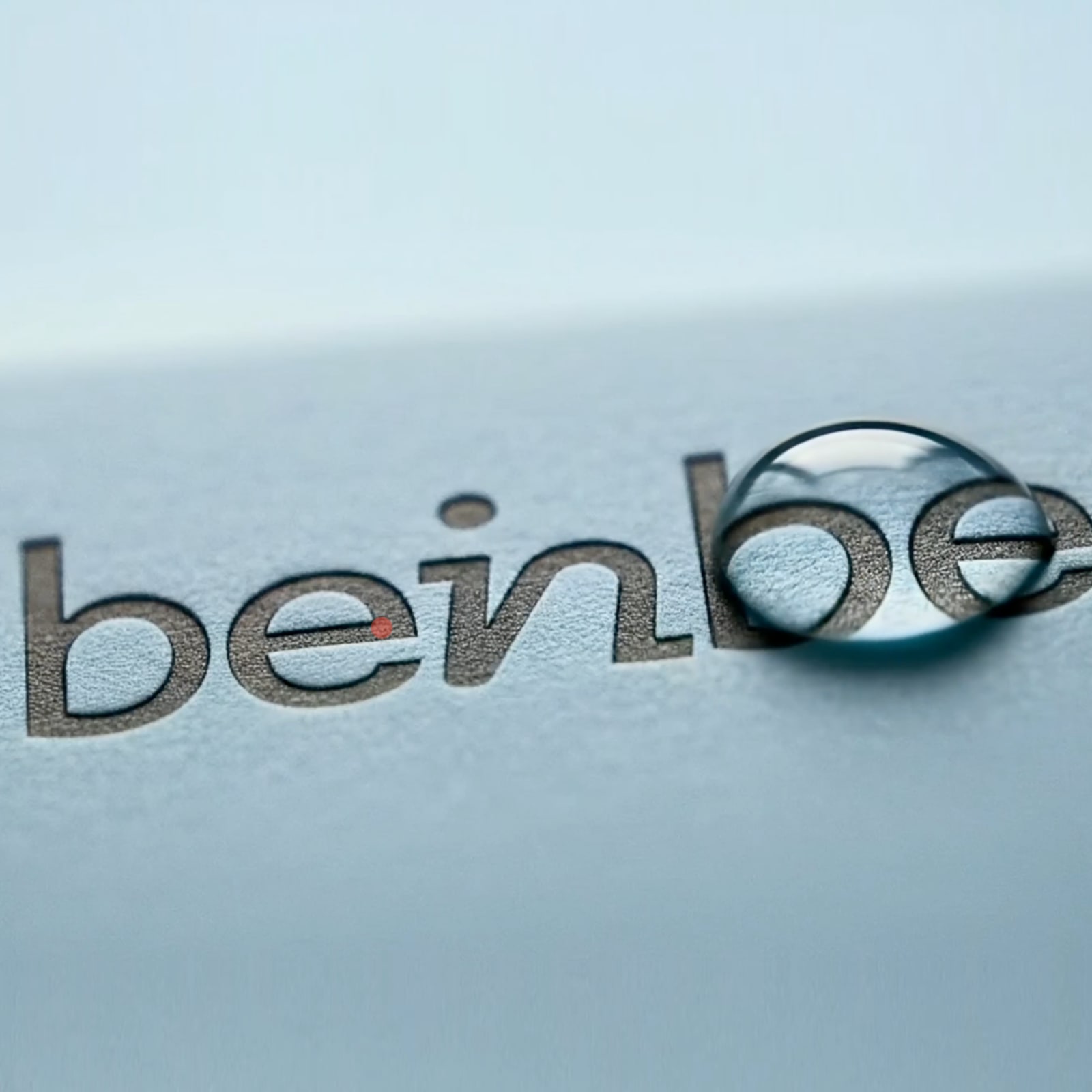
The logotype extends that concept visually. Xolve crafted a custom wordmark where the letters "in" at the center of Beinbe are styled to draw the eye inward. It is a subtle gesture, but one that makes the brand's entire philosophy legible at a glance. The mark does not shout. It invites.
Color reinforces that restraint. Beinbe Charcoal and Beinbe Off White form the primary palette — a pairing that reads as premium without leaning on the gold or blush tones common across wellness branding. The Metrophobic typeface brings clean, modern legibility. Nothing here competes with the product or the consumer.
Packaging System and Visual Language
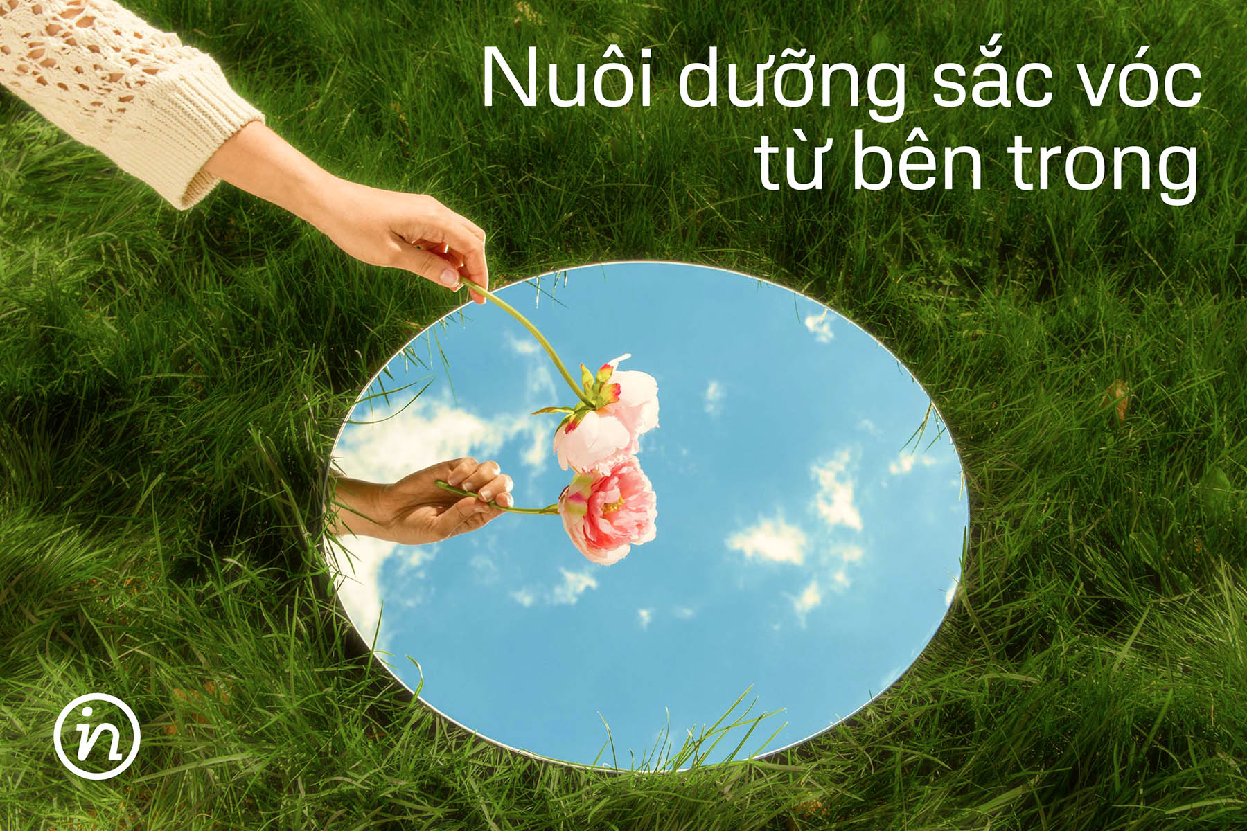
The circle appears throughout the brand as a core graphic element. It signals perfection, wholeness, and 360-degree care — a visual metaphor for the brand's promise of complete wellness. It informs photographic compositions, layout geometry, and how type is positioned relative to imagery. The circle is not decorative; it is structural.
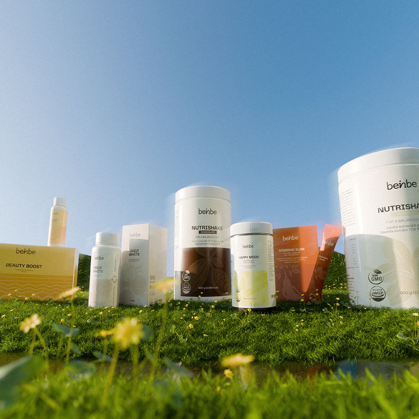
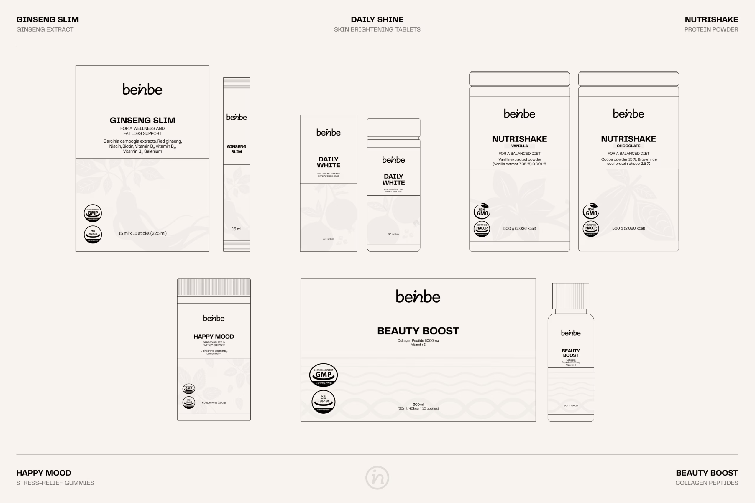
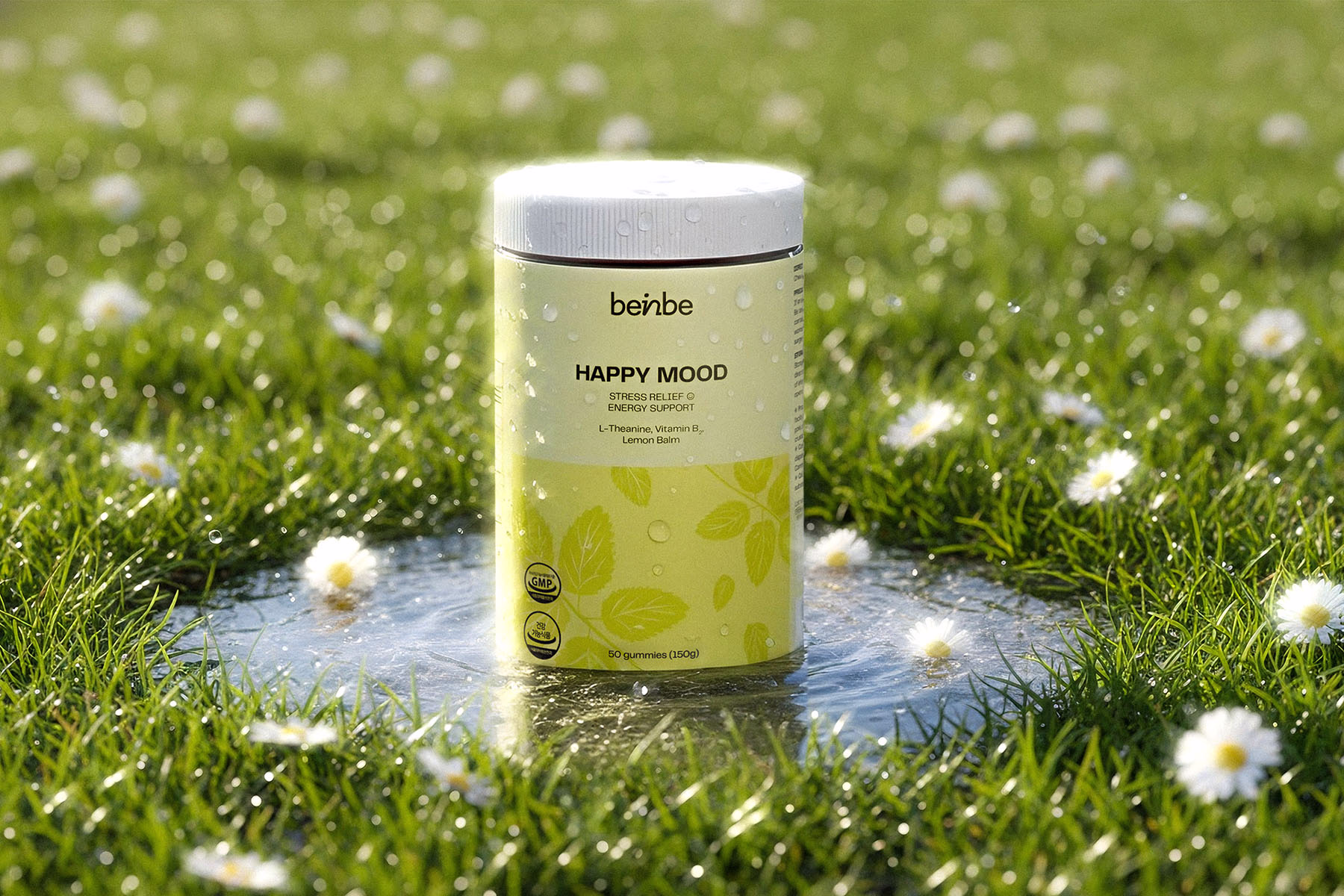
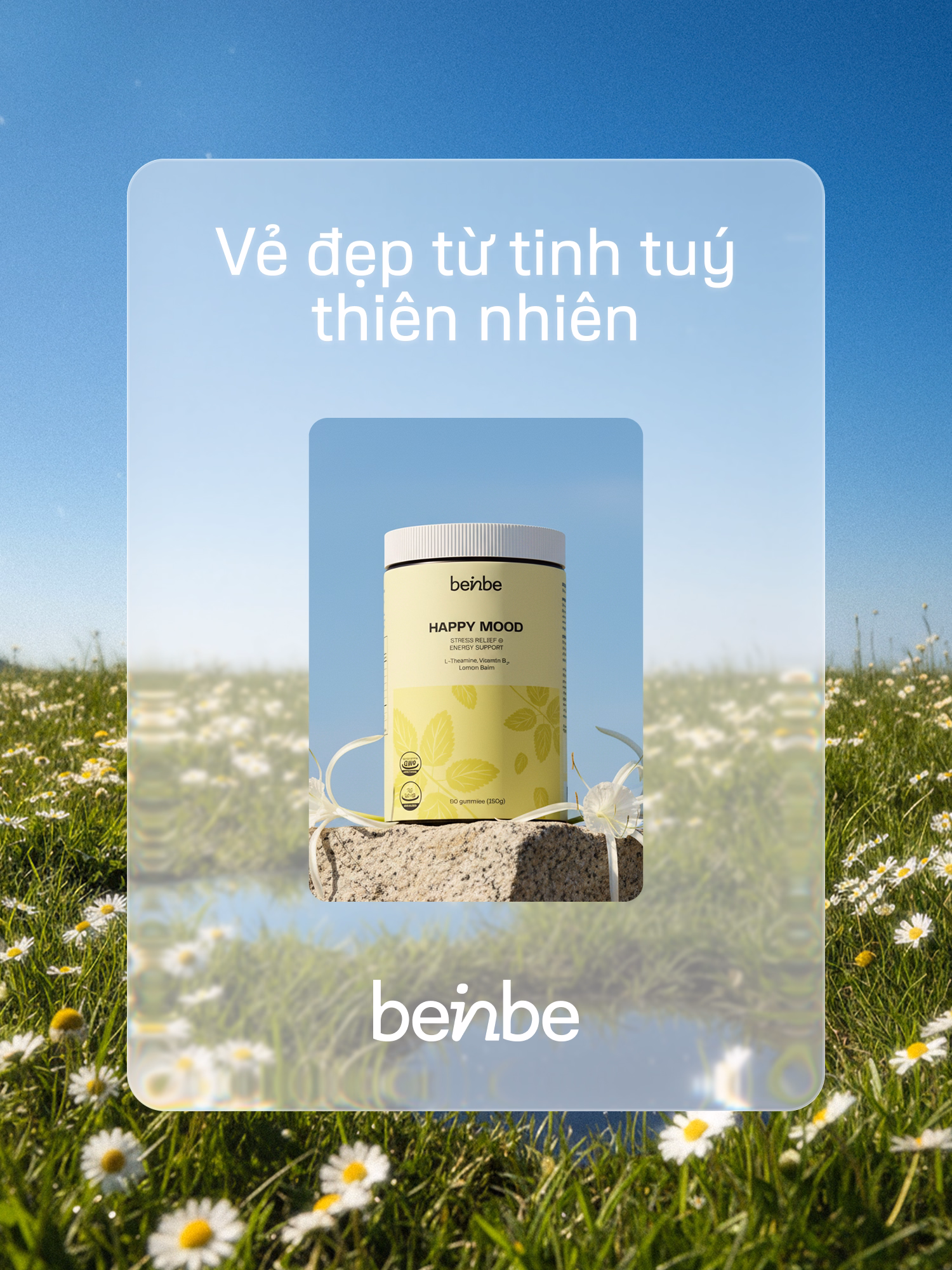
Packaging is where the branding earns its keep. Xolve built a cohesive system across the product line — minimalist grid, clean hierarchy, earthy tones that differentiate each SKU while keeping the family unified. On a busy pharmacy shelf, the restraint reads as confidence.
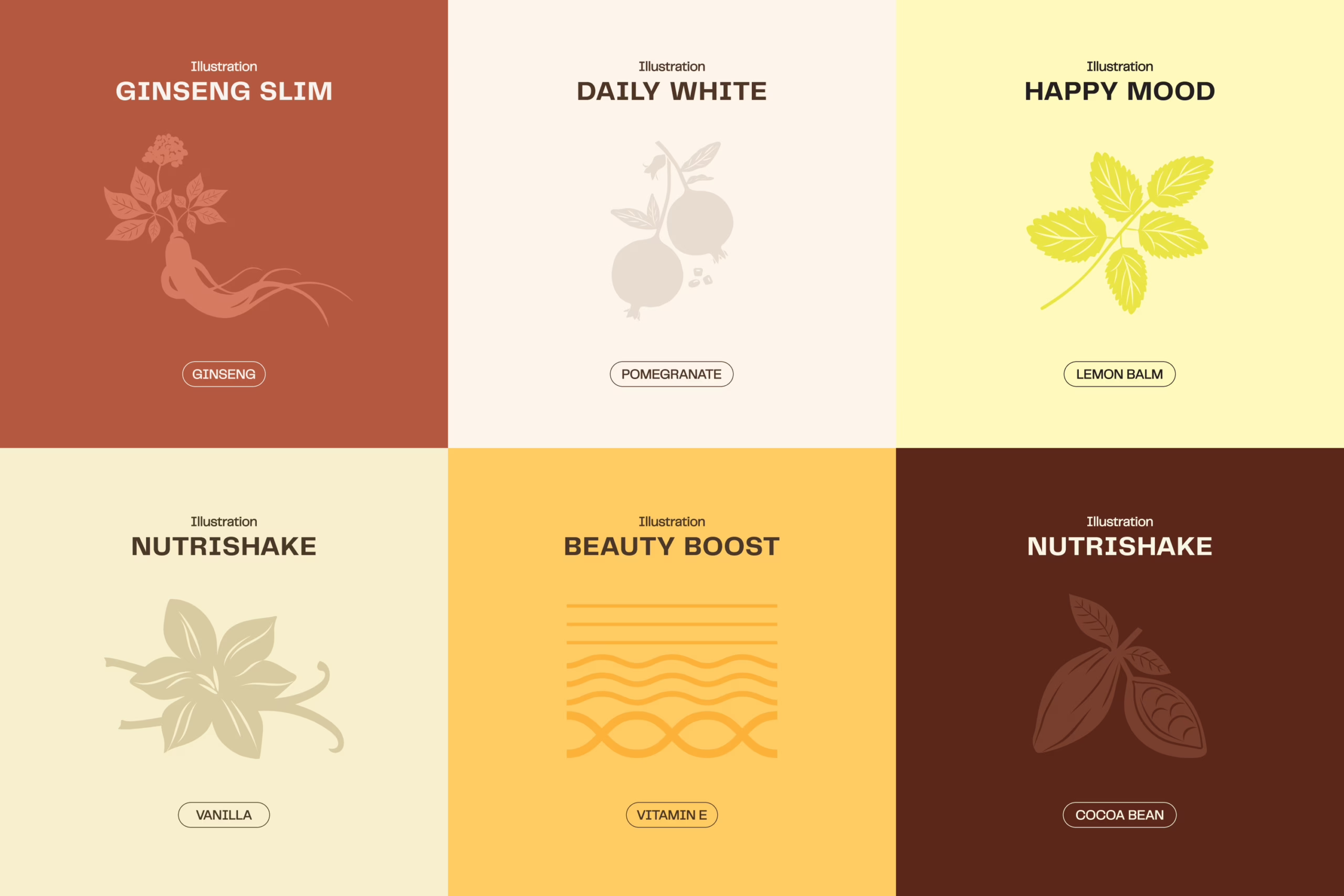
The bespoke ingredient illustrations are a particular highlight. Hand-crafted drawings of ginseng and vanilla roots sit alongside ingredient callouts, giving each pack a botanical warmth that factory-printed type alone could never achieve. These illustrations communicate craft and authenticity — qualities that matter deeply to the educated wellness consumer Beinbe is targeting.
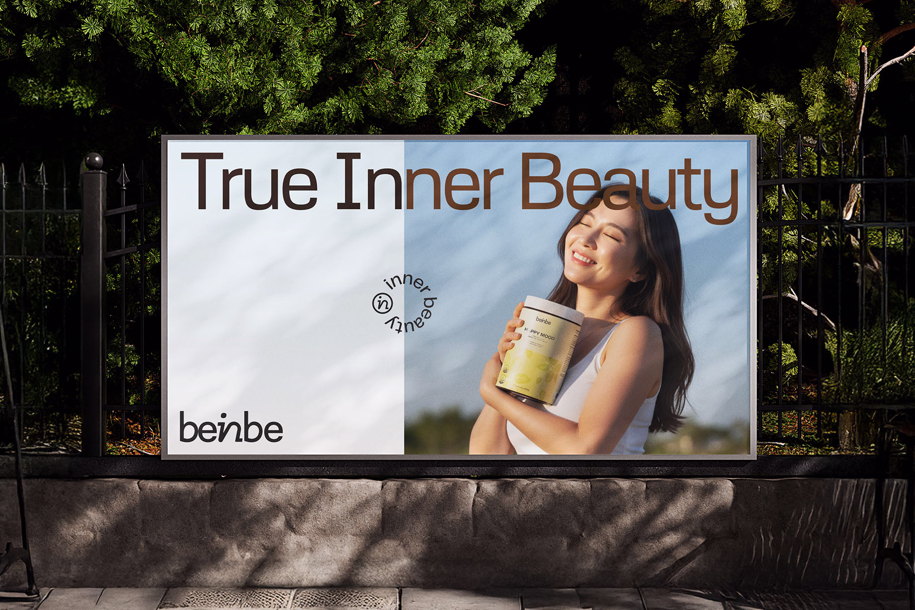
OOH applications extend the system convincingly. Billboard executions use the same tight typographic logic at scale, proving the identity holds beyond packaging. The branding is system-level thinking, not a collection of pretty assets.
Beinbe enters the Vietnamese market with a clear point of view: true inner beauty is a discipline, not a shortcut. The branding makes that argument without saying it directly, which is exactly the point.


 — Branding and Visual Identity")

