by jeff
Studio Arch creates a brand identity grounded in Digbeth industrial heritage, with black, white, and grey tones echoing the district raw urban character.
Birmingham's Digbeth is a creative hub with deep industrial roots. Studio Arch calls this district home. The studio's brand identity approach draws directly from its surroundings. Railway arches, exposed concrete, and weathered steel inform the visual language. Place and practice are inseparable here.
A Brand Identity Built on Industrial Foundations
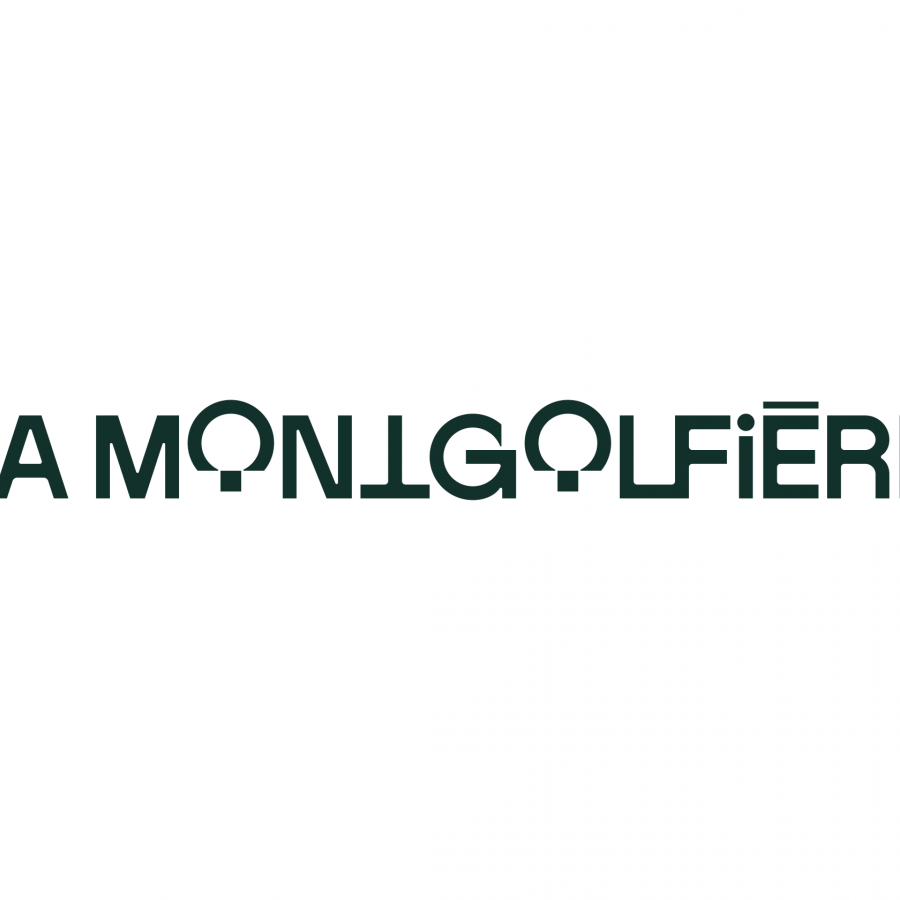
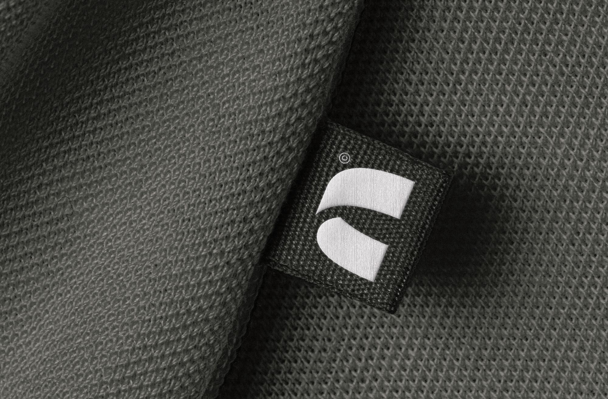
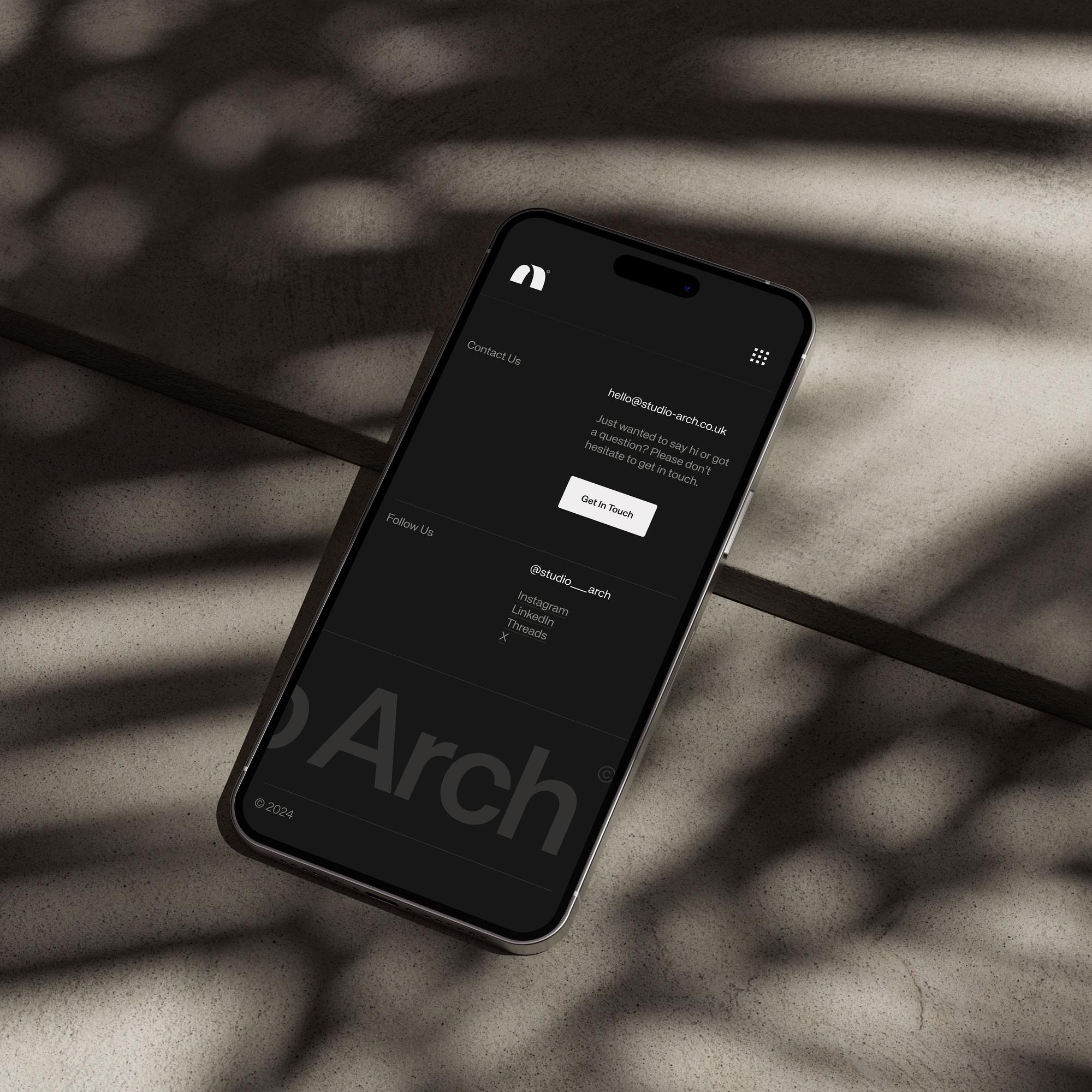
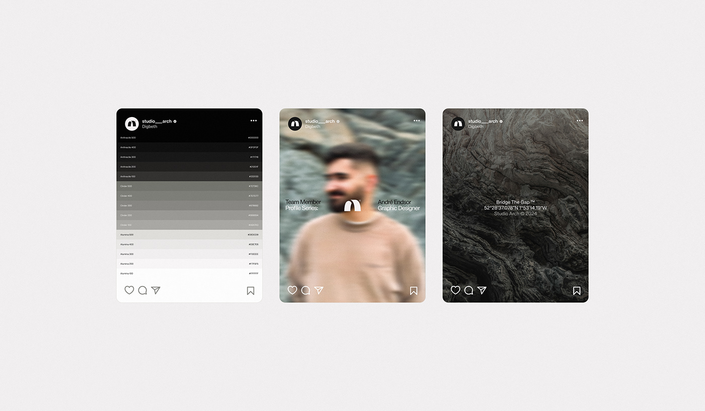
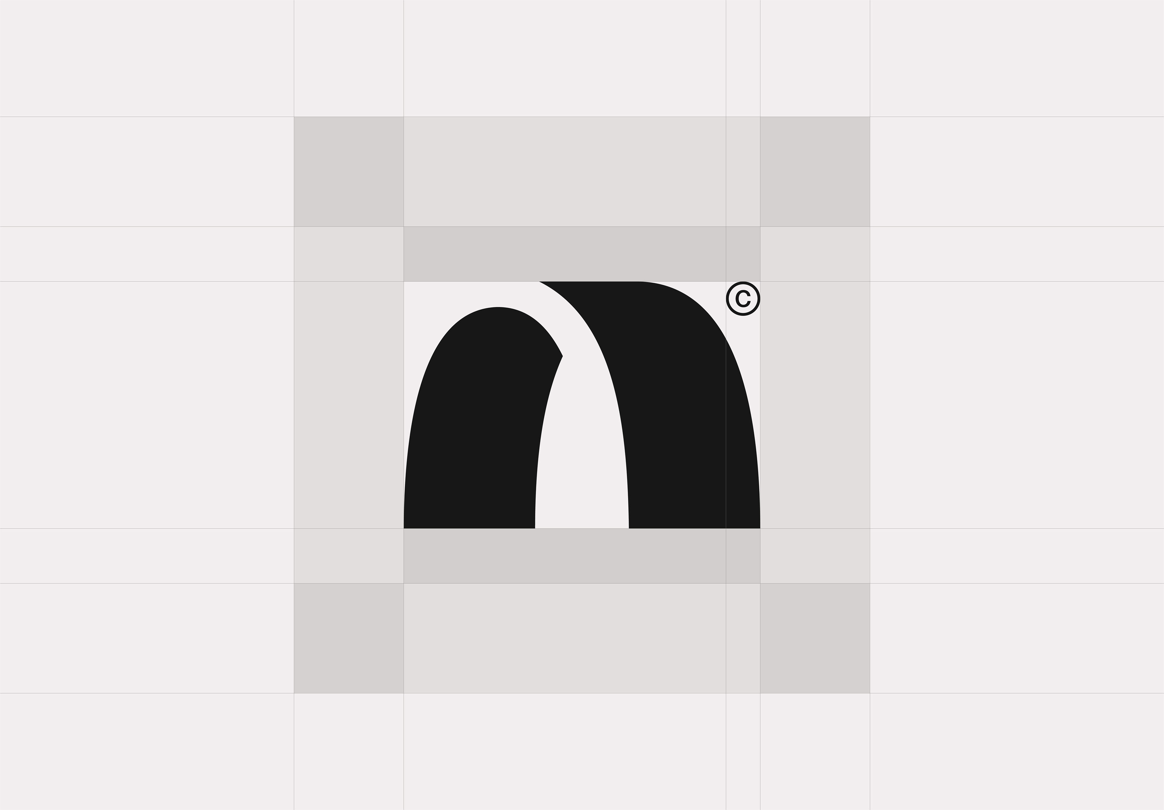
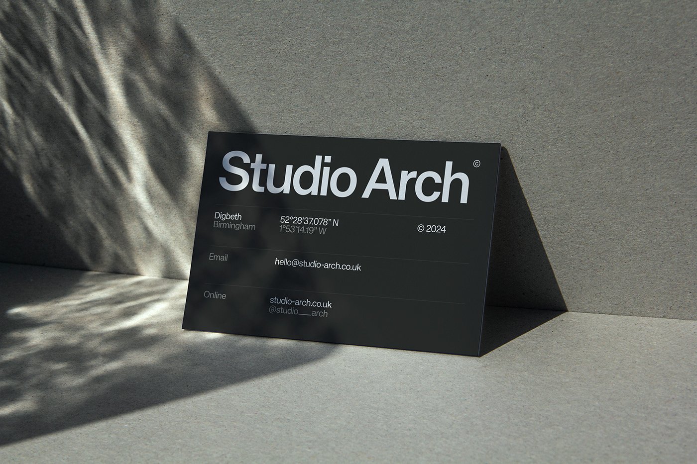
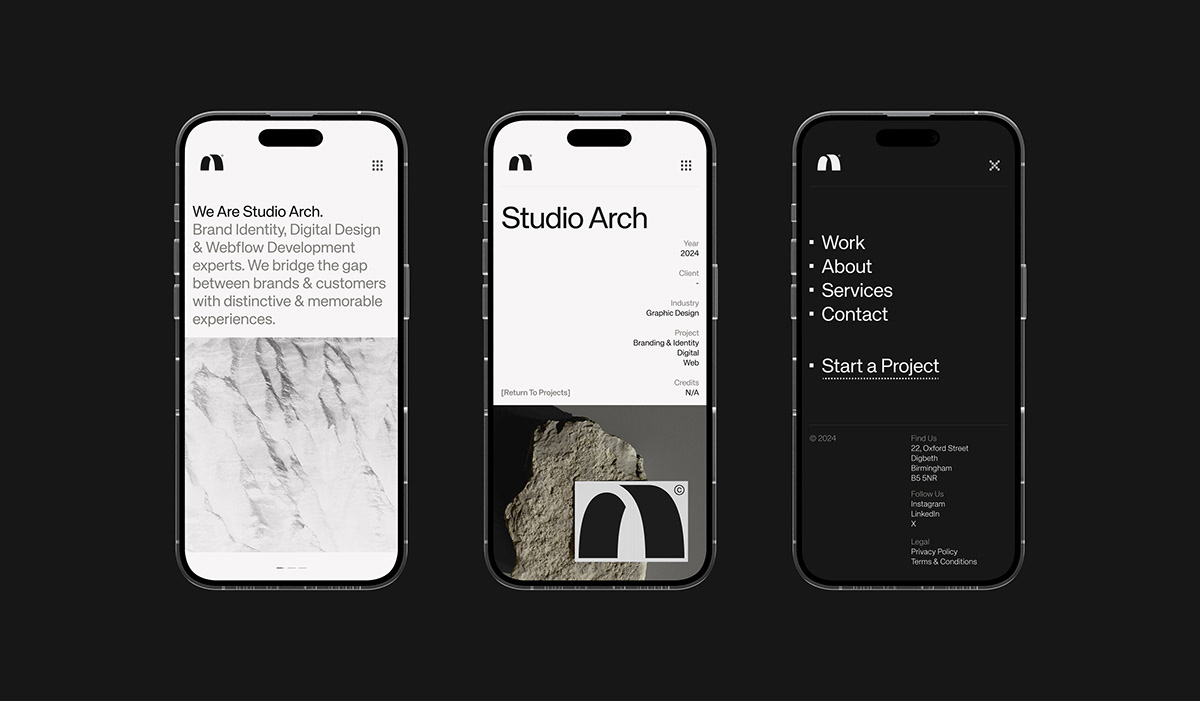
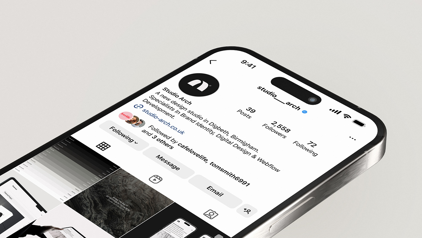
The brand identity centres on a restrained palette. Black, white, and varying greys form the core. These tones reflect the raw materials around the studio — concrete, steel, and weathered brick. The logo abstracts the arch motif into a clean structural shape. It carries both spatial and symbolic weight. Every element connects back to this foundational reference. Nothing is decorative.
Studio Arch was founded in 2016 as the in-house design unit for Lab11. It moved through Circle Media before adopting its current name in 2024. That history gives the rebrand a sense of earned clarity. This is not a studio choosing an aesthetic from a mood board. It is one that has spent years building a working philosophy.
Typography reinforces the industrial sensibility throughout the brand identity system. Type is stripped of ornament. It is structurally sound and confident in negative space. The result is a brand identity that demonstrates rigour and restraint. It communicates both authority and craft.
Studio Arch now works with startups, established companies, and cultural organisations. The studio has grown beyond Digbeth's nightlife sector. The full project appears on Behance. It shows the visual system across brand applications, spatial contexts, and typographic layouts.
For studios working through a rebrand, the Studio Arch brand identity offers a clear reference. Limiting the colour palette works. Anchoring the logo in geography creates distinction. Resisting trend-driven aesthetics builds longevity. Digbeth is changing fast — development pressure is reshaping the district. Studio Arch's brand identity captures a moment of real creative intensity in one of the UK's most active design communities.
Credits: Studio Arch — View project on Behance