by abduzeedo
Mubien Brands built the energy branding for Nertik, an energy consultancy, using dotted-line motifs, warm gradients, and a sharp geometric identity mark.
Nertik is a Spanish energy consultancy helping businesses understand, manage, and cut their electricity and gas costs. The challenge Mubien Brands faced was one that trips up many identity projects in the utilities space: how do you make an inherently technical service feel approachable, trustworthy, and human? The Madrid studio answered that question with a visual language built on guidance. The idea that Nertik does not just sell services, it accompanies clients through every step of their energy journey.
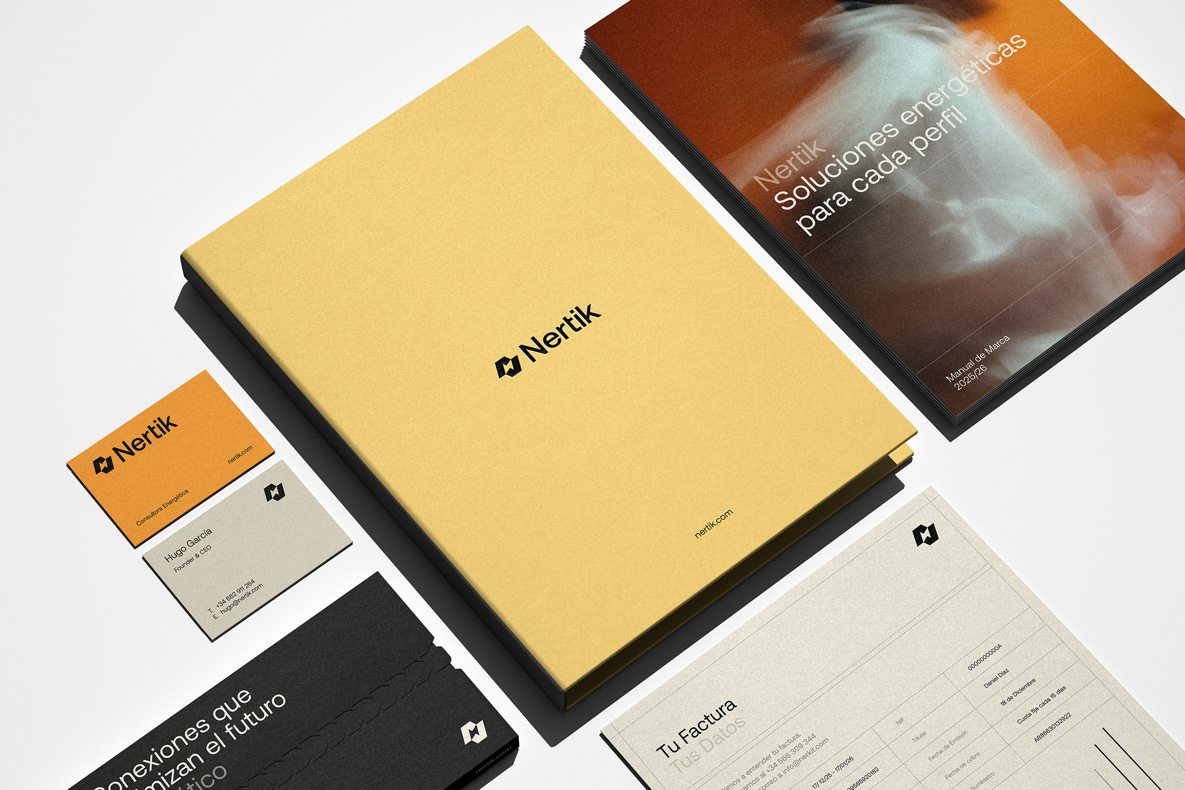
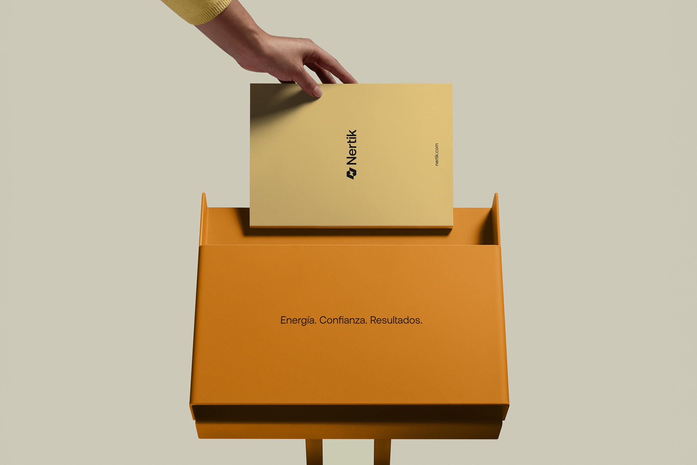
The defining motif of the energy branding system is the dotted line. Across stationery, signage, packaging, and the new website, dotted lines recur as a visual thread, literally tracing the path of accompaniment that Nertik promises its clients. It is a simple device, but it gives the identity coherence and narrative depth that most energy sector brands lack entirely. Paired with a warm gradient palette that moves from amber to a deeper coral-orange, the system projects energy and warmth without resorting to the cold blues and greens that saturate the renewable energy category.
Energy Branding That Balances Geometry and Warmth
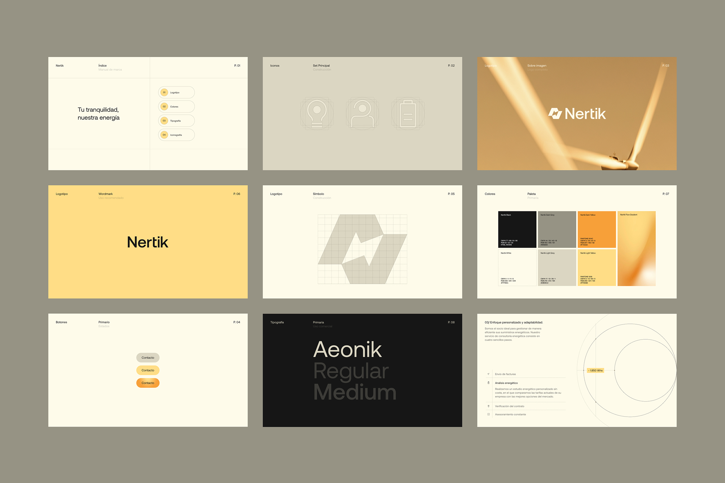
The logo at the center of this energy branding system is a compact geometric mark built from two interlocking ideas. An inner lightning bolt references energy and the company's capacity for transformation. The surrounding connected geometry, with its subtle angular breaks, reads simultaneously as a checkmark and as a continuous loop, reinforcing ideas of precision, cyclical support, and reliable delivery. It is a mark that works at billboard scale and at business card size without losing legibility or intent.
The stationery suite demonstrates how disciplined the system is in practice. Letterheads, business cards, and document folders all carry the dotted-line motif at different scales and densities, creating visual rhythm without clutter. The warm gradient appears as an accent rather than a flood used in corners, borders, and highlights to give each piece a sense of directed energy. The brand guidelines document lays out these rules with the same structural clarity that defines the rest of the work: tight grid, clear type hierarchy, and color swatches that show how the palette behaves in both light and dark contexts.
Physical applications push the identity further. The display unit, a freestanding expositor built for retail or event contexts, carries the full visual language at human scale: the logotype in a clean sans-serif, the gradient applied to structural panels, and dotted-line graphics running along surfaces to reinforce the navigation metaphor. A billboard execution strips the identity back to its essentials, proving that the mark and the palette hold their own at outdoor scale against direct sunlight.
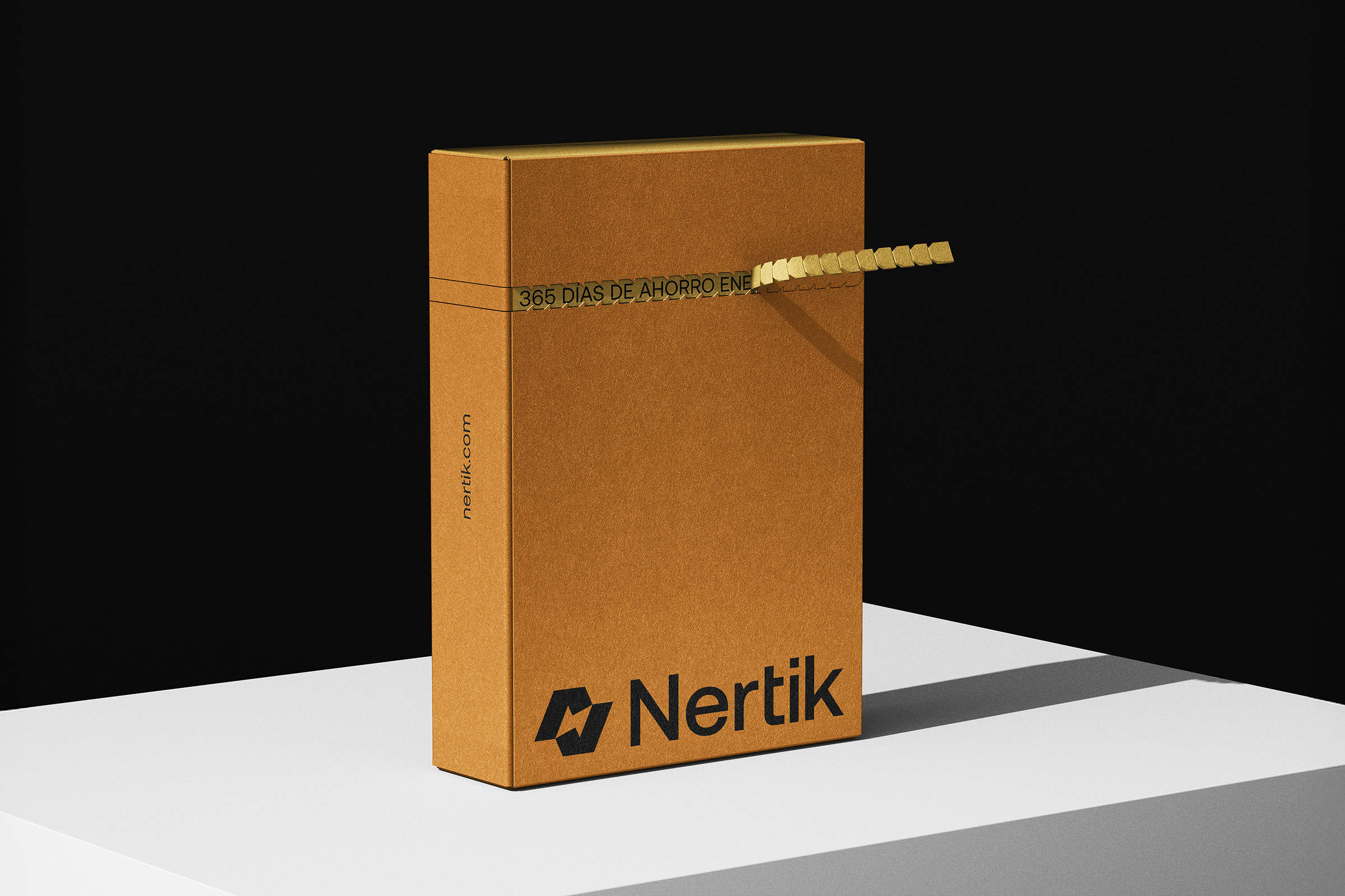
The packaging work rounds out the system. Product boxes use the same geometric vocabulary as the logo, with dotted-line borders framing the faces and gradient accents giving depth to an otherwise flat surface. Each touchpoint in the Nertik system, from the smallest card to the largest sign, speaks the same visual language without feeling repetitive, which is the real measure of whether an energy branding project has been executed well. Mubien Brands delivered a system that earns that standard.
Credits: mubien.com


