by jeff
Microdot brand identity by Standard Projects builds a film-language visual system for a London post-production studio working with Netflix and Nike work.
![]()
Post-production studios rarely carry distinctive visual identities. Most rely on neutral presentation and let the work do the talking. Microdot, a London studio founded in 2025 by Adam Clarke, Mikey Smith, and Zdravko Stoitchkov, chose a different path. The team built a brand identity from the language of cinema itself, developed with design studio Standard Projects.
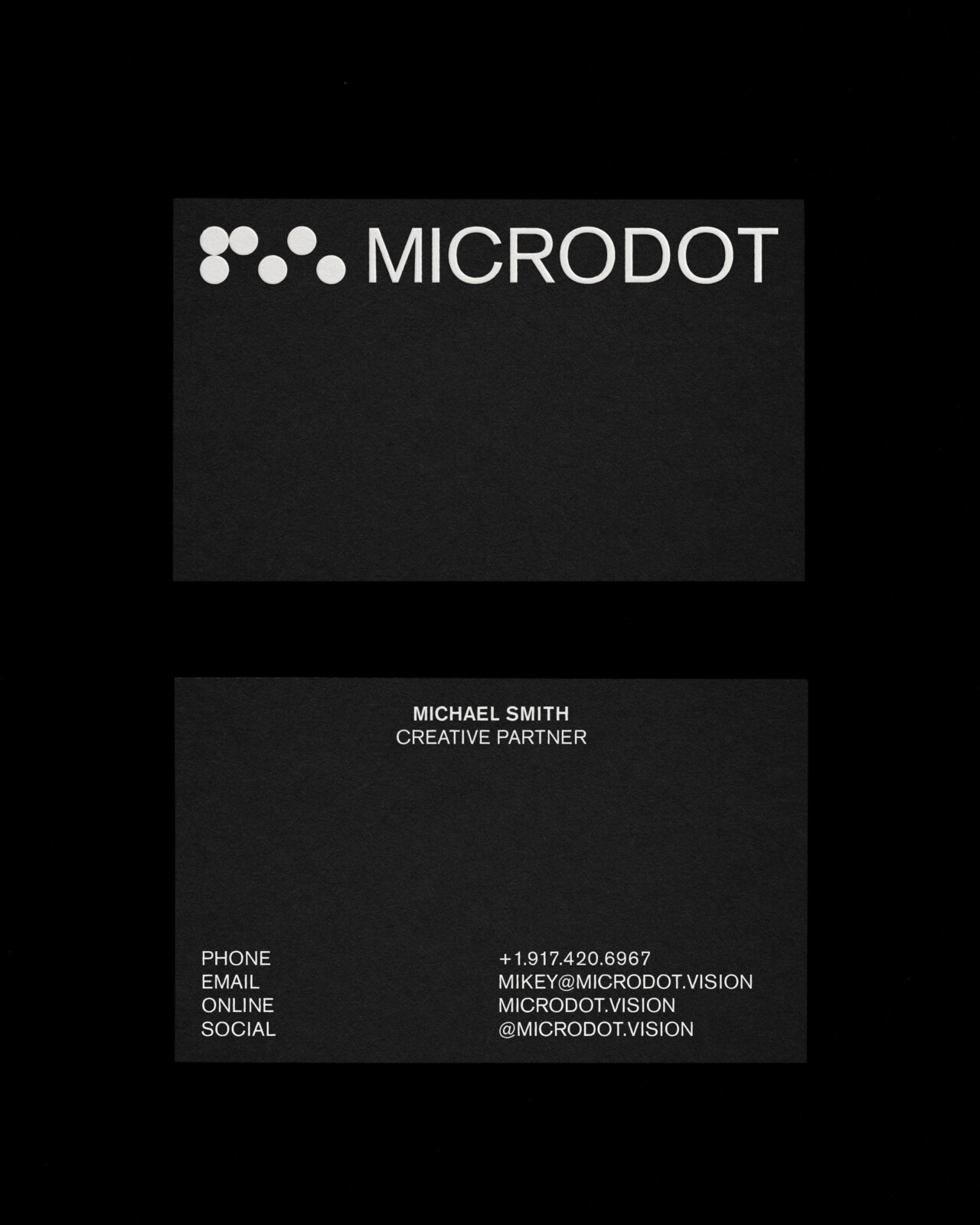
Microdot's work appears at Sundance and Stockholm International Film Festivals, streams on Netflix, and runs in campaigns for Maison Margiela, Nothing, and Nike. That profile demanded a brand identity with equal weight. Standard Projects articulated the studio's positioning through a single phrase: Rendering Imagination. The line serves as both a technical description of post-production and an aspirational statement about what Microdot does at its best.

Cinema as the Language of Brand Identity
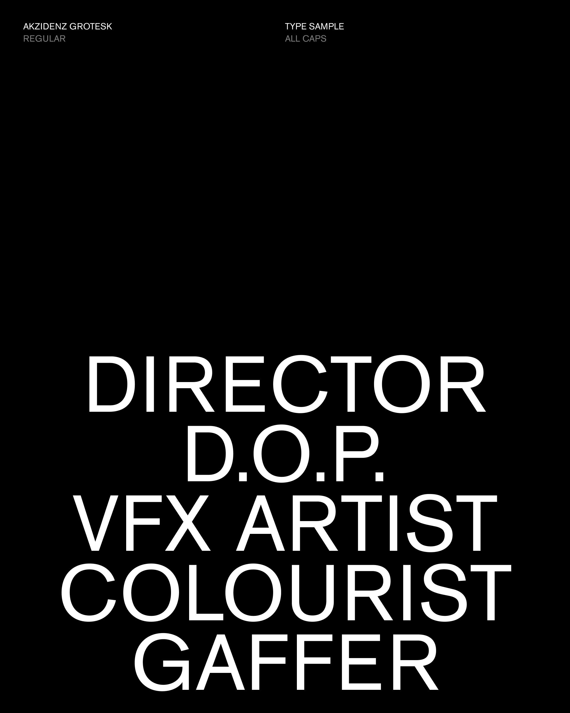
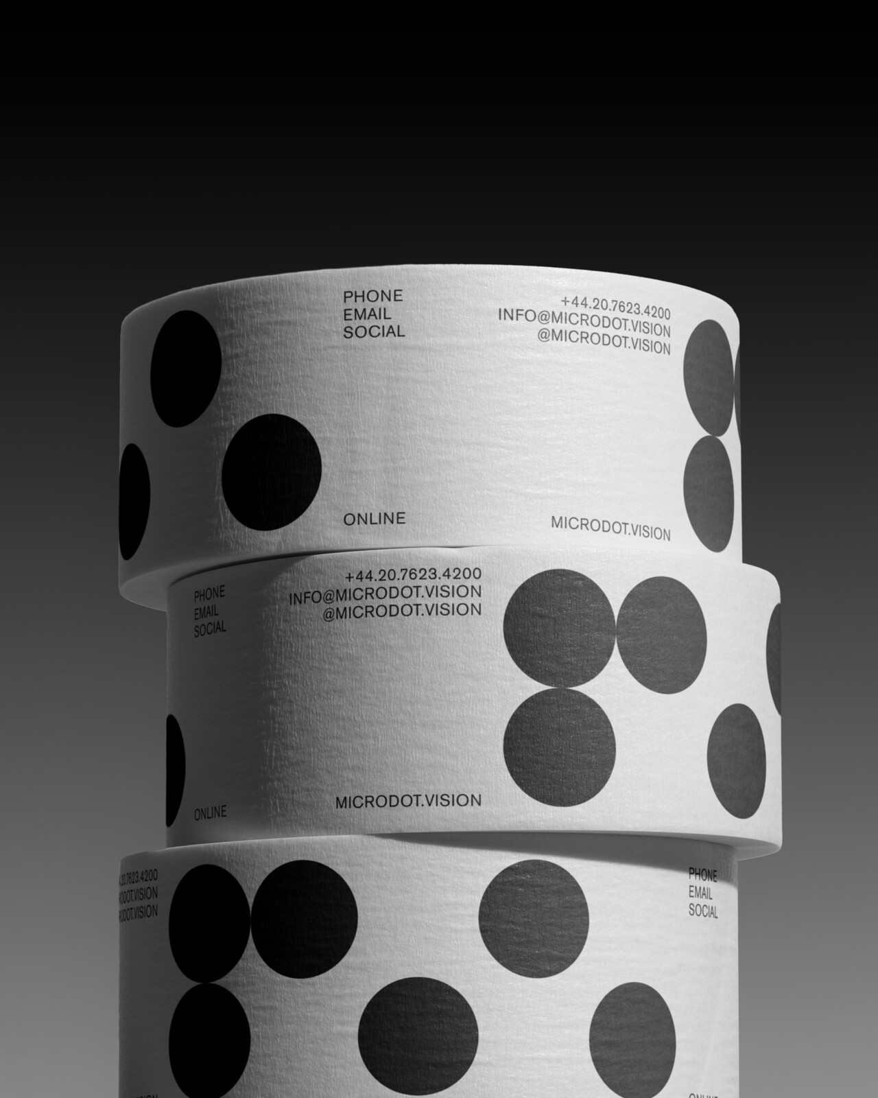
The brand identity draws on the minutiae of filmmaking. Edge codes and timecodes structure the typographic system. Light-leaks inform the colour and texture approach. Slitscans and scrubbers provide motion references. The team, led by directors Dan Flynn and Adam Vella with design contributions from Denny Louis, built every element from the grammar of the moving image. Akzidenz Grotesk underpins the brand identity with a nod to functional, pre-digital precision.
Standard Projects describes Microdot's character as carrying two qualities at once: experimental and exacting. The brand identity reflects that duality at every scale. Microdot operates at pixel level because imprecision destroys the illusion the team is paid to construct. That philosophy shapes the brand identity as much as any aesthetic decision does in the system.

The digital experience extends the brand identity into site design and build. Cinematic case studies, darkroom treatments, dynamic titling, and micro-interactions create an immersive presentation without overshadowing client work. Performance remained a priority throughout. The result positions Microdot as a studio that understands both the craft and business context of post-production at the highest level.
The project stands as an example of brand identity work that earns its visual complexity by grounding every decision in subject matter. For studios interested in how identity systems can be built from a domain's own technical vocabulary, the Microdot project offers a rigorous case study worth studying carefully.