01301.
Illustrations for Sound Deals podcast
illustration

Sound Deals is an improvised comedy podcast where founders Max and Ivan - along with a roster of incredible guests - have to promote fictional products.
Sound Deals is an improvised comedy podcast where founders Max and Ivan - along with a roster of incredible guests - have to promote fictional products.
")
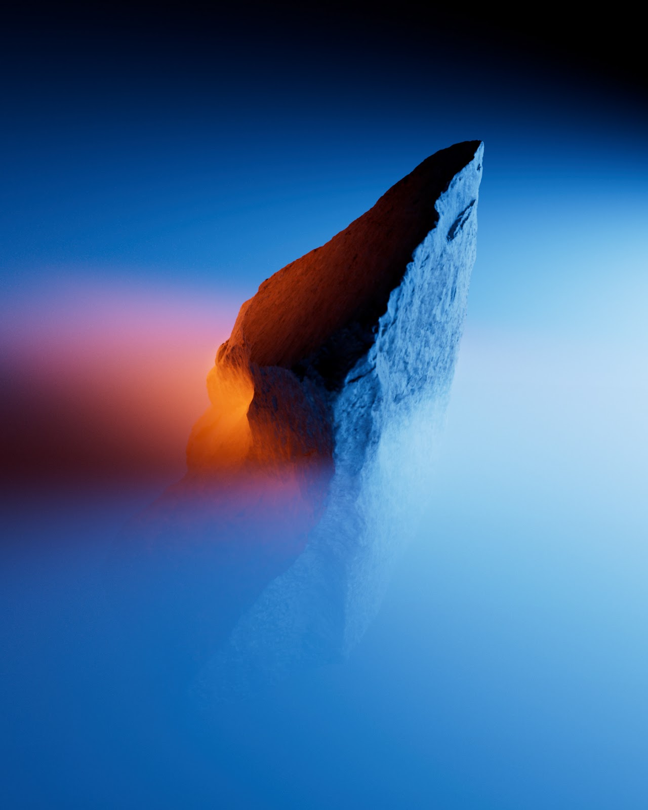
I love changing the wallpaper on my devices. Phone, tablet and laptop. I also like abstract and in a way simple wallpapers, usually with some mix of gradient and color effects. For this tutorial I will show you how to create a super simple composition using gradients, brushes and blending modes.


BUCK is proud to have worked with Transportation Alternatives to bring attention to Spatial Equity NYC, a new tool created with MIT's Norman B. Leventhal Center for Advanced Urbanism to map the (in)equity of space and how it impacts our health, environment, and the ways we get around.

Mubariz Yusifzade shared a branding and visual design system for Manifold. Equipment for TV studios for live broadcasting, offer a new, reliable, flexible and efficient technical solution. High processing density, flexibility and density, a compact and very strong team of engineers who have already proven themselves in this area.

How&How partner with www.flyp.co to develop a new strategic position, brand identity and website. Love your estate agent? Yes, really.

Ezequiel Cafaro was called to design the poetry collection for Editorial Salto de Página and redesign the seal brand. For the collection system Ezequiel and team generated "a color palette of images that do not exist", indefinite, but that could be anything you imagine. "We leave it to your discretion” — he adds.


Accept & Proceed Principal Designer Nigel Cottier announces the launch of Letterform Variations, a personal project comprising a book published by Slanted, a font collection, and a series of artworks that look at letterform construction using basic grid and shape based systems, and its potential to generate vast amounts of varying alphabetical outcomes.

NB Television™ Pro pays tribute to popular typefaces of the ‘cathode ray tube’ era by translating the analogue ‘crt’ grid based softedged typesets to the digital age. With a focus on detail and reference to the ‘crt’ grid, each glyph was designed with pixel perfect precision.

Obis.agency designed and developed a beautiful website for Odin’s Crow, a team of former bankers, lawyers and M&A advisors, backed by a few of the best CEO’s on the planet. The site has this classic look that reminds me of old VHS packaging but in a great way.

Lea Konaševská shared a series of abstract art exploring different shapes and forms but still building up from the circles from the previous collection. I love the abstract compositions, especially the color gradients that Lea accomplished by mixing the forms.

TOLM shared a motion design project titled AVA. This project is an experimental 3D animated music video for Janek Murd - an Estonian musician and composer. Ava explores the constant cycle of life - be it a breath of air, passing of a day, full turn of the year, or journey from one's birth to death.

Tendril collaborated with Riot Games to create a visual identity, motion branding system and toolkit for or Riot Worlds 2022, a global championships event for League o Legends.

Type Forward shared a typography/typeface project titled Bion. Bion is a contemporary geometric sans serif with a down-to-earth attitude. It is distinguished by a high x-height, vertically cut terminals, and a minimal stroke contrast, giving it a distinctive, sharp look that is both timeless and universally appealing.

Yaroslav Cherkunov has a solid portfolio and I love looking back and seeing old projects. This one was for the Ukranian Creative Week that happened in 2016. I know, it’s been 6 years since but the work is still inspiring.

Amanda Louisi shared a super stylish illustration and print project titled Anifolius. The name is the same of these imaginary hybrid and fluid lifeforms. This series consists of 18 arts with symmetrical shapes inspired by the union of the shapes of leaves, flowers, insects and some other animals. The prints will be on sale soon in materials such as cards and posters for decoration.

Todd Huynh shared a branding project that he worked on for Artkey Universe, a creative studio specializing in manufacturing technological handmade accessories with the main product being art mechanical keycaps. The brand's manifesto is to turn desk accessories into works of art through the artist's ingenuity and imagination.


During 2022, KOBU Agency had the opportunity to develop the rebranding of the BRUMA brand, a major taps designer and manufacturer in Portugal. The overhaul of this 30-year old brand included defining its new positioning, tone of voice, concept and storytelling while its logo and visual universe.