by abduzeedo
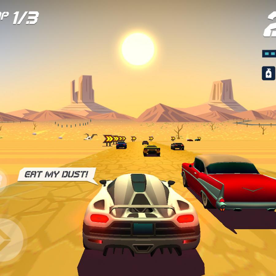
Horizon Chase is one of those games that brings back a lot of good memories, especially if you are from the generation that played the classic Sega Outrun or Nintendo's Top Gear. Outrun is the best reference because of the Ferrari. Another amazing thing about this game and game design is that I know the folks behind it, they are from my hometown, which makes me even happier. So for this post I just wanted to share the work that Rodrigo Bellão published on his Behance profile. I added the info he was kind to share with us.
As the Lead UX/UI designer on this project I worked alongside the game designers to revamp the nostalgic experience of the classics racing games from the 90's in this multi platform game developed by Aquiris Game Studio.
Achievements
- 8+ MILLION ORGANIC DOWNLOADS
- Editors' Choice on App Store - Worldwide
- App Store “Best of” 2015 Worldwide
- App Store “Best of” 2016 Apple Tv category
- “Android excellence” 2017 - 15 games featured only
- Game of the year - App store iPAD in Brazil and Mexico
- Game of the week - toucharcade.com
- Gold award and game of the year nominee - Pocket Gamer
- Best game - Big Festival 2016
- Featured on the Apple Stores’ devices around the globeI
Game design
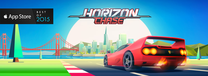
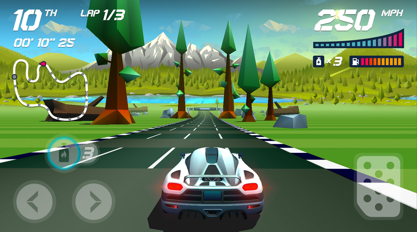
The team did not want to just replicate 16-bit graphics of classic games. The process of visual exploration led us to a combination of low poly 3D objects with high detailed illustrated backgrounds and a colorful palette. To design the key visual I used a prototype screenshot combined with a montage of landscape illustrations from our mood board. A basic HUD was design, inspired by digital panels from 80s and 90s cars.


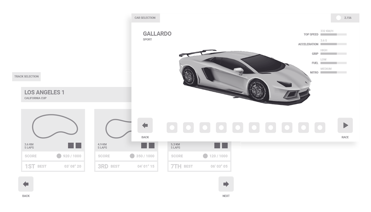
I kept my wireframes ready to include new features. The economy and the meta game went through several stages until maturing. Many features were tested such as the store, the collections, upgrade systems and the introduction of currencies. With the time they were removed to let the player focus on the gameplay.
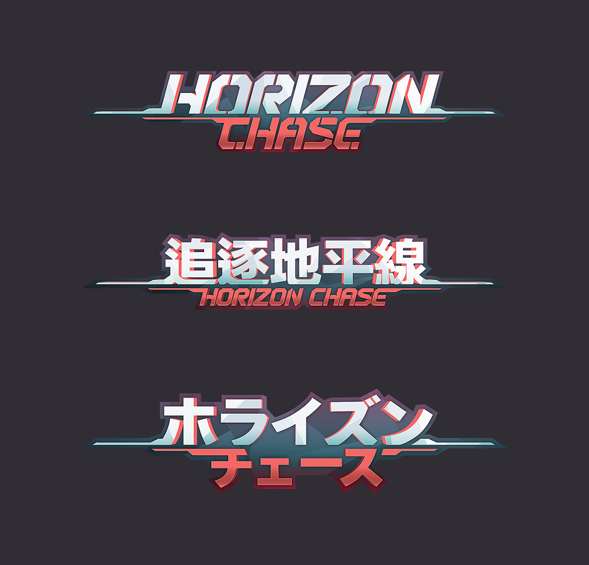
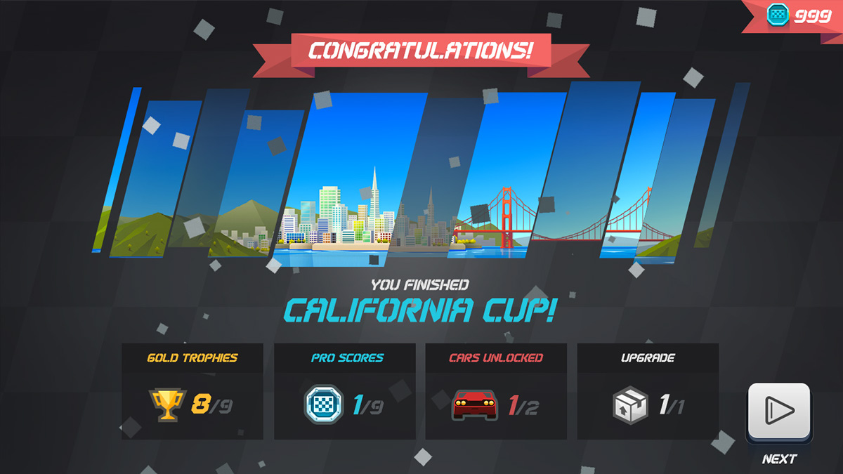
I experimented with low poly visuals in the UI, but I noticed that overusing it could affect the usability impairing the contrast of elements. My solution for the UI visual was a mix of low poly with retro looking 3D buttons.



The HUD required a lot of iterations and user testing to achieve a good usability. We had to experiment with large variation of screen sizes and input devices to accommodate digital controls and visual feedbacks according to user customization.

All promotional materials were made in house. We created an entire digital campaign that included the website, 5 trailers and several assets for the stores.
