SaaS Dashboard UI/UX Design: Structuring Workspace Efficiency
This saas dashboard ui ux design by Iconiq Designers optimizes complex workflows with dark mode layouts. It simplifies team management and candidate tracking.
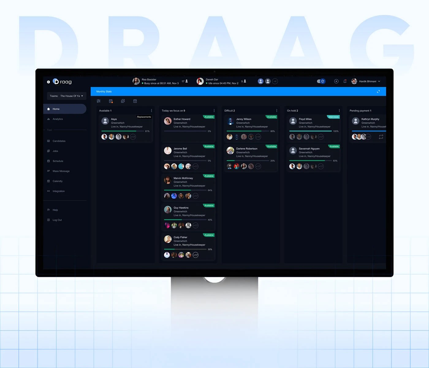
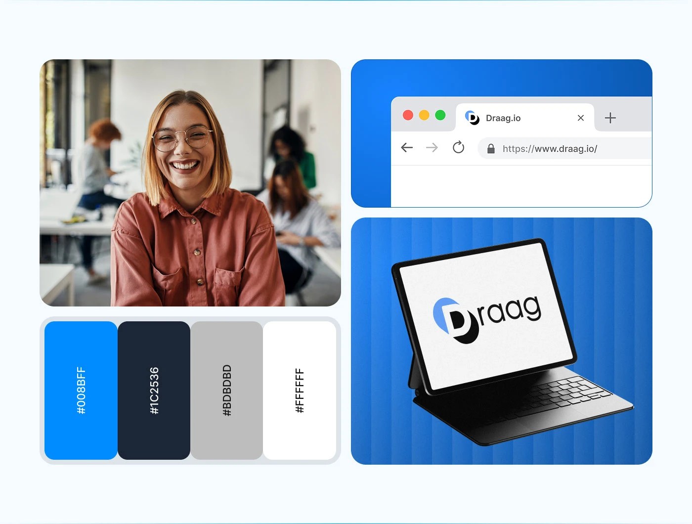
The platform, named Draag, integrates candidate tracking and human resource tools to reduce cognitive load for teams. The screen uses a clean modular grid for this saas dashboard ui ux design, separating links from data. A primary sidebar hosts main options including stats, jobs, and setup. Vertical columns map the candidate journey, creating a clear visual rhythm. Card components display candidate profile images, job roles, progress bars, and status tags to enforce baseline alignment for easy scanning. High contrast accents highlight urgent tasks without cluttering the view.
Refining the SaaS Dashboard UI/UX Design
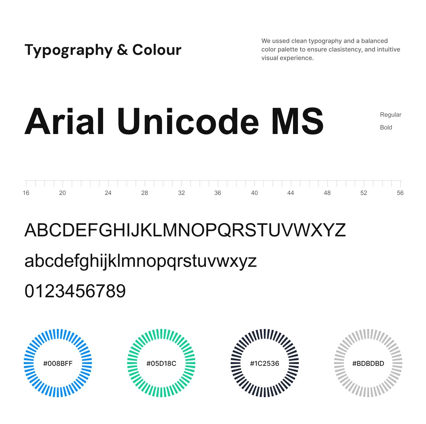
The color palette employs deep charcoal and navy backdrops to reduce eye strain. Bold blue banners segment monthly statistics, creating visual tension against the dark background. The type system relies on a clean, geometric sans-serif font, providing high legibility across dense data tables. This saas dashboard ui ux design uses typographic scale and generous negative space to define card boundaries, avoiding heavy line work for a lightweight feel. Tactile contrast emerges through clean hover states and progress bars.
Iconiq Designers demonstrates a disciplined approach to enterprise tool design. This saas dashboard ui ux design shifts the focus from data density toward user-led patterns. The layout balances complex features with structural order. By organizing workflows visually, the design reduces training times. The project illustrates how modern consumer aesthetics help teams work faster.
Learn more about this project by visiting the portfolio of Iconiq Designers.