by abduzeedo
Explore the stunning branding and visual identity of Provenance Box by Oleksandr Maksymov, featuring a unique curved line design that supports local producers and brings top Australian restaurants into your home.
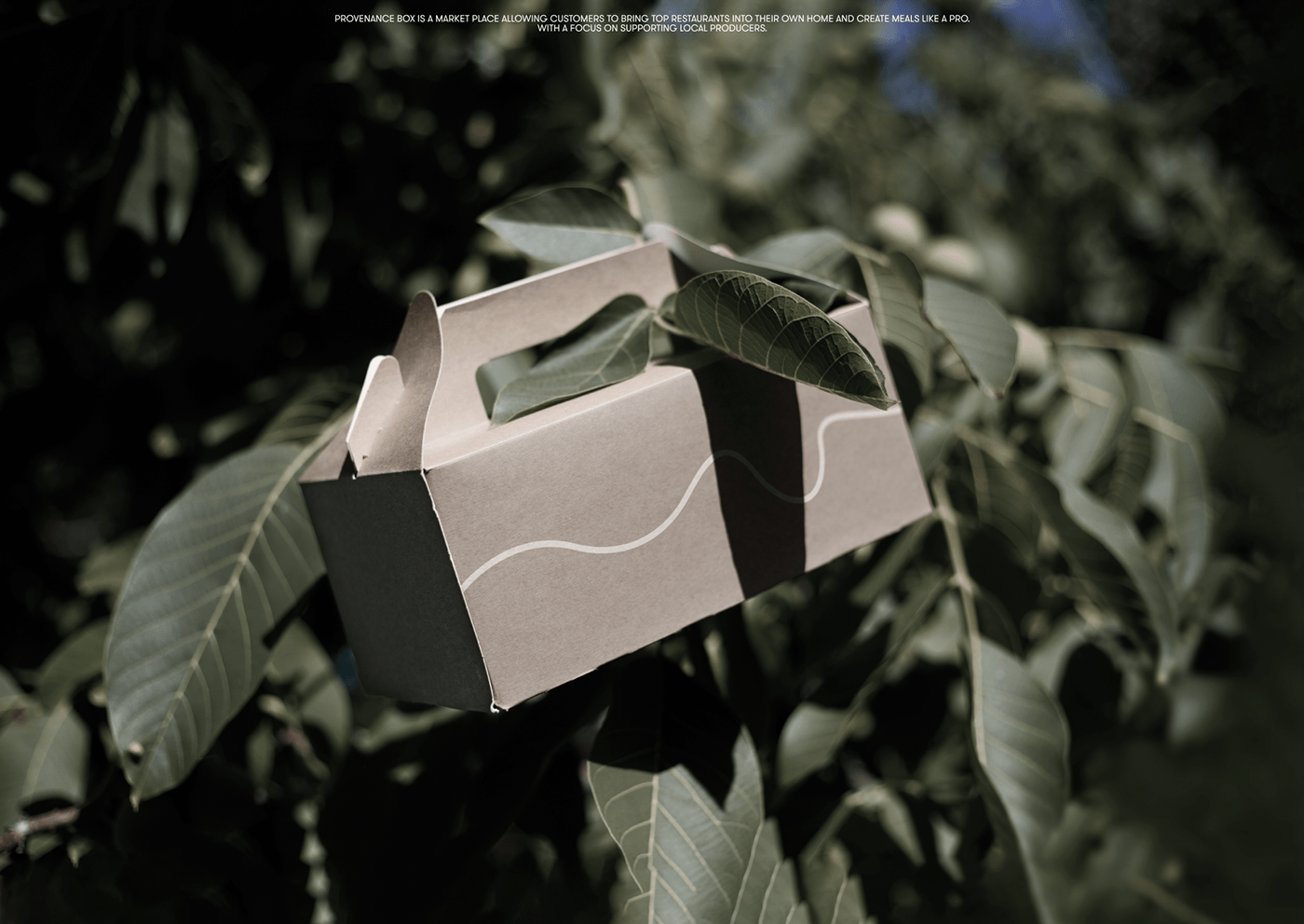
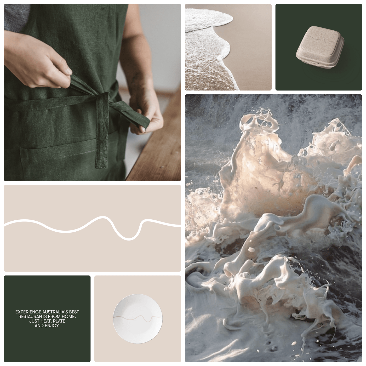
Oleksandr Maksymov’s latest project, Provenance Box, showcases a remarkable approach to branding and visual identity. This marketplace allows customers to bring top Australian restaurants into their homes, offering a seamless way to experience fine dining with just a few steps: heat, plate, and enjoy.
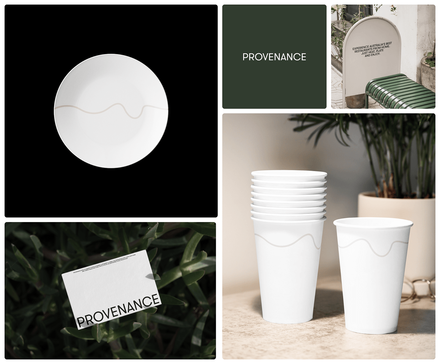
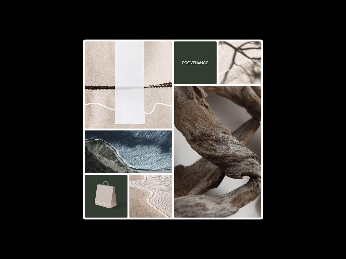
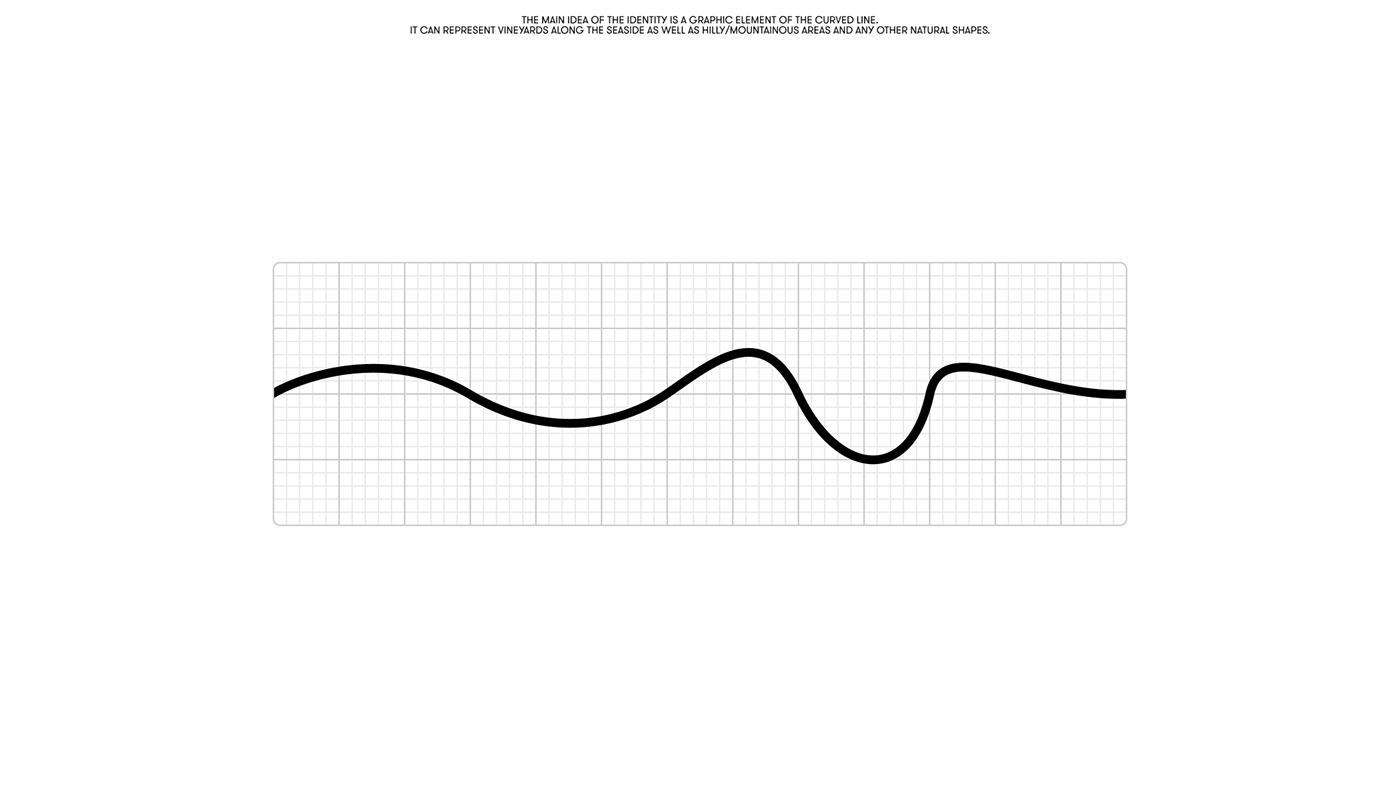
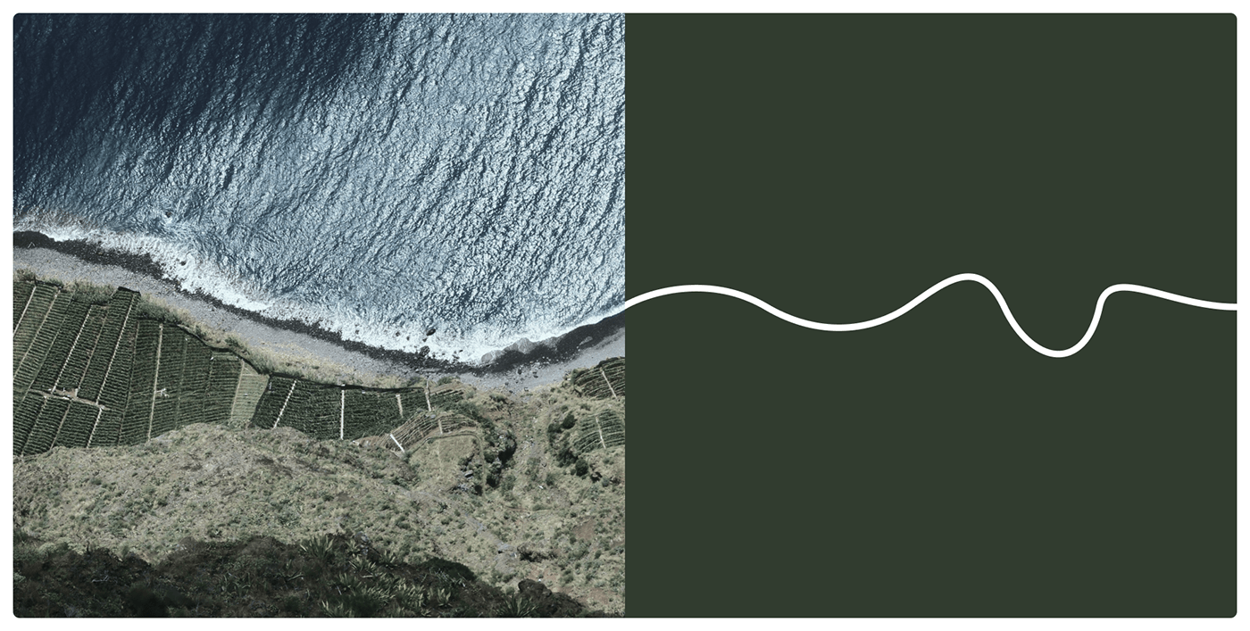
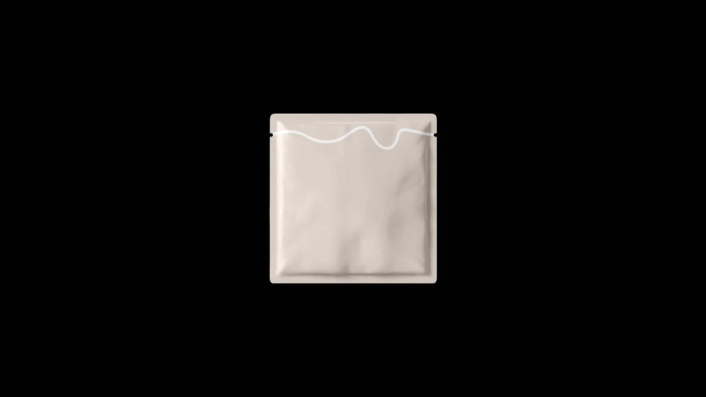
The core of Provenance Box’s identity lies in its graphic element – a gracefully curved line. This versatile design choice symbolizes various natural forms, from vineyards along the seaside to hilly, mountainous terrains. The simplicity and elegance of this element capture the essence of Australia’s diverse landscapes, creating an immediate visual connection to the product’s origins.
Maksymov’s design brilliantly supports local producers, a key value for Provenance Box. The visual identity fosters a sense of authenticity and locality, appealing to consumers who value high-quality, locally-sourced food. The use of natural shapes in the branding aligns perfectly with the product’s mission, enhancing the overall user experience.
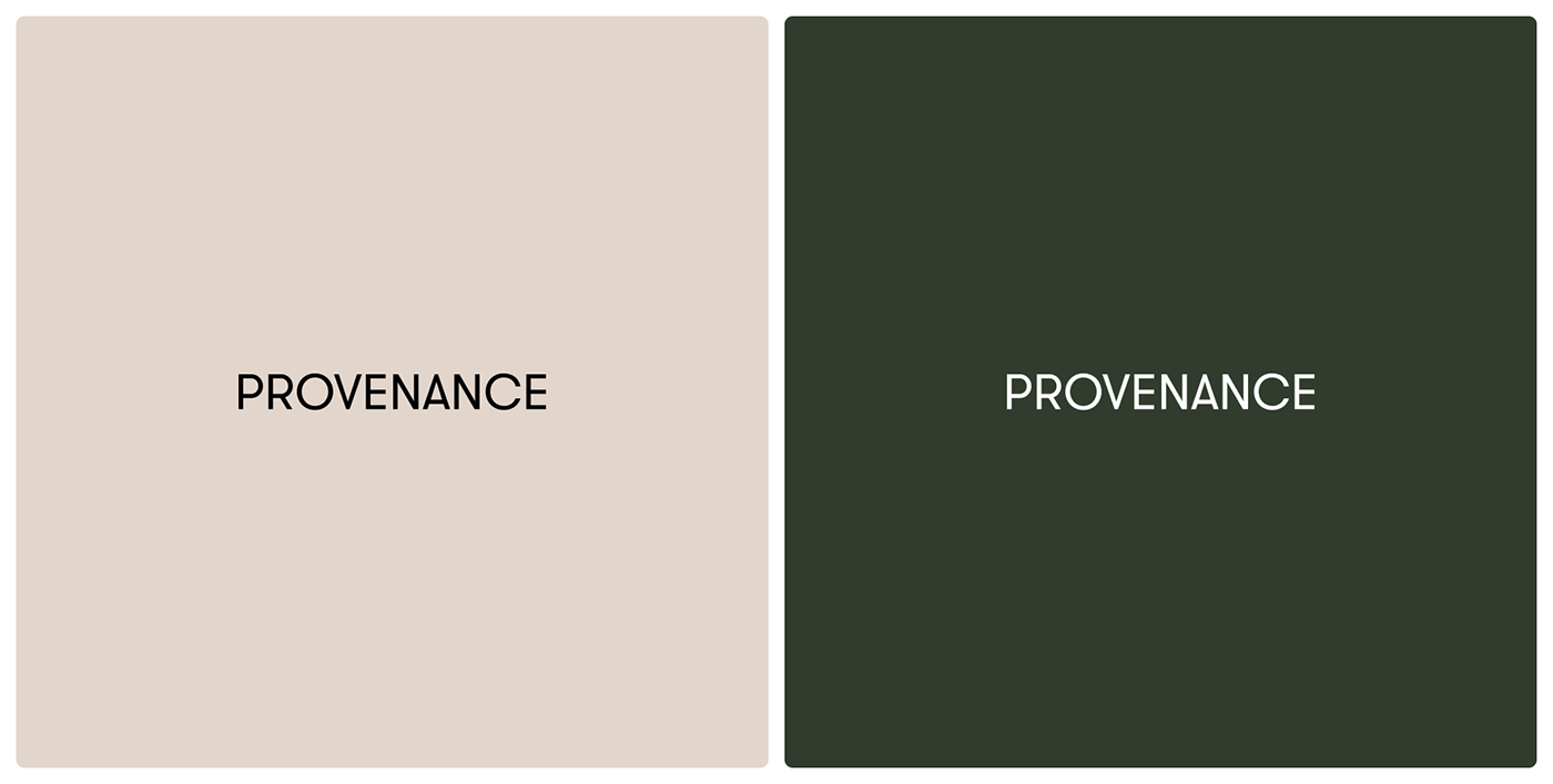
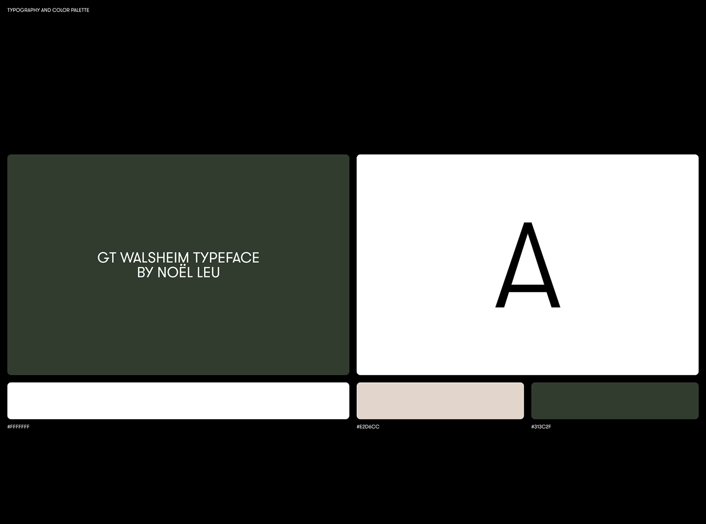
In terms of design, the minimalistic approach ensures that the focus remains on the product. Clean lines and a straightforward color palette allow the food to take center stage, while the branding subtly reinforces the product’s premium quality. The curved line element is used across various touchpoints, creating a cohesive and recognizable brand identity.
Provenance Box’s branding effectively communicates its value proposition – high-end restaurant meals at home, made possible by supporting local producers. Maksymov’s design is a testament to the power of simplicity and thoughtful design choices in creating a strong, lasting brand impression.
By focusing on design elements and their impact, this article highlights the thoughtful choices behind Provenance Box’s branding, making it a perfect fit for readers interested in branding and visual identity.
Branding and visual identity artifacts