Sweet Scandy Skincare Branding and Packaging Design
Explore the vibrant, playful branding and packaging design for Scandy Skincare by Classmate Studio.
Stepping into the world of youth skincare, Scandy Beauty brings a burst of color and fun. This Scandinavian brand, with a global reach, is all about ditching old beauty norms and celebrating who you are. Think inclusivity, self-expression, and giving the next generation the power to embrace their unique look. Classmate Studio teamed up with Scandy to whip up a visual identity and webshop that perfectly captures this joyful vibe.
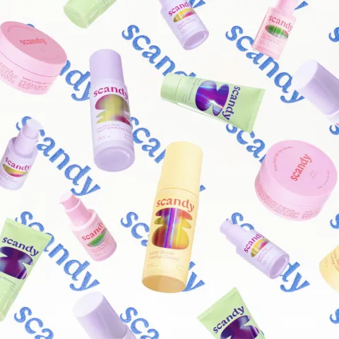
The look and feel of Scandy are seriously inspired by candy. It's all about uplifting, colorful, and bubbly shapes that just feel fresh and fun. You see these elements throughout the branding and packaging design artifacts. The shapes are instantly recognizable and add a playful touch to every product.
Color Palette and Typography
The color palette is bright and diverse, a direct nod to celebrating variety and individuality. This isn't a one-size-fits-all brand, and the colors make that clear. Alongside the vibrant colors, the typography keeps things clean and elegant. It's a nice balance between playful visuals and a refined presentation.
Packaging Details
Let's talk packaging. The designs continue the candy-inspired theme with colorful shapes and a clear, elegant typeface for product information. For instance, the "Spot the F Off Invisible Blemish Patches" packaging features the bubbly shapes and concise text like "Evicting unwanted guests. one patch at a time". Even the details like the barcode and expiration date are integrated cleanly.
From the serum bottles to the patches, the branding is consistent and engaging. The visual identity extends to their online presence too, with an engaging webshop that reflects the brand's spirit. The overall design creates a cohesive and inviting experience for the target audience.
More Than Just Packaging
What Classmate Studio has done with Scandy Skincare is a great example of how branding and packaging design can tell a story. It's not just about putting a label on a product; it's about creating a whole universe that resonates with the brand's values of inclusivity and self-expression. The candy-like inspiration translates into a feeling of joy and approachability.
[Suggested Image: Image 5 - Side-by-side images showing a Scandy product outside and a flat packaging design]
It's a reminder that design can be a powerful tool to connect with people and make them feel seen and celebrated. The vibrant visual identity and engaging packaging make Scandy Skincare stand out.
Check out more work from the studio behind this sweet branding: Classmate Studio
Credits
Photography: Silja Minkkinen
Client: Scandy Beauty
Branding and packaging design artifacts