by abduzeedo
When it comes to designing a user-friendly and visually appealing app, UI/UX design plays a crucial role. UI (User Interface) design is all about creating the look and feel of an app, while UX (User Experience) design is about crafting a seamless and intuitive user journey. The combination of these two disciplines can make or break the success of an app, especially in the highly competitive world of banking apps.
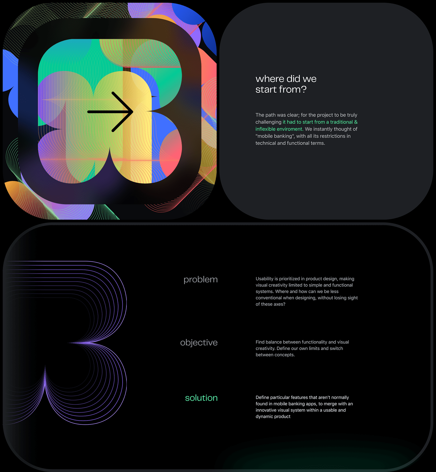
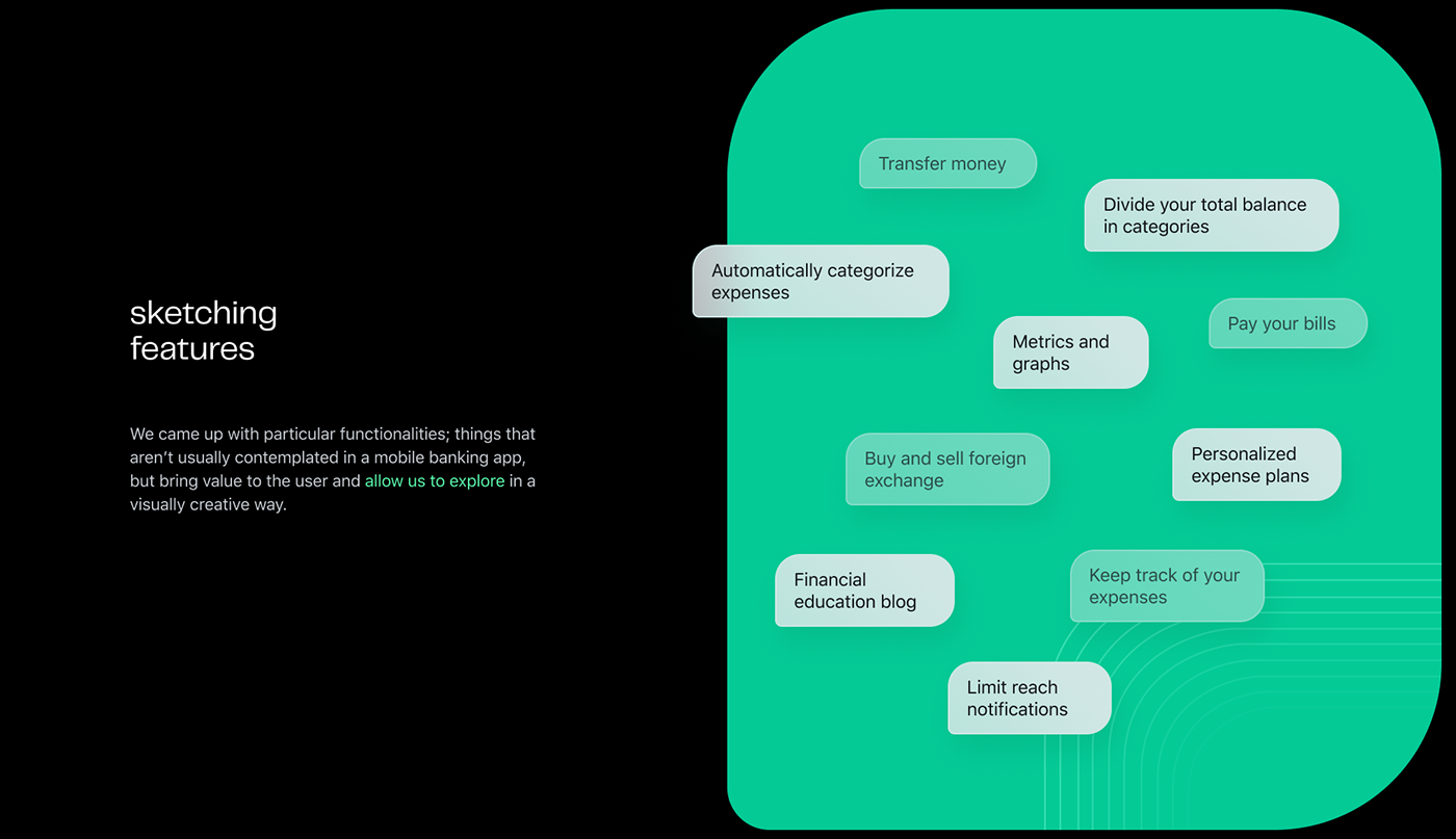
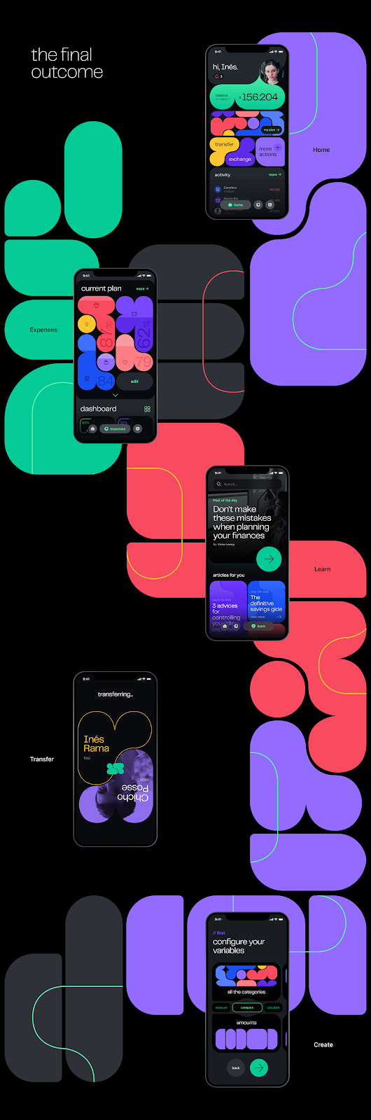
That's why we're excited to share with you the concept design for a banking app that we've recently come across. Created by Agustin Posse and Inés Rama, this app design showcases bold colors and stylish typography that immediately catches the eye. Let's take a closer look at what makes this design stand out and what we can learn from it.
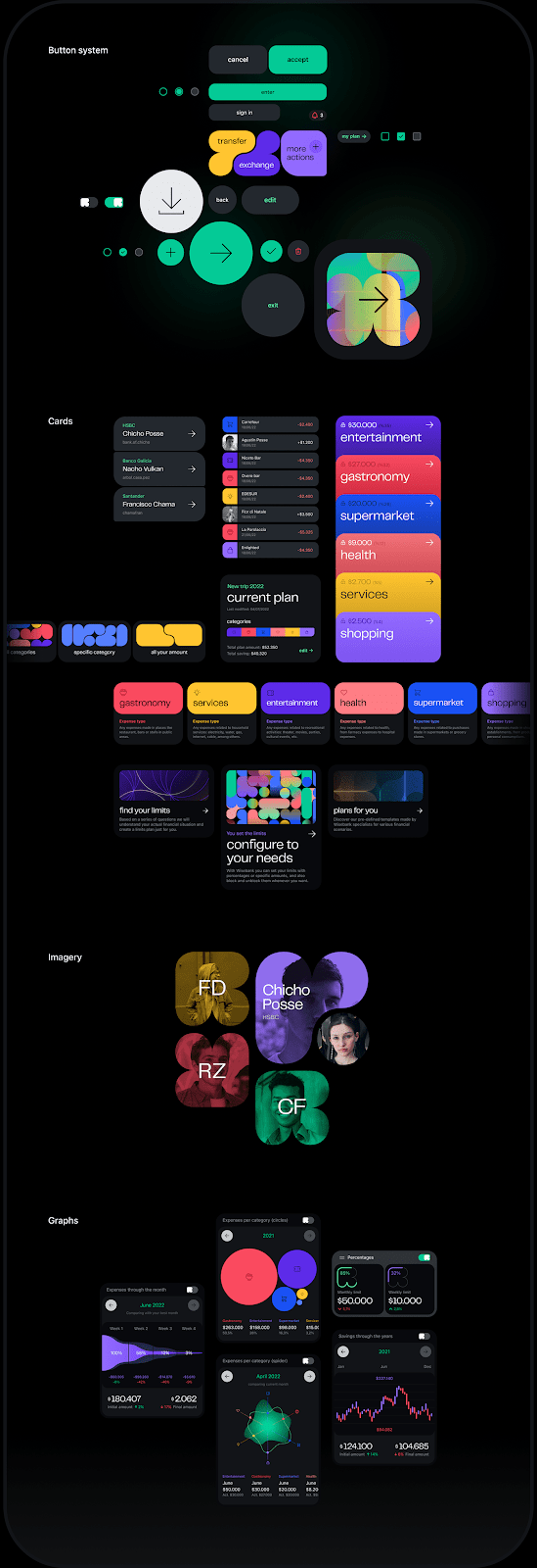
Firstly, the color scheme of the app is worth noting. It features a predominantly blue and white palette, which are commonly associated with trust, security, and professionalism – all essential traits for a banking app. However, what makes this app design unique is the use of bold and bright colors, such as a vibrant shade of green for the "Deposit" button and a striking pink for the "Pay" button. This approach adds a touch of playfulness and excitement to the app, making it feel less intimidating and more approachable.
Another standout feature of this app design is the typography. The use of a bold sans-serif font for the headlines and a clean and modern serif font for the body text creates a sense of hierarchy and makes the content easy to read. Additionally, the use of ample white space and well-placed graphics ensures that the app doesn't feel cluttered, further enhancing the user experience.
Overall, the concept design for this banking app is an excellent example of how bold colors and stylish typography can be used to create a visually appealing and user-friendly app. The combination of the two makes for a unique and engaging experience that sets it apart from other banking apps on the market. As designers, we can learn a lot from this app design, from the effective use of color to the importance of typography in creating a seamless user experience.
In conclusion, UI/UX design is essential when it comes to creating successful and engaging apps. The concept design for this banking app by Agustin Posse and Inés Rama is an excellent example of how the use of bold colors and stylish typography can create a visually appealing and user-friendly app. By taking inspiration from this design, we can create apps that not only look good but also provide a seamless and intuitive user experience.
UI/UX design artifacts


For more information make sure to check out Agustin Posse and Inés Rama on Behance.


