by alex
Unbegun is a brand identity by Bram Naus for an Amsterdam upcycling brand, built around a logo that reads the same at every angle of rotation, echoing a cycle of continuous renewal.
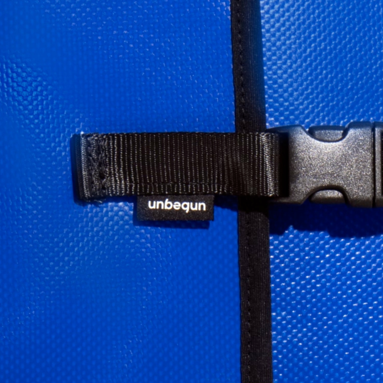
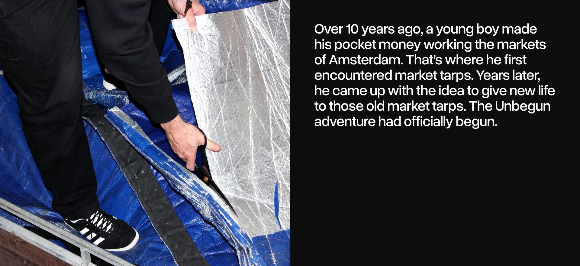
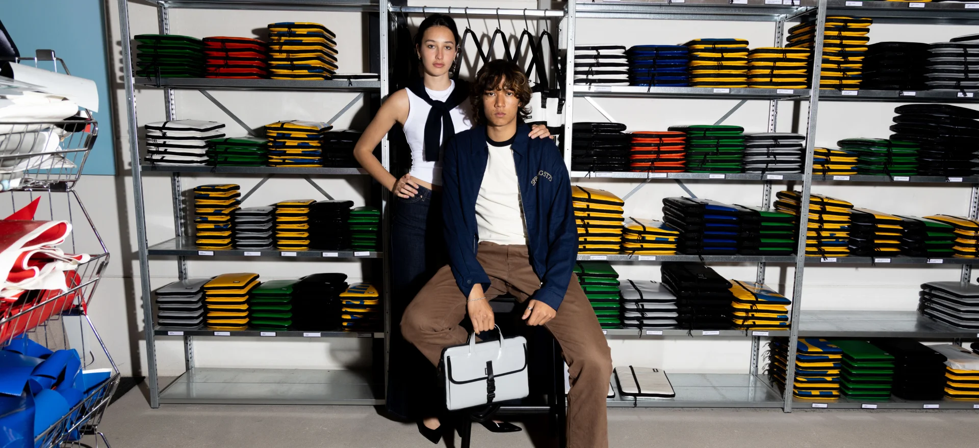
The Unbegun brand identity project by designer Bram Naus starts with a material fact: the brand makes durable bags and laptop sleeves from recycled tarps and tent cloth, all handmade in Amsterdam. Some of the source materials have weathered years outdoors. Others never left the factory. The brand identity needed to carry that layered sense of history, usefulness, and local craft without being precious about it.
The answer Naus arrived at is a logo that can be rotated endlessly and still read as the same mark. That kind of rotational symmetry is rare and difficult to achieve while maintaining legibility. It works as a visual metaphor for the brand's core idea: nothing is wasted, everything cycles back. The logo itself performs the brand's promise rather than just describing it.
![]()
Unbegun Brand Identity: Honest Amsterdam Design
Bram Naus describes the visual identity for Unbegun as reflecting what Amsterdam stands for: honest, straightforward design with a bold, rebellious edge. That framing is useful. The identity avoids nostalgia and avoids the kind of earnest sustainability branding that can feel preachy. Instead it leans into confidence and clarity. The materials have a story. The bags are made with care. The design reflects that without sentimentality.
The scope of the Unbegun brand identity project covered visual identity, digital design, and motion, making it a full brand system rather than just a logo exercise. The motion component extends the rotation concept into animation, giving the brand a living quality across digital touchpoints. It is a compact, well-resolved piece of work that earns its cleverness by tying form directly to brand meaning.
The Unbegun brand identity is documented on Bram Naus's portfolio. The Unbegun brand sells its upcycled products through its own channels in Amsterdam.